Report Component - Timeseries Chart

Component Palette Icon:
![]()
Description
The Timeseries Chart, while similar to the XY Chart, uses a datetime value for the Domain Axis instead of a numerical value. This chart is ideal when trying to display Tag Historian data in a Report.
Properties
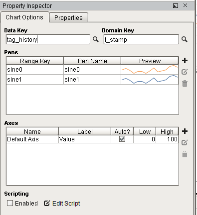
Chart Options
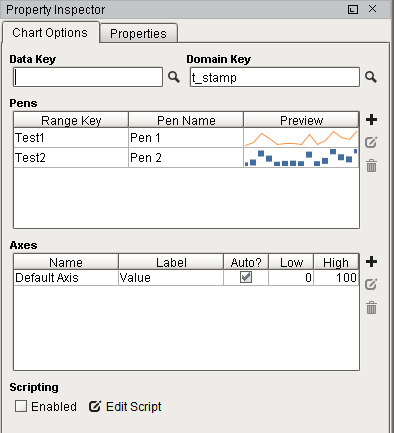
| Property/Symbol | Description |
|---|---|
| Data Key | Unique identifier or placeholder to the data source that will populate the chart. |
| Domain Key | The data key that should represent the X axis on the chart. The Timeseries Chart expects a timestamp, while the XY chart can use any numeric value as the domain key. |
| Pens | Pens represent a series of data. There are several properties for each pen exposed on the Chart Options tab: Range Key: The key the pen should retrieve data from. Pen Name: The name of the pen that should appear on the chart. Preview: Visual representation of how the pen will be rendered. The trend is simply a preview, and does not take the data from the range key into account. |
| Add Pen | Adds a pen. |
| Edit Pen | Opens Pen Configuration area for editing. |
| Remove Pen | Deletes a pen. |
| Axes | There are several properties for each axis exposed on the Chart Options tab: Name: The name of the axis. Label: Text next to the axis. Commonly used to describe what the values of each pen represent. Auto?: Determines if the axis should automatically adjust the upper and lower bound of the axis to include all data from each pen. When enabled, the High and Low properties are ignored. When disabled, High and Low will be used. Low: The low range value the axis will use when 'Auto?' is disabled. High: The high range value the axis will use when 'Auto?' is disabled. |
| Add Axis | Add an axis. |
| Edit Axis | Opens Axis Configuration area for editing. |
| Remove Axis | Deletes an axis. |
| Edit Script | Allows the chart to be modified via Python scripting before the report is rendered. |
Properties Tab
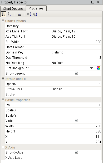
| Property | Description | Category |
|---|---|---|
| Data Key | Data key of the dataset that drives this chart. | Chart Options |
| Axis Label Font | Font to use for axis labels. | Chart Options |
| Axis Tick Font | Font to use for axis tick marks. | Chart Options |
| Bar Width | The width of any bar dataponts, specified in milliseconds. | Chart Options |
| Date Format | Optional format string to override the domain axis date format. | Chart Options |
| Domain Key | Key name of the column inside the dataset that contains the domain (x) value. | Chart Options |
| Gap Threshold | Multiplier for the average space between data points to be considered a data gap for the "line with gaps" render style. | Chart Options |
| No Data Msg | Message to show when no data is available. | Chart Options |
| Plot Background | Color to use for chart background. | Chart Options |
| Show Legend | If true, show a legend for the chart. | Chart Options |
| Opacity | How opaque the fill color is, between 0 and 1. | Stroke and Fill |
| Stroke Style | What style of stroke or border to use: Hidden, Shape Outline, Border, or Double. To learn more about stroke styles, refer to Stroke and Fill Properties. | Stroke and Fill |
| Stroke | Details for the chosen stroke. Each Stroke has its own properties depending on the Stroke Style chosen. | Stroke and Fill |
| Roll | Number of degrees this shape is rotated clockwise. | Basic Properties |
| Scale X | Amount to scale the width of this shape. 1 is scale to 100%. | Basic Properties |
| Scale Y | Amount to scale the height of this shape. 1 is scale to 100%. | Basic Properties |
| Visible | If true, the shape will be visible. | Basic Properties |
| Width | Width of this shape in pixels. | Basic Properties |
| Height | Height of this shape in pixels. | Basic Properties |
| Show X-Axis | If true, show the x-axis. | X-Axis |
| X-Axis Label | Label text for the x-axis. | X-Axis |
Examples
Example 1
Example 2
Dynamically set the range on your chart in the report. This script includes a minimum and maximum boundary so you can set operating ranges. It will throw out values that don't land in the correct range. IE: You don't want to display oven temperatures below 500 degrees, or values of 0 represent bad data.
This code should be placed in the configureChart function definition of your chart. You can access it by clicking the Edit Script button at the bottom of the Property Inspector.
configureChart
# set boundries to throw out 'bad' values that land outside this range
minBoundary = 50
maxBoundary = 100

from org.jfree.data.general import DatasetUtilities
# get the chart, axis, data
plot = chart.getPlot()
rangeAxis = plot.getRangeAxis()
rangeAxis.setAutoRange(False)
ds = plot.dataset

# Find the initial range of the dataset
rangeBounds = DatasetUtilities.findRangeBounds(ds)
rangeMin = rangeBounds.getLowerBound()
rangeMax = rangeBounds.getUpperBound()
# working minimum and maximum values for dataset. these are swapped with the initial values on purpose
currentMin = rangeMax
currentMax = rangeMin

# loop through the dataset to find desired min and max
series = 0 # which pen to search
numItems = ds.getItemCount(series)
for i in range(numItems):
    val = ds.getYValue(series,i)
    # find lowest value that is above the minBoundary
    if val > minBoundary and val < currentMin:
        currentMin = val
    # find highest value that is below the maxBoundary
    if val < maxBoundary and val > currentMax:
        currentMax = val

# calculate 10% padding
padding = (currentMax - currentMin) * 0.1

# set bounds in chart
rangeAxis.setLowerBound(currentMin - padding)
rangeAxis.setUpperBound(currentMax + padding)

# for troubleshooting: look in the console after going to the preview pane to see real values
# comment these lines when done with testing
print "Min: ", currentMin
print "Max: ", currentMax
print "Padded Min: ", currentMin - padding
print "Padded Max: ", currentMax + padding