Report Component - Report Object
Description
The report itself. This component has properties that control the dimensions, margins, and more. These settings impact all pages in the report. It may be selected by clicking on the Report object in the Project Browser.
Properties
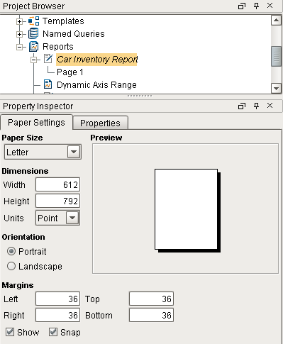
Paper Settings
| Property | Description |
|---|---|
| Paper Size | The desired paper size for the report. Many common sizes are available. When a size is selected, the width and height of the selected size are loaded into the Dimentions property. |
| Dimensions | Contains the Width and Height of the page. These properties work in conjunction with the Units property. The Dimensions may be changed manually here, or be modifying the Paper Size property. This section also contains a Units drop down with the following units of measurement:
|
| Orientation | Determines if the report should appear as Portrait (taller reports) or Landscape (wider reports) |
| Margins | Allows you to specify the position of the margin on the report. If the Show property is enabled, the margin is visible on the report's Design Panel. The margin will never appear on the Preview Panel or on the generated reports. The Snap property, when enabled, will cause report components to snap to the margin if moved within close proximity. |
Properties Tab

| Property | Description | Category |
|---|---|---|
| Grid Spacing | The space between each grid in Printer Points. Defaults to 9, which is 1/8th of an inch. | Grid Options |
| Show Grid | Enables a grid on the Design Panel. Useful for spacing out each component on the report. The grid is not visible on the Preview Panel, or on the resulting report. | Grid Options |
| Snap to Grid | When dragging a component, enabling this property will cause the component to snap to the grid. | Grid Options |
| Page Layout | Specifies how the page looks in the designer. Has the following options:
| Document Options |
| String for Null | Specifies the value to use should a key return a null value. Note that individual Text Shapes also have a String for Null property that will override this property. | Document Options |
| Roll | Number of degrees this shape is rotated clockwise. | Basic Properties |
| Scale X | Amount to scale the width of this shape. 1 is scale to 100%. | Basic Properties |
| Scale Y | Amount to scale the height of this shape. 1 is scale to 100%. | Basic Properties |
| Visible | If true, the shape will be visible. | Basic Properties |
| Width | Width of this shape in pixels. | Basic Properties |
| Height | Height of this shape in pixels. | Basic Properties |
| X | Horizontal distance in pixels between the left edge of this shape and the left edge of the page. | Basic Properties |
| Y | Vertical distance in pixels between the top edge of this shape and the top edge of the page. | Basic Properties |