Column Selector

Component Palette Icon:
Description
The column selector component is conceptually similar to the Row Selector, except that instead of filtering rows, it filters columns from its output dataset. Each column from the input dataset is shown as a checkbox. As the user checks and un-checks columns, the output dataset has those columns added or removed. This is very handy for driving the Table and Classic Chart components. In addition, this component can bring in multiple datasets and output just as many filtered datasets.
Additional information on the Column Selector can be found on the Vision Reporting Components page.
Properties
| Name | Description | Property Type | Scripting | Category |
|---|---|---|---|---|
| Alphabetize | If true, checkboxes will be ordered alphabetically by thier text. | Boolean | .alphabetize | Behavior |
| Background Color | The background color of the component. | Color | .background | Appearance |
| Border | The border surrounding this component. NOTE that the border is unaffected by rotation. | Border | .border | Common |
| Cursor | The mouse cursor to use when hovering over this component. | Int | .cursorCode | Common |
| Data In | Input dataset. *Note: This is the default when first dropping the component on the window, the name may change based on configuration and there may be more of these input dataset properties. | Dataset | .Data_in | Custom Properties |
| Data Out | Output dataset.*Note: This is the default when first dropping the component on the window, the name may change based on configuration and there may be more of these output dataset properties. | Dataset | .Data_out | Custom Properties |
| Font | Font of text on this component. | Font | .font | Appearance |
| Foreground Color | The foreground color of the component. | Color | .foreground | Appearance |
| Group By Dataset | If true, checkboxes will be grouped by thier dataset. Otherwise, checkboxes will be arranged flat. | Boolean | .grouping | Behavior |
| Horizontal Gap | The horizontal gap between checkboxes or grouping panels. | Int | .hGap | Appearance |
| Mouseover Text | The text that is displayed in the tooltip which pops up on mouseover of this component. | String | .toolTipText | Common |
| Name | The name of this component. | String | .name | Common |
| Normalize Widths | If true, all checkboxes will be assigned the same width, which causes them to line up in columns. | Boolean | .normalizeWidths | Appearance |
| Vertical Gap | The vertical gap between checkboxes and grouping panels. | Int | .vGap | Appearance |
| Visible | If disabled, the component will be hidden. | Boolean | .visible | Common |
Scripting
Scripting Functions
This component does not have scripting functions associated with it.
Extension Functions
This component does not have extension functions associated with it.
Event Handlers
Event handlers allow you to run a script based off specific triggers. See the full list of available event handlers on the Component Events page.
Customizers
The Column Selector component has its own Column Selector Panel Customizer that allows you to configure how the Column Selector filters columns.
Column Selector Customizer
The Column Selector Customizer contains two basic parts. The left side of the customizer allows you to configure how many datasets can be brought in for filtering. Each dataset added will add two additional custom properties to the Column Selector; an In dataset property and an Out filtered dataset property. Datasets can also be removed here, or moved up or down in the list. If there are multiple datasets, the columns from the first dataset in the list will be displayed at the top of the Column Selector, while the columns from the last will be at the bottom.
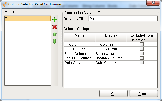
The right side of the customizer allows you to configure the settings for each dataset. When a dataset is highlighted on the left, we can see some basic information about it on the right, such as the Grouping Title and a list of all of the columns in that dataset. The Grouping Title is only used if there is more than one dataset in the Column Selector. In the component, each dataset's columns will be contained in a border and will display the Grouping Title. This can be configured to be anything, so that it is easier for a user to distinguish what each set of columns is for. In the Column Settings table, we see each one of the columns in that dataset listed out. Here, the Display column allows us to alter what name that column will display on the component, again allowing you to create names that are more meaningful to the user. Finally, the Excluded from Selection column allows you to exclude certain columns from being filtered. Columns that have this enabled will not show up in the list of columns on the component. This will not filter them out in the output dataset, but instead forces them to be in the output dataset.
Examples
Refer to the example on the Vision Reporting Components page.