Vision Reporting Components
The Reporting Module comes with some additional components that can be used with the Vision components to help you configure and filter your data, and view reports. These extra components are found in the Component Palette under Reporting: Report Viewer, Row Selector, Column Selector, File Explorer, and PDF Viewer.
These components will not be visible on the Component Palette unless the Reporting Module is installed.

Each of these components are described below along with examples of how they can be used and how to configure them.
Reporting Module Components
Row Selector
The Row Selector component allows users to filter a dataset based on unique values of one or more columns. Each level in the sorting tree is based on these properties. The user will see a dynamically generated expandable tree that groups their data by any number of choices. As a user clicks down the tree, objects bound to the dataset will indicate the filtered data.

A common way to filter the data is by time. For example, you can feed the Row Selector an input dataset that represents a large time range, and have it break it up by Year, Month, and Day. Then you can power a report with the output dataset that lets the user dynamically create reports for any time range. When configuring the Row Selector for the first time, you'll notice some default Date filters in the Row Selector Tree Customizer to help you quickly configure and filter raw data by time. If you don't want to filter your data by time, then simply delete the default filters and create your own.
See the Appendix for more information on the Row Selector.
Row Selector Examples
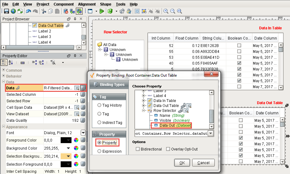
A Row Selector has two important properties: Data In and Data Out. The Row Selector component filters the data in the Data In property and pushes the filtered result to the Data Out property.
Let's configure a Row Selector to filter on some raw data. (This example uses a Power Table component which gives you the option of using some sample test data, or you can create your own data).
-
Drag a Power Table component on to your window and change the Name of the Power Table to "Data In Table". Scroll down the Property Editor and toggle the TestData property. This will populate the Data property with some test data. Alternatively, you could manually populate the Data property using either the Dataset Viewer or by creating a binding on the property.
-
Drag a Row Selector on to your window. With the Row Selector selected, click the binding icon on the Row Selector's Data In property, select the Property binding type and bind it to the Data property in the Data In Table, and click OK.
Data In Table

- Drag another Power Table component on to your window, change the Name to "Data Out Table", and bind the Data property to the Row Selector Data Out property, and click OK.
Don't worry about the 'Unknown' nodes in the Row Selector component, as shown in the example below. The Row Selector has three default Date filters which haven't been configured for your data yet. You will need to reconfigure them, or delete them and configure your own unique set of filters. Once configured, the 'Unknown' nodes will disappear.
Data Out Table
- Now let's configure your filters. Right click the Row Selector component and scroll down to Customizers > Row Selector Tree Customizer. The Row Selector Tree Customizer provides three default Date filters. Here you can customize the parameters of each Date filter or choose another filter type that is more appropriate for your dataset. Each column on the Data In Table will be listed in the Available Filters tree, and the types of filters available to each column depends on the datatype of the column. After configuring your filters, click OK. All your filter nodes will be displayed in the Row Selector.
This example uses the Date column to filter on the Month, Day, and Time combination.

- In Preview Mode, select Month, Day, or Time to filter on. The filtered results are displayed in the Data Out Table: 3 PM on May 6th 2017 is selected in the Row Selector, so the Data Out Table only contains records that match that datetime.
When designing your report window, it's not necessary to display the Data In Table only the Data Out Table. Furthermore, you don't necessarily need a component to house the data: the Data In property on the Row Selector could simply retrieve the raw data with a binding.

Here are a few more Row Selector examples:
-
A Line Graph bound to a Row Selector - Set up grouping to be first by month and year, then day, then hour, like the example above. Clicking on a month and year will dynamically update the graph for that time period. Further clicking to a specific day or hour will re-filter the graph for that period.
-
A Report Viewer bound to a Row Selector - Grouping by department (String) would allow selection by department, automatically regenerating the Report on selection.
-
An "Alarm History" Table bound to a Row Selector - This could first be broken down severity level (Integer), then broken into "Alarm Acknowledged" / "Not Acknowledged" (Boolean based). Clicking "Severity 3" would filter the table to all Severity 3 alarms. Selecting "Unacknowledged" would then filter the table to Unacknowledged alarms of Severity 3.
Column Selector
The Column Selector is similar to the Row Selector except that instead of filtering rows, it filters out entire columns from the output dataset. Each column from the input dataset is shown as a checkbox and allows users to show or hide variables in the datasets via the checkboxes, then outputs the resulting dataset. The Column Selector allows users to choose which columns in a dataset they wish to use. If an object is bound to the Column Selector it will update itself whenever a user checks or unchecks a column. This allows users to dynamically show or hide Table columns, "pens" on a graph, data in a Report Viewer, or any other component set up to use a dataset.

See the Appendix for more information on the Column Selector.
Column Selector Example
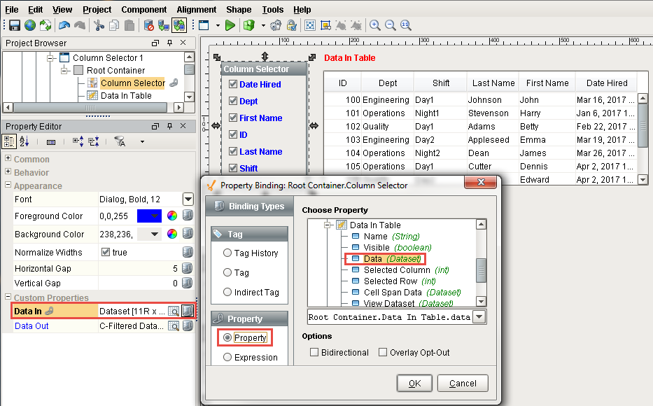
Just like the Row Selector, the Column Selector also has the same two important properties: Data In and Data Out. The Column Selector filters the data in the Data In property and pushes the filtered results to the Data Out property.
Let's configure a Column Selector to filter on some columns of employee data. (You can use a Power Table component which gives you the option of using some test data, or creating your own data like we did in the example below).
-
Drag a Power Table component onto your window and change the Name of the Power Table to "Data In Table". Scroll down the Property Editor and toggle the TestData property. This will populate the Data property with some test data. Alternatively, you could manually populate the Data property using either the Dataset Viewer or by creating a binding on the property.
-
Drag a Column Selector on to your window. With the Column Selector selected, click the binding icon on the Data In property at the bottom of the Property Editor, select the Property binding type and bind it to the Data property in the Data In Table, and click OK. The Column Selector will display a list of all the columns that are available in the dataset, and the Data In Table displays all the raw data.
- Drag another Power Table component on to your window, name this component Data Out Table, bind the Data property of this Power Table to the Column Selector Data Out property, and click OK. All the columns and raw data will be displayed in the Data Out Table.
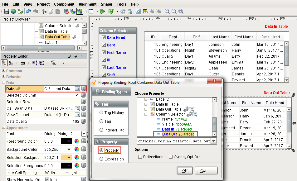
- In Preview Mode, you can can hide specific columns by unchecking the box in the Column Selector. Conversely, if you want to bring a column into view, simply check the box. In this example the Date Hired and Shift columns were unchecked. You'll notice that these columns are omitted from the Data Out Table.
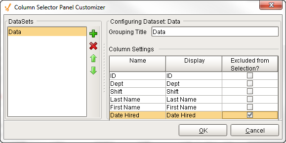
- The Column Selector component also has a way to hide columns that you don't want the user to deselect. In the Designer, right click the Column Selector and scroll down to Customizers > Column Selector Customizer. Click on Data DataSet, and you'll see a list of all the columns in the DataSet. If you check any of the columns under the Excluded from Selection, they will no longer show up on the Column Selector. It's important to note, that the Excluded from Selection doesn't filter out the column, it simply determines if you are able to filter the data on that column or not.
PDF Viewer
The PDF Viewer allows you to take PDF files and embed them into your Ignition Client. This can allows you to view PDF documents without having to leave the Ignition Client, perfect when running a client at full screen, or to view any reports that were saved in PDF format.

File Explorer and PDF Viewer
The File Explorer component displays a file system tree structure that allows users to navigate around various folders. It can be rooted to any folder including shared network folders, and can filter file types by their file extension like 'pdf.' The File Explorer is typically used in conjunction with the PDF Viewer component in order to create a PDF viewing window. This is very useful for viewing documents from within a project.

File Explorer and PDF Viewer Example
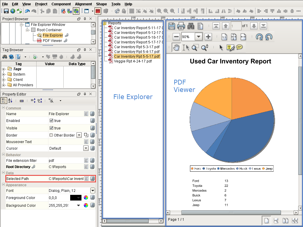
Let's setup the File Explorer and the PDF Viewer to create a window to view a PDF documents.
- In Designer, drag a File Explorer component and PDF Viewer component on to a window and place them side by side.
- Select the PDF Viewer component and Bind its File Path property to File Explorer's Selected Path property. Select the Property binding type, and drill down to the File Explorer Selected Path property.

- In the Property Editor of the File Explorer component, set the Root Directory property to any folder. You can either type in the folder path or bind the root directory as shown in the image below. The Root Directory restricts which directories are accessible on the component. This is typically used to restrict access to a particular folder so that the user doesn't have access to the entire file system. All folders nested within the Root Directory can be accessed on the component, so keep this in mind if you do not want user to see specific folders within the rooted directory.
If you set the File Explorer's Root Directory to a network folder, all clients will be able to access documents within all folders in that network folder).

-
To filter for only PDF file types, enter 'pdf' (without quotes) in the File Extension Filter property, otherwise, all file types will be displayed inside the Root Directory.
-
In Preview Mode, click on one of the reports in your Root Directory. The PDF Viewer works by passing the file path of the file you selected to the PDF Viewer. You'll also notice several PDF Viewer properties that drive the appearance of the PDF Viewer: Page Fit Mode, Hide or Show Toolbar, Utility Bar, Highlight, Select, Save, Print, and more. Note: Clicking on the Save icon in the runtime saves a copy of the report to the client computer, not the Ignition Gateway.