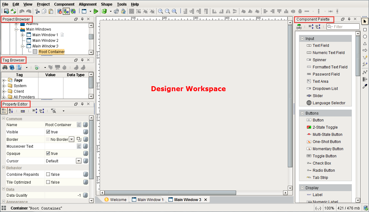
Designer User Interface
Designer Workspace
The Designer is organized in panels around a central workspace. Some of these panels include: Project Browser, Tag Browser, and Property Editor. The workspace changes depending on the type of resource that you are currently editing. For example, if you are editing a Window, your workspace will be the Window Designer. If you are editing a Transaction Group, your workspace will be the Transaction Group Editor, and so on.
There are many dockable and dragable panels that surround the workspace, as well as the familiar menu bars and toolbars. The dockable panels can be rearranged as you wish and will snap into place as you move them around the screen. Each type of workspace can have panels that are only valid when that workspace is active. Each workspace remembers its own perspective, which is the docking arrangement of the panels around it.
If you have closed a panel and want to get it back, re-enable it from the View > Panels submenu. The View > Reset Panels will reset the user interface back to its default window arrangement.
Docking System
The Designer's docking system provides a very flexible user interface, allowing you to customize the layout as you wish. To re-arrange the dockable panels, simply drag on their title bars. As you are dragging the panel, it will try to snap into place and show you a highlighted border. Use the highlighted border that appears to gauge where the panel will be moved to. Hold the CTRL key as you drag these panels to keep them from snapping into place. You can also drag these panels outside of the designer or onto a second monitor.
Dockable panels can be in one of four modes:
-
Docked - The panel is visible, and located somewhere around the perimeter of the workspace. If two panels are docked in the same location, a tab strip will appear to switch between the two panels.
-
Floating - A panel can be dragged outside of the workspace perimeter to be floated. The panel can now be positioned anywhere on your desktop.
-
Pinned - Pinning a panel makes it minimize to one of the four sides of the Designer, represented by a small tab. Hover over the tab to use the panel.
-
Hidden - A hidden panel is not shown. You can open it again by selecting it in the View > Panels menu.
Toolbars can also be rearranged and floated to your liking. Simply drag on the "textured" left edge of the toolbar. If you have re-arranged your panels into a layout that you don't like, you can quickly revert back to the default by selecting the View > Reset Panels option from the menu bar.
Your docking preferences are stored under %USER_HOME%/.ignition/*.layout. If you really want to reset your preferences, remove these files and restart the Designer.
File Menu

The File Menu contains most of your basic options related to saving, similar to many other software applications on your PC.
| Function | Description |
|---|---|
| New | The New menu option allows you to create a new Object. That Object could be a new window, a new template, or even a new project. It can vary depending on what modules you have installed, also providing the ability to make new transaction groups, reports, Sequential Function Charts, and more. |
| Open | Allows you to Open a previously created project. |
| Save and Publish and Rollback | By default, saving and publishing are all done together. However, this can be changed to allow for just saving, where the changes will be saved but not pushed out to clients, and just publishing, where the new saved changes will be pushed out to the client. Rollback will allow you to 'roll back' to one of the 10 most recently saved versions of the project. See also: Versioning |
| Update Project | Merges any changes from the gateway to the project, if for example there were multiple people working on the same project. |
| Ignition Exchange | New in 7.9.13 Opens the Ignition Exchange website. |
| Import and Export | Allows you to import or export specific resources into or out of the project. Export global will export globally scoped resources, such as Alarm Pipelines. |
Edit Menu
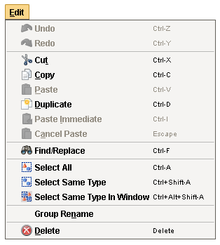
The Edit Menu is also similar to other applications edit menus, in that it provides much of the basic copy/paste functionality.
| Function | Description |
|---|---|
| Undo and Redo | Can be used to revert to the previous state, essentially removing the last change, or redoing it again after having been removed. This has a large queue that can be traversed but does not include every change. ie: Tag edits cannot be undone. |
| Cut/Copy/Paste/Duplicate | These function much the same as they do everywhere else. Most things in the Designer can be copied and pasted elsewhere, from individual components on the window to entire folders of windows. The difference is that when using paste with an object on a window, it will instead create a paste action, and allow you to move the mouse and select where you want to paste, clicking the mouse to confirm. Cancel Paste will cancel the paste action, while paste immediate will bypass the paste action, and instead immediately paste the object from where it was cut or copied from |
| Fine/Replace | Brings up the find and replace interface to allow you to find specific objects within the project. See also: Find and Replace |
| Select All | Selects all siblings in the same container as the currently selected component. |
| Select Same Type | Selects all components of the same type in the same container as the currently selected component. |
| Select Same Type in Window | Selects all components of the same type as the currently selected component, regardless of what container they are in. |
| Group Rename | Renames a group of components to a prefix with a number afterwords. For example, if your prefix is Button, it will rename all selected components Button (1), incrementing the number each component. |
| Delete | Deletes the currently selected component. This can also be done using the delete key. |
View Menu

The View Menu allows you to manipulate how various objects look or act in the designer.
| Functions | Description |
|---|---|
| Emulate Touchscreen | Simulates Touchscreen mode in the Designer to be able to test it without having to open a client. |
| Disable Overlays | Disables the red or gray overlays on components because of a bad Tag or binding, but only in this Designer session. |
| Reset Panels | Resets panels (Project Browser, Tag Browser, etc) to the default panel configuration. |
| Panels | Allows you to enable or disable certain panels within the Designer. |
| Toolbars | Allows you to enable or disable certain toolbars within the Designer. |
| Welcome Screen | Takes you to the welcome screen in the designer, or reopen it if it had been closed. |
| Grid Size | Allows you to select a grid size of 5 or 10. |
| Show Grid | Toggles the grid on and off. |
| Snap to Grid | Changes click-and-drag behavior to snap components to grid lines. This works even when Show Grid is off. |
| Show Guides | Shows any guide lines. |
| Snap to Guides | Changes click-and-drag behavior to snap components to any created guidelines. |
| New Guide | Adds a guide line to the current window. |
| Spotlights | Puts a highlighted border around components that have the selected spotlight. Bound objects will get a green highlight, objects with scripting will get a blue highlight, and invisible objects will get a pink highlight. If a component has multiple highlights, and both are enabled, it will alternate the colors throughout the highlight. |
| Dependencies | Shows the binding dependencies (as arrows) based on the selected component or components. Show Supporters will show all components that the currently selected component is bound to, Show Dependents will show all components that are bound to the currently selected component, and Show All will show all of the bindings, regardless of the selected components. |
Project Menu

The Project Menu is where many project specific settings can be changed.
| Functions | Description |
|---|---|
| Designer Comms | The Comm settings allow you to select the level of communication the designer can have with the gateway. By default, this is set to Comm Read-Only, which will make any information coming from the gateway read only, but this can be changed to Comm Off which will turn prevent gateway communication, or Comm Read/Write, which will allow both read and write communications between the gateway. The default that the Designer opens at can be changed in the Project Properties. See also: Communication Modes |
| Properties | Opens up the Project Properties window, allowing project settings to be changed. See also: Project Properties |
| Event Scripts | Opens up the appropriate event script window, either client or gateway. These can also be accessed from the project browser. See also: Client and Gateway Event Scripts |
| Preview Mode | Puts the Designer into preview mode, allowing you to interact with it like a client. See also: Previewing the Project |
| Preview Language | Determines the language that the Designer will revert to when in preview mode. See also Localization and Languages |
Component Menu

The Component Menu offers many of the same selections for the selected component that right clicking on that component would contain.
| Function | Description |
|---|---|
| Group | Only available when multiple components are selected. Grouping will place the currently selected components into a group. Ungroup will remove the grouping. See also: Working with Components |
| Ungroup | Only available when a group is selected. This option removes the group (and any custom properties that are on the group) and places all items from that group into the object the group was in. |
| Convert to Container | Only available when a group is selected. Converts the selected group to a container. See also: Container |
| Lock | Locks or unlocks the selected component's size and position. |
| Layout | Set layout constraints for the selected component. |
| Size and Position | Change the size and position of the currently selected component. |
| Customizers | Allows you to select any of the available customizers for the currently selected component. |
| Scripting | Brings up the scripting window for the currently selected component |
| Security | Opens up the Security Settings Panel, allowing security to be placed on the selected components. |
| Translations | Brings up the Translatable Terms Panel, showing any translations for the selected component. |
Alignment Menu

These options allow you to adjust the alignment of components relative to other components.
| Function | Description |
|---|---|
| Move | The move commands move a component on its z axis, as in in front of or behind other components. It can be moved to the far back or front, or done in single steps. |
| Align | The align commands move all selected components to the edge of the furthest component. So if Align Left was selected, it would move all components to the leftmost component's edge. |
| Align Centers | Aligns all of the selected components either vertically or horizontally on their centers. |
| Align as Row | Aligns all of the the components on their centers as a row or stack, and will add padding between them that you can select. Normalizing them will change the size of all of the components to the first selected component. |
| Center | Centers the currently selected components relative to their parents either vertically or horizontally. |
Shape Menu

The Shape Menu allows for manipulation of shape or path objects.
| Function | Description |
|---|---|
| Rotate | Rotates the currently selected shape 90 degrees either right or left. |
| Mirror | Flips the component either vertically or hoizontally. |
| Union | Alters the first shape to be the combination of all selected shapes. |
| Difference | Alters the first selected shapes by removing the last selected shape from them. |
| Intersection | Alters the first shape to become a new shape consiting of the area they share. |
| Exclusion | Alters the first shape to become a new shape consiting of the area they do not share. |
| Division | Cuts the first shape into multiple shapes along the borders of other shapes. |
| To Path | Converts a shape to a simple path object. |
| Stroke | Converts the selected shape into a new shape defined by its stroke. |
Tools Menu

The Tools menu in the Designer provides some tools to help you when creating projects. The Console, Image Management, and Symbol Factory tools are described here.
| Function | Description |
|---|---|
| Console | The Output Console is the script-writers best friend. It is a dockable panel, and you can open it via the Tools > Console menu or the Ctrl-Shift-C keyboard shortcut. The output console is most frequently used to test and debug Python scripts in Ignition. For example, by using the print function in your script, you can observe the inner workings of your script as it executes. If you executed the following script: see Console - Example Script The output console is also available in the Vision Client from Help > Diagnostics. See also: Scripting, Help Menu |
| Image Management | The Image Manager is available from the Tools > Image Management menu. This tool is a drag-and-drop browser that helps manage the images that are stored on the Gateway. It is important to realize that these images are shared across all projects: they are not stored inside a project itself. Use the toolbar at the top to do common tasks like uploading new images and creating folders. You can drag images and folders from your computer's desktop or hard drive into this window to easily upload new images to the Gateway. You can also get to this tool by putting an Component Palette > Display > Image component on a window, and clicking the browse button on the image's Image Path property. See also: Images (png, jpg, gif) |
| Script Console | Opens up the Scripting Console window. This is where you can test scripts out. See also: Script Console |
| Database Query Browser | Opens up the Database Query Browser Panel, which will allow you to run SQL queries against your database connections. See also: Database Query Browser |
| Translation Manager | Opens up the Translation Manager Panel, which will allow you to configure translations. See also: Localization and Languages |
| Cloud Templates Browser | Changed in 7.9.13 Cloud Templates have been moved to the new Ignition Exchange and are still available. |
| Symbol Factory | If you have the Symbol Factory module installed, you'll be able to open the Symbol Factory browser under the Tools menu in the Designer. You can browse through the symbols or use the convenient search function to find the symbol you need. Once you find a symbol, you can drag-and-drop it into a window. Each symbol is dropped as a shape group. You will be able to un-group it or double-click into the group just as if you had drawn the symbol yourself using fundamental shapes. This means that you can alter the shape if you need to, or bind any colors inside the shape to a tag to make the shape dynamic. |
| Launch Project | Allows you to launch the project directly from the designer. You can either launch a staging or published windowed client, or a published full screen client. |
Console - Example Script
# A python script that demonstrates the print statement
print "Print me first"
x=10
z=2
print x, y, x/y

# Result looks like this:
#Print me first
#10 2 5
Help Menu

| Functions | Description |
|---|---|
| Help | Opens up your web browser and takes you to this User Manual, for quick reference. |
| Tip of the Day | Reopens the Tip of the Day popup that by default appears when you first open the Designer. |
| Diagnostics | The Help menu in the Designer and the Vision Client has a Diagnostics window that contains a number of tabs each providing a useful troubleshooting feature. You can right-click on any of the tabs to show or hide the other tabs. These tabs or the troubleshooting features are as follows: Performance Tab Displays a number of small realtime charts that show various aspects of the currently executing Designer or Client's performance. These charts can be very useful to help troubleshoot performance issues, especially slow queries. One of the most common causes of query slowdown is simply running too many queries too frequently, and the # of Select Queries (Queries/Second) chart can help identify when this is occurring. The statistics shown on this page apply to the current session only, you can see the Gateway statistics from the Status section of the Gateway. Console Tab Displays the Ignition Output Console. Log Viewer Displays the logged events for the current Designer or Client session. Whenever errors occur, they are logged and displayed in this tab. This is a good place to go when troubleshooting an issue, as any errors shown here may illuminate the cause of the problem. To view entries across all categories chronologically, uncheck the Group Categories checkbox. Logging Levels Determines the verbosity of a host of internal loggers. Most users will not use this tab unless prompted by a technical support representative. Thread Viewer Shows information about the currently running threads. Most users will not use this tab unless prompted by a technical support representative. Connections Displays the Gateway connection status as being connected or not. |
| About Ignition Designer | Provides information about the Designer such as the versions of the modules, java version, and gateway IP Address that the designer is using. |