Bar Chart

Component Palette Icon:
Description
The Bar Chart is a very easy-to-use chart that provides a familiar bar representation of any numeric values. That is, the height of the bars is determined by some numeric value in the underlying dataset. It is often configured to display as a category chart. A category chart is a chart whose X-values are categories (strings, names, groupings, etc) rather than numeric values (numbers, dates).
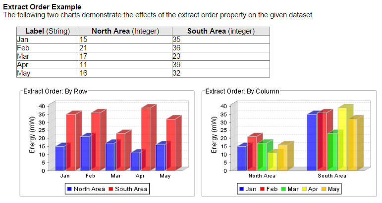
Like most chart components (other than the Easy Chart), the Data property drives the chart. The first column in the Data dataset defines the names of the categories. The rest of the columns define the values for each of the series (if there is more than one series per category), and thus should be numeric.
If your data is 'turned on its side', meaning that the columns define the categories and rows define the series, then set the Extract Order to "By Column".
Properties
| Name | Description | Property Type | Scripting | Category |
|---|---|---|---|---|
| Bar Label Color | The color for the bar labels. | Color | .barLabelColor | Axes |
| Bar Label Font | The font for the bar labels. | Font | .barLabelFont | Axes |
| Bar Label Offset | The offset between the bar and the bar label. | double | .barLabelOffset | Axes |
| Border | The border surrounding this component. NOTE that the border is unaffected by rotation. | Border | .border | Common |
| Category Axis Label | The label for the category axis. | String | .categoryLabel | Axes |
| Category Axis Label Angle | The angle for the value axis' labels. | int | .catAxisLabelPosition | Axes |
| Category Axis Label Color | The color for the category axis label. | Color | .catAxisLabelColor | Axes |
| Category Axis Label Font | The font for the category axis label. | Font | .catAxisLabelFont | Axes |
| Category Axis Lower Margin | The lower margin, as a percentage, of the category axis. | double | .catAxisLowerMargin | Axes |
| Category Axis Tick Color | The color for the category axis' ticks. | Color | .catAxisTickColor | Axes |
| Category Axis Tick Font | The font for the category axis' ticks. | Font | .catAxisTickFont | Axes |
| Category Axis Upper Margin | The upper margin, as a percentage, of the category axis. | double | .catAxisUpperMargin | Axes |
| Category Margin | The margin between categories as a fraction of the total space. | double | .categoryMargin | Appearance |
| Chart Title | An optional title that will appear at the top of the chart. | String | .title | Appearance |
| Chart Type | Controls how the bar chart is displayed. | int | .rendererType | Appearance |
| Cursor | The mouse cursor to use when hovering over this component. | int | .cursorCode | Common |
| Data | The data driving the chart. | Dataset | .data | Data |
| Data Quality | The data quality code for any tag bindings on this component. | int | .dataQuality | Data |
| Extract Order | Controls whether the first row defines the categories or the series. | int | .extractOrder | Data |
| Foreground Transparency | The transparency of the pie (useful for 3D pies). | float | .foregroundAlpha | Appearance |
| Gradient bars? | If true, bars will be painted with a gradient 'shine'. | boolean | .gradient | Appearance |
| Item Margin | The margin between bars in a category as a fraction. | double | .itemMargin | Appearance |
| Labels? | Always display labels? | boolean | .labels | Appearance |
| Legend Font | The font for the legend items. | Font | .legendFont | Axes |
| Legend? | If true, show a legend for the chart. | boolean | .legend | Appearance |
| Mouseover Text | The text that is displayed in the tooltip which pops up on mouseover of this component. | String | .toolTipText | Common |
| Name | The name of this component. | String | .name | Common |
| Plot Background | The background color for the plot. | Color | .plotBackground | Appearance |
| Series Colors | The sequence of colors used for series in the bar chart. | Color[] | .seriesColors | Appearance |
| Shadows? | If true, bars will have a drop-shadow beneath them. | boolean | .shadows | Appearance |
| Title Font | The font for the chart's title. | Font | .titleFont | Axes |
| Tooltips? | If true, show tooltips. | boolean | .tooltips | Behavior |
| Value Axis Auto-Range | If true, the value axis range will be determined automatically. If false, the specified upper and lower bounds will be used. | boolean | .valAxisAutoRange | Axes |
| Value Axis Label | The label for the value axis | String | .valueLabel | Axes |
| Value Axis Label Color | The color for the value axis label. | Color | .valAxisLabelColor | Axes |
| Value Axis Label Font | The font for the value axis label. | Font | .valAxisLabelFont | Axes |
| Value Axis Lower Bound | The lower bound of the value axis. Used only when auto-range is false. | double | .valAxisLowerBound | Axes |
| Value Axis Tick Color | The color for the value axis' ticks. | Color | .valAxisTickColor | Axes |
| Value Axis Tick Font | The font for the value axis' ticks. | Font | .valAxisTickFont | Axes |
| Value Axis Upper Bound | The upper bound of the value axis. Used only when auto-range is false. | double | .valAxisUpperBound | Axes |
| Value Axis Upper Margin | The upper margin, as a percentage, of the value axis. Only used when auto-range is true. | double | .valAxisUpperMargin | Axes |
| Vertical | Sets the orientation of the chart to vertical (true) or horizontal(false) | boolean | .vertical | Appearance |
| Visible | If disabled, the component will be hidden. | boolean | .visible | Common |
Scripting
Scripting Functions
This component does not have scripting functions associated with it.
Extension Functions
getBarColor
-
Description
- Provides a chance to override the color of each bar. Can be used to have bar colors changed based upon bar value. Returning the value None will use the default bar color for the series.
-
Parameters
-
Component self - A reference to the component that is invoking this function.
-
int series - The series index for this bar.
-
int category - The category index for this bar.
-
int value - The value (a number) of this bar.
-
Color defaultColor - The color that the bar would be if this function wasn't invoked.
-
-
Return
- Color
-
Scope
- Client
Event Handlers
Event handlers allow you to run a script based off specific triggers. See the full list of available event handlers on the Component Events page
Customizers
Examples