Control Components
When creating real-time status and control screens, operators typically use control components to write back to the PLC. You can find all the control components that come with Ignition under the Input and Buttons tabs in the Component Palette of the Designer. You can use various Input components like the Numeric Text Field, Spinner, or Slider; and Buttons such as 2-State Toggle, Multi-State, One-Shot, or Momentary to write values back to a database or PLC. These control components are the core of data entry in Ignition, and the most commonly used that allow data entry.
When choosing control components, be sure to look at the component's properties. Each component has different properties that affect its behavior and can dictate which component to use for your project.
This section describes several control components and how to use them in a controls environment. These examples assume you have some Tags created. If not, you can drag some simulator Tags from the OPC-UA server by going to your Tag Browser, clicking on the OPC icon ( ), and dragging some Tags into your Tags folder, or creating some Memory Tags. Any Tag will work.
Binding Tags
Another thing to mention as you read through the examples, there are the three ways of binding Tags. There is no right or wrong way, simply choose if you want to bind multiple Tags, individual tags, or which ever way is best for you.
- Drag a Tag from the Tag Browser to the component. A yellow outline will appear around the component, release the mouse, and the Tag is instantly bound to multiple properties of the component.
- In the Property Editor, click the Binding icon (
 ) next to one particular property you want to bind to a Tag. The Property Binding window will open, select a Tag Binding Type, navigate to the Tag you want to use, and click OK. This one particular property of the component is now bound to the selected Tag.
 - Drag a Tag from the Tag Browser on to one individual property in the Property Editor of the component. For example, select an Integer Tag from the Tag Browser and drop it on the Value (Integer) property of a Numeric Text Field. The Tag is now bound to that individual property.
Here are a few examples of control components and how they can be used in a controls environment.
Input Components
Input components allow users to enter or select data. One characteristic that Input components have is that they allow users to modify a numeric or string value and write back to the PLC. Different components have different properties so make sure to look at all of them. When you drag a Tag on to a numeric component, you'll see that it often binds multiple properties. Often there are Minimum and Maximum values that control what can be entered.
Defer Updates
Before we get started looking at some Input components, we need to mention the Defer Updates property. The Defer Updates property exists on most Input components, and by default is set to true. Users typically have specific cases where they want to use it, and cases where they don't want to use it, so it's important to understand how it works with each component.
- If True, then any edits to the component's value will not be submitted until the enter key is pressed. For example: if you type a word into a Text Field, the text property will not be updated until enter is pressed.
- If False, then the component's value will be submitted when each key is pressed. For example: if you type a word into a Text Field, the text property will be updated once for each keystroke in the word.
You can leverage this when you use an Input component as part of a filter for a SQL query on another component. In this case, turning off Defer Updates would re-run the query every time a key is pressed. This allows you to make your tables filter what rows are shown as the operator starts typing.
You should not turn off Defer Updates when using a bi-directional Tag binding for two reasons.
- Writes are sent immediately but these bindings update at a set rate. This means the operators may not see the update and type in odd values that may trigger unnecessary alarms.
- When using Input components that have a numeric or text Format Pattern, this formatting will be applied at every keystroke. That means decimals can be truncated if the number is entered incorrectly.
It's a good idea to test the Defer Updates property on the component you intend to use so you know exactly what to expect.
Numeric Text Field
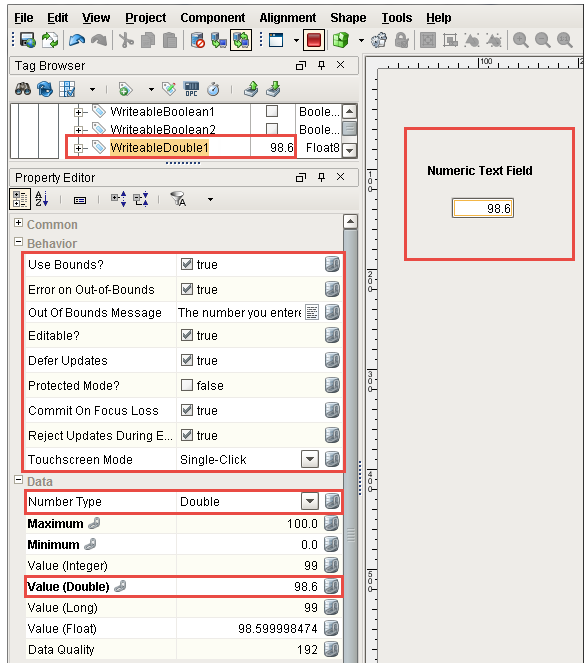
The most important property of the Numeric Text Field is the Number Type. The Number Type property dictates what type of numbers this component will display. You can select from the following value types: Integer, Double, Long, or Float. You can change the Number Type (i.e. from a Double to an Integer), but should not bind this property. Instead, bind the corresponding Value property. Be careful to select your Number Type properly, otherwise the wrong value might get written back to your bound Tag.
Here are descriptions of some of the Numeric Text Field properties:
- Number Type - this property dictates the numeric formatting that is displayed on the component's value. You'll notice that every time you enter a new value, you will see all the Value properties change: Value (Integer), Value (Double), Value (Long), and Value (Float). So it's important to be careful to select the appropriate Number Type to match the value property binding.
- Defer Updates - it's a good idea to have the Defer Updates property set to 'true' (don't update until enter is pressed), otherwise you're entering each number into the Tag and triggering different values that may have other consequences.
- Protected Mode - when set to 'true', the Numeric Text Field is disabled. The user must double click on the field or press enter in order to edit the field. When editing is complete, press enter again or leave the field, and the field will become disabled again.
- Reject Updates - when set to 'true', updates coming from property bindings are ignored while the the Numeric Text Field component has focus (is being edited).
- Use Bounds - when set to 'true', values that are outside the Minimum and Maximum properties will be blocked. Entering a bad value will instead set the value to the closest bound (i.e., entering a value above the maximum will instead set the maximum value).
- To see an Out-of-Bounds Message when an operator enters a value out of range, you need to set both the Use Bounds and Error on Out-of-Bounds properties to 'true'. When an operator enters a value that is out of bounds, the text in the Out of Bounds Message property will appear and the new value will not be entered. If the Error on Out-of-Bounds property is false, this message will be ignored.
- Touch Screen Mode - When Touch Screen Mode is enabled, a numeric keyboard will be displayed when a user touches the Numeric Text Field component.
Numeric Text Field Example
Drag a Numeric Text Field component onto your window, and drop a Tag on to the component. In the Property Editor, you'll notice that it binds multiple properties (in bold). (In the image below, you can see that we selected the WriteableDouble1 Tag from our simulator and it is bound to the Value (Double) property bidirectionally).
In the Property Editor, check the component's properties to see if you want to enable, disable, or change any default values or styles for any of the component's properties.
- Set the Number Type property to Double (but don't bind it).
- Keep the default values set for Maximum and Minimum at 100 and 0, respectively.
- To send an Out of Bounds Message, set the User Bounds and Error on Out-of-Bounds properties to 'true'. You can use the default Out-Of-Bounds message, or create one of your own.
Test it out!
Make sure your Gateway Communication Mode is set to read/write. You can enter a value for the Numeric Text Field in three ways:
- In Preview Mode of the Designer, enter a value (i.e., 98.6) in the component, and you'll see the value change in the Tag Browser next to your bound Tag.
- In the Property Editor, enter a value directly in the Value (Double) field making sure it corresponds to your Number Type setting. (i.e., If your Number Type is Double, then enter a value in the Value (Double) field). If you enter a valid value, the Tag will update. If you enter an out-of-bounds value, an Out-of-Bounds Message will popup, and the value will return to the last known good value.
- Once you save and publish your project, login to the Client, and enter a new value in the Numeric Text Field component. If the value is within bounds, the Tag will update along with the input component, otherwise, you will receive an Out-of-Bounds Message.
Spinner
The Spinner component is another Input component that allows users to modify a numeric value in the PLC. It not only allows users to edit a numeric value directly, but to "spin" the value up or down by some defined step size, using the up and down buttons that are part of the component.
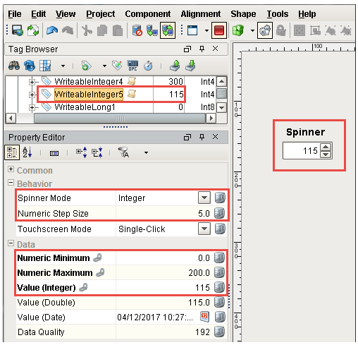
The most important property of the Spinner is the Spinner Mode. The Spinner Mode dictates what type of numbers this component will display: Integer, Double, or Date. When setting up property bindings, make sure to use the value property that corresponds to the Spinner Mode. For example, if you choose an Integer as your Spinner Mode, you need to bind a Tag to the Value (Integer) property. Another convenient property of the Spinner component is the Numeric Step Size property. This property dictates how much you step up or step down when using the buttons and the Integer or Double Spinner Mode.
The Spinner component has Numeric Minimum and Numeric Maximum properties that you can set forcing an operator to enter a value between the bounds. If an operator enters a value out of the of the minimum or maximum range, the value property in the Spinner component will not accept the value. The Spinner component does not have an error message property that alerts you when a value is out of bounds, so it's not always obvious when entering a value directly in the Spinner component that it is out of bounds. When typing in a value directly, a user would have to click away from the spinner to change focus, then they would see the value go back to the last known good value. If the up and down buttons were used to change the value and the new value is out of bounds, the spinner value will not change, thus alerting an operator that the value is out of bounds.
The Touch Screen Mode is an available property on the Spinner component. When enabled, this overrides the Client Touchscreen Mode to force a keyboard to be displayed when a user touches the Spinner. Setting this property to False does not block the keyboard when the Client is in Touchscreen Mode. Lastly, the Defer Updates property is not an available option on the Spinner component, it will always behave as if Defer Updates was True.
Spinner Example
Drag a Spinner component onto your window, and drag a Tag on to the component. In the Property Editor, you'll notice that it binds multiple properties (in bold), and binds the Value (Integer) property bidirectionally if you use an Integer Tag. (In this example, a WriteableInteger5 Tag was selected from our simulator and it bound the Value (Integer) property bidirectionally).
In the Property Editor, check the component's properties to see if you want to enable, disable, or change any default values or styles for any of the component's properties.
Let's make a few changes.
- In the Property Editor, set the Spinner Mode to Integer.
- Set the Numeric Step Size to 5 or whatever you want. (The default is 1).
- Next, change the Numeric Maximum property to *200, so any value over 200 is out of bounds and doesn't write to the property.
- Keep the Numeric Minimum value at the default of 0.
Test it out!
Make sure your Gateway Communication Mode is set to read/write. You can enter a value for the Spinner in three ways:
- In Preview Mode, enter a value (i.e.,115) directly in the component, or use the up or down buttons to change the value. Once you enter a new value, you'll see the value change in the Tag Browser next to your bound Tag.
- In the Property Editor, enter a new value directly in the Value (Integer) field making sure it corresponds to your Number Type setting. (i.e., If you Number Type is an Integer, then enter a value in the Value (Integer) field). If you enter a valid value, the Tag will update. If you enter an out-of-bounds value and press enter, the new value will not update. When you change focus from the component, the value will return to the last known good value.
- Once you save and publish your project, login to the Client, and enter a new value in the Spinner component. If the value is within bounds, the Tag will update along with the component. If not, change focus and the value will return to the last known good value.
Slider

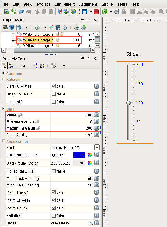
The Slider component allows a user to drag an indicator along a scale to choose a specific value within a given range and write back to the PLC. Unlike the Numeric Text Field and Spinner components that use various Tag types, the Slider component uses only an Integer type for its Value property. It is very easy to use and has quite a few appearance properties you can change. For example, you can choose to display your Slider horizontally or vertically, change the foreground and background colors, tick spacing, labels, and lots more. You can set the Minimum and Maximum Values for your Slider. If the Value property holds a value outside of the minimum and maximum values, an overlay appears on the component. The overlay will not be removed until a valid value is entered.
The Slider component has the Defer Updates property set to 'true' by default because as you drag the indicator around on the slider, you probably don't want to see the value constantly updating.
Slider Example
Drag a Slider component on to your window, and drop a Tag on to the Slider component. In the Property Editor, you'll notice that the Tag binds multiple properties (in bold), and binds the Value property bidirectionally. (In this example, a WriteableInteger4 Tag was selected from our simulator and it bound the Value property bidirectionally).
In the Property Editor, check the properties to see if you want to enable, disable, or change any default values or styles for any of the component's properties.
Let's make a few changes.
- The Slider is set to display horizontally by default. Set the Horizontal Slider property to false so it displays vertically.
- Set a range on the Slider. Click on the binding icon for the Maximum Value and set it to 200. Keep the Minimum Value set to the default value of 0.
- Change the Foreground Color to blue.
- Set the Major Tick Spacing to 50.
- Set the Minor Tick Spacing to 10.
Test it out!
Make sure your Gateway Communication Mode is set to read/write. You can change a value for the Slider in three ways:
- In Preview Mode, use the indicator and drag it along the scale to set a value (i.e., 100). Once you enter a new value, you'll see the value update in the Tag Browser next to your bound Tag.
- In the Property Editor, enter a new value directly in the Value field. The slider indicator will move to the specified value on the scale and the bound Tag will update. If you enter value that is out of range of the Minimum and Maximum values, a component overlay will appear on the component. When a valid value is entered, the overlay disappears.
- Once you save and publish your project, login to the Client, slide the indicator to any value on the slider, and the Tag will update.
Formatted Text Field
The Formatted Text Field is an excellent Input controls component that allows you to format data added to an input field. The Formatted Text Field is actually a specialized text field used for alphanumeric text input that matches a specific pattern or format in a specific way. It operates in two modes:
- Formatted Mask - user input is automatically formatted and restricted to a pattern. There are several commonly used formatted mask patterns to choose from such as phone number, percent, date, etc.
- Regular Expression - user input is validated against a special string that defines a set of allowed strings. There are several commonly used regular expression patterns like email address, IP address, HTTP URL, and more. Input that matches the regular expression is allowed, and input that doesn't match, is restricted. RegEx is very complicated, so don't worry if you don't understand each of the sample patterns.
The Formatted Text Field has an extensive list of properties. Here are descriptions of some of the commonly used Formatted Text Field properties:
- Validation Mode - required. Select Regular Expression of Formatted Mask Mode.
- Formatted Mask Pattern - if Validation Mode is set to Formatted Mask, fill in this property. You can choose from the list of of commonly used formatted masks.
- Reg Ex Pattern - if Validation Mode is set to Regular Expression, fill in this property. You can choose from the list of commonly used regular expressions.
- Commit While Typing - commits valid text while user is typing. The default is set to 'false'. It's recommended not to commit text while typing because it may have unintended consequences.
- Touch Screen Mode - when Touch Screen Mode is enabled, a keyboard will be displayed when a user touches this component expecting a value to be entered.
- Allows Invalid Text - when 'true', allows the user to type in a value but will not commit the value unless it matches the selected pattern.
- Committed Value - holds the current committed value.
Formatted Text Field Example
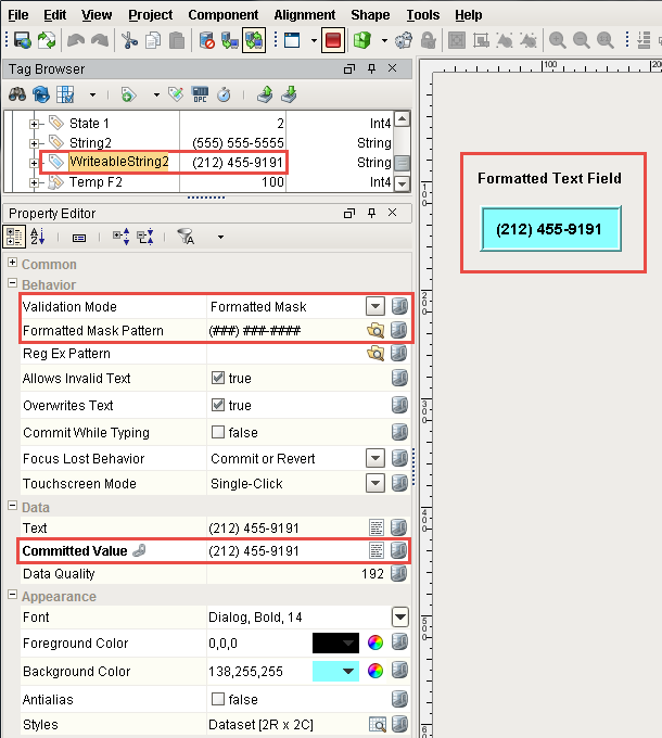
Drag a Formatted Text Field component on to your window, and drop a string Tag on to the Formatted Text Field component. (In this example, a WriteableIString2 Tag was selected from our simulator).
In the Property Editor, check the properties to see if you want to enable, disable, or change any default values or styles for any of the component's properties.
The following examples uses the Formatted Mask Mode.
- Set the Validation Mode property to Formatted Mask Mode.
- Click on the folder next to the Formatted Mask Pattern (
 ) and select any pattern from the list (i.e., Phone Number). You'll notice how the Formatted Mask Pattern property and component display the format selected.
 - Next to the Committed Value property, click the binding icon and select a Tag binding type, select a string Tag, mark it Bidirectional, and click OK.
Test it out!
Make sure your Gateway Communication Mode is set to read/write. You can test out the component in two ways:
- In Preview Mode, enter a phone number (or whatever format you setup), hit return, and you'll see the phone number in the Tag Browser next to your string Tag. The Committed Value property is also updated with the phone number.
- Once you save and publish your project, login to the Client, enter a phone number in the component and press Enter.
Button Components
Button components are very versatile components that also work great in a controls environment. They can do things like change the state of a machine, and be configured to accept user input. Here are a few examples of buttons used as control components and how they can be used in a controls environment.
2-State Toggle Button
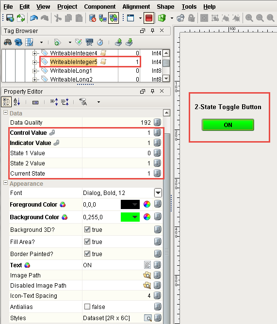
The 2-State Toggle button is an excellent button to use to toggle a value between two states on a machine like On/Off, Stop/Run, etc. It is easy to setup and uses four integer values: Control Value, Indicator Value, and the values that define the two different states, State 1 and State 2. Each time the 2-State Toggle button is pressed, one of the State Values is written to the Control Value. The Indicator Value property determines which state the machine is currently in.
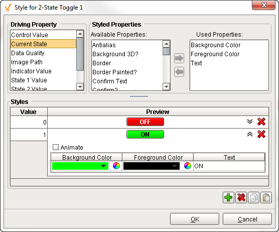
The 2-State Toggle button also has a Style Customizer that allows you to define the visual styles for the two states such as background and foreground colors, image path, font, border, and lots more. This helps an operator quickly identify at a glance which state a machine is currently in.
2-State Toggle Button Example
Drag a 2-State Toggle button on to your window, and drop a Integer Tag on to the component. In the Property Editor, you'll notice that the Tag binds to multiple properties (in bold), including the Control Value and Indicator Value properties. (In this example, a WriteableInteger5 Tag was selected from our simulator and bound it to the Control Value property bidirectionally).
In the Property Editor, check the component's properties to see if you want to enable, disable, or change any default values or styles for any of the properties.
-
Set the State 1 and State 2 properties, but you can use the default values of 0 and 1, respectively. (This example uses the default values for these properties).
-
Double click on the component to open the Style Customizer. Here you change the visual styles of the button by changing the color, font, border, make them blink, etc. The Style Customizer already has some default styles set, so if you don't like them, change them, otherwise, you are good to go!
Test it out!
Make sure your Gateway Communication Mode is set to read/write. You can enter a value in three ways:
- In Preview Mode, press the the 2-State Toggle button, and you'll see the value change in the Tag Browser next to your Integer Tag. Each time you toggle the button, it will change your Integer Tag to either 0 or 1, and the button will change from OFF to ON and vice versa.
- In the Property Editor, enter a value of 1 directly in the Control Value property. The 2-State Toggle button will change to ON. The Indicator Value will also change to 1 showing the current state of the machine. (If you used the default colors in the Style Customer, the button will change from red to green).
- Once you save and publish your project, login to the Client, and toggle the button to see the button change from ON to OFF and vice versa.
Multi-State Button

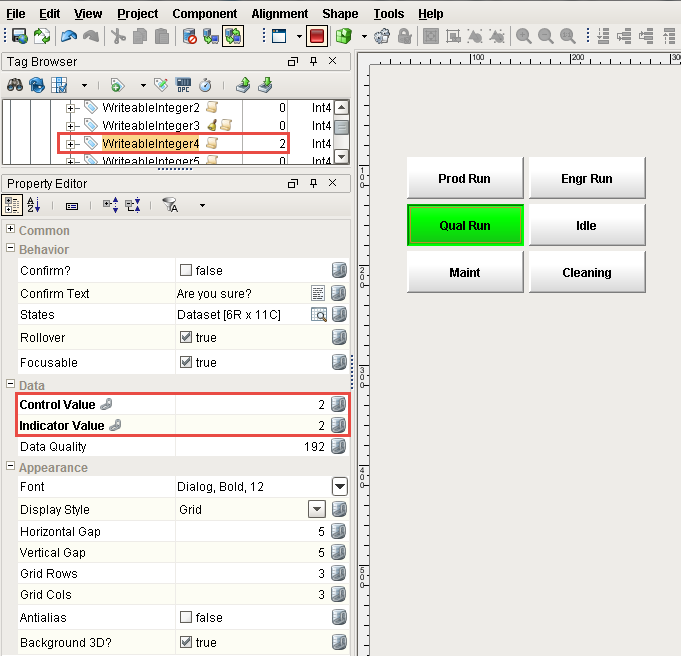
The Multi-State Button is a commonly used component in a controls environment. It's easy to configure, and has it's own Style Customizer that lets you define a set of visual styles that change based on the current state. It's similar to the 2-State Toggle Button, but you can have more than two states. The Multi-State Button is a series of two or more buttons, arranged in a column, row, or grid. Each button represents an integer-valued state. Each state defines two styles for a button: the selected style, and the unselected style. Each button is automatically displayed with the correct visual style based on the current state (Indicator Value). When a button is pressed, its state's value is written to the Control Value.
Multi-State Button Example
Drag a Multi-State Button on to your window, and drop a Integer Tag on to the component. In the Property Editor, you'll notice that the Tag binds to the Control Value and Indicator Value properties (in bold). (In this example, a WriteableInteger5 Tag was selected from our simulator and bound it to the Control Value property bidirectionally).
In the Property Editor, check the component's properties to see if you want to enable, disable, or change any default values or styles for any of the properties.
Let's make a few changes.
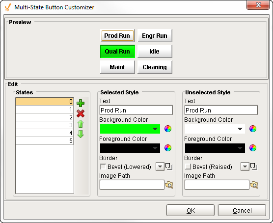
- Open the Multi-State Button Customizer by right-clicking on the component and selecting Customizers -> Multi-State Button Customizer.
- Add three additional states by clicking on the green plus icon.
- Enter a name for the selected and unselected text that will be displayed on the button.
- You can have a different visual style when the button is selected and unselected. Edit the visual styles for each button when it is selected and unselected. This is optional, but does help an operator quickly identify the current state of the equipment.
- Click the OK button to close the customizer when you are finished with your changes.
- In the Property Editor, you can change the Display Style property from a column to rows, or a grid. Our example uses a Grid.
You have a couple of choices on how to add and remove states, and change the visual styles of each state. You can use the Multi-State Customizer or the States property by opening the Dateset Viewer.
- Multi-State Button Customer - As above, Double click on the component, add additional states by clicking the green plus icon (
 ). The state will automatically assign the next number. We recommend you organize your states in numerical order to make it easier to configure and update in the future. You can enter the name for the selected and unselected text that will be displayed on the button. You can even edit the foreground, background, border, and add an image to selected and unselected styles for each button. The Multi-State Button Customizer has a Preview area that shows the text and the styles as you configure them. An example of the Multi-State Button Customizer is shown below.
 - States property - In the Property Editor, click on the the Dataset Viewer icon (
 ) next to the States property. Here you can view all states, add, remove, and edit states. When adding a state, by default, the value assigned is 0. We recommend you organize your states in numerical order to make it easier to configure and update in the future. Enter the name for the selected and unselected text that will be displayed on the button. You can edit the foreground, background, border, and even add an image to the selected and unselected styles for each button. Once you close the Dataset Viewer, the styles for your buttons will update. The Dataset Viewer for the States property is shown below.
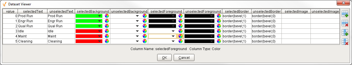
You'll notice when you first add your Multi-State button and open either the Customizer or the Dataset Viewer, the states are in random order. It's a good idea to first put your states in numerical order, then match each state value with the corresponding button, and finally enter the text and style for the selected and unselected styles for your buttons.
Make sure your Gateway Communication Mode is set to read/write. You can enter values in three ways:
-
In Preview Mode, press one of the buttons and you'll see the value change in the Tag Browser next to your bound Tag. You'll notice the Control Value and Indicator Values will also change corresponding to the state value. In the Property Editor, enter one of your state values in the Control Value field (i.e., 2), and the Tag will update. You'll notice that the Indicator Value will also update with the current state (i.e., 2). The button will change text and color depending on how it was configured. One you save and publish your project, login to the Client, and press any button. You will see the button changes state from selected to unselected as you press different buttons.
One-Shot Button
The One-Shot Button allows the operator to only press the button once to write a value to the PLC, and then it waits for the PLC to reset the value before becoming available again. This component is considered safer than the Momentary Button because it receives positive feedback from the PLC that the signal was received. The PLC must be programmed to reset the Value property after reading it, otherwise, the button will remain in a "Writing..." state until it is manually reset.
One-Shot Example
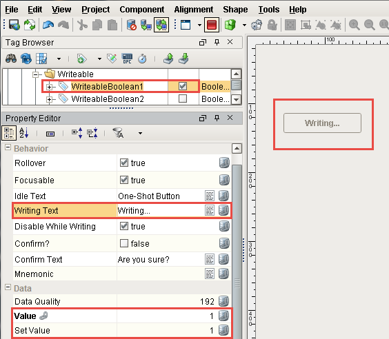
Drag a One-Shot Button on to your window, and drop a Boolean Tag on to the component. In the Property Editor, you'll notice that the Tag binds to multiple properties (in bold), and the Value property is bound bidirectionally. When the On-Shot Button is pressed, it writes a value in its Set Value property to the Value property. By default, the Set Value is 1 and the Value is 0, which is the ready state. The button disables itself when it is writing, and displays the text "Writing..." When the button is "Writing" you'll see that both the Set Value and Value properties are both equal to 1.
In the Property Editor, check the component's properties to see if you want to enable, disable, or change any default values or styles for any of the properties.
How the One-Shot Button Works
- By default, the Set Value property is 1 and the Value property is 0. When the One-Shot Button is pressed, it writes the value in the Set Value property (i.e., 1) to the Value Property. Now both values are equal.
- When both values are equal, the One-Shot Button will disable itself, and the following text will be displayed on the button, "Writing..."
- Uncheck the Boolean Tag to reset to it, so you can execute the task again using the One-Shot button.
Test it out!
This example uses a WriteableBoolean1 Tag so you will need to uncheck the Tag to can clear the "Writing..." state so you can execute the task again. As mentioned earlier, the PLC can be programmed to reset itself after the value is read.
Make sure your Gateway Communication Mode is set to read/write. You can change the value in three ways:
-
In Preview Mode, press the One-Shot button, and you'll see your Tag change to 'true' in the Tag Browser. You'll also see the button change to "Writing...".
-
In the Property Editor, enter a value of 1 directly into the Value property. The button will display "Writing....". Set your Tag to 'false' which resets the Value property back to the ready state.
-
Once you save and publish your project, login to the Client, and press the One-Shot Button. The button will display "Writing...". It will not change back until the PLC resets the Value property to the ready state, or you manually set the your Tag to 'false.'
Momentary Button
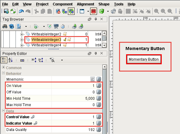
The Momentary Button is a controls component that sets the value in the PLC for specified number of seconds, or however long the button remains held down, whichever is longer. It uses several properties such as the Control Value and Indicator Value properties, in addition to the On Value and Off Value properties that define two different states. The On Value and Off Value properties are set to 0 and 1, respectively.
The Momentary Button uses a Min Hold Time property that resets the value after a minimum number of seconds which you can specify. The default Min Hold Time is 1 second and the Max Hold Time is 0, but you can set both properties to whatever you want. When the Momentary Button is pressed, it writes the On Value to the Control Value and Indicator Value properties. (The Indicator Value is used to determine which state the machine is currently in). When released, it will either write the Off Value to the Control Value immediately, or wait until the Min Hold Time has elapsed.
Note that the Momentary Button does not force the value or continually write a value during the on time. It only writes the on value once, then writes the off value some time later.
If you are using the Momentary Button to start a motor or move a piece of equipment, make sure to account for network latency.
Momentary Button Example
Drag a Momentary Button on to your window, and drop a Tag on to the component. In the Property Editor, you'll notice that the Tag binds to the Control Value and the Indicator Value properties (in bold). The Control Value is bound bidirectionally to the Tag. (In this example, a WriteableBoolean1 Tag was selected from our simulator and it bound the Control Value property bidirectionally).
In the Property Editor, check the component's properties to see if you want to enable, disable, or change any default values or styles for any of the properties.
Let's make a few changes.
- Use the default settings for the On Value and Off Value properties of 1 and 0, respectively.
- Set the Min Hold Time for 5 seconds and use the default Max Hold Time of 0.
Test it out!
Make sure your Gateway Communication Mode is set to read/write. You can change the value in two ways:
-
In Preview Mode - press and release the Momentary Button. The button will become highlighted, and you'll see the value change in the Tag Browser next to your Tag. In the Property Editor, you will see the Control Value and Indicator Values properties get set to the On Value (i.e.,1) for the specified Min Hold Time (i.e, 5 seconds). After 5 seconds, its writes the Off Value to the the Control Value (i.e., 0).
-
Once you saved and published your project, login to your Client, press your Momentary Button. The button will become highlighted and remain highlighted for the Min Hold Time (i.e., 5 seconds). You can also hold down the button instead of releasing the button immediately. However long the button remains held down, it sets the value in the PLC. If it is less than 5 seconds, it will wait the until the Min Hold Time is elapsed.
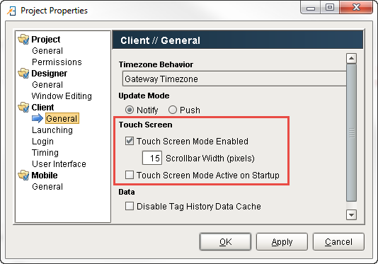
Touch Screen Mode
Ignition has a built-in Touch Screen Mode that allows access to Input components on computers that don't have a keyboard or mouse. This means that whenever Touch Screen Mode is turned on, a keyboard will be displayed when a user touches an Input component that expects a value to be entered such as a Text Field, Numeric Text Field, Spinner, etc... You can find the Touch Screen Mode under the Property Editor for most Input components. It has three settings so you can select from to open the Touch Screen keyboard: single-click, double-click, or disable it all together. Depending on the data type of a component, one of three keyboards will automatically be opened: alpha-numeric, numeric, or password.
To enable Touch Screen Mode, go to the menubar and select Project Properties > Client > General, and select Touch Screen Mode Enabled.