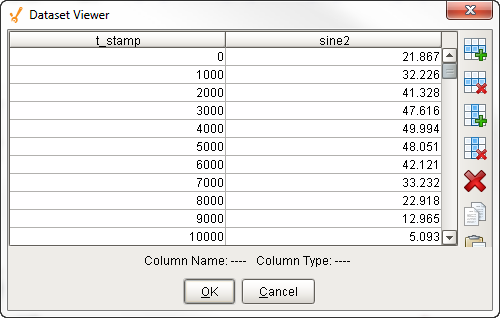
Chart Customizer
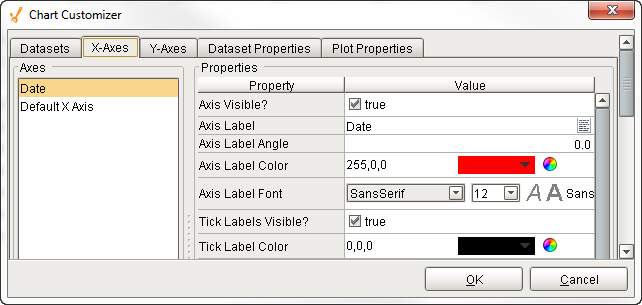
Description
The Chart component, also known as the Classic Chart, can be used to make almost any kind of chart. It provides a flexible way to display XY charts using a host of built-in properties. All you need to do to create a chart is add datasets, fill them in with data, configure a property binding, and setup the chart properties using the customizer.
Customizer
The Chart component has its own special customizer called the Chart Customizer. When you open the customizer, you'll notice five tabs at the top: Dataset, X-Axes, Y-Axes, Dataset Properties, and Plot Properties. Each tab has its own set of properties and defaults.
To get started, first add your dataset(s) and any additional XY axes using the appropriate tabs in the customizer. You can configure additional properties for each dataset, like what axes the data maps to, as well as select from a host of visual styles.
There are six types of axes to choose from when configuring a chart, each having its own list of properties: Number Axis, Date Axis, Category Axis, Logarithmic Axis, Elapsed Axis, and Symbols Axis. Most of the X and Y axes properties are used in the customizer, and some properties are specific to the axis type and have their own unique properties
The customizer already has some default styles in place to help you get started, but you can modify these default settings to your own style using the XY properties, Axes Type, Renderer and Plot styles. If you don't like one style, try another.
Shown below is each tab in the Chart Customizer with all its properties, description, and what axes type it supports. Note: Not all properties are available for all axes type charts.
Datasets Tab
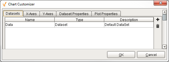
The Dataset tab is where you set up, add, and remove datasets.
| Property | Description |
|---|---|
| Data | Default dataset property. |
 Add Add | Adds a new dataset. Click the plus icon a new row will be added. Enter the dataset Name and Description. |
 Delete Delete | Deletes an existing dataset. Click the Delete icon to delete an existing dataset. |
| Name | Name of the dataset. Double click in the field to rename the dataset. |
| Type | Default type is "Dataset." |
| Description | Describes the dataset. |
X-Axes Tab
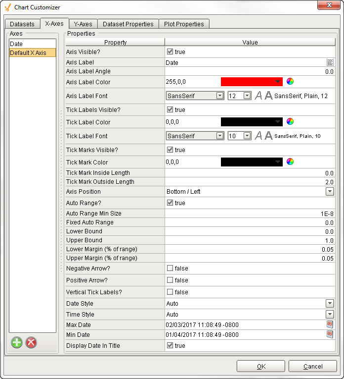
The X-Axes tab is where X-Axis properties are configured. You can also add and delete X axes here.
| Property | Description | Support Axes Types |
|---|---|---|
 | Add X axis. When you add an X axis, you can select from one of the following axis types: Number, Date, Category, Logarithmic, Elapsed, and Symbol. Click the green plus icon, select an Axis Type, enter an Axis Name, and click OK. 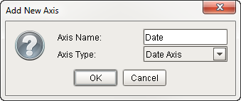 | All |
 | Delete an existing axis. Select the axis, and click the Delete icon. | All |
| Axis Visible | If false, the axis will be hidden. | All |
| Axis Label | Name of the axis. | All |
| Axis Label Angle | Angle of the value on the axis label. | All |
| Axis Label Color | Color of axis label. | All |
| Axis Label Font | Font type and size of text on axis label. | All |
| Tick Labels Visible | If false, the tick labels will be hidden. | All |
| Tick Label Color | Color of tick labels. | All |
| Tick Label Font | Font type and size of text on tick labels. | All |
| Tick Marks Visible | If false, the tick marks will be hidden. | All |
| Tick Mark Color | Color of tick marks. | All |
| Tick Mark Inside Length | Length of tick marks inside the chart. | All |
| Tick Mark Outside Length | Length of tick marks outside the chart. | All |
| Axis Position | Depends on the axis selected. X-axis label alternates between top and bottom. Y-axis label alternates between left and right. You many need to change both X and Y axis properties to get your intended axis position. | All |
| Auto Range | If true, the value axis range will be determined automatically. If false, the specified Lower and Upper bounds will be used. | All |
| Auto Range Min Size | If true, the minimum value range is used. | Date, Number, Logarithmic, Symbol, Elapsed |
| Fixed Auto Range | Sets an axis up for dynamic graphs. | Date, Number, Logarithmic, Symbol, Elapsed |
| Lower Bound | Lower bound value. Used only when Auto Range is false. | Date, Number, Logarithmic, Symbol, Elapsed |
| Upper Bound | Upper bound value. Used only when Auto Range is false. | Date, Number, Logarithmic, Symbol, Elapsed |
| Lower Margin (% of range) | Lower margin represented as a percentage. Used only when Auto Range is true. | Date, Number, Logarithmic, Symbol, Elapsed |
| Upper Margin (% of range) | Upper margin represented as a percentage. Used only when the Auto Range is true. | Date, Number, Logarithmic, Symbol, Elapsed |
| Negative Arrow | If true, negative arrow is visible. | Date, Number, Logarithmic, Symbol, Elapsed |
| Positive Arrow | If true, positive arrow is visible. | Date, Number, Logarithmic, Symbol, Elapsed |
| Vertical Tick Labels | Vertical orientation for tick labels. | Date, Number, Logarithmic, Symbol, Elapsed |
| Auto Range Includes Zero | If true, the range includes a zero. | Date, Number, Logarithmic, Symbol, Elapsed |
| Auto Range Sticky Zero | If true, the zero is on both the XY axes. | Date, Number, Logarithmic, Symbol, Elapsed |
| Number Format Override | Overwrites the current number format. | Date, Number, Logarithmic, Symbol |
| Date Style | The style of the date displayed on the axis. | Date |
| Time Style | The style of the time displayed on the axis. | Date |
| Max Date | Max value in a series of dates. | Date |
| Min Date | Min value in a series of dates. | Date |
| Display Date in Title | If true, the date will be displayed in the title when the range is zoomed into the hour range. | Date |
| Label Angle | The angle for the value axis labels. | Category |
| "1e#"-style tick labels | If true, uses scientific notation format (i.e.,1e5, 1e6, etc.,). | Logarithmic |
| "10^n"-style tick labels | If true, uses power notation format (i.e., 10 to the "X" power). | Logarithmic |
| Symbols String | Sequence of characters such as a literal constant. (i.e., On,Off,Auto) | Symbols |
| Grid Bands Visible | If true, grid bands will be hidden. | Symbols |
| Grid Bands Color | Color of grid bands. | Symbols |
| Grid Bands Alternate Color | Backup color of grid bands. | Symbols |
| Format String | Specified sequence of characters. | Elapsed |
Y-Axes Tab
The Y-Axes tab is where Y-Axis properties are configured. You can also add and delete Y axes here.
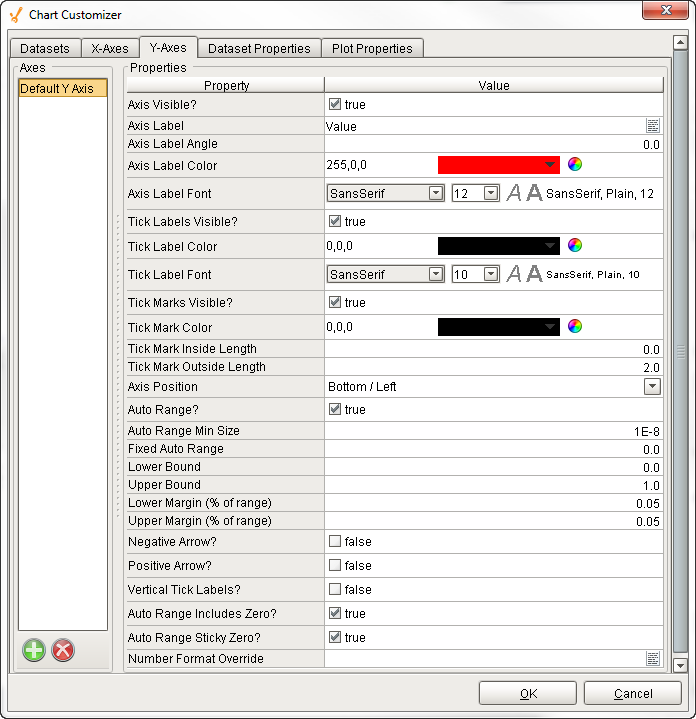
| Property | Description | Support Axes Types |
|---|---|---|
| Add axis. When you add a Y axis, you can select from one of the following axis types: Number, Date, Category, Logarithmic, Elapsed, and Symbol. Click the green plus icon, select an Axis Type, enter an Axis Name, and click OK. 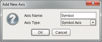 | All |
| Delete an existing axis. Select an axis, and click the Delete icon. | All |
| Axis Visible | If false, the axis will be hidden. | All |
| Axis Label | Name of the axis. | All |
| Axis Label Angle | Angle of the value on the axis label. | All |
| Axis Label Color | Color of axis label. | All |
| Axis Label Font | Font type and size of text on axis label. | All |
| Tick Labels Visible | If false, the tick labels will be hidden. | All |
| Tick Label Color | Color of tick labels. | All |
| Tick Label Font | Font type and size of text on tick labels. | All |
| Tick Marks Visible | If false, the tick marks will be hidden. | All |
| Tick Mark Color | Color of tick marks. | All |
| Tick Mark Inside Length | Length of tick marks inside the chart. | All |
| Tick Mark Outside Length | Length of tick marks outside the chart. | All |
| Axis Position | Depends on the axis selected. X-axis label alternates between top and bottom. Y-axis label alternates between left and right. You many need to change both X and Y axis properties to get your intended axis position. | All |
| Auto Range | If true, the value axis range will be determined automatically. If false, the specified Lower and Upper bounds will be used. | All |
| Auto Range Min Size | If true, the minimum value range is used. | Date, Number, Logarithmic, Symbol, Elapsed |
| Fixed Auto Range | Sets an axis up for dynamic graphs. | Date, Number, Logarithmic, Symbol, Elapsed |
| Lower Bound | Lower bound value. Used only when Auto Range is false. | Date, Number, Logarithmic, Symbol, Elapsed |
| Upper Bound | Upper bound value. Used only when Auto Range is false. | Date, Number, Logarithmic, Symbol, Elapsed |
| Lower Margin (% of range) | Lower margin represented as a percentage. Used only when Auto Range is true. | Date, Number, Logarithmic, Symbol, Elapsed |
| Upper Margin (% of range) | Upper margin represented as a percentage. Used only when the Auto Range is true. | Date, Number, Logarithmic, Symbol, Elapsed |
| Negative Arrow | If true, negative arrow is visible. | Date, Number, Logarithmic, Symbol, Elapsed |
| Positive Arrow | If true, positive arrow is visible. | Date, Number, Logarithmic, Symbol, Elapsed |
| Vertical Tick Labels | Vertical orientation for tick labels. | Date, Number, Logarithmic, Symbol, Elapsed |
| Auto Range Includes Zero | If true, the range includes a zero. | Date, Number, Logarithmic, Symbol, Elapsed |
| Auto Range Sticky Zero | If true, the zero is on both the XY axes. | Date, Number, Logarithmic, Symbol, Elapsed |
| Number Format Override | Overwrites the current number format. | Date, Number, Logarithmic, Symbol |
| Date Style | The style of the date displayed on the axis. | Date |
| Time Style | The style of the time displayed on the axis. | Date |
| Max Date | Max value in a series of dates. | Date |
| Min Date | Min value in a series of dates. | Date |
| Display Date in Title | If true, the date will be displayed in the title when the range is zoomed into the hour range. | Date |
| Label Angle | The angle for the value axis labels. | Category |
| "1e#"-style tick labels | If true, uses scientific notation format (i.e.,1e5, 1e6, etc.,). | Logarithmic |
| "10^n"-style tick labels | If true, uses power notation format (i.e., 10 to the "X" power). | Logarithmic |
| Symbols String | Sequence of characters such as a literal constant. (i.e., On,Off,Auto) | Symbols |
| Grid Bands Visible | If true, grid bands will be hidden. | Symbols |
| Grid Bands Color | Color of grid bands. | Symbols |
| Grid Bands Alternate Color | Backup color of grid bands. | Symbols |
| Format String | Specified sequence of characters. | Elapsed |
Dataset Properties Tab
The Dataset tab is where you can modify the visual styles of your chart. You can configure your chart with subplots, experiment with different renderer types and property types to change how the data is displayed until you find what best meets your requirements.
Not all Renderer properties are available for each axis type.
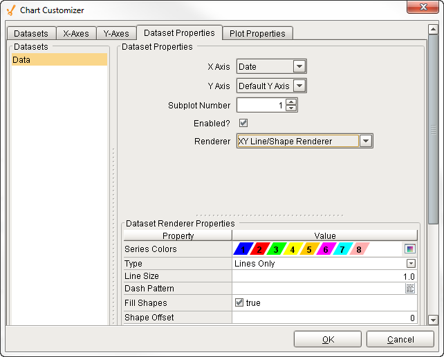
| Property | Description | Support Axes Types |
|---|---|---|
| Dataset | Collection of data in tabular form. Data from the dataset drives the chart. | All |
| X Axis | Horizontal axis. | All |
| Y Axis | Vertical axis. | All |
| Subplot Number | Number of plot areas on one chart. | All |
| Enabled | If true, the chart is displayed with the selected renderer properties. | All |
| Renderer | The visual style of the data presented on the chart. Select from various renderer styles:
| All |
| Series Colors | An ordered list of the colors to draw series in. | All |
| Type | Type of XY Item Renderer. | All |
| Line Size | The thickness of the line. | All |
| Dash Pattern | The pattern used for dashed lines. | All |
| Fill Shapes | If false, there is only an outline of the shape, no fill color. | All |
| Shape Offset | The offset into the standard shape list to start this renderer at. Offset values and respective values are listed below.
| Offset |
| Margin | The percentage by which the bars are trimmed using the XY Bar Renderer. | All |
| Shadows | If true, draws shadows under the bars using the XY Bar Renderer. | All |
| Outline | If true, draws an outline around the area using the XY Area Renderer. | All |
| Draw Lines | If true, lines will be drawn to connect the datapoints using the Category Line/Shape Renderer. | All |
| Draw Shapes | If true, shapes will be drawn to connect each datapoint if using the Category Line/Shape Renderer. | All |
| Date Style | The style of the date displayed on the axis. | Date |
| Time Style | The style of the time displayed on the axis. | Date |
| Max Date | Max value in a series of dates. | Date |
| Min Date | Min value in a series of dates. | Date |
| Display Date in Title | If true, the date will be displayed in the title when the range is zoomed into the hour range. | Date |
| Label Angle | The angle for the value axis labels. | Category |
| "1e#"-style tick labels | If true, uses scientific notation format (i.e.,1e5, 1e6, etc.,). | Logarithmic |
| "10^n"-style tick labels | If true, uses power notation format (i.e., 10 to the "X" power). | Logarithmic |
| Symbols String | Sequence of characters such as a literal constant. (i.e., On,Off,Auto) | Symbols |
| Grid Bands Visible | If true, grid bands will be hidden. | Symbols |
| Grid Bands Color | Color of grid bands. | Symbols |
| Grid Bands Alternate Color | Backup color of grid bands. | Symbols |
| Format String | Specified sequence of characters. | Elapsed |
Plot Properties Tab
The Plot Properties tab allows you to break up the chart plot area into multiple distinct subplots.
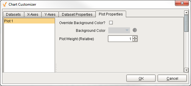
| Property | Description | Axes Types Supports |
|---|---|---|
| Plot | The chart area displaying data. | All |
| Override Background Color | If enabled, allows you to change the background color. | All |
| Background Color | Background color of the chart. | All |
| Plot Weight (Relative) | The chart ratio between subplots. | All |
References
Axis Type Examples
The Chart Customizer has six different axis types to choose from when configuring a chart, each with its own list of properties.
Some customizer properties are specific to the axis type and have their own unique properties. Examples of all axis types are shown below along with the property settings used to create each chart.
Number Axis Chart
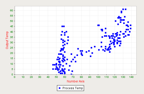
Binding Type
- Tag - Tag History
Chart Customizer Property Settings
Datasets Tab
| Property Name | Value |
|---|---|
| Datasets | Data |
| X-Axes Tab |
| Property Name | Value |
|---|---|
| Axes | Number |
| X Axis Label | Number Axis |
| Axis Label Color | Red |
| Tick Label Color | Green |
| Y-Axes Tab |
| Property Name | Value |
|---|---|
| Axes | Default Y Axis |
| Y Axis Label | Output Temp |
| Axis Label Color | Red |
| Tick Label Color | Green |
| Dataset Properties Tab |
| Property Name | Value |
|---|---|
| X Axis | Number |
| Y Axis | Default Y Axis |
| Renderer | XY Line/Shape Renderer |
| Type | Shapes Only |
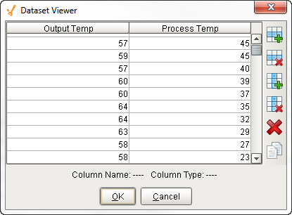
Dataset Property Dataset
Date Axis Chart
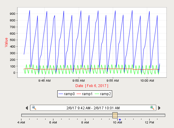
Chart Customizer Property Settings
Datasets Tab
| Property Name | Value |
|---|---|
| Datasets | Data |
| X-Axes Tab |
| Property Name | Value |
|---|---|
| Axes | Date |
| Axis Label | Date |
| Axis Label Color | Red |
Y-Axes Tab
| Property Name | Value |
|---|---|
| Axes | Default Y Axis |
| Axis Label | Value |
| Axis Label Color | Red |
Dataset Properties Tab
| Property Name | Value |
|---|---|
| Datasets | Data |
| X Axis | Date |
| Y Axis | Default Y Axis |
| Renderer | XY Line/Shape Renderer |
| Type | Lines Only |
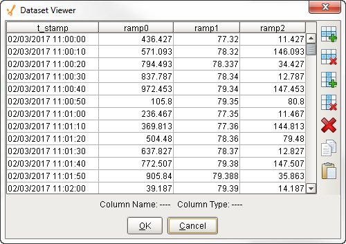
Dataset Property Dataset
Category Axis Chart
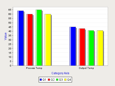
Behavior
| Property | Value |
|---|---|
| Chart Type | Category |
Chart Customizer Property Settings
Datasets Tab
| Property Name | Value |
|---|---|
| Datasets | Data |
| X-Axes Tab |
| Property Name | Value |
|---|---|
| Axes | Category |
| Axis Label | Category Axis |
| Axis Label Color | Blue |
Y-Axes Tab
| Property Name | Value |
|---|---|
| Axes | Default Y Axis |
| Axis Label | Value |
| Axis Label Color | Blue |
Dataset Properties Tab
| Property Name | Value |
|---|---|
| Datasets | Data |
| X Axis | Category |
| Y Axis | Default Y Axis |
| Renderer | Category Bar Renderer |
| Type | Bar |
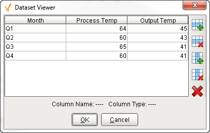
Dataset Property Dataset
Logarithmic Axis Chart
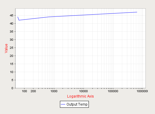
Chart Customizer Property Settings
Datasets Tab
| Property Name | Value |
|---|---|
| Datasets | Data |
| X-Axes Tab |
| Property Name | Value |
|---|---|
| Axes | Logarithmic |
| Axis Label | Logarithmic Axis |
| Axis Label Color | Red |
Y-Axes Tab
| Property Name | Value |
|---|---|
| Axes | Default Y Axis |
| Axis Label | Value |
| Axis Label Color | Red |
Dataset Properties Tab
| Property Name | Value |
|---|---|
| Datasets | Data |
| X Axis | Logarithmic |
| Y Axis | Default Y Axis |
| Renderer | XY Line/Shape Renderer |
| Type | Lines Only |
Dataset Property Dataset
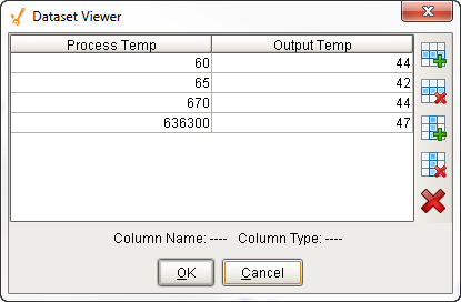
Symbols Axis Chart
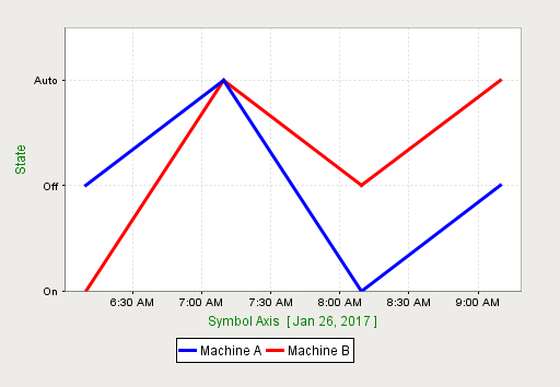
Chart Customizer Property Settings
Datasets Tab
| Property Name | Value |
|---|---|
| Datasets | Data |
| X-Axes Tab |
| Property Name | Value |
|---|---|
| Axes | Default Axis |
| Axis Label | Symbol Axis |
| Axis Label Color | Green |
Y-Axes Tab
| Property Name | Value |
|---|---|
| Axes | Symbol |
| Axis Label | State |
| Axis Label Color | Green |
| Symbols String | On,Off,Auto |
| Dataset Properties Tab |
| Property Name | Value |
|---|---|
| Datasets | Data |
| X Axis | Default X Axis |
| Y Axis | Symbol |
| Renderer | XY Line/Shape Renderer |
| Type | Lines Only |
| Line Size | 3 |
Dataset Property Dataset
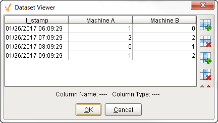
Elapsed Time Axis Chart
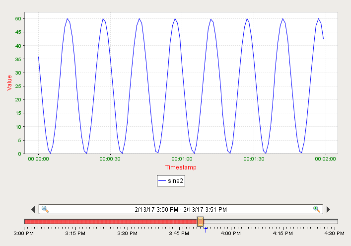
Binding Type
- Database
- SQL Query
Chart Customizer Property Settings
Datasets Tab
| Property Name | Value |
|---|---|
| Dataset | Data |
| X-Axes Tab |
| Property Name | Value |
|---|---|
| Axes | Elapsed Time |
| Axis Label | Timestamp |
| Axis Label Color | Red |
| Tick Label Color | Green |
| Upper Bound | 60,000 |
| Tick Size (ms) | 30,000 |
| Y-Axes Tab |
| Property Name | Value |
|---|---|
| Axes | Default Y Axis |
| Axis Label | Value |
| Axis Label Color | Red |
| Tick Label Color | Green |
| Dataset Properties Tab |
| Property Name | Value |
|---|---|
| Datasets | Data |
| X Axis | Elapsed |
| Y Axis | Default Y Axis |
| Renderer | XY Line/Shape Renderer |
| Type | Lines Only |
Dataset Property Dataset