Label
Component Palette Icon
The Label is one of the most versatile components. It can display text, images, or both. Its text can be HTML formatted (like most components). It can even be made to respond to user interaction through its events.
Labels are one of the most common components that you will want to add dynamic properties to. For instance, you can put an integer dynamic property "state" on a label, and then bind the text to be "On" when the state=1 and "Off" otherwise, using an expression binding. Bind the background color to be red when the state is 0, and green when the state is 1 using a property binding. Now you have a re-usable binary state indicator. While you could have used the Multi-State Indicator to achieve the same effect, the exercise is good practice for creating custom components. You can see how the flexibility of bindings and dynamic properties make the Label extremely versatile.
Properties
| Name | Description | Property Type | Scripting | Category |
|---|---|---|---|---|
| Antialias | Draw with antialias on? Makes text smoother. | boolean | .antialias | Appearance |
| Background Color | The background color of the label, if opaque is set to "true". | Color | .background | Appearance |
| Border | The border surrounding this component. NOTE that the border is unaffected by rotation. | Border | .border | Common |
| Cursor | The mouse cursor to use when hovering over this component. | int | .cursorCode | Common |
| Data Quality | The data quality code for any tag bindings on this component. | int | .dataQuality | Data |
| Disabled Image Path | The relative path of the image to be displayed when this component is not enabled. | String | .disabledPath | Appearance |
| Enabled | If disabled, a component cannot be used. | boolean | .componentEnabled | Common |
| Fill Background | If true, the label's background color will be drawn. If false, it will have a transparent background. | boolean | .fillBackground | Appearance |
| Font | Font of text on this component. | Font | .font | Appearance |
| Foreground Color | The color of the Label's text. | Color | .foreground | Appearance |
| Horizontal Alignment | Determines the alignment of the label's contents along the X axis. | int | .horizontalAlignment | Layout |
| Horizontal Text Position | Determines the horizontal position of the label's text, relative to its image. | int | .horizontalTextPosition | Layout |
| Icon-Text Spacing | The space (in pixels) between the icon (if any) and the text (if any). | int | .iconTextGap | Appearance |
| Image Path | The relative path of the image. | String | .path | Appearance |
| Mouseover Text | The text that is displayed in the tooltip which pops up on mouseover of this component. | String | .toolTipText | Common |
| Name | The name of this component. | String | .name | Common |
| Rotation | The angle of rotation in degrees. | int | .rotation | Appearance |
| Styles | Contains the component's styles. | Dataset | .styles | Appearance |
| Text | Text of this Label. | String | .text | Data |
| Vertical Alignment | Determines the alignment of the label's contents along the Y axis. | int | .verticalAlignment | Layout |
| Vertical Text Position | Determines the vertical position of the label's text, relative to its image. | int | .verticalTextPosition | Layout |
| Visible | If disabled, the component will be hidden. | boolean | .visible | Common |
Scripting
Scripting Functions
This component does not have scripting functions associated with it.
Extension Functions
This component does not have extension functions associated with it.
Event Handlers
Event handlers allow you to run a script based off specific triggers. See the full list of available event handlers on the Component Events page
Customizers
Example
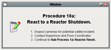
Stylized Label Inside a Popup Window
Properties
- Image Path:
Builtin/icons/48/edit.png - Text: Shown below:
<html><p><strong><center><h2>Procedure 10a: <br>
React to a Reactor Shutdown.</h2></center></strong></p>
<ol>
<li>Inspect cameras for potential safety incident.</li>
<li>Contact Supervisor and Floor Coordinator.</li>
<li>Continue to <strong>Sub Process 1a: Reactor Reset.
</strong></li>
</ol></html>