Compass
Component Palette Icon
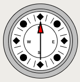
The compass is a component that displays up to three needles at once on a cardinal direction compass. This can be useful for plotting anything that has a cardinal direction, such as the wind direction.
Each needle can be one of 9 different styles. Use the "Disabled" style to turn off any needle.
Properties
| Name | Description | Property Type | Scripting | Category |
|---|---|---|---|---|
| Border | The border surrounding this component. NOTE that the border is unaffected by rotation. | Border | .border | Common |
| Center Color | The center color of the compass. | Color | .centerColor | Appearance |
| Cursor | The mouse cursor to use when hovering over this component. | int | .cursorCode | Common |
| Data Quality | The data quality code for any tag bindings on this component. | int | .dataQuality | Data |
| Label Font | The font to use for the compass's labels. | Font | .labelFont | Appearance |
| Mouseover Text | The text that is displayed in the tooltip which pops up on mouseover of this component. | String | .toolTipText | Common |
| Name | The name of this component. | String | .name | Common |
| Rose Color | The background color of the rose. | Color | .roseColor | Appearance |
| Rose Highlight | The highlight color of the rose. | Color | .roseHighlightColor | Appearance |
| Styles | Contains the component's styles. | Dataset | .styles | Appearance |
| Value 1 | Value 1 for the compass. | double | .value1 | Data |
| Value 1 Color | The main color for Value 1's needle. | Color | .value1Color | Appearance |
| Value 1 Needle | The needle type for this value. | int | .value1Needle | Data |
| Value 1 Outline | The outline color for value 1s needle. | Color | .value1OutlineColor | Appearance |
| Value 2 | Value 2 for the compass. | double | .value2 | Data |
| Value 2 Color | The main color for Value 2's needle. | Color | .value2Color | Appearance |
| Value 2 Needle | The needle type for this value. | int | .value2Needle | Data |
| Value 2 Outline | The outline color for value 2s needle. | Color | .value2OutlineColor | Appearance |
| Value 3 | Value 3 for the compass. | double | .value3 | Data |
| Value 3 Color | The main color for Value 3's needle. | Color | .value3Color | Appearance |
| Value 3 Needle | The needle type for this value. | int | .value3Needle | Data |
| Value 3 Outline | The outline color for value 3s needle. | Color | .value3OutlineColor | Appearance |
| Visible | If disabled, the component will be hidden. | boolean | .visible | Common |
Scripting
Scripting Functions
This component does not have scripting functions associated with it.
Extension Functions
This component does not have extension functions associated with it.
Event Handlers
Event handlers allow you to run a script based off specific triggers. See the full list of available event handlers on the Component Events page
Customizers
Examples
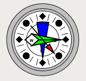
| Property Name | Value |
|---|---|
| Value 1 | 140 |
| Value 1 Needle | Arrow |
| Value 2 | 90 |
| Value 2 Needle | Long |
| Value 3 | 180 |
| Value 3 Needle | Plum |