Table Column Configurations
This page contains examples that involve making changes to a table component's columns property.
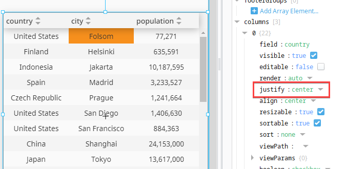
Aligning Text in a Column
The table component can apply different text alignment for each column. In this example we will demonstrate the concept with the default dataset on the component.
-
Create a new table component, or select an existing one.
-
Add an element for each column you wish to display on the tag to the props.columns property by either clicking the Add Array Element button or the + icon right of the columns property. Repeat this process until you see all columns on the table again.
-
Map each props.column element to a column in the underlaying data (props.data). For each props.columns[#].field property, set the field property to the name of a column/series in our props.data property in the desired column order:
- props.columns.[0].field to country
- props.columns.[1].field to city
- props.columns.[2].field to population
-
Change the alignment on each column by changing the props.columns.[#].justify property. In our case, we set the justify property on all columns elements to center to center the text.
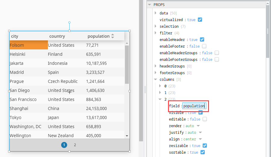
Changing Applied Formatting
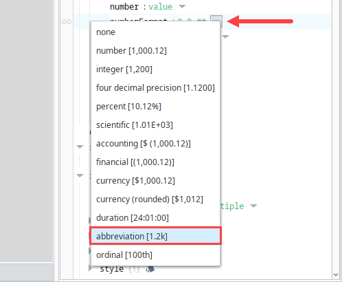
In a Perspective Table, you can adjust your column format to display data as desired. In this example, instead of using the default number [1,000.12] format to display population counts, we will select abbreviation [1.2k] using the numberFormat dropdown.
-
Drag a Perspective Table component onto your view. We'll use the default population information.
-
Add three array elements to the columns property of your table.
-
Set the field property value for props.columns.[2] to population to associate the column data in the table to the column configuration.
-
Select the numberFormat dropdown to view all format options.
-
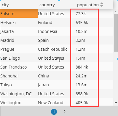
Select abbreviation [1.2k] to adjust the displayed data in the table's population column.
Replacing a Value in a Cell with a Progress Bar
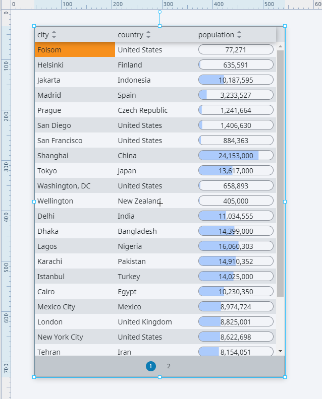
Column configurations can be customized to display a progress bar on the table to show a column's value. We will use the default population information initially configured in the Table component to demonstrate this option.
-
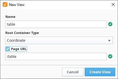
In the Project Browser, right click on Views to create a view. In this example, the view will be named table. Set it to have a Coordinate root container type.
-
Drag a Table component onto your table view.
-
Add three array elements to the columns property of your table.
-
Set the field property values inside each of the three columns array elements to match each of the column names in your table to associate a column in the table and the custom column configurations.
- props.columns.[0].field to country
- props.columns.[1].field to city
- props.columns.[2].field to population
-
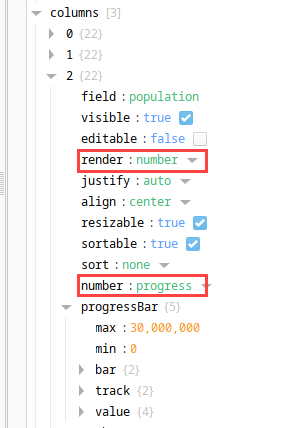
Access the props.columns.[2] and set the render property to number.
-
Then, set the number property to progress.
-
Set the progressBar.max value to 30,000,000 to account for cities with a large population.
Embedding a View in a Table Cell
In a Perspective Table, it is possible to embed a view inside a table cell. In this example, instead of using the table's built-in progress bar, we'll embed a view that contains a custom progress bar using the Progress component. The default information that comes on the factory configured table component will be used.
-
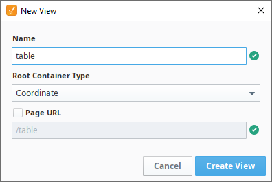
Create the table view first. In the Project Browser, right click on Views to create a view. In this example, name the view table. Set it to a Coordinate root container type.
-
Drag a Perspective Table onto the table view.
-
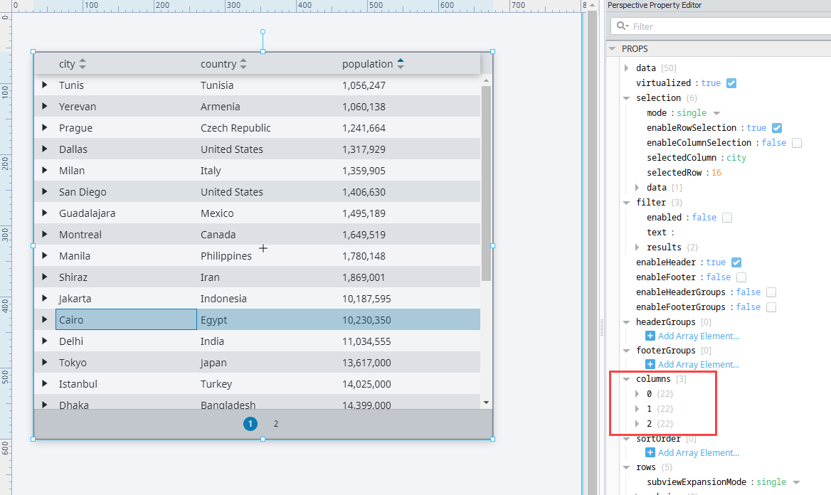
Add three array elements to the columns property of the table like as shown in Property Editor as shown in the image below.
-
There is a field property inside each of the three column array elements. Set the field values to match each of the column names in your table
- props.columns.[0].field to country
- props.columns.[1].field to city
- props.columns.[2].field to population
-
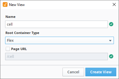
Now, create the cell view. Right click on Views to create a view. In this example, the view will be named cell. Set it to a Flex Root Container Type.
-
Drag and drop a Progress component onto the cell view.
-
Select the Progress Bar component and set the position.grow property to 1 so that the bar takes up as much space in the container as possible.
-
In the Project Browser, select the cell view, and resize the view so it is closer in size to the population column in the table on the table view.
-
Click Add View Parameter while your view is selected in the Project Browser.
-
Select Value from the listed type options.
-
Enter value in place of key.
-
Set the max property value to 30,000,000 on the Progress component to account for large values.
-
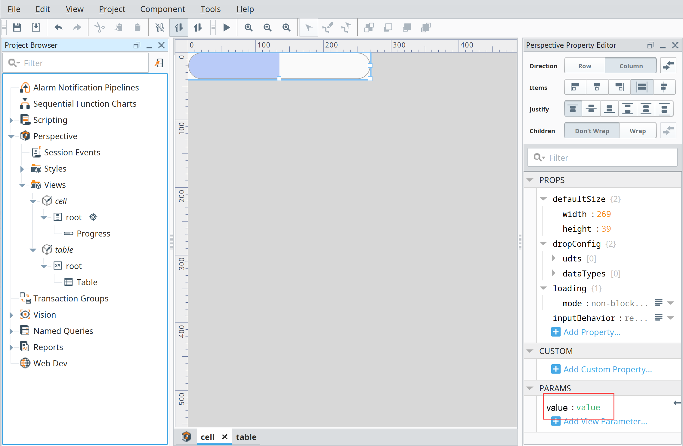
Bind the Progress's value property to the view parameter created in Step 10 as shown below.
-
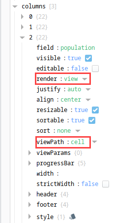
Go to the column array element with the field value of population and set the render value to view.
-
Set the viewPath to cell to embed cell view into the population cell values.
-
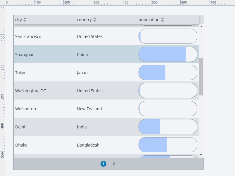
After the population column is pointed to the cell view, the population number from the table cell will be passed to the cell view. Since the cell view's Progress Bar has its value property bound to the cell view's input parameter, the population value will then be displayed on the table by the Progress Bar in the cell view. If you wanted to resize the progress bar, simply change the height and width properties under the defaultSize property on the cell view.
Once a column is configured to render each cell as a view, the table component will automatically pass each view a number of contextual view parameters. Components on the rendered view can access these property values by first configuring view params that match the passed keys.
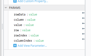
| Property Key | Description |
|---|---|
column | A string representing the column name of the column, as defined by props.columns.[columnNumber].field. |
columnIndex | A number representing the index of the current column. Similar to columnNumber in props.columns.[columnNumber]. |
row | A number representing the index of the row. Note that this property does not adjust for hidden rows, or rows that are otherwise not displayed. |
rowData | A JSON object representing table data for the current row. This is equivalent to accessing props.data[row] on the table. |
rowIndex | A number representing the displayed index of the row. This property differs from row in that rowIndex does not count rows that aren't displayed.For example, assuming a table is only showing 25 rows per page, then the first row on the second page of results would display a rowIndex of 0, while row would provide a value of 25. |
value | Represents the value of the cell being rendered as a view. |