Table Customizer
Description
The Table component is one of the most flexible and easy to configure components in Ignition. It has its own Table Customizer that allows you to make changes to tabular data and display it in a variety ways. The customizer not only lets you customize each column in the table, but together with its data properties and use of scripting and extension functions, it lets you configure how each cell in the table looks and behaves.
Customizers
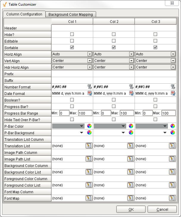
The Table Customizer allows you to configure how you want the table to look to users. When you open the Table Customizer, you'll notice two tabs: Column Configuration and Background Color Mapping. The Column Configuration tab contains a number of column configuration properties that can be used to customize each column in the dataset to look a certain way. You can assign a header name, hide a column, make the column editable and sortable, align the text within the column, add a prefix by putting a "$" in front of a value, or suffix by adding a "%" at the end of a value, select a number and date format, turn the column into a progress bar, translate a number into a string or image or even into a background or foreground color. It's even possible to change the background, foreground, and font for the text in each particular column or cell, and more.
In the Background Color Mapping tab, you can set the table's Background property to 'Mapped', and choose a column to govern the background color of each row. The column is specified in the Mapping Column dropdown selector. The column must be a numeric type. The number to color translation works with the contents of the mapping column rows to format the cells in accordance with the selected color.
If you want to test how the Table Customizer works in the Table, drag a Table on to your workspace, go to the Test Data property in the Property Editor, and check the 'false' checkbox. It will automatically fill the table with some test data so you get test out the Table Customizer
Table Customizer Properties
Column Configuration Tab
| Property | Description |
|---|---|
| Header | Provide a custom name to the column header. |
| Hide | Hides the column. |
| Editable | Allows the editing of the cell pertaining to the column. |
| Sortable | Allows the user to sort the table according to the selected column. |
| Horiz Align | Aligns the contents of the column. |
| Vert Align | Aligns the contents of the column. |
| Hdr Horiz Align | Aligns the contents of the column. |
| Prefix | A custom text that proceeds the contents of each cell. |
| Suffix | A custom text that follows the contents of each cell. |
| Number Format | A format of the cell if the contents of the cell are number types. |
| Boolean | Changes the contents of the cell to reflect a 'check box' look and feel. |
| Progress Bar | A graphical bar is represented in the cell instead of a number. |
| Progress Bar Range | Sets the min and max range of the progress bar. |
| Hide Text Over P-Bar | Makes the value and text that controls the progress bar visible or invisible. |
| P-Bar Color | The color of the progress bar. |
| P-Bar Background | The color of the cell that has a progress bar. |
| Translation List Column | This works in conjunction with the Translation List. The key is provided by a named column resulting in the cells being translated according to the list that contains the key pairs. |
| Translation List | Defines the key/Translation pairs and translates the contents of the cell accordingly. |
| Image Path Column | This works in conjunction with the Image Path List. The key is provided by a named column resulting in the cells being translated according to the list that contains the key pairs. |
| Image Path List | Defines the key/Translation pairs and translates the contents of the cell accordingly. |
| Background Color Column | This works in conjunction with the Background Color List. The key is provided by a named column resulting in the cells being translated according to the list that contains the key pairs. |
| Background Color List | Defines the key/Translation pairs and translates the contents of the cell accordingly. |
| Foreground Color Column | This works in conjunction with the Foreground Color List. The key is provided by a named column resulting in the cells being translated according to the list that contains the key pairs. |
| Foreground Color List | Defines the key/Translation pairs and translates the contents of the cell accordingly. |
| Font Map Column | This works in conjunction with the Foreground Color List. The key is provided by a named column resulting in the cells being translated according to the list that contains the key pairs. |
| Font Map | Defines the key/Translation pairs and translates the contents of the cell accordingly. An example of a font translation could look like this "Dialog, Bold, 12" |
Color Mapping Tab
| Property | Description |
|---|---|
| Mapping Column | Select a column to govern the background color of each row. |
| Number to Color Translation | A numeric value (typically an integer) that drives the background and foreground color of a row. For every number or value, you can choose a different color. |
| Fallback Color | Default color that can be set when a value does is not defined. |
Examples
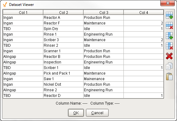
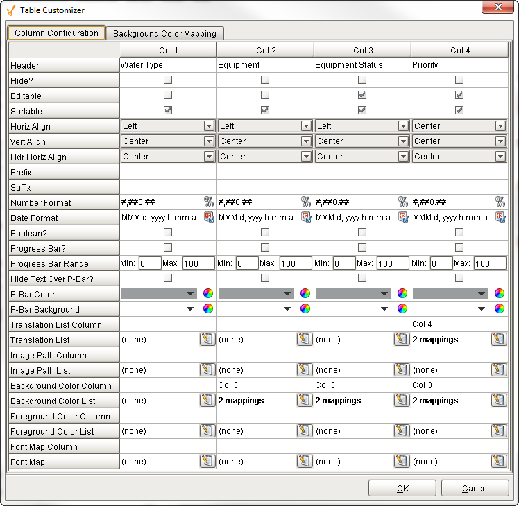
The table in this example uses several mappings:
- Col 4 changed a number into a string: translated a priority "1" to Critical, and priority "2" to High. It also change the background colors of the cells for both priorities.
- Col 3 changed the background colors for the equipment status's "Maintenance" and "Idle" to pale red.
- Col 2 change the background color of the equipment name to pale red for the equipment status's that were "Idle" and "Maintenance."
Table

Table Customizer
Data Property Dataset