Dropdown List Example
Dropdown lists are used when you want to select a single item from a list of options. The Dropdown component is under the Input section of the component palette. Simply drag it on to your window. The most important property of a Dropdown component is the Data property. It is a Dataset that contains one or more rows of data. Each of the rows are different options that you see on the component. Select the Dropdown component and click on the Dataset Viewer icon for the Data property to manually add some options.

There are 3 ways you can use the Data property’s dataset: a number/label pair, a single label column, and a code/label pair. Which mode is used depends on what columns are in the Data property’s dataset, and will determine the values of the Selected Value, Selected String Value and Selected Label properties. Any additional columns that are added to the dataset will not affect these properties.
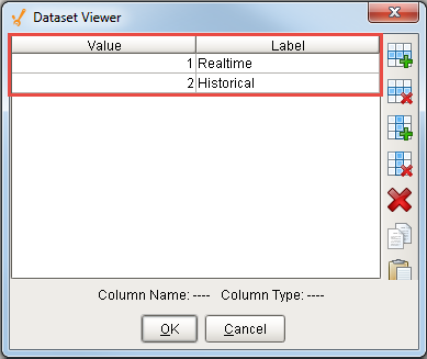
In the first mode, the first column is an integer (often an id) and the second column is a string (often a label). The first column is the Value column which is invisible to the user and is usually used in binding. The second column is the Label column and is visible to the user in the dropdown list.
In this example, the dataset has 2 rows. Under the Value column, you see the integers '1' and '2' respectively. Under the Label column, you see the 'Realtime' and 'Historical' options.
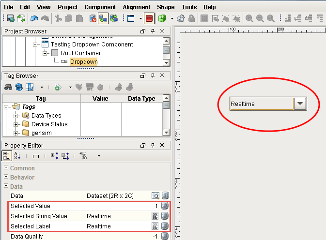
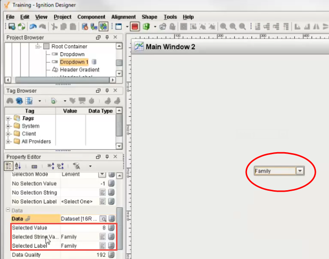
In Preview Mode, select from the list of dropdown options. Notice, you can only see the options in the Label column. Select the 'Realtime' option. You can see under the Data property section, the Selected Value is '1' which is the first (integer) column in the dataset and is not visible to users. The Selected String Value and the Selected Label are the same and show the 'Realtime' option which is the second (string) column in the dataset.
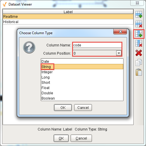
The second mode you can use is a string/string combination which are 2 columns that are both strings. Remove the Value column from our example by selecting a cell in that column and clicking on the vertical x icon. Add another column by clicking on the verical plus icon. Call the new column 'code,' set the column position to '0' and make it a 'String.' Both columns are now strings. Under the 'code' column enter 'v1' and 'v2.' Press OK.
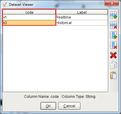
Because we added the 'code' column in position '0,' the users will see the same 2 options in the dropdown list: 'Realtime' and 'Historical.' If you see 'v1' and 'v2' instead, that means your 'code' column is not the first column.
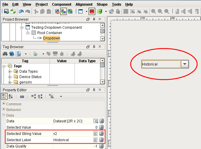
In Preview Mode, click on 'Historical' and you can see the Selected String Value is 'v2' because the value is in the first column and the Selected Label is 'Historical.'
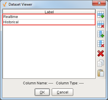
The third mode you can use is simply one string column. Remove the ‘code’ column and keep the ‘Label’ column the same. Again, you are going to see the same 2 options in the dataset viewer: ‘Realtime’ and ‘Historical.’ Note, that this only applies if there is exactly one column in this dataset.
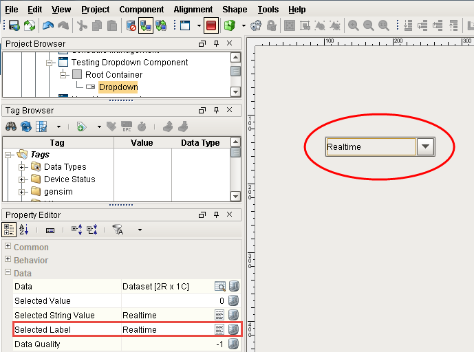
In Preview Mode, select the ‘Realtime’ option. You will see the same value in the Selected Label and Selected String Value properties since there is only the one column.
Now, you can set these dropdown options manually or bind the Data property. In this example, you can take a Dropdown List on the window and bind the Data property using a SQL query.
Click on the binding icon for the Data property. Select the SQL Query Binding Type and type a query that brings back an ID and Name from one of your tables in the database.
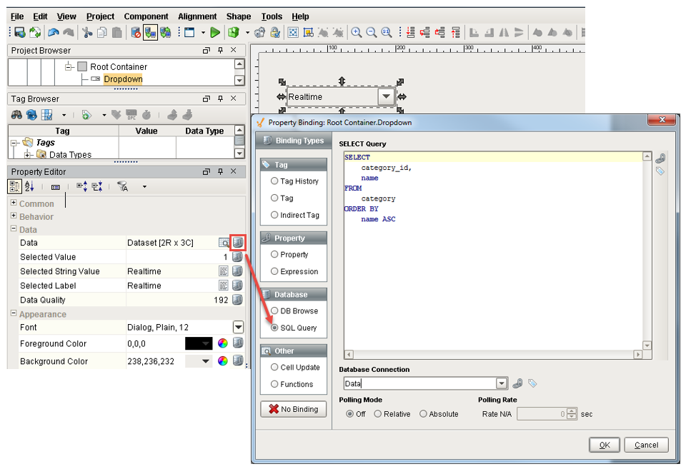
Click OK to see all the options that came back from the database. In Preview Mode, select any one of these options and you can see the Selected Value, Selected String Value, and Selected Label as shown in the following example.
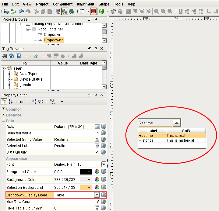
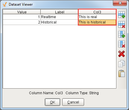
Another feature of the Dropdown component is you can show more than one column to a user. Drag another Dropdown component to your window. Go to the Dataset viewer and add some options manually. Instead of having only one or two columns you can add as many as you want. The first column needs to be either an integer or a string. Any additional columns will show up in the dropdown.
Open the Dataset View, under Value, enter ‘1’ and ‘2.’ Under Label, enter ‘Realtime’ and ‘Historical.’ Add another column and call it ‘Col3’ and make it a string and enter ‘This is real’ and ‘This is historical.’
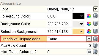
Press OK. Go to the Property Editor > Appearance and set the Dropdown Display Mode to ‘Table’ to see both columns.
Now you can see Label and Col3 and select between those different rows. It’s a nice way to show more information in the Dropdown list. The Selected Value, Selected String Value, and Selected Label properties will behave the same as previous examples ignoring any columns beyond the second.