Week View

Component Palette Icon:
Description
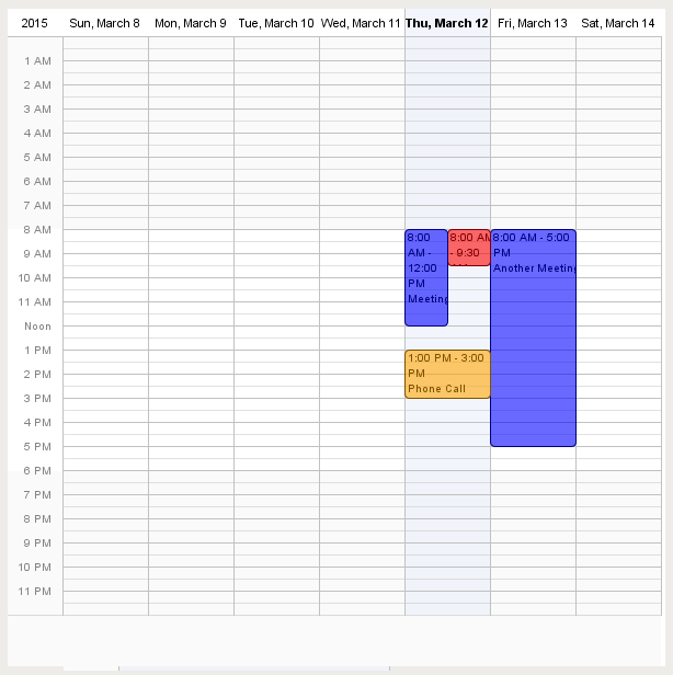
Displays a full week's worth of events on a calendar. Configuration is achieved by populating the Calendar Events dataset. See the Day View for details.
Properties
| Name | Description | Property Type | Scripting | Category |
|---|---|---|---|---|
| 24 Hour Format | Whether or not to show 24 hour or 12 hour format. | boolean | .twentyFourHour | Appearance |
| Border | The border surrounding this component. NOTE that the border is unaffected by rotation. | Border | .border | Common |
| Calendar Background Color | The color of the calendar's background. | Color | .calendarBackground | Appearance |
| Calendar events | Contains the calendar events. | Dataset | .events | Data |
| Cursor | The mouse cursor to use when hovering over this component. | int | .cursorCode | Common |
| Data Quality | The data quality code for any tag bindings on this component. | int | .dataQuality | Data |
| Day | Set the calendar's day. | int | .day | Data |
| Day Outline Color | The color of the day's outline. | Color | .boxOutline | Appearance |
| Event Font | The font for all calendar events. | Font | .eventFont | Appearance |
| Grid marks | Set the amount of grid lines. | int | .gridMarks | Appearance |
| Hour Font | The font for the hour of the day. | Font | .hourFont | Appearance |
| Hour Foreground Color | The foreground color for hours in a day. | Color | .hourForeground | Appearance |
| Hover Background Color | The background color of the hovered day and time. | Color | .hoverBackground | Appearance |
| Hovered Day | The calendar's hovered day. | String | .hoveredDay | Data |
| Hovered Event | The calendar's hovered event. | int | .hoveredEvent | Data |
| Hovered Time | The calendar's hovered time. | String | .hoveredTime | Data |
| Month | Set the calendar's month. | int | .month | Data |
| Mouseover Text | The text that is displayed in the tooltip which pops up on mouseover of this component. | String | .toolTipText | Common |
| Name | The name of this component. | String | .name | Common |
| Non-Working Hours Background Color | The background color for the non-working hours of the day. | Color | .nonWorkingHourBackground | Appearance |
| Selected Background Color | The color of the selected day's background. | Color | .selectedBackground | Appearance |
| Selected Day | The calendar's selected day. | String | .selectedDay | Data |
| Selected Event | The calendar's selected event. | int | .selectedEvent | Data |
| Show Event Time? | Whether or not to show the event time. | boolean | .showEventTime | Appearance |
| Show Weekend? | Whether or not to show Saturday and Sunday. | boolean | .showWeekend | Appearance |
| Styles | Contains the component's styles. | Dataset | .styles | Appearance |
| Today's Background Color | The color of the today's background. | Color | .todayBackground | Appearance |
| Visible | If disabled, the component will be hidden. | boolean | .visible | Common |
| Week Day Background Color | The color of the week day's background. | Color | .weekDaysBackground | Appearance |
| Week Day Font | The font of the week day's text. | Font | .weekdayFont | Appearance |
| Week Day Foreground Color | The color of the week day's text. | Color | .weekDaysForeground | Appearance |
| Working End Hour | The end hour of a working day. | int | .workingEndHour | Appearance |
| Working Start Hour | The start hour of a working day. | int | .workingStartHour | Appearance |
| Year | Set the calendar's year. | int | .year | Data |
| Zoom | Zooms into the specified zoom time-range. | boolean | .autoZoom | Appearance |
| Zoomed End Hour | The end hour zoomed in. | int | .autoZoomEndHour | Appearance |
| Zoomed Start Hour | The start hour zoomed in. | int | .autoZoomStartHour | Appearance |
Scripting
Scripting Functions
This component does not have scripting functions associated with it.
Extension Functions
This component does not have extension functions associated with it.
Event Handlers
Event handlers allow you to run a script based off specific triggers. See the full list of available event handlers on the Component Events page