Alarm Journal Table
Component Palette Icon
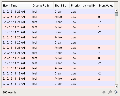
The alarm journal table provides a built-in view to explore alarm history that has been stored in an alarm journal. If you only have one alarm journal specified on your Gateway, then you do not need to specify the journal name. If you have more than one specified, then you need to provide the name of the journal you'd like to query.
The journal table shows the alarm history that is found between the Start Date and End Date properties. When you first put an alarm journal table on a window, these properties will be set to show the most recent few hours of journal history. Note that without further configuration, the journal table will always show the few hours before it was created. To properly configure an alarm journal table,please bind its start and end date properties to something what will update, such as the Date Range component or expressions involving the time now(). This way, you can configure it so that operators can choose the time to display, or have dates will be update automatically to have it poll.
To change the columns that are displayed, the order of the columns, and/or the column width, put the Designer into preview mode. Then right-click on the table header to show/hide columns. Click and drag to re-order columns, and drag the margins of the columns to resize their width. No further action is necessary - the column configuration will remain in place after the window is saved.
Additional examples of configuring the Alarm Journal Table can be found on the Alarm Journal Table Component page.
Properties
| Name | Description | Property Type | Scripting | Category |
|---|---|---|---|---|
| Acked Events | Show acked events. | boolean | .includeAckedEvents | Filters |
| Active Events | Show active events. | boolean | .includeActiveEvents | Filters |
| Antialias | Draw with antialias on? Makes text smoother. | boolean | .antialias | Appearance |
| Border | The border surrounding this component. NOTE that the border is unaffected by rotation. | Border | .border | Common |
| Cleared Events | Show cleared events. | boolean | .includeClearedEvents | Filters |
| Data Quality | The data quality code for any tag bindings on this component. | int | .dataQuality | Data |
| Date Format | A date format pattern used to format dates in the table. If blank, the default format for the locale is used. | String | .dateFormat | Appearance |
| Display Path Filter | Filter alarms by alarm display path, falling back to the source path if display path isn't set. Specify multiple paths by separating them with commas. Supports the wildcard "*". | String | .displayPathFilter | Filters |
| Enabled | If disabled, a component cannot be used. | boolean | .componentEnabled | Common |
| End Date | The ending date for the displayed history range. If left blank, will default to the current time when the component was loaded. | Date | .endDate | Behavior |
| Is Filtered | True if the results are filtered. (Read-only) | boolean | .isFiltered | Behavior |
| Journal Name | The name of the alarm journal to query. | String | .journalName | Behavior |
| Max Priority | The maximum priority to display. | int | .maximumPriority | Filters |
| Min Priority | The minimum priority to display. | int | .minimumPriority | Filters |
| Name | The name of this component. | String | .name | Common |
| Notes Area Border | The border surrounding the notes area. | Border | .notesAreaBorder | Appearance |
| Notes Area Font | The font for the notes area. | Font | .notesAreaFont | Appearance |
| Notes Area Location | The location of the notes display area. | int | .notesAreaLocation | Appearance |
| Notes Area Size | The size of the notes area, in pixels. | int | .notesAreaSize | Appearance |
| Number Format | A number format string to control the format of the value column. | String | .numberFormat | Appearance |
| Read Timeout | The timeout, in milliseconds, for running the alarm history query. | int | .readTimeout | Behavior |
| Row Height | The height, in pixels, for each row of the table. | int | .rowHeight | Appearance |
| Row Styles | A dataset containing the different styles configured for different alarm states. | Dataset | .rowStyles | Appearance |
| Search String | Filter alarms by searching for a string in both source path and display path. | String | .searchString | Filters |
| Selected Alarms | A dataset containing each selected alarm. (Read-only) | Dataset | .selectedAlarms | Data |
| Selection Color | The color of the selection border. | Color | .selectionColor | Appearance |
| Selection Thickness | The size of the selection border. | int | .selectionThickness | Appearance |
| Show Table Header | Toggles visibility of the table's header. | boolean | .showTableHeader | Appearance |
| Source Filter | Filter alarms by alarm source path. Specify multiple paths by separating them with commas. Supports the wildcard "*". | String | .sourceFilter | Filters |
| Start Date | The starting date for the displayed history range. If left blank, will default to 8 hours prior to when the component was loaded. | Date | .startDate | Behavior |
| System Events | Show system events such as startup and shutdown. | boolean | .includeSystemEvents | Filters |
| Table Background | The background of the alarm table. | Color | .tableBackground | Appearance |
| Touchscreen Mode | Controls when this input component responds if touchscreen mode is enabled. | int | .touchscreenMode | Behavior |
| Visible | If disabled, the component will be hidden. | boolean | .visible | Common |
Scripting
Scripting Functions
.print(fitWidth, headerFormat, footerFormat, showDialog, landscape)
-
Description
- This specialized print function will paginate the table onto multiple pages. This function accepts keyword-style invocation.
-
Keyword Args
- boolean fitWidth - If true, the table's width will be stretched to fit across one page's width. Rows will still paginate normally. If false, thetable will paginate columns onto extra pages. (default = true) [optional]
- string headerFormat - A string to use as the table's page header. The substring "0" will be replaced with the current page number. (default = None) [optional]
- string footerFormat - A string to use as the table's page footer. The substring "0" will be replaced with the current page number. (default = "Page 0") [optional]
- boolean showDialog - Whether or not the print dialog should be shown to the user. Default is true. [optional]
- boolean landscape - Used to specify portrait (0) or landscape (1) mode. Default is portrait (0). [optional]
-
Return
- Boolean- True if the print job was successful.
-
Scope
- Client
- Description
- Returns a dataset of the alarms currently displayed in the Alarm Status Table component. The columns will be: EventId, Source, DisplayPath, EventTime, State, and Priority.
- Keyword Args
- None
- Return
- Dataset - A dataset of alarms.
- Scope
- Client
Extension Functions
createPopupMenu
- Description
- Returns a popup menu that will be displayed when the user triggers a popup menu (right click) in the table. Use system.gui.createPopupMenu() to create the popup menu.
- Parameters
- Component self- A reference to the component that is invoking this function.
- List selectedAlarmEvents - The alarm events selected on the Alarm Status Table. For an individual alarm Event, call alarmEvent.get('propertyName') to inspect. Common properties: 'name', 'source', 'priority'.
- Return
- JPopupMenu - A popup menu that was created with system.gui.createPopupMenu()
- Scope
- Client
filterAlarm
- Description
- Called for each event loaded into the alarm status table. Return false to hide this event from the table. This code is executed in a background thread.
- Parameters
- Component self- A reference to the component that is invoking this function.
- Alarm Event alarmEvent - The alarm event itself. Call alarmEvent.get('propertyName') to inspect. Common properties: 'name', 'source','priority'.
- Return
- Boolean- Returns true or false for every alarm event in the table. True will show the alarm. False will not show the alarm.
- Scope
- Client
onDoubleClicked
- Description
- Called when an alarm is double-clicked on to provide custom functionality.
- Parameters
- Component self- A reference to the component that is invoking this function.
- Alarm Event alarmEvent - The alarm event that was double clicked. For an individual alarmEvent, call alarmEvent.get('propertyName') to inspect. Common properties: 'name', 'source', 'priority'.
- Return
- Nothing
- Scope
- Client
Event Handlers
Event handlers allow you to run a script based off specific triggers. See the full list of available event handlers on the Component Events page