Paintable Canvas

Component Palette Icon:
Description
The Paintable Canvas component is a component that can be custom "painted" using Jython scripting. By responding to the component's repaint event, a designer can use Java2D to draw anything within the component's bounds. Whenever any dynamic properties on the component change, the component is re-painted automatically, making it possible to create dynamic, vector-drawn components that can represent anything.
This component is an advanced component for those who are very comfortable using scripting. It is not user-friendly. The upside is that it is extraordinarily powerful, as your imagination is the only limit with what this component can be.
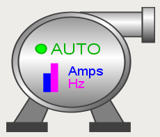
When you first drop a Paintable Canvas onto a window, you'll notice that it looks like a placeholder. If you switch the Designer into preview mode, you'll see an icon of a pump displayed. The pump is an example that comes pre-loaded into the Paintable Canvas. By editing the component's event scripts, you can dissect how the pump was drawn. You will notice that the script uses Java2D. You can read more about Java2D here. You will notice that as you resize the pump, it scales beautifully in preview mode. Java2D is a vector drawing library, enabling you to create components that scale very gracefully.
- Don't forget that you can add dynamic properties to this component, and use the styles feature. Use the values of dynamic properties in your repaint code to create a dynamic component. The component will repaint automatically when these values change.
- You can create an interactive component by responding to mouse and keyboard events
- You can store your custom components on a custom palette and use them like standard components.
Properties
| Name | Description | Property Type | Scripting | Category |
|---|---|---|---|---|
| Background Color | The background color of the component. | Color | .background | Appearance |
| Border | The border surrounding this component. NOTE that the border is unaffected by rotation. | Border | .border | Common |
| Cursor | The mouse cursor to use when hovering over this component. | int | .cursorCode | Common |
| Data Quality | The data quality code for any tag bindings on this component. | int | .dataQuality | Data |
| Focusable | If the component is focusable, it will receive keyboard input and can detect if it is the focus owner. | boolean | .focusable | Behavior |
| Font | Font of text on this component. | Font | .font | Appearance |
| Foreground Color | The foreground color of the component. | Color | .foreground | Appearance |
| Mouseover Text | The text that is displayed in the tooltip which pops up on mouseover of this component. | String | .toolTipText | Common |
| Name | The name of this component. | String | .name | Common |
| Styles | Contains the component's styles. | Dataset | .styles | Appearance |
| Visible | If disabled, the component will be hidden. | boolean | .visible | Common |
Scripting
Scripting Functions
This component does not have scripting functions associated with it.
Extension Functions
This component does not have extension functions associated with it.
Event Handlers
Event handlers allow you to run a script based off specific triggers. See the full list of available event handlers on the Component Events page
Customizers
Example
There are no examples associated with this component. However examples are available in the component itself.
The component comes prescripted to render the following pump: