Schedule Management

Component Palette Icon:
Description
This component allows for management of schedules. Schedules can be defined by specifying which days of the week and which times of day they are active on. The times of day are defined using a string of time ranges, where the times are specified in 24-hr format with dashes between the beginning and the end. Multiple ranges can be specified by separating them with commas. Examples:
| 8:00-17:00 | Valid from 8am to 5pm |
| 6:00-12:00, 12:45-14:00 | Valid from 6am to noon, and then again from 12:45pm to 2pm |
| 0:00-24:00 | Always valid. |
Schedules that alternate weekly or daily can be specified by using the repetition settings. All repeating schedules need a starting day. For example, you could have a schedule that repeats on a weekly basis, with 1-week on and 1-week off. This schedule would be active for seven days starting on the starting day, and then inactive for the next seven days, then active for seven days, and so on. Note that the days of the week and time settings are evaluated in addition to the repetition settings. This means that both settings must be true for the schedule to be active. Also note that if you set "Repeat / Alternate" to a setting other than "Off" and you do not specify a starting day, the schedule will never be active.
Properties
| Name | Description | Property Type | Scripting | Category |
|---|---|---|---|---|
| Antialias | Draw with antialias on? Makes text smoother. | boolean | .antialias | Appearance |
| Border | The border surrounding this component. Note that the border is unaffected by rotation. | Border | .border | Common |
| Data Quality | The data quality code for any tag bindings on this component. | int | .dataQuality | Data |
| Enabled | If disabled, a component cannot be used. | boolean | .componentEnabled | Common |
| Name | The name of this component. | String | .name | Common |
| Schedule Available Color | New in 7.9.5 Changes the color of the available times in the schedule. | Color | .schedulePreviewAvailableColor | Appearance |
| Schedule Available Text Color | New in 7.9.5 Changes the text color of events on the schedule preview. | Color | .eventForeground | Appearance |
| Styles | Contains the component's styles. | Dataset | .styles | Appearance |
| Table Color | New in 7.9.5 Changes the background color of the tables, User Roles and Role Member lists. Note: When a row is selected it will revert to highlighted. | Color | .tableBackground | Appearance |
| Table Header Color | New in 7.9.5 Changes the background color of the table headers. | Color | .tableHeaderBackground | Appearance |
| Table Header Text Color | New in 7.9.5 Changes the text color of the table headers. | Color | .tableHeaderTextColor | Appearance |
| Table Text Color | New in 7.9.5 Changes the text color of the tables. Note: When a row is selected, it will revert to black. | Color | .tableForeground | Appearance |
| Touchscreen Mode | Controls when this input component responds if touchscreen mode is enabled. | int | .touchscreenMode | Behavior |
| Visible | If disabled, the component will be hidden. | boolean | .visible | Common |
| Window Color | New in 7.9.5 Changes the window background color. | Color | .windowBackground | Appearance |
| Window Header Color | New in 7.9.5 Changes the window header background color. | Color | .windowHeaderBackground | Appearance |
| Window Header Save Button Background Color | New in 7.9.5 Changes the window header save button background color. | Color | .windowHeaderSaveButtonBackground | Appearance |
| Window Header Save Button Text Color | Changes the window header save button text color. | Color | .windowHeaderSaveButtonForeground | Appearance |
| Window Header Text Color | New in 7.9.5 Changes the window header text color. | Color | .windowHeaderForeground | Appearance |
| Window Text Color | New in 7.9.5 Changes the text color of the window. | Color | .windowForeground | Appearance |
Scripting
See the Schedule Management Scripting Functions page for the full list of scripting functions available for this component.
Event Handlers
Event handlers allow you to run a script based off specific triggers. See the full list of available event handlers on the Component Events page.
Customizers
Example
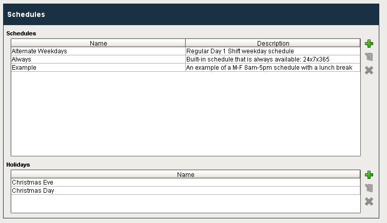
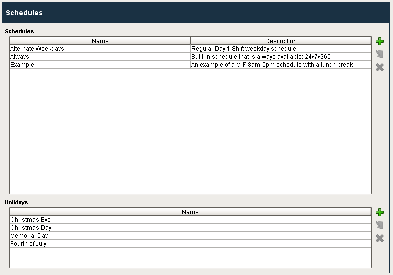
Here is an example of the schedule management component and its property table.
| Property Name | Value |
|---|---|
| Data Quality | -1 |
| Enabled | True |
| Name | Schedules |
| Touchscreen Mode | Single-Click |
| Visible | True |
