Perspective - Form
💡Have feedback for this page? Let us know on the IA Forum.
Component Palette Icon:
Description
The Form component is a versatile container for creating dynamic and responsive forms in Perspective. It simplifies collecting and validating user input, making it easy to create professional and interactive forms.
Key features include:
- Responsive Design: Automatically adapts layouts for different screen sizes.
- Validation Support: Provides built-in and custom validation rules.
- Flexible Layouts: Configure rows, columns, and widgets to meet your needs.
- Dynamic Visibility: Conditionally display or enable form elements based on user input.
Properties
These properties define the behavior and structure of the Form at the top level. They live directly under props on the component and control things like the form name, whether interaction is allowed, how many columns the form contains, and how validation information is tracked. Most properties support binding options. For more information, see Types of Bindings in Perspective.
| Name | Description | Property Type |
|---|---|---|
| name | The name of the form. This name will be used by handlers to identify forms and sort form submissions. | String |
| disabled | Disables all inputs and actions in the form. Default is false. | Boolean |
| readOnly | Sets all inputs to read-only. Inputs remain focused but cannot be edited. Default is false. | Boolean |
| columns | Array of column configuration objects defining the form structure. See the Columns Properties section below for more detail on configuration options. | Array |
| actions | Configuration object for Submit and Cancel buttons, including text, style, and behavior settings. See the Actions Properties section below for more detail on configuration options. | Object |
| context | Provides additional context for the form, including metadata and configurations. | Object |
| data | Stores user input values using unique widget IDs. | Object |
| validation | Read-only object containing live validation results, including references to any widgets that are currently invalid. | Object |
| style | Sets a style for this component. Full menu of style options is available for text, background, margin and padding, border, shape and miscellaneous. You can also specify a style class. | Object |
Columns Properties
The columns object controls how columns are arranged and holds the list of individual column definitions. As columns are defined, more properties become available to configure. Most notable is the items array, which is included at the columns level and again at the rows level. All possible column properties are included in the tables below based on their property path.
| Name | Description | Property Type |
|---|---|---|
| align | Specifies how rows are aligned horizontally within this column. Inherited by all items of this column. Options include start, end, center, and stretch. | String |
| justify | Specifies how rows are aligned vertically within this column. Inherited by all items of this column. Options include start, end, center, space-between, and space-around. | String |
| items | An array of column configuration objects. The number of entries in 'items' determines how many columns the form displays. See columns.items[x] Properties below for more details. | Array |
| style | Sets a style for all columns. Full menu of style options is available for text, background, margin and padding, border, shape and miscellaneous. You can also specify a style class. | Object |
columns.items[x] Properties
The items array appears under props.columns.items[x].* and control visibility and styling for an individual column, and contain the rows that make up that column.
| Name | Description | Property Type |
|---|---|---|
| visible | Controls whether this column is shown. Default is true. | Boolean |
| rows | A rows configuration object for the columns item. See Rows Properties below for more details. | Object |
| style | Sets a style for the column item. Full menu of style options is available for text, background, margin and padding, border, shape and miscellaneous. You can also specify a style class. | Object |
rows Properties
The rows object appears under props.columns.items[x].rows and controls how rows items inside a single column are laid out.
| Name | Description | Property Type |
|---|---|---|
| align | Specifies how widgets are aligned horizontally within this row. Inherited by all items of this row. Options include start, end, center, and stretch. | String |
| justify | Specifies how widgets are aligned vertically within this row. Inherited by all items of this row. Options include start, end, center, space-between, and space-around. | String |
| items | An array of row configuration objects for this column. Each entry represents a single row. The number of entries in items determines how many rows the column displays. See rows.items[x] Properties below. | Array |
| style | Sets a style for the rows in the column. Full menu of style options is available for text, background, margin and padding, border, shape and miscellaneous. You can also specify a style class. | Object |
rows.items[x] Properties
The items array for rows appears under props.columns.items[x].rows.items[x].* and groups widgets together to control their alignment, visibility, and interaction conditions.
| Name | Description | Property Type |
|---|---|---|
| align | Specifies how widgets are aligned horizontally within this row. Overrides the value inherited from the parent row configuration. Options include start, end, center, and stretch. | String |
| justify | Specifies how widgets are aligned vertically within this row. Overrides the value inherited from the parent row configuration. Options include start, end, center, space-between, and space-around. | String |
| visible | Controls whether this row is shown. Default is true. | Boolean |
| enabled | Controls whether the widgets in this row accept input. Default is true. | Boolean |
| widgets | An array of widget objects that exist within this row. See the Widgets section for details. | Array |
| style | A style object applied to the row. Full menu of style options is available for text, background, margin and padding, border, shape, and miscellaneous. You can also specify a style class. | Object |
| visibleWhen |
| Object |
| enabledWhen |
| Object |
Actions Properties
Actions appear under props.actions.* and define the behavior, layout, and visibility of the action bar that contains the form’s Submit and Cancel buttons. The default form layout places this action bar at the bottom, but its position can be adjusted as needed.
| Name | Description | Property Type |
|---|---|---|
| disabled | Disables all actions in the form. When true, Submit and Cancel buttons do not accept interaction. Default is false. | Boolean |
| fixed | Determines whether the action bar remains fixed in place, even when scrolling. | Boolean |
| layout | Specifies how the contents of the action bar are arranged. Options include: row, column, row-reverse, and column-reverse | Object |
| align | Aligns actions along the cross axis. Actions can be aligned from the start, end, or center. The alignment layout will be vertical when set to row and horizontal when set to column. | String |
| justify | Justifies actions along the main axis. Actions can be justified from the start, end, center, space-between, space-around, or space-evenly. The justification layout will be horizontal when set to row and vertical when set to column. | String |
| submit | Configuration for the submit action. See Submit Properties below for more details. | Object |
| cancel | Configuration for the cancel action. See Cancel Properties below for more details. | Object |
| style | Sets a style for the actions. Full menu of style options is available for text, background, margin and padding, border, shape and miscellaneous. You can also specify a style class. | Object |
Submit Properties
The Submit button configuration appears under props.actions.submit.* and defines the text, icon, behavior, event triggers, submission handling, response display, and reset logic associated with the submit action.
The Submit button is always rendered as part of the Form component’s action bar. While it can be disabled using the disabled property, it cannot be hidden. This is intended behavior, as the Form component is designed to provide a consistent submission mechanism and ensure that users always have access to a primary action for submitting form data.
| Name | Description | Property Type |
|---|---|---|
| disabled | Disables the Submit button, preventing user interaction. Default is false. | Boolean |
| text | The text displayed on the Submit button. | String |
| icon | Configures the icon shown on the Submit button, including its path, color, and style.
| Object |
| fireComponentEvent | When true, triggers the onSubmitActionPerformed component event script. | Boolean |
| fireSubmissionEvent | When true, sends form data to a Gateway-scoped Form Submission event script and enables the submissionHandler property. | Boolean |
| submissionHandler | The name of the Form Submission handler script. Only appears when fireSubmissionEvent is true. | String |
| includeDisabledFieldValues | Includes values from disabled widgets in the submission payload when true. Default is false. | Boolean |
| includeHiddenFieldValues | Includes values from hidden widgets in the submission payload when true. Default is false. | Boolean |
| autoDisable | Automatically enables or disables the Submit button based on form validity and whether a submission is in progress. | Boolean |
| resetOn | Determines when the form resets after submission. Determines when the form resets after submission.
| String |
| awaitResponse | When true, the form waits for a Gateway response before applying reset behavior. Only applies when fireSubmissionEvent is true. | Boolean |
| responseDisplay | Controls how submission responses are presented, including layout and style for the title and message areas.
| Object |
| style | A style object applied to the Submit button. Full menu of style options is available for text, background, margin and padding, border, shape, and miscellaneous. You can also specify a style class. | Object |
Cancel Properties
Cancel button configuration appears under props.actions.cancel.* and define how the cancel action behaves, including button text, icon configuration, component event triggers, and whether the form resets when the button is pressed.
The Cancel button is always rendered as part of the Form component’s action bar. While it can be disabled using the disabled property, it cannot be hidden. This is intended behavior, as the Form component is designed to provide a consistent submission mechanism and ensure that users always have access to a primary action for submitting form data.
| Name | Description | Property Type |
|---|---|---|
| disabled | Disables the Cancel button, preventing user interaction. | Boolean |
| text | The text displayed on the Cancel button. | String |
| icon | Controls the appearance of the Cancel button’s icon, including its path, color, and style.
| Object |
| style | A style object applied to the Cancel button. Full menu of style options is available for text, background, margin and padding, border, shape, and miscellaneous. You can also specify a style class. | Object |
| fireComponentEvent | When true, triggers the onCancelActionPerformed component event script. | Boolean |
| reset | Resets all form fields to their default values when the Cancel button is pressed. | Boolean |
Widgets
Widgets live at deeper paths under props.columns.items[x].rows.items[x].widgets[x]. However, they function as their own complete layer of configuration where each widget represents a single form input like a text field, dropdown, toggle, or slider. All widgets share a common set of base properties, and each widget type introduces its own additional configuration options.
Widget Properties
| Name | Description | Property Type |
|---|---|---|
| id | A unique identifier for the widget. Used in scripts and the form’s data object. | String |
| domID | The HTML ID attribute applied to the widget for styling or scripting purposes. | String |
| type | Determines which widget configuration is available. See the Widget Types section for a list of available widgets. | String |
| visible | Controls whether the widget is shown. Default is true. | Boolean |
| enabled | Controls whether the widget accepts input. Default is true. | Boolean |
| readOnly | Sets all inputs to read-only. Inputs remain focused but cannot be edited. This property becomes available when text, email, URL, password, number, or tel widgets are selected. Default is false. | Boolean |
| defaultValue | The default value of this form field that is used as the value when the form is reset. | String |
| layout | Controls how the widget is positioned within the row. | Object |
| label | Text and styling applied to the widget’s label. | Object |
| info | Supplemental help text or a tooltip displayed alongside the widget. | Object |
| tabIndex | Determines keyboard navigation order. Default is 0. | Integer |
| style | Sets a style for the selected widget. Full menu of style options is available for text, background, margin and padding, border, shape and miscellaneous. You can also specify a style class. | Object |
Widget Types
Each widget’s type property controls which additional properties become available under props.columns.items[x].rows.items[x].widgets[x].*. These properties define the behavior, validation rules, icons, messages, and styling for the selected widget type. Widget types include:
- None (Default)
- Text
- URL
- Password
- Number
- Tel
- Text Area
- Radio
- Checkbox
- Toggle
- Slider
- Dropdown
- Date Picker
- Time Picker
- Date and Time Picker
Text
A single-line text input for general purpose string entry, such as names, identifiers, or short notes. The text properties appear under props.columns.items[x].rows.items[x].widgets[x].text.*
Text Properties
| Name | Description | Property Type |
|---|---|---|
| autoComplete | Provides browser-level autocomplete hints. | String |
| placeholder | Text displayed when the field is empty. | String |
| validation | Configures validation constraints, error messages, and visual feedback for this widget. See the Widget Validation section for a list of available configurations. | Object |
| style | Sets a style for this widget. Full menu of style options is available for text, background, margin and padding, border, shape and miscellaneous. You can also specify a style class. | Object |
Email
A single-line input optimized for capturing email addresses, with option support for multiple comma-separated entries. The email widget properties appear under props.columns.items[x].rows.items[x].widgets[x].email.*
Email Properties
| Name | Description | Property Type |
|---|---|---|
| autoComplete | Provides autocomplete hints suitable for email entry. | String |
| multiple | Allows multiple comma-separated email entries. | Boolean |
| placeholder | Text displayed when the field is empty. | String |
| validation | Configures validation constraints, error messages, and visual feedback for this widget. See the Widget Validation section for a list of available configurations. | Object |
| style | Sets a style for this widget. Full menu of style options is available for text, background, margin and padding, border, shape and miscellaneous. You can also specify a style class. | Object |
URL
A field for entering and validating URLs, typically used for web links or resource references. The URL widget properties appear under props.columns.items[x].rows.items[x].widgets[x].url.*
URL Properties
| Name | Description | Property Type |
|---|---|---|
| autoComplete | Provides autocomplete hints suitable for URL entry. | String |
| placeholder | Text displayed when the field is empty. | String |
| validation | Configures validation constraints, error messages, and visual feedback for this widget. See the Widget Validation section for a list of available configurations. | Object |
| style | Sets a style for this widget. Full menu of style options is available for text, background, margin and padding, border, shape and miscellaneous. You can also specify a style class. | Object |
Password
A masked text input used for sensitive values such as passwords or authentication tokens. Password widget properties appear under props.columns.items[x].rows.items[x].widgets[x].password.*
Password Properties
| Name | Description | Property Type |
|---|---|---|
| autoComplete | Provides autocomplete hints for password entry. | String |
| placeholder | Text displayed when the field is empty. | String |
| validation | Configures validation constraints, error messages, and visual feedback for this widget. See the Widget Validation section for a list of available configurations. | Object |
| style | Sets a style for this widget. Full menu of style options is available for text, background, margin and padding, border, shape and miscellaneous. You can also specify a style class. | Object |
Number
A numeric input that restricts entry to numbers and supports min, max, and step validation. The number widget properties appear under props.columns.items[x].rows.items[x].widgets[x].number.*
Decimal input requires constraints.step.enabled to be enabled. See Widget Validation for details on configuration.
Number Properties
| Name | Description | Property Type |
|---|---|---|
| autoComplete | Provides autocomplete hints suitable for numeric entry. | String |
| placeholder | Text displayed when the field is empty. | String |
| validation | Configures validation constraints, error messages, and visual feedback for this widget. See the Widget Validation section for a list of available configurations. | Object |
| style | Sets a style for this widget. Full menu of style options is available for text, background, margin and padding, border, shape and miscellaneous. You can also specify a style class. | Object |
Tel
A phone-number–oriented input that supports pattern validation for telephone formats. The tel widget properties appear under props.columns.items[x].rows.items[x].widgets[x].tel.*
Tel Properties
| Name | Description | Property Type |
|---|---|---|
| autoComplete | Provides autocomplete hints for phone number entry. | String |
| placeholder | Text displayed when the field is empty. | String |
| validation | Configures validation constraints, error messages, and visual feedback for this widget. See the Widget Validation section for a list of available configurations. | Object |
| style | Sets a style for this widget. Full menu of style options is available for text, background, margin and padding, border, shape and miscellaneous. You can also specify a style class. | Object |
Text Area
A multi-line input for longer free-form text such as comments or descriptions. The text area widget properties appear under props.columns.items[x].rows.items[x].widgets[x].text-area.*
Text Area Properties
| Name | Description | Property Type |
|---|---|---|
| autoComplete | Provides autocomplete hints for multi-line text. | String |
| placeholder | Text displayed when the text area is empty. | String |
| spellCheck | Enables or disables browser spell checking. | Boolean |
| wrap | Determines how text wraps within the text area. | String |
| validation | Configures validation constraints, error messages, and visual feedback for this widget. See the Widget Validation section for a list of available configurations. | Object |
| style | Sets a style for this widget. Full menu of style options is available for text, background, margin and padding, border, shape and miscellaneous. You can also specify a style class. | Object |
Radio
A group of mutually exclusive options where the user selects exactly one value. The radio widget properties appear under props.columns.items[x].rows.items[x].widgets[x].radio.*
Radio Properties
| Name | Description | Property Type |
|---|---|---|
| options | Defines the list of available radio options, including their labels and returned values.
| Array |
| layout | Layout configuration for the group of radio options. | Object |
| align | Alignment of radio options within the group. | String |
| justify | Spacing behavior between options. | String |
| textPosition | Position of the label text relative to the radio icon. | String |
| selectedIcon | Defines the icon shown when a radio option is selected, including its path, colors, and styles.
| Object |
| unselectedIcon | Defines the icon shown when a radio option is not selected, including its path, enabled and disabled colors, and styles.
| Object |
| validation | Configures validation constraints, error messages, icons, and style for this widget. See the Widget Validation section for a full list of available validation properties. | Object |
| style | A style object applied to the widget. Full menu of style options is available for text, background, margin and padding, border, shape and miscellaneous. You can also specify a style class. | Object |
| optionStyle | A style object applied to each radio option. Full menu of style options is available for text, background, margin and padding, border, shape and miscellaneous. You can also specify a style class. | Object |
Checkbox
A group of independent options where each item can be checked or unchecked. The checkbox widget properties appear under props.columns.items[x].rows.items[x].widgets[x].checkbox.*.
Checkbox Properties
| Name | Description | Property Type |
|---|---|---|
| type | Controls the checkbox behavior and visual style. | String |
| options | Defines the set of checkbox options, including labels, values, and whether each supports a tri-state mode.
| Array |
| layout | Layout configuration for the group of checkbox options. | Object |
| align | Alignment of the checkbox options within the group. | String |
| justify | Spacing behavior between checkbox options. | String |
| textPosition | Position of the label text relative to the checkbox icon. | String |
| checkedIcon | Defines the icon shown when the checkbox is in the checked state, including its path, enabled and disabled colors, and styles.
| Object |
| indeterminateIcon | Defines the icon used when the checkbox is in an indeterminate state, along with its colors and style.
| Object |
| uncheckedIcon | Defines the icon shown when the checkbox is not selected, including path, enabled and disabled colors, and styles.
| Object |
| validation | Configures validation constraints, error messages, icons, and style for this widget. See the Widget Validation section for a full list of available validation properties. | Object |
| style | A style object applied to the checkbox group. Full menu of style options is available for text, background, margin and padding, border, shape and miscellaneous. You can also specify a style class. | Object |
| optionStyle | A style object applied to each checkbox option. Full menu of style options is available for text, background, margin and padding, border, shape and miscellaneous. You can also specify a style class. | Object |
Toggle
A switch-style selection control used for boolean or labeled on/off choices. The toggle widget properties appear under props.columns.items[x].rows.items[x].widgets[x].toggle.*
Toggle Properties
| Name | Description | Property Type |
|---|---|---|
| type | Controls the toggle behavior and visual style. Options include boolean and string types. | String |
| options | Defines the set of toggle options, including the displayed text and the value returned when selected.
| Array |
| layout | Layout configuration for the group of toggle options. | Object |
| align | Alignment of the toggle options within the group. | String |
| justify | Spacing behavior between toggle options. | String |
| textPosition | Position of the label text relative to the toggle control. | String |
| color | Defines the colors used for selected and unselected toggle options.
| Object |
| validation | Configures validation constraints, error messages, icons, and style for this widget. See the Widget Validation section for a full list of available validation properties. | Object |
| style | A style object applied to the toggle group. Full menu of style options is available for text, background, margin and padding, border, shape, and miscellaneous. You can also specify a style class. | Object |
| optionStyle | A style object applied to each toggle option. Full menu of style options is available for text, background, margin and padding, border, shape, and miscellaneous. You can also specify a style class. | Object |
Slider
A draggable control used to select a numeric value within a defined range. The slider widget properties appear under props.columns.items[x].rows.items[x].widgets[x].slider.*.
Slider Properties
| Name | Description | Property Type |
|---|---|---|
| labels | Controls how tick labels appear along the slider track, including whether they show and how often they appear.
| Object |
| max | The maximum value allowed by the slider. | Number |
| min | The minimum value allowed by the slider. | Number |
| step | The increment applied when adjusting the slider value. | Number |
| handleColor | The color applied to the slider handle. | String |
| railColor | The color applied to the background rail track. | String |
| trackColor | The color applied to the filled portion of the slider track. | String |
| style | A style object applied to the slider. Full menu of style options is available for text, background, margin and padding, border, shape, and miscellaneous. You can also specify a style class. | Object |
Dropdown
A collapsible list of options used to select one or multiple values from a predefined list. The dropdown widget properties appear under props.columns.items[x].rows.items[x].widgets[x].dropdown.*.
Dropdown Properties
| Name | Description | Property Type |
|---|---|---|
| options | Defines the list of dropdown options, including their labels, values, and disabled state.
| Array |
| multiselect | Allows multiple options to be selected. | Boolean |
| wrapMultiSelectValues | Wraps selected values instead of truncating them. | Boolean |
| placeholder | Controls the placeholder text, color, and icon shown when no selection has been made.
| Object |
| textAlign | Alignment of the displayed text within the field. | String |
| minMenuHeight | The minimum height for the dropdown menu. | Number |
| maxMenuHeight | The maximum height for the dropdown menu. | Number |
| validation | Configures validation constraints, error messages, icons, and style for this widget. See the Widget Validation section for a full list of available validation properties. | Object |
| style | A style object applied to the dropdown. Full menu of style options is available for text, background, margin and padding, border, shape, and miscellaneous. You can also specify a style class. | Object |
| optionStyle | A style object applied to each dropdown option. Full menu of style options is available for text, background, margin and padding, border, shape, and miscellaneous. You can also specify a style class. | Object |
Date Picker
A control for selecting calendar dates with formatting and locale options. The date picker widget properties appear under props.columns.items[x].rows.items[x].widgets[x].date-picker.*.
Date Picker Properties
| Name | Description | Property Type |
|---|---|---|
| defaultToNow | Uses the current date as the initial value when enabled. | Boolean |
| displayType | Controls how the date picker appears, such as inline or dialog. | String |
| minDate | The earliest selectable date. | String |
| maxDate | The latest selectable date. | String |
| format | The format string used to display the date. | String |
| placeholder | The text displayed when no date is selected. | String |
| locale | The locale used for date formatting and localization. | String |
| dismissOnSelect | Closes the date picker when a date is selected. | Boolean |
| validation | Configures validation constraints, error messages, icons, and style for this component. See the Widget Validation section for a full list of available validation properties. | Object |
| style | A style object applied to the date picker. Full menu of style options is available for text, background, margin and padding, border, shape, and miscellaneous. You can also specify a style class. | Object |
| modalStyle | A style object applied to the date picker modal or popup. Full menu of style options is available for text, background, margin and padding, border, shape, and miscellaneous. You can also specify a style class. | Object |
Time Picker
A control for selecting times of day, with optional spinner or typed entry. The time picker widget properties appear under props.columns.items[x].rows.items[x].widgets[x].time-picker.*.
Time Picker Properties
| Name | Description | Property Type |
|---|---|---|
| defaultToNow | Uses the current time as the initial value when enabled. | Boolean |
| minTime | The earliest selectable time. | String |
| maxTime | The latest selectable time. | String |
| showSpinners | Shows increment and decrement controls for adjusting time. | Boolean |
| format | The format string used to display the time. | String |
| locale | The locale used for time formatting and localization. | String |
| style | A style object applied to the time picker. Full menu of style options is available for text, background, margin and padding, border, shape, and miscellaneous. You can also specify a style class. | Object |
Date and Time Picker
A combined control for selecting both a date and a time. The date and time Picker widget properties appear under props.columns.items[x].rows.items[x].widgets[x].date-time-picker.*.
Date and Time Picker Properties
| Name | Description | Property Type |
|---|---|---|
| defaultToNow | Uses the current date and time as the initial value when enabled. | Boolean |
| displayType | Controls how the picker is displayed, such as inline or dialog. | String |
| minDate | The earliest selectable timestamp. | String |
| maxDate | The latest selectable timestamp. | String |
| format | The format string used to display the date and time. | String |
| placeholder | The text displayed when no value is selected. | String |
| locale | The locale used for formatting and localization. | String |
| dismissOnSelect | Closes the picker when a value is selected. | Boolean |
| validation | Configures validation constraints, error messages, icons, and style for this widget. See the Widget Validation section for a full list of available validation properties. | Object |
| style | A style object applied to the date and time picker. Full menu of style options is available for text, background, margin and padding, border, shape, and miscellaneous. You can also specify a style class. | Object |
| modalStyle | A style object applied to the picker modal or popup. Full menu of style options is available for text, background, margin and padding, border, shape, and miscellaneous. You can also specify a style class. | Object |
Widget Validation
The constraints, icon, messages, and style groups make up the validation settings for widgets. Although these groups appear across multiple widget types, not every sub-property is shared. Refer to the Supported Widgets column to see which widgets implement each sub-property.
| Name | Description | Property Type | Supported Widgets |
|---|---|---|---|
| constraints.maxLength.enabled | Enables validation that checks whether the input exceeds the maximum allowed length. | Boolean |
|
| constraints.maxLength.value | Specifies the maximum number of characters allowed. | Number |
|
| constraints.minLength.enabled | Enables validation that checks whether the input meets the minimum required length. | Boolean |
|
| constraints.minLength.value | Specifies the minimum number of characters required. | Number |
|
| constraints.pattern.enabled | Enables validation that checks whether the input must match a regular expression. | Boolean |
|
| constraints.pattern.value | Specifies the regular expression the input must match. | String |
|
| constraints.required.enabled | Enables validation that checks whether a value has been provided. | Boolean | All types |
| constraints.min | Specifies the lowest numeric value allowed. | Number | number |
| constraints.max | Specifies the highest numeric value allowed. | Number | number |
| constraints.step.enabled | New in 8.3.4 Enables validation that enforces the specific interval between numeric values as set by the step.value property.Note: When constraints are enabled, this property must also be enabled to allow decimal values. Otherwise, input is limited to integers. | Boolean | number |
| constraints.step.value | New in 8.3.4 Defines the interval between allowed numeric values. Set to any to allow any value. | String | number |
| icon.path | Specifies the icon displayed when validation feedback becomes active. | String | All types |
| icon.color | Specifies the color applied to validation icons. | String | All types |
| icon.style | Specifies the style applied to validation icons. | Object | All types |
| messages.valueMissing | Displays when a required field has no value. | String | All types |
| messages.patternMismatch | Displays when input does not match the required pattern. | String |
|
| messages.tooLong | Displays when input exceeds the maximum allowed length. | String |
|
| messages.tooShort | Displays when input does not meet the minimum required length. | String |
|
| messages.typeMismatch | Displays when the value does not match the expected type. | String |
|
| messages.rangeUnderflow | Displays when a numeric value is lower than the minimum allowed. | String |
|
| messages.rangeOverflow | Displays when a numeric value is higher than the maximum allowed. | String |
|
| validation.style | Specifies styles applied to validation messages and indicators. | Object | All types |
For the Number widget type, enabling constraints without enabling constraints.step.enabled limits input to integer values. To allow decimal values, enable constraints.step.enabled and set constraints.step.value to the interval you want to allow, or to any.
Scripting
See the Perspective - Form Scripting page for the full list of scripting functions available for this component.
Examples
Create a Basic Form Layout with Validation
When a Form component is first added to a view, it will have a single column containing two rows for the header and input. This example demonstrates how to further configure multiple rows and validation for email and phone number fields.
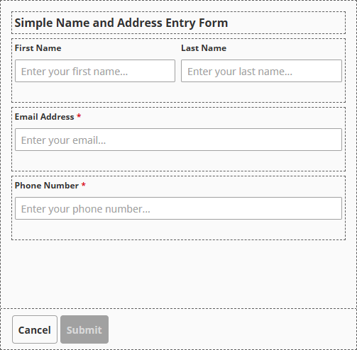
To configure the Form component with validation:
-
Drag a Form component onto your view.
-
Select the Form component and set props.name to
Basic Formin the Property Editor.
-
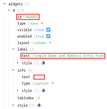
Edit the header row.
- Navigate to columns.items[0].rows.items[0].widgets.
- Expand 0, then set the following values:
- id to
header - label.text to
Simple Name and Address Entry Form - (Optional) Delete or update info.text. In this example, each info.text value has been deleted.
- id to
-
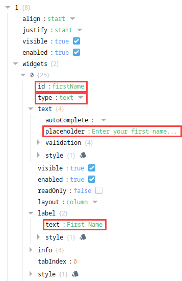
Edit the existing input row for first and last name.
-
Navigate to columns.items[0].rows.items[1].widgets.
-
Expand 0, then set the following values:
- id to
firstName - type to
text - text.placeholder to
Enter your first name... - label.text to
First Name
- id to
-
Add a second widget to the same row.
-
Click the Add
 icon next to widgets.
 -
Expand 1, then set the following values:
- id to
lastName - type to
text - text.placeholder to
Enter your last name... - label.text to
Last Name
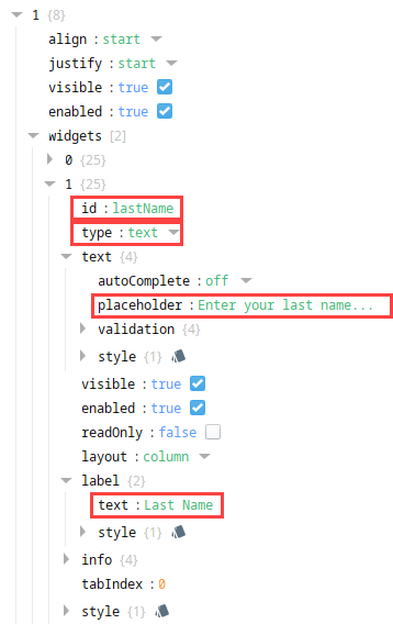
- id to
-
-
-
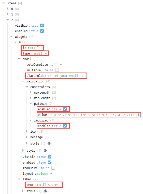
Add a row for the email field.
- Navigate to columns.items[0].rows.items and click the Add icon next to items.
- Navigate to rows.items[2].widgets.
- Expand 0, then set the following values:
- id to
email - type to
email - text.placeholder to
Enter your email... - label.text to
Email Address
- id to
- Expand email.validation.constraints.pattern, then set the following values:
- enabled to
true - value to
^[a-zA-Z0-9._%+\-]+@[a-zA-Z0-9.\-]+\.[a-zA-Z]{2,}$
- enabled to
- Expand email.validation.constraints.required, then set enabled to
true.
- Navigate to columns.items[0].rows.items and click the Add
-
Add a row for the phone number field.
- Navigate to columns.items[0].rows.items and click the Add icon next to items.
- Navigate to rows.items[3].widgets.
- Expand 0, then set the following values:
- id to
phoneNumber - type to
tel - text.placeholder to
Enter your phone number... - label.text to
Phone Number
- id to
- Expand tel.validation.constraints.required, then set
enabledtotrue. - Expand tel.validation.constraints.pattern, then set the following values:
- enabled to
true - value to
^\+?[1-9]\d{1,14}$
- enabled to
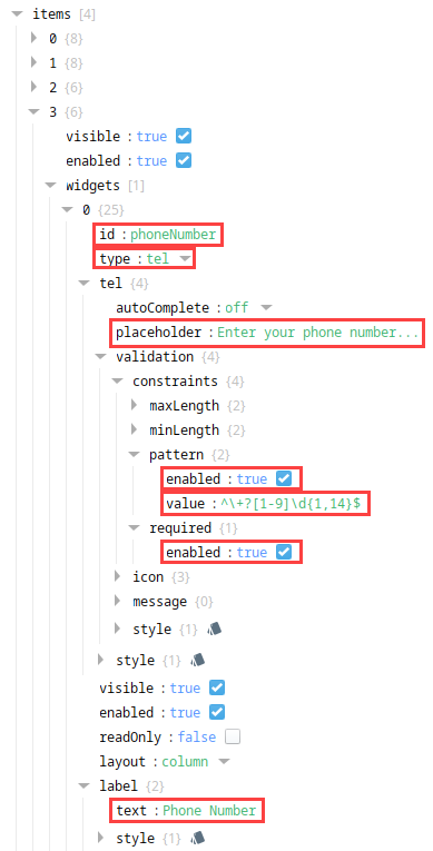
- Navigate to columns.items[0].rows.items and click the Add
Properties Used
| Property | Value |
|---|---|
| props.name | Basic Form |
| props.columns.items[0].rows.items[0].widgets[0].id | header |
| props.columns.items[0].rows.items[0].widgets[0].label.text | Simple Name and Address Entry Form |
| props.columns.items[0].rows.items[1].widgets[0].id | firstName |
| props.columns.items[0].rows.items[1].widgets[0].type | text |
| props.columns.items[0].rows.items[1].widgets[0].text.placeholder | Enter your first name... |
| props.columns.items[0].rows.items[1].widgets[0].label.text | First Name |
| props.columns.items[0].rows.items[1].widgets[1].id | lastName |
| props.columns.items[0].rows.items[1].widgets[1].type | text |
| props.columns.items[0].rows.items[1].widgets[1].text.placeholder | Enter your last name... |
| props.columns.items[0].rows.items[1].widgets[1].label.text | Last Name |
| props.columns.items[0].rows.items[2].widgets[0].id | |
| props.columns.items[0].rows.items[2].widgets[0].type | |
| props.columns.items[0].rows.items[2].widgets[0].text.placeholder | Enter your email... |
| props.columns.items[0].rows.items[2].widgets[0].label.text | Email Address |
| props.columns.items[0].rows.items[2].widgets[0].email.validation.constraints.pattern.enabled | true |
| props.columns.items[0].rows.items[2].widgets[0].email.validation.constraints.pattern.value | ^[a-zA-Z0-9._%+\-]+@[a-zA-Z0-9.\-]+\.[a-zA-Z]{2,}$ |
| props.columns.items[0].rows.items[2].widgets[0].email.validation.constraints.required.enabled | true |
| props.columns.items[0].rows.items[3].widgets[0].id | phoneNumber |
| props.columns.items[0].rows.items[3].widgets[0].type | tel |
| props.columns.items[0].rows.items[3].widgets[0].text.placeholder | Enter your phone number... |
| props.columns.items[0].rows.items[3].widgets[0].label.text | Phone Number |
| props.columns.items[0].rows.items[3].widgets[0].tel.validation.constraints.required.enabled | true |
| props.columns.items[0].rows.items[3].widgets[0].tel.validation.constraints.pattern.enabled | true |
| props.columns.items[0].rows.items[3].widgets[0].tel.validation.constraints.pattern.value | ^\+?[1-9]\d{1,14}$ |