Style Reference
The following tables describe the style user interface for style properties in Perspective. These styles are based on Cascading Style Sheets (CSS), a style sheet language used for describing the presentation of a document or webpage. For an overview on using styles in Perspective, see also Styles and Style Classes.
note
Examples on this page are provided for demonstrative purposes. However CSS documentation is easy to obtain on the internet. For more information on the properties listed below, check out MDN's CSS Reference documentation.
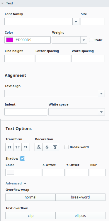
Text Menu
| Property Name | Description | Example | Output |
|---|---|---|---|
| Font Family | Specifies the font for the component. Examples of a Font Family are Times, Courier, Arial, Monospace, etc. | fontFamily: Monospace | Hello world |
| Size | Specifies the size of the font. All CSS length units are available and can be applied by specifying the unit after the number. If you enter just a number, Perspective assumes the value is in pixels (px). | fontSize: 26px | Hello world |
| Color | Specifies the color of the text. You can set the color with a HEX, RGB, or HSL value. See also Color Selector Reference. | color: #FF0000 | Hello world |
| Weight | Sets how thick or thin characters in the text are displayed.
| fontWeight: Bold fontSize: 26px | Hello world |
| Italic | Checkbox to indicate if the font style should be italic. | fontStyle: italic | Hello world |
| Line Height | Specifies the height of a line. Can be specified as one of the following:
| lineHeight: normal | Hello world |
| Letter Spacing | Increases or decreases the space between characters. The default is 0. | letterSpacing: 12px | Hello world |
| Word Spacing | Increases or decreases the white space between words. The default is normal. | wordSpacing: 24px | Hello world |
Alignment
| Property Name | Description | Example | Output |
|---|---|---|---|
| Text Align | The horizontal alignment of text in a component.
| textAlign: right | Hello world |
| Text Indent | The indentation of the first line in a text-block. The default value is 0. | textIndent: 24px | Lorem ipsum dolor sit amet, consectetur adipiscing elit. Praesent fringilla, mi nec ultrices auctor, metus ante |
| White Space | The horizontal alignment of text in a component.
| whiteSpace: pre | Whitespace is preserved |
Text Options
| Property Name | Description | Example | Output |
|---|---|---|---|
| Transform | Capitalization setting for the text.
| textTransform:capitlizetextTransform:uppercasetextTransform:lower | Hello WorldHELLO WORLDhello world |
| Decoration | Text decoration setting.
| textDecoration:underlinetextDecoration:line-throughtextDecoration:overline | Hello WorldHello WorldHello World |
| Break-word | Allows unbreakable words to be broken. | wordWrap: break-word | The word is: Incomprehensibilities |
| Shadow | Adds shadow to text. Shadow is set in pixels.
| textShadow: #ff0000 6px 6px 2px | Hello World |
| Overflow wrap | Allows the browser to break a line of text inside a component into multiple lines in an otherwise unbreakable place, thus avoiding a long string of text causing layout problems due to overflow.
| overflow wrap: break-word | This example uses normal: Incomprehensibilities This example uses break-word: Incomprehensibilities |
| Text overflow | Specifies how overflowed content that is not displayed should be signaled to the user. It can be clipped or it can display an ellipsis (...). Note that this property doesn't force overflow to occur. You'll typically need to use other properties, such as overflow and white-space. See the MDN documentation for more details.
| textOverflow: cliptextOverflow: ellipsis |
 Capitalize: Transforms the first character of each word to uppercase.
 UpperCase: Transforms all characters to uppercase.
 Lowercase: Transforms the first character of each word to lowercase.
 Underline: Horizontal line under text.
 Line-Through: Horizontal line through the middle of the text.
 Overline: Horizontal line above the text.
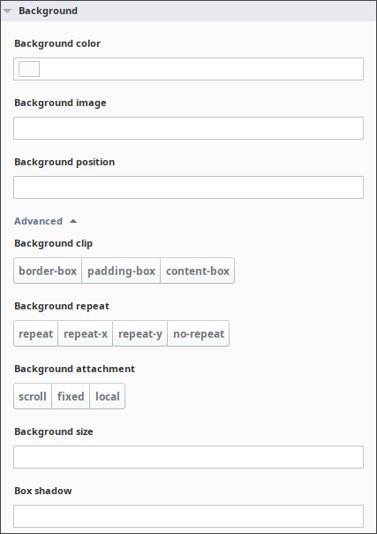
Background Menu
| Property Name | Description | Example |
|---|---|---|
| Background Color | Sets the background color of a component. The background of a component is the total size of the component, including padding and border (but not the margin). You can set the color with a HEX, RGB, or HSL value. See also Color Selector Reference. | backgroundColor: #D5D5D5 |
| Background Image | Sets one or more background images for a component. By default, a background-image is placed at the top-left corner of a component, and repeated both vertically and horizontally. This setting also has options for setting a linear or radial gradient as the background image. For more information, see the MDN docs. | backgroundImage: url("http://example/hostedFile.png") |
| Background Position | Sets the starting position of a background image. By default, a background-image is placed at the top-left corner of a component, and repeated both vertically and horizontally. Values can be provided in explicit sizes, percentages, or keywords (e.g., top, left, etc). For more information, see the MDN documentation for background-position. | backgroundPosition: 100px 100px |
Advanced
| Property Name | Description | Example |
|---|---|---|
| Background Clip | Defines how far the background (color or image) should extend within a component. (Be sure to set up the border, padding, background properties, and add some content before configuring the background-clip, otherwise you will not see any changes when you add a value for the backgroundClip. Options are:
| backgroundClip: content-box |
| Background Repeat | Sets if/how a background image will be repeated. By default, a background-image is repeated both vertically and horizontally.Options are:
| backgroundRepeat: repeat |
| Background Attachment | Specifies whether a background image scrolls with the rest of the page, or is fixed.Options are:
| backgroundAttachment: fixed |
| Background Size | Sets the size of the components background image. MDN documentation for background-size to learn more. | backgroundClip: content-box |
| Box Shadow | Attaches one or more shadows to a component. No shadow is the default. See the MDN documentation for box-shadow. | boxShadow: 5px 10px #D3D3D3 |
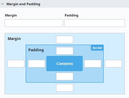
Margin and Padding
| Property Name | Description | Example | Output |
|---|---|---|---|
| Padding Top/Left/Bottom/Right | Padding is the space inside of a component, between the border and the content of the component. This property sets the padding for each of the four sides inside of a component. | paddingBottom: 2 paddingLeft: 30 paddingRight: 13 paddingTop: 13 |  |
| Margin Top/Left/Bottom/Right | Margin is the space outside of a component. This property sets the padding for each of the four sides surrounding a component. | marginBottom:10px marginLeft:10px marginRight: 10px marginTop: 10px |  |
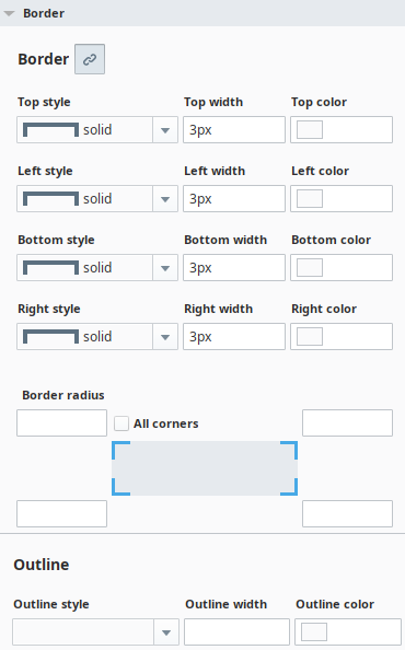
Border
| Property Name | Description | Example | Output |
|---|---|---|---|
| Border Unlink Sides / Link Sides | The first item on the Border menu is the Border Unlink sides  icon. When you click this icon, the four border sides of the component are "unlinked," and the Border Styles settings can be applied individually to each side. icon. When you click this icon, the four border sides of the component are "unlinked," and the Border Styles settings can be applied individually to each side. When the Link Sides  icon is selected, then the Border Styles settings will apply to all four borders equally. icon is selected, then the Border Styles settings will apply to all four borders equally. | ||
| Border Style | Sets the style for an component's four borders. For an example of each style, see the Border Style Options Table below. | borderStyle: dotted | Hello World |
| Border Width | Sets the width of the border. If the Unlink sides icon is selected, you can set separate border widths for the top, left, bottom, and right sides. | borderWidth: 7px borderStyle: solid | Hello World |
| Border Color | Specifies the color of the border. You can set the color with a HEX, RGB, or HSL value. See also Color Selector Reference. If the Unlink sides icon is selected, you can set separate border colors for the top, left, bottom, and right sides. | borderColor: #AC00AC borderStyle: solid | Hello World |
| Border Radius | Defines the radius of the component's corners allowing rounded borders. | borderRadius: 10px borderStyle: solid | Hello World |
| Border Radii Top/Left/Bottom/Right | Sets the radius for each of the component's corners: Border top left radius, Border top right radius, Border bottom left radius, Border bottom right radius. | borderTopLeftRadius: 10px borderBottomRightRadius: 10px borderStyle: solid | Hello World |
| Outline Style | Specifies the style of an outline. For an example of each style, see the Border Style Options Table below. | outlineStyle: dotted | Hello World |
Border Style Options
| Style | Description |
|---|---|
| none | Specifies no border. This is default. |
| solid | Specifies a solid border. |
| dashed | Specifies a dashed border. |
| dotted | Specifies a dotted border. |
| double | Specifies a double border. |
| groove | Specifies a 3D grooved border. The effect depends on the border-color value. |
| ridge | Specifies a 3D ridged border. The effect depends on the border-color value. |
| inset | Specifies a 3D inset border. The effect depends on the border-color value. |
| outset | Specifies a 3D outset border. The effect depends on the border-color value. |
| hidden | The same as "none", except in border conflict resolution for table elements. |
Outline Style
| Style | Description |
|---|---|
| none | Specifies no outline. This is default. |
| solid | Specifies a solid outline. |
| dashed | Specifies a dashed outline. |
| dotted | Specifies a dotted outline. |
| double | Specifies a double outliner. |
| groove | Specifies a 3D grooved outline. The effect depends on the outline-color value. |
| ridge | Specifies a 3D ridged outline. The effect depends on the outline-color value. |
| inset | Specifies a 3D inset outline. The effect depends on the outline-color value. |
| outset | Specifies a 3D outset outline. The effect depends on the outline-color value. |
| hidden | Specifies a hidden outline. |
Shape Menu

| Style | Description |
|---|---|
| Fill | Sets a color for the fill of an SVG shape. |
| Stroke | Sets a color for the stroke. The stroke is a border around SVG shapes. Specifies the color of the text. You can set the color with a HEX, RGB, or HSL value. See also Color Selector Reference. |
| Stroke width | Sets the width of the stroke, in pixels. |
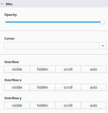
Misc Menu
| Property Name | Description | Example | Output |
|---|---|---|---|
| Opacity | Describes the transparency level for a component, where 1 is not transparent at all, 0.5 is 50% see-through, and 0 is completely transparent. Opacity applies to text, border, and outline properties. | opacity: 0.4 | Hello World |
| Cursor | Specifies the mouse cursor to be displayed when pointing over a component. For a full list of options, see the MDN documentation. | cursor:pointer |  |
| Overflow | Specifies what should happen if content overflows a component's box: whether to clip content or add scrollbars when a component's content is too big to fit in a specified area. For an description of each value, see the Overflow Property Table. | overflow:scroll | Lorem ipsum dolor sit amet, consectetur adipiscing elit. Praesent fringilla, mi nec ultrices auctor, metus ante |
| Overflow X | Specifies whether to clip the content, add a scroll bar, or display overflow content of a block-level component, when it overflows at the left and right edges. For an description of each value, see the Overflow Property Table. | N/A | N/A |
| Overflow Y | Specifies whether to clip the content, add a scroll bar, or display overflow content of a block-level component, when it overflows at the top and bottom edges. For an description of each value, see the Overflow Property Table. | N/A | N/A |
Overflow Property Table
Below is an expaination of the various values for overflow properties. Additional details can be found in the MDN documentation.
| Value | Description | Example |
|---|---|---|
| visible | The overflow renders outside the component's box. It is not clipped. This is the default. | Lorem ipsum dolor sit amet, consectetur adipiscing elit. Praesent fringilla, mi nec ultrices auctor, metus ante |
| hidden | The overflow is clipped, and the rest of the content will be invisible. | |
| scroll | The overflow is clipped, but a scrollbar is added to see the rest of the content. | Lorem ipsum dolor sit amet, consectetur adipiscing elit. Praesent fringilla, mi nec ultrices auctor, metus ante |
| auto | If overflow is clipped, a scrollbar will be added to see the rest of the content. | Lorem ipsum dolor sit amet, consectetur adipiscing elit. Praesent fringilla, mi nec ultrices auctor, metus ante |