Configuring a Dashboard
The Dashboard exposes widgets to end users in a Perspective Session so they can customize their dashboard layout for their individual needs. Widgets are views that are pre-configured in the Designer and made available to Perspective Session users. End users have the flexibility to add, remove, resize, move around, and even configure widgets in the dashboard of their Perspective Session without having access to the Designer. Users can interact with widgets in a session on both desktop and mobile devices. There may be some minor variances in how a user can interact with their dashboard between desktop and mobile devices, but the principle is still the same.
Configuring a Dashboard Component
Configuring a Dashboard starts with designing widgets and having a selection of pre-configured widgets for users to choose from to configure their individual dashboards. Designers create the widgets and make them available for end users to use in their individual dashboards. By making the widgets available using the 'availableWidgets' property, the widget overlay modal is populated with a searchable list of all the available widgets a user can add to their dashboard. The dashboard component contains a host of additional properties that can be configured based on the end-user requirements.
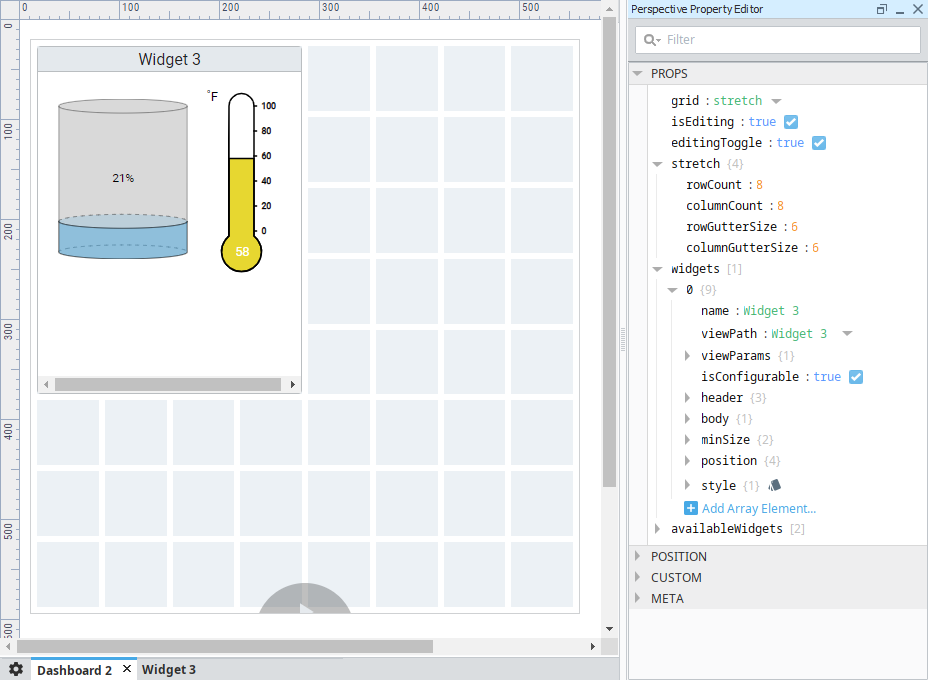
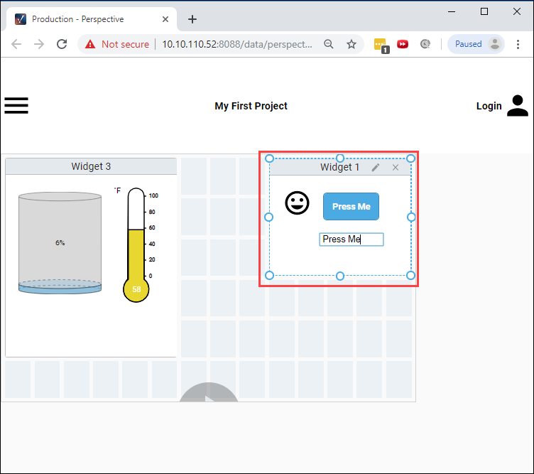
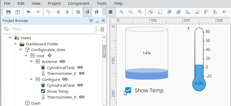
The Dashboard component uses a grid system based off of CSS grid specifications to position and place your widgets. The Property Editor settings of the Dashboard component control the general layout of the grid. They specify the responsive mode: fixed or stretch, if the dashboard is editable, and if each widget is configurable and available in a Perspective session. The image below shows one widget on a dashboard in the Designer along with some of its properties.
To learn more about Dashboard properties, refer to the Dashboard component page.
Setting Up a User Dashboard
Setting up a dashboard starts with users choosing from a list of pre-configured widgets to configure their dashboards in a Perspective Session based on their individual needs.
To edit the dashboard in a Perspective Session, the user can put the dashboard into Edit mode by clicking the Edit icon at the bottom of the dashboard and deciding what widgets they want, where they want them, and how they want them configured. They can add, remove, resize and configure widgets, including the ability to interact with widgets such entering text in a text field or displaying/hiding components in a widget. You can also remove this control entirely and implement your own by configuring the 'editingToggle' property on the component. Refer to the Dashboard component properties for more details.
The following sections on this page describe how to set up your own dashboard.
Adding a Widget
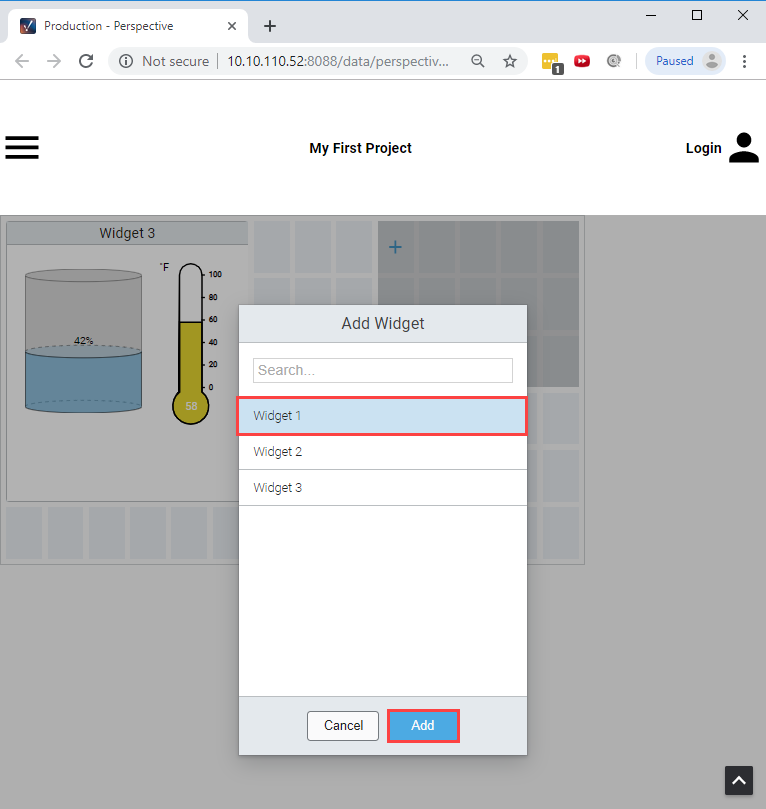
There are two ways a user can add a widget in a Perspective Session: by clicking on a single grid cell, or by dragging a grid cell over multiple grid cells that opens an add widget overlay as shown in the image below. Both ways result in displaying the add widget modal which provides a searchable list of all of the available widgets a user may add to their dashboard.
Dragging a grid cell creates an add widget overlay that specifies the desired dimensions of the widget to add. If the desired widget position overlaps other widgets, the overlapped widgets will be moved to any available space on the dashboard. Widgets do not overlap when being added, resized, and moved unless there happens to be no space for a widget so that it is placed within the grid.
When adding a widget, if the desired dimensions are less than the configured minimum dimensions, the desired dimensions will get overridden by the minimum dimensions. If a single grid cell is clicked, the configured default dimensions will be applied, if and only if, the default meets the required minimum dimensions, otherwise the minimum dimensions are applied. By default, the minimum and default dimensions for a widget are 1x1.
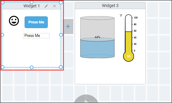
On mobile devices, activating a grid cell requires a long-press of about a second. Once a grid cell is activated, you can then drag to create the add widget overlay. The image below shows Widget 1 dropped over the multiple selected grid cells in the dashboard. You'll notice the active widget has a dashed blue border.
Removing a Widget
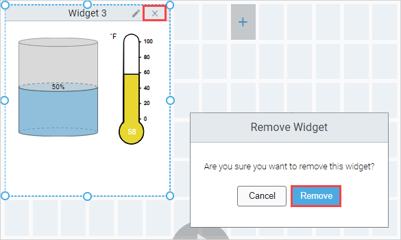
Click the Edit icon, select the widget, and you'll notice the widget has a dashed blue border indicating the widget is active, then click the Delete 'X' icon in the top right corner to remove the widget from the dashboard. You will then be prompted with a confirmation modal to delete the widget. Click Remove.
Moving a Widget
Put the dashboard in Edit mode, select the widget so that it becomes active (dashed blue border). Drag the widget to the desired position. As you move the widget, any overlapped widgets will be repositioned into the first available space.
Resizing a Widget
To resize a widget, put the dashboard in Edit mode, then simply select the widget you’d like to resize and drag one of the resize handles. If, while resizing, the widget overlaps other widgets, the overlapped widgets will be repositioned into the first available space.
Configuring a Widget
The dashboard allows your users to configure a widget in a Perspective Session. To do this, you need make a few changes to your view and Dashboard component configuration.
Setting a Widget as Configurable in the Designer
To make a view allow configuration, you need to set the isConfigurable property for each widget that needs to be configured. This will set a param value on your view (in the runtime) that you can use to create a configuration display in your view. The purpose of this parameter is to avoid having to make a separate widgets for each possible variation of the same view.
- Select the Dashboard component.
- Expand the availableWidgets parameter, and expand the array object for the widget that you want to make configurable.
- Set the isConfigurable property to true for this widget.
Creating a Configurable View in the Designer
To make a view configurable, you need to do a bit of work to alter what is in the view. This is possible because the Dashboard component was created to use a parameter named configuring that is set to true when the widget is in put into configuration mode. The idea here is to have a second 'mode' or 'display' version of the view that has controls on it to effect the primary display. The best way to do this is to create two containers in your view; one for configuration, and one for display. You can then bind the visibility on each container so only one is shown at a time.
To learn more about using parameters to pass properties, refer to the Perspective Component Properties page. You will not need to pass any value into the param though, it is done automatically for you if you get the param name correct.
-
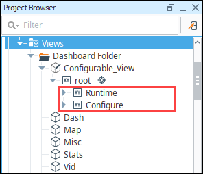
Create a new Coordinate view. For the example, we named our Configurable_View.
noteIf you use a Flex container, some of the settings will be different further down in the example.
-
In the Property Editor, add a view param. Name the param
configuringand set the value to true. Note the spelling and (lack of) capitalization.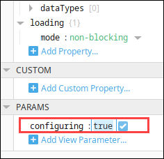
-
Drag a Coordinate Container component inside your view. Give the container a good name like 'Runtime.'
-
Add any display components you want.
noteIf you started from an existing view, move all existing components into the new container then make the container fill your entire view.
- Deep Select the Configure container.
- Drag a Cylindrical Tank component into it.
- Bind the value property to a tag.
- Drag a Temperature Gauge component into it.
- Bind the value property to a tag.
-
We need to create a second new container in the view for your configuration. Duplicate the Runtime container. Give the container a good name like 'Configure.' This container will be a sibling to the Runtime container, not inside the Runtime container.
-
Add a Checkbox to toggle the temperature component visibility.
noteIf you started with an existing view, this step is completely up to you. You will decide what should be configurable and create controls for that in your configuration container. For example, you could create a list of Tags for the user to select between and display only the selected Tags on a chart.
- Deep Select the Configure container.
- Drag a Checkbox component into it.
- Set the Name and Text to "Show Temp".
-
Now we need to alter the Runtime container components to listen to our new controls.
- Deep Select the Runtime Container.
- Select the Temperature Gauge component.
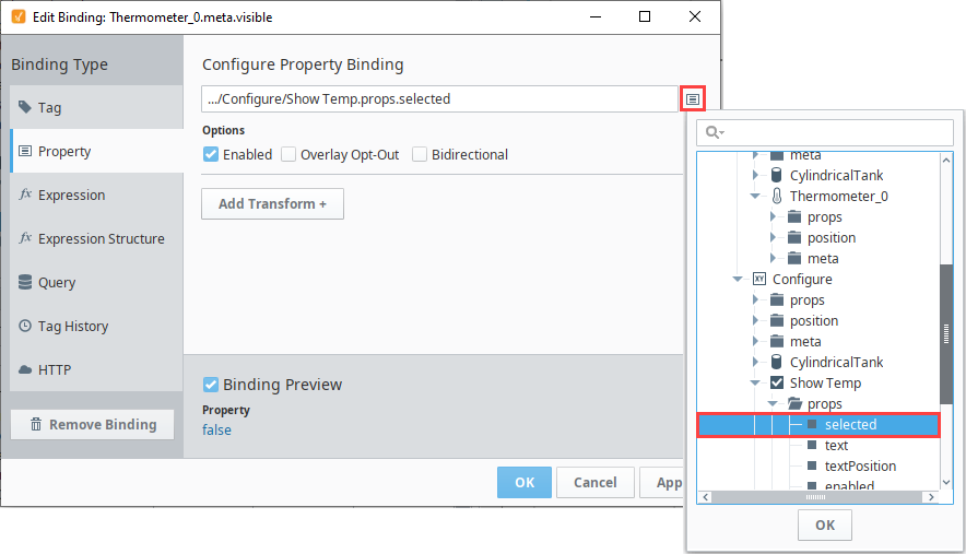
- In the Property Editor under META, bind the Visible property to the Selected value of the Show Temp Checkbox component.
-
Now we just need to show one container at at time.
noteIf you used a Flex container at the start of this example, then use the 'display' property instead of the 'visible' property in the following steps.
-
Bind the
visibleproperty for the Runtime container using an expression. It should be true when the configuring param is false.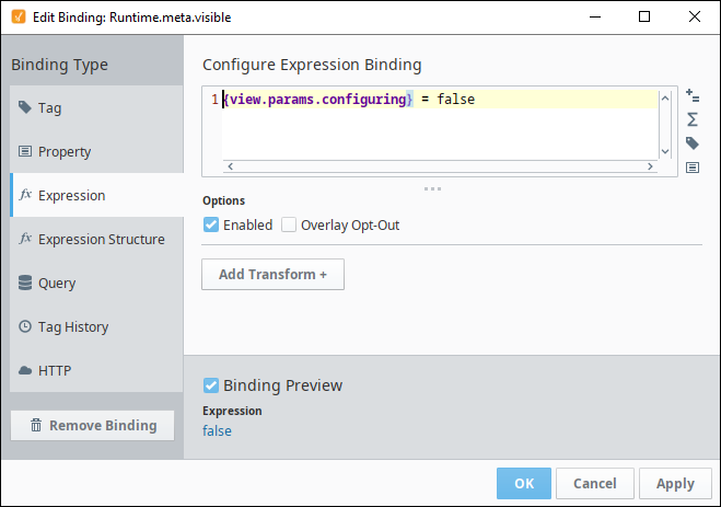
-
Bind the
visibleproperty for the Configure container using an expression. It should be true when the configuring param is true.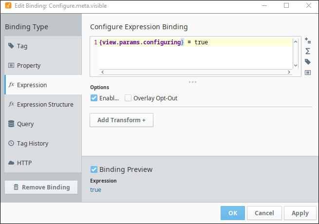
-
-
Save your project and then put the Designer into Preview mode. When you click on the Temp Show button, you'll see the Temperature component appear or disappear.
Now you can use this view in your dashboard.
Configuring in the Dashboard Component in the Runtime (Perspective Session)
This section is for the people using the Dashboard in a Perspective Session.
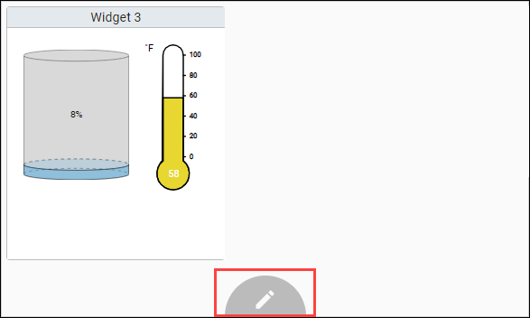
- To use a configurable widget in the runtime, put the dashboard in Edit mode and select the widget you’d like to configure.
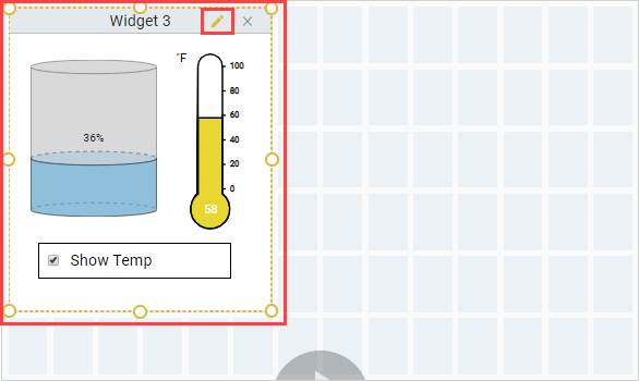
- Click the edit icon (pencil) in the top right corner of the widget. The widget's border will change colors from blue to orange (shown in the image below).
- The view changes to show the ‘configuring’ mode you set up previously for the view, allowing users to configure the widget.
Saving Perspective Session Edits and Populating Widgets
Edits that an end user makes in their dashboard in a Perspective Session are not automatically saved and do not persist when the end user's session restarts. A session can be refreshed within the same session. One possible solution for populating widgets for the next editing session is to add a property change script on the widgets prop to listen for changes and then write that value back to a database along with any user information derived from the active session. The value of the widgets prop will be an array of QualifiedValues, which you’ll need to handle accordingly. In similar fashion, consider adding an onStartup event action that will query the database and then populate the widgets prop with the users last saved configuration and optionally populate the availableWidgets prop (possibly for varying user roles).
Saving and Loading Dashboard Component JSON Data
The Dashboard Component also has the ability to save and load custom widget configurations. This functionality can be set up by configuring a database table to store widget data, and then writing scripts to save and pull JSON data. We'll set up an example using a MySQL database to demonstrate the basic format of this functionality, which can be expanded to serve many processes.
Once you have a database connection, complete the following steps to create a MySQL database table:
-
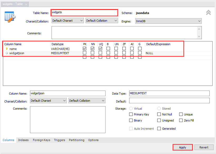
Open MySQL Workbench and create a table.
-
Enter a name for the table, in this case we used widgets.
-
Enter name under Column Name in the first row.
-
Use the dropdown to select VARCHAR(45) from the Datatype dropdown.
-
Select UQ to make sure values aren't duplicated.
-
Enter widgetjson under Column Name a second row.
-
Select MEDIUMTEXT from the Datatype dropdown.
noteDepending on your database, it may be a different datatype name so make sure to select a datatype that can hold long strings.
-
Select Apply.
-
Select Apply and Finish on the confirmation pop-up.
-
Add data into your Workbench table query scripting:
INSERT INTO test.widgets VALUES ("Widget", "1234")
- Select the Execute
 icon to confirm the Action Output.
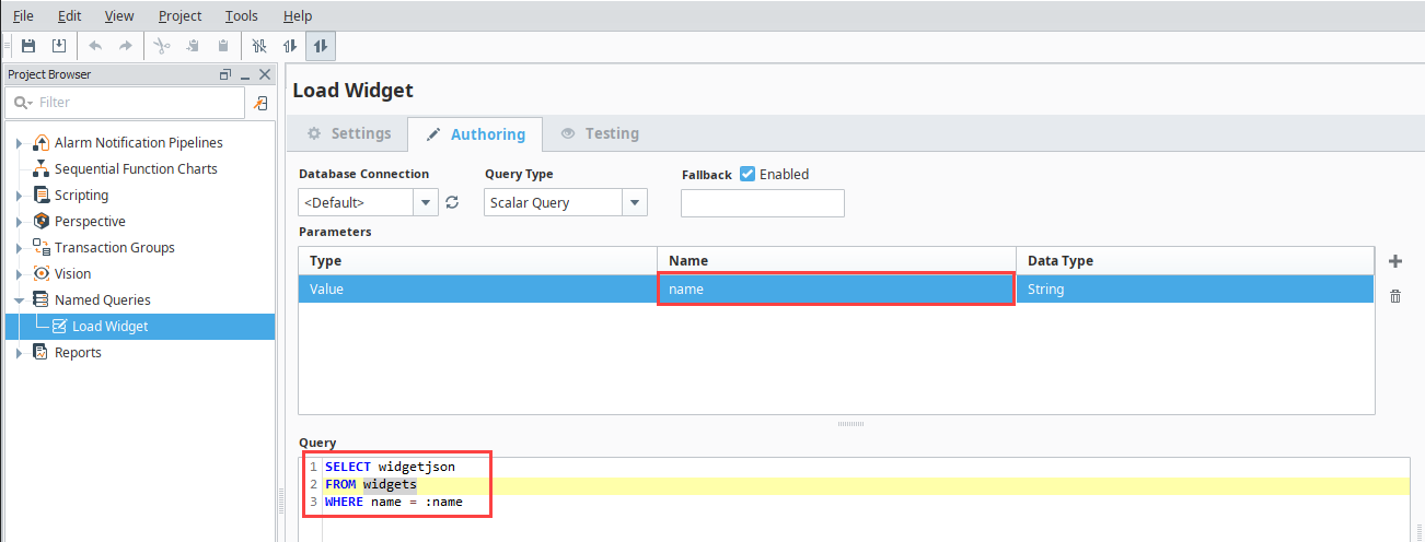
Next, we will create two named queries in the Designer that will be used in the save and load scripts.
-
Right-click Named Queries and select New Query in the Designer.
-
Enter Load in the Name field.
-
Select Create Named Query.
-
Select the Authoring Tab.
-
Fill in the Query script:
SELECT widgetjson
FROM widgets
WHERE name = :name -
Enter name in Name column.
-
Select the Testing Tab.
-
Enter a name value in the Value column, in this example, we used Widget.
-
Select Execute Query to confirm the result is as expected, 1234.
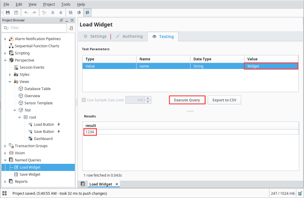
-
Select the Save
 icon to save the Load Widget Query.
 -
Right-click Named Queries and select New Query.
-
Enter Save in the Name field.
-
Select Create Named Query.
-
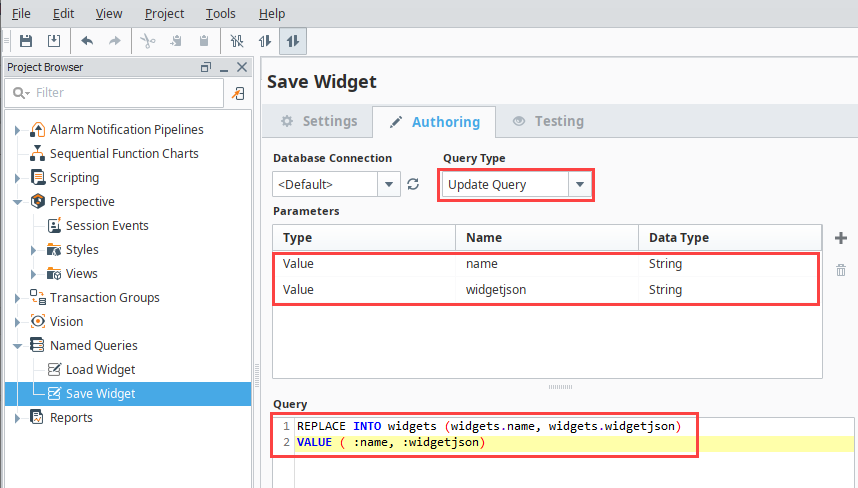
Select the Authoring Tab.
-
Fill in the Query script:
REPLACE INTO widgets (widgets.name, widgets.widgetjson)
VALUE ( :name, :widgetjson) -
Select Update Query as the Query Type.
-
Enter name into the Name field for the first parameter row.
-
Enter widgetjson into the Name field for the second parameter row.
-
Confirm both row Data Types are listed as String.
-
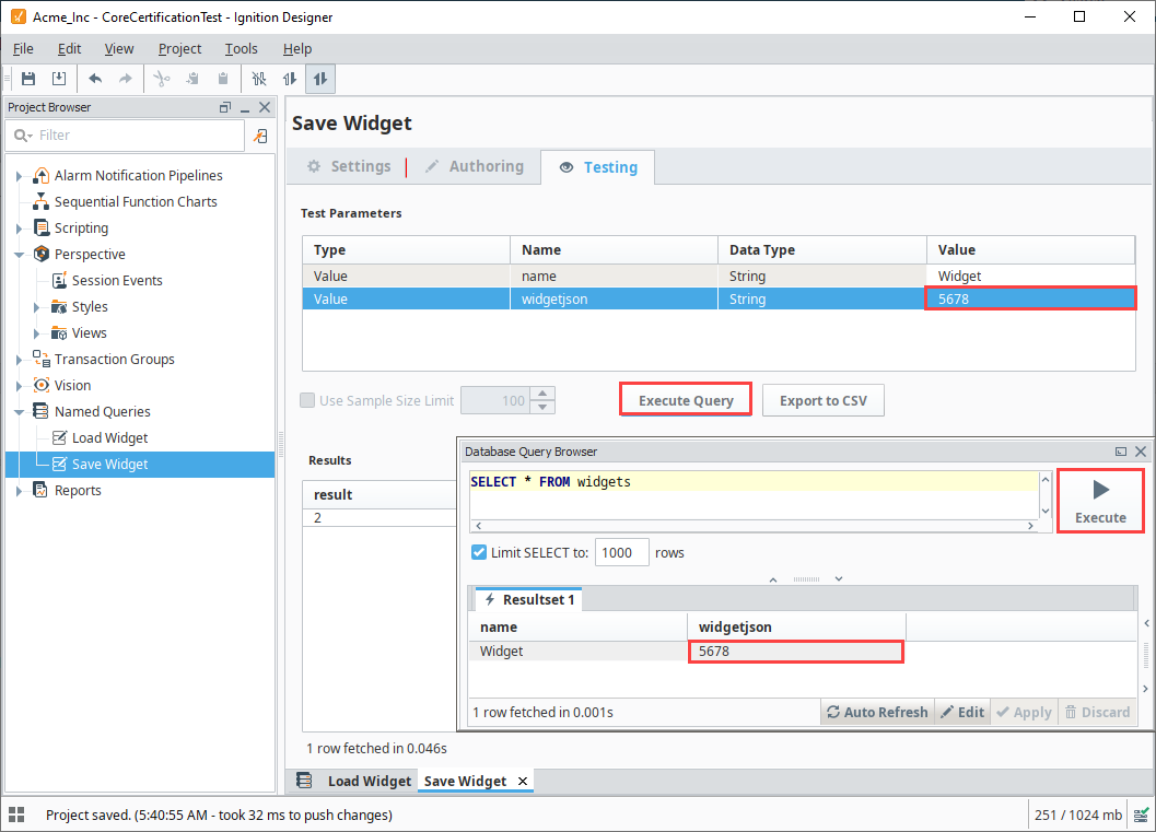
Select the Testing tab.
-
Enter Widget into the name row.
-
Enter 5678 into the widgetjson row.
-
Open the Database Query Browser to see how the saved value updates.
-
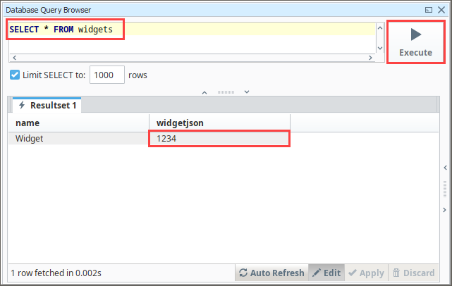
Enter browsing script to see the current widgets results:
SELECT * FROM widgets -
Select Execute to see Widget listed in the name column and 1234 in the widgetjson column.
-
Now, select Execute Query for the Save Widget Testing to save a new widgetjson value.
-
Select Execute on the Database Query Browser to see the updated result of 5678 in the widgetjson column.
-
Select the Save
icon to save the Save Widget Query.
Next we will create a New View to enable the save and load functionality.
-
Right-click Views and select New View.
-
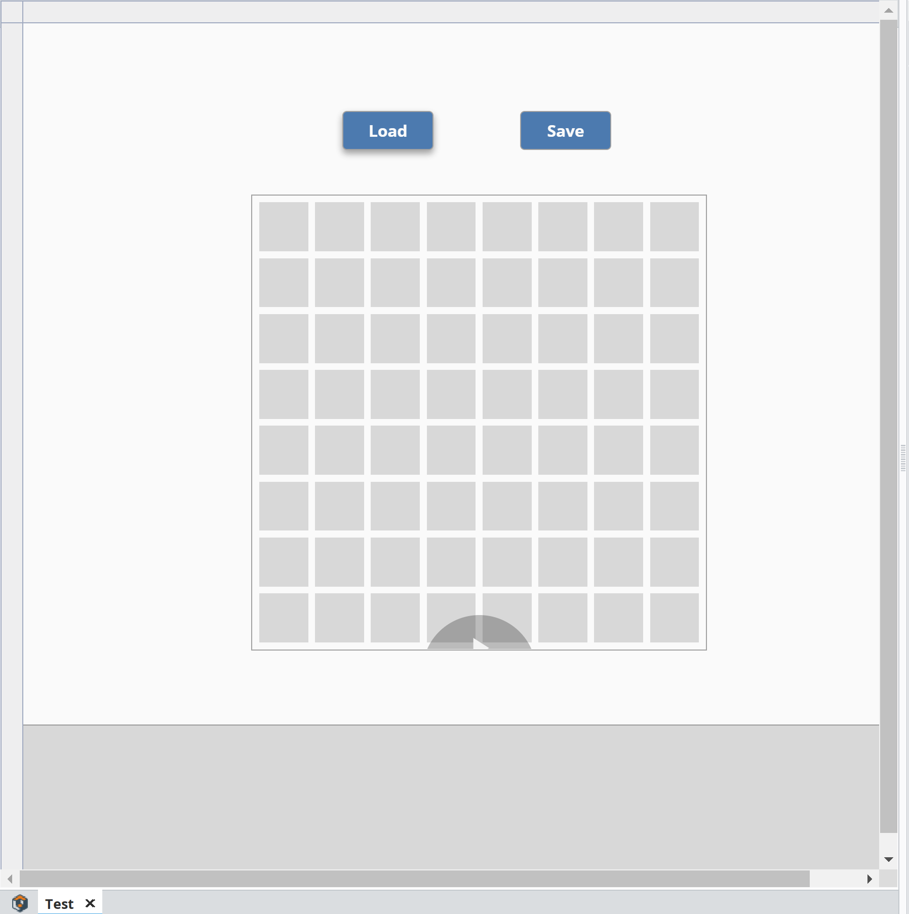
Enter a name into the Name field. In this example, we used Test as the name. Root Container Type selection does not matter for this example. Selecting Page URL is optional, but can be helpful. In this example, we use the page URL to see the View when we launch a session at the end of the example setup.
-
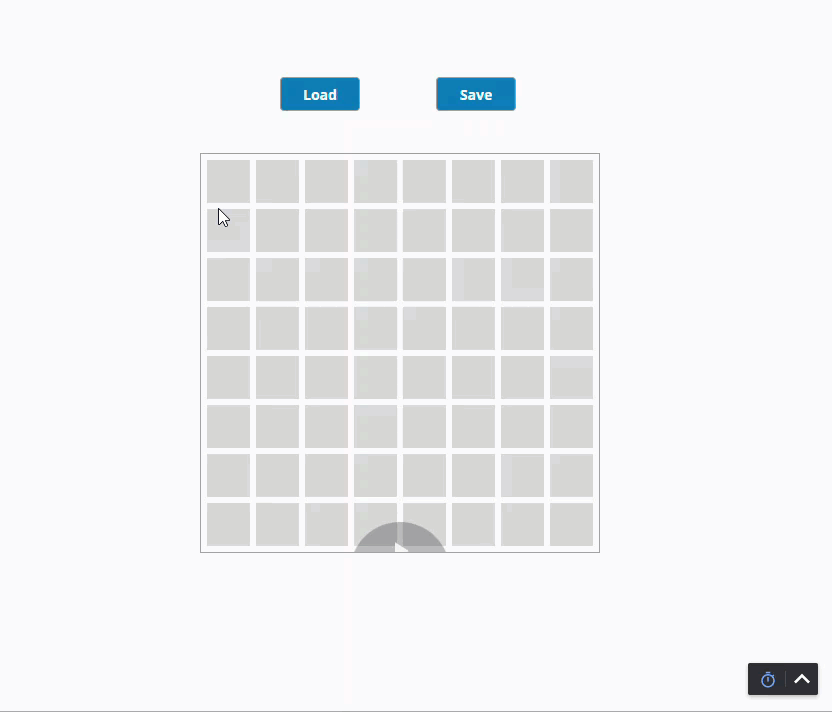
Drag a Dashboard component onto the view, drag two buttons onto the view.
-
Change one button text to Load and the other to Save.
-
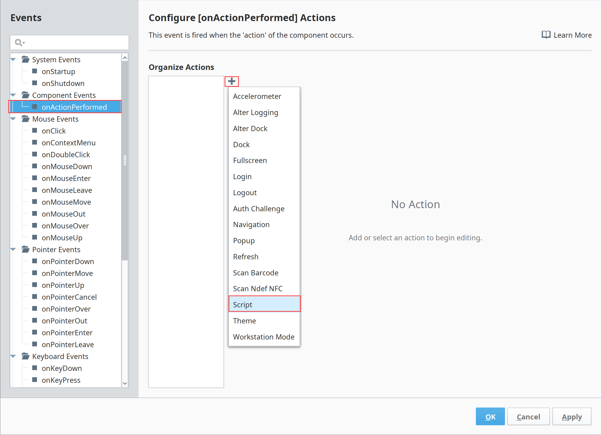
Right-click on the Save button and select Configure Events…
-
Select onActionPerformed.
-
Select the Add
 icon.
icon. -
Select Script.
-
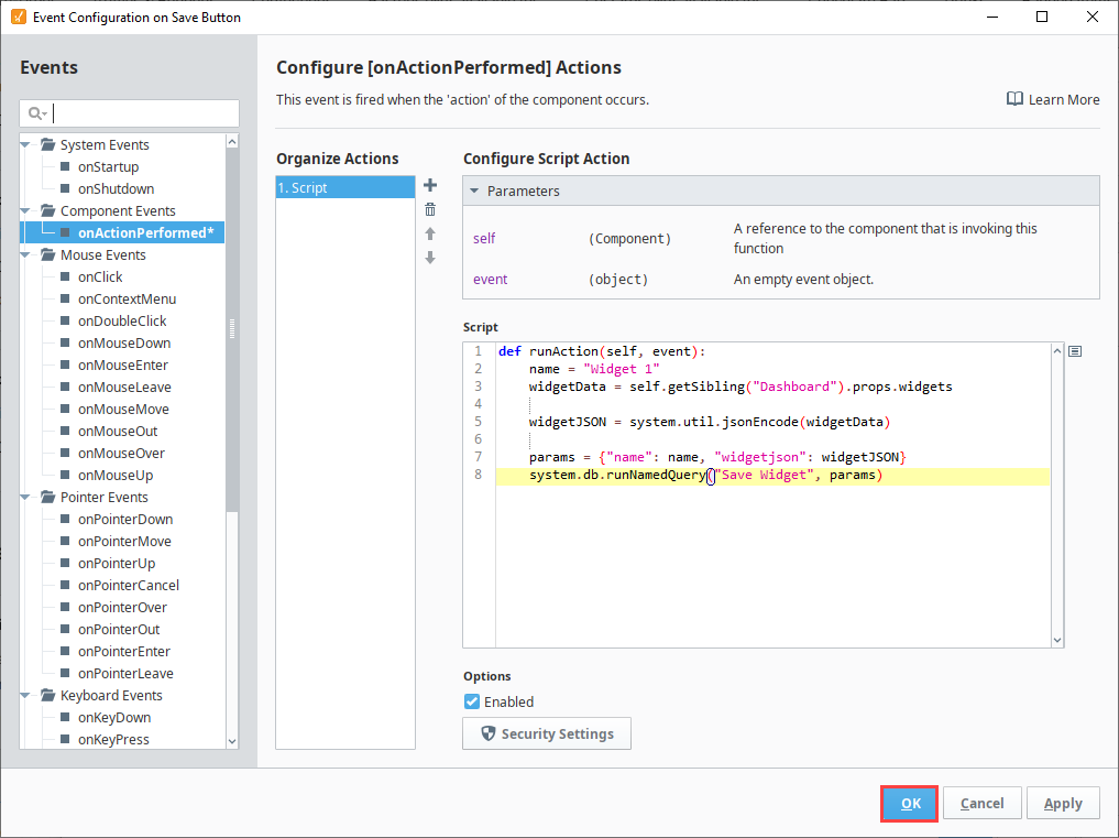
Enter scripting to pull name and widgets out of properties:
name = "Widget 1"
widgetData = self.getSibling("Dashboard").props.widgetsnoteThe name can alternatively come from a text entry box.
-
Enter scripting to convert the widget json format to a string:
widgetJSON = system.util.jsonEncode(widgetData) -
Enter scripting to update variables for the named query and run the query:
params = {"name": name, "widgetjson": widgetJSON}
system.db.runNamedQuery("Save Widget", params) -
Select OK.
-
Right-click on the Load button and select Configure Events…
-
Select onActionPerformed.
-
Select the Add
icon. -
Select Script.
-
Enter scripting to prepare the name of the widgets we want to load:
name = "Widget 1"
params = {"name": name} -
Enter scripting to run the Load query:
returnedString = system.db.runNamedQuery("Load Widget", params) -
Enter scripting to decode the string into the JSON object and set the Dashboard to the corresponding widgets:
widgets = system.util.jsonDecode(returnedString)
self.getSibling("Dashboard").props.widgets = widgets -
Select OK.

Now you can test your Save and Load button functions using the Preview Mode in the Designer or Launching a Perspective Session. Testing will show how users can add, remove, and modify widgets freely, the save the Dashboard configuration so if they continue to modify widgets, the Load button can be used to return the Dashboard to the saved setup.