Perspective - Drawing
💡Have feedback for this page? Let us know on the IA Forum.
Component Palette Icon:
Description
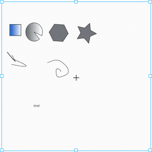
A component that allows you to create and manipulate SVG-based vector graphics directly within the Designer. You can configure these drawings through the built-in Drawing Editor.
Properties
Most Properties have binding options. For more information on Bindings, see Types of Bindings in Perspective. This section only documents the Props Category of properties. The other Categories are described on the Perspective Component Properties page.
| Name | Description | Property Type |
|---|---|---|
viewBox | Defines the visible area and coordinate system for the drawing. If null, the entire Canvas is visible. | value: object |
preserveAspectRatio | Controls how the drawing scales relative to the Viewbox, preserving or ignoring the aspect ratio. The default value, xMidYMid, centers the drawing while maintaining the aspect ratio. | value: string |
elements | A dynamic list of SVG elements within the drawing, stored as JSON. Automatically updates when elements are created or modified. See Element Properties for details about each element. | value: array |
style | Sets a style for the entire drawing. The Style menu contains all tools for modifying appearance, including fill, stroke, and opacity. You can also specify a style class. | value: object |
Elements Properties
The following table displays the attributes within the elements property. With a few exceptions, these attributes are camel-cased versions of the original attribute. These exceptions will be denoted with an asterisk (*).
SVG attributes are expansive, and some attributes have been modified to be more compatible with Ignition. Testing these attributes is recommended to avoid unexpected behavior.
| Name | Description | Property Type |
|---|---|---|
| clipPath | Defines a clipping path with the element the path is related to. | value: object |
| clipRule | Defines an algorithm that determines the graphical elements contained within a clipPath element. | value: string |
| elements | Allows users to nest individual elements within the property tree. | value: array |
| *end | Adds a marker to the end of the shape path. This attribute has been modified to automate some aspects that the original marker-end attribute required manual setup or manipulation for, including unique IDs for itself and referenced elements for color, rotation, width, height, and more. It also has built-in shapes such as arrows, reversed arrows, circles, squares, and lines. | value: object |
| fill | Configuration options for the color inside a shape. | value: string or object |
| id | A DOM id that will be automatically prepended with prefix to prevent collisions with other DOM ids. Manually assigning new ids will break rendering of elements referencing this id. | value: string |
| mask | An attribute that allows users to bind a given mask element to the element the attribute belongs to. | value: object |
| *name | A name to be displayed for the specified element within the Drawing Editor Layer's panel. | value: string |
| opacity | Sets the transparency of an element and its children. | value: string |
| overflow | Behavior when an element's context is too big to fit in its block formatting context. Browser support varies. | value: string |
| pathLength | Advanced SVG attribute representing the total length for the path, in user units. | value: numeric |
| *start | Adds a marker to the start of the shape path. This attribute has been modified to automate some aspects that the original marker-start attribute required manual setup or manipulation for, including unique IDs for itself and referenced elements for color, rotation, width, height, and more. It also has built-in shapes such as arrows, reversed arrows, circles, squares, and lines. | value: object |
| stroke | Configuration options for the color of an outline of a shape. | value: string or object |
| style | Allows users to style an element using CSS declarations. | value: object |
| *textPath | Renders text along the shape of a path. Applicable to text type elements only. | value: object |
| transform | A string representation of SVG transform definitions that are applied to an element and the element's children. | value: string |
| *type | Controls the type of element being rendered. | value: string |
| *typeAttr | New in 8.3.4 The type attribute to be applied to the SVG element. | value: string |
| vectorEffect | Advanced SVG attribute specifying an effect to be used when drawing an SVG element. | value: string |
| *vertex | Adds a marker to the interior vertices of the shape path, excluding the first and last vertices. This attribute has been modified to automate some aspects that the original marker-mid attribute required manual setup or manipulation for, including unique IDs for itself and referenced elements for color, rotation, width, height, and more. It also has built-in shapes such as arrows, reversed arrows, circles, squares, and lines. | value: object |
| visibility | Allows users to control the visibility of graphical elements. | value: string |
| *wrapper | If provided, this element will be wrapped in a wrapper SVG element of this wrapperType. This is useful for clipPath, mask, and pattern. | value: object |
Component Events
The Perspective Event Types Reference page describes all the possible component event types for Perspective components. Not all component events support each Perspective component. The Component Events and Actions page shows how to configure events and actions on a Perspective component. Component scripting is handled separately and can be accessed from the Component menubar or by right clicking on the component.
Drawing Editor
The Drawing Editor can be opened in the Designer by right-clicking on the Drawing component within a Perspective view or from the Project Browser, and selecting Edit Drawing. You can open only one drawing at a time in the editor. While a drawing is being edited, the right-click context menu option on drawing instances in the Designer will be disabled.
The Drawing Editor supports importing vector graphics (SVGs) using drag and drop functionality.
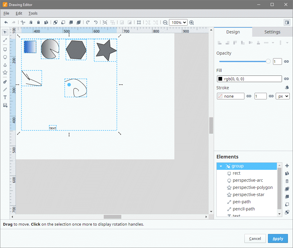
The Drawing Editor interface consists of several sections to facilitate creating and editing drawings:
- Command Bar: Provides quick access to core actions like applying changes, undo/redo, and managing objects.
- Toolbox: Contains all the drawing tools used to create and modify shapes, lines, and text.
- Design Panel: Provides alignment, properties for selected elements, and group management options.
- Settings Panel: Allows you to configure the Canvas, grids, guides, and other workspace properties.
- Viewbox: Displays the current viewable area of the Canvas, defining the visible portion of the drawing.
- Canvas: The central drawing area where you create and edit vector graphics.
- Status Bar: Shows useful information like cursor position, zoom level, and editing tips based on the current tool or action.
- Apply / Cancel Buttons: Located at the bottom of the editor, these buttons allow you to either save your changes or discard them.
Command Bar
The Command Bar gives you easy access to essential drawing actions, including applying changes, undoing or redoing edits, and managing object layers or alignment. Depending on the tool selected from the Toolbox, additional tool-specific controls may populate in the Command Bar.
| Icon | Command | Description |
|---|---|---|
 | Undo | Reverts the most recent change. |
 | Redo | Reapplies the most recent undone change. |
 | Cut | Removes the selected object and places it on the clipboard. |
 | Copy to Clipboard | Copies the selected object to the clipboard. |
 | Paste | Pastes objects from the clipboard into the Canvas. |
 | Duplicate | Creates a duplicate of the selected object. |
 | Send to Back | Moves the selected object to the back of the stacking order. |
 | Send Backward | Moves the selected object one step backward in the stacking order. |
 | Bring Forward | Moves the selected object one step forward in the stacking order. |
 | Bring to Front | Moves the selected object to the front of the stacking order. |
 | Rotate Right | Rotates the selected object 90 degrees to the right. |
 | Rotate Left | Rotates the selected object 90 degrees to the left. |
 | Group | Groups selected objects for unified manipulation. |
 | Ungroup | Separates a grouped object into individual elements. |
 | Mask | Creates a mask using selected objects to hide portions of other objects. |
 | Clip | Creates a clipping path using selected objects. |
 | Convert to Path | Converts selected objects into an editable path object. |
 | Place Text on Path | Places selected text along a path. |
 | Remove Text from Path | Removes text from a path and reverts it to a regular text object. |
 | Zoom Out | Zooms out, reducing the size of objects on the Canvas. |
 | Zoom In | Zooms in, increasing the size of objects on the Canvas. |
 | Show / Hide Panel | Toggles the visibility of the side panel. |
For detailed descriptions of the additional tool controls that appear in the Command Bar, see the Path Tool Controls, Pen Tool Controls, and Pencil Tool Controls sections.
Keyboard Shortcuts
You can use keyboard shortcuts in the Drawing Editor to quickly access many of the commands listed above, switch between tools, modify shapes, and perform common editing actions without leaving the Canvas. Shortcut tooltips appear on action buttons, and the Status Bar displays context-aware hints based on the active tool or selection.
- Windows/Linux
- macOS
Tool Activation
| Tool | Shortcut |
|---|---|
| Path | F1 |
| Selection | F2 |
| Rectangle | F3 |
| Circle / Ellipse | F4 |
| Polygon | F5 |
| Star | F6 |
| Pen | F7 |
| Pencil | F8 |
| Text | F9 |
| Gradient | F10 |
Path and Pen
| Action | Shortcut |
|---|---|
| Convert to curved segment | C |
| Convert to straight segment | 1 |
| Break segment at nodes | Enter |
| Add node between selected nodes | Insert |
| Remove selected nodes | Delete |
| Commit path and close | Enter |
| Cancel current path | Esc |
| Pen: Bézier mode | B |
| Pen: Paraxial mode | L |
| Snap to 15 degrees while drawing | Ctrl (hold) |
| Override paraxial (free move) | Shift (hold) |
Selection (Move and Scale)
| Action | Shortcut |
|---|---|
| Toggle rotation mode | R |
| Nudge by 1 pixel | Arrow keys |
| Nudge by 10 pixels | Alt + Arrow |
| Change width by 1 pixel | Shift + Left/Right |
| Change height by 1 pixel | Shift + Up/Down |
| Change width by 10 pixels | Ctrl + Shift + Left/Right |
| Change height by 10 pixels | Ctrl + Shift + Up/Down |
Common Actions
| Action | Shortcut |
|---|---|
| Cut | Ctrl+X |
| Copy | Ctrl+C |
| Paste | Ctrl+V |
| Duplicate | Ctrl+D |
| Group | Ctrl+G |
| Ungroup | Ctrl+Shift+G |
| Undo | Ctrl+Z |
| Redo | Ctrl+Y |
| Delete | Delete |
| Reload Drawing Editor | Ctrl+F12 |
View
| Action | Shortcut |
|---|---|
| Zoom In | Ctrl + + or Mouse Wheel Up |
| Zoom Out | Ctrl + – or Mouse Wheel Down |
| Fit to Viewbox | Ctrl+0 |
| Pan | Ctrl + Mouse Drag |
| Toggle Side Panel | F9 |
Shape Modifiers
| Tool | Modifier | Result |
|---|---|---|
| Circle Tool | Ctrl (hold) | Constrain ellipse to a circle |
| Rectangle Tool | Ctrl (hold) | Constrain rectangle to a square |
Tool Activation
| Tool | Shortcut |
|---|---|
| Path | F1 |
| Selection | F2 |
| Rectangle | F3 |
| Circle / Ellipse | F4 |
| Polygon | F5 |
| Star | F6 |
| Pen | F7 |
| Pencil | F8 |
| Text | F9 |
| Gradient | F10 |
Path and Pen
| Action | Shortcut |
|---|---|
| Convert to curved segment | C |
| Convert to straight segment | 1 |
| Break segment at nodes | Enter |
| Add node between selected nodes | Insert |
| Remove selected nodes | Delete |
| Commit path and close | Enter |
| Cancel current path | Esc |
| Pen: Bézier mode | B |
| Pen: Paraxial mode | L |
| Snap to 15 degrees while drawing | ⌘ (hold) |
| Override paraxial (free move) | Shift (hold) |
Selection (Move and Scale)
| Action | Shortcut |
|---|---|
| Toggle rotation mode | R |
| Nudge by 1 pixel | Arrow keys |
| Nudge by 10 pixels | Option + Arrow |
| Change width by 1 pixel | Shift + Left/Right |
| Change height by 1 pixel | Shift + Up/Down |
| Change width by 10 pixels | ⌘ + Shift + Left/Right |
| Change height by 10 pixels | ⌘ + Shift + Up/Down |
Common Actions
| Action | Shortcut |
|---|---|
| Cut | ⌘ X |
| Copy | ⌘ C |
| Paste | ⌘ V |
| Duplicate | ⌘ D |
| Group | ⌘ G |
| Ungroup | ⌘ Shift+G |
| Undo | ⌘ Z |
| Redo | ⌘ Shift+Z |
| Delete | Delete |
| Reload Drawing Editor | ⌘ F12 |
View
| Action | Shortcut |
|---|---|
| Zoom In | ⌘ + |
| Zoom Out | ⌘ – |
| Fit to Viewbox | ⌘ 0 |
| Pan | ⌘ + Mouse Drag |
| Toggle Side Panel | F9 |
Shape Modifiers
| Tool | Modifier | Result |
|---|---|---|
| Circle Tool | ⌘ (hold) | Constrain ellipse to a circle |
| Rectangle Tool | ⌘ (hold) | Constrain rectangle to a square |
Toolbox
The Toolbox contains all the drawing tools you will use to create and modify shapes, paths, and text within the Canvas. Each tool provides different options depending on what you want to create or edit. Some tools have additional controls available in the Command Bar when they are selected.
| Icon | Tool | Description |
|---|---|---|
 | Selection | Selects objects on the Canvas for moving, resizing, or transforming. |
 | Path | Draws and edits complex curves and lines with path options. See Path Tool Controls for additional options. |
 | Rectangle | Draws rectangles and squares on the canvas. |
 | Circle | Draws circles and ellipses. |
 | Polygon | Draws polygons with a specific number of corners. |
 | Star | Creates star shapes with adjustable points. |
 | Pen | Allows precise control for creating straight lines or Bézier curves. See Pen Tool Controls for additional options. |
 | Pencil | Draws freehand lines with a configurable smoothing factor. See Pencil Tool Controls for additional options. |
 | Text | Adds text to the Canvas, which can then be styled, aligned, and manipulated. |
 | Gradient | Applies and edits gradient fills. |
Path Tool Controls
The Path Tool provides additional controls to manipulate nodes and segments on the path:
| Icon | Control | Description |
|---|---|---|
 | Add Node | Adds a new node to the path. |
 | Remove Node | Removes the selected node from the path. |
 | Join Nodes | Connects two selected nodes to create a segment. |
 | Break Nodes | Splits the segment between two selected nodes. |
 | Straighten Segment | Converts the selected segment into a straight line. |
 | Curve Segment | Converts the selected segment into a curve. |
 | Sharpen Nodes | Makes selected nodes sharp corners. |
 | Smooth Nodes | Makes selected nodes smooth, adjusting their curvature. |
Pen Tool Controls
The Pen Tool allows precise control over drawing straight lines and curves:
| Icon | Control | Description |
|---|---|---|
 | Bézier Curve | Draws a Bézier curve segment for greater control over curvature. |
 | Paraxial Line Segment | Draws straight lines constrained to paraxial angles (0°, 90°, etc.). |
Pencil Tool Controls
The Pencil Tool is used for freehand drawing and has a configurable smoothing option:
| Icon | Control | Description |
|---|---|---|
 | Smoothing | Adjusts the smoothness of the freehand line, reducing jagged edges. |
Design Panel

The Design Panel is located on the right side of the Drawing Editor interface and contains alignment options, properties for selected elements, and a list of all elements in layer order. This panel is used to control the arrangement and appearance of selected objects, as well as manage the hierarchy of elements in the drawing.
Alignment Options
The alignmentoOptions in the Design Panel help you position and distribute selected objects on the Canvas.
| Icon | Action | Description |
|---|---|---|
 | Align Left | Aligns selected objects to the leftmost edge. |
 | Align Right | Aligns selected objects to the rightmost edge. |
 | Align Top | Aligns selected objects to the topmost edge. |
 | Align Bottom | Aligns selected objects to the bottommost edge. |
 | Center Horizontally | Centers selected objects horizontally. |
 | Center Vertically | Centers selected objects vertically. |
 | Align as Column | Arranges selected objects in a vertical column. |
 | Align as Row | Arranges selected objects in a horizontal row. |
Elements
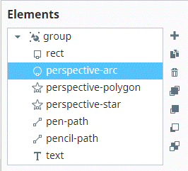
At the bottom of the Design Panel, the Elements subsection displays all elements in the drawing, listed in their layer order. You can manage the elements using the following icons located to the right of the list:
| Icon | Action | Description |
|---|---|---|
 | Add Group Element | Adds a new group to organize elements. |
| Duplicate Element | Duplicates the selected element. |
 | Delete Element | Deletes the selected element. |
| Bring to Front | Moves the selected element to the front of the layer stack. |
| Bring Forward | Moves the selected element forward by one layer. |
| Send Backward | Moves the selected element backward by one layer. |
| Send to Back | Moves the selected element to the back of the layer stack. |
Element Properties
Each element type has its own properties available in the Design Panel. Below are the tables for each type.
rect Element Properties
| Property | Description | Property Type |
|---|---|---|
| X | The x-coordinate of the rectangle's top-left corner. | value: numeric |
| Y | The y-coordinate of the rectangle's top-left corner. | value: numeric |
Mirror Horizontally | Flips the rectangle horizontally. | value: boolean |
Mirror Vertically | Flips the rectangle vertically. | value: boolean |
| W | The width of the rectangle. | value: numeric |
| H | The height of the rectangle. | value: numeric |
| Units | The units for width and height. | value: string |
| RX | Horizontal corner radius for rounding. | value: numeric |
| RY | Vertical corner radius for rounding. | value: numeric |
Make Corners Straight | Removes corner rounding, making all corners straight. | value: boolean |
| Opacity | Sets the rectangle's opacity. | value: numeric |
| Fill | The fill color of the rectangle. | value: color |
| Stroke | The stroke color of the rectangle. Click the Configure Stroke icon  for access to additional properties. Refer to the Stroke Configuration Menu for a full list of properties. for access to additional properties. Refer to the Stroke Configuration Menu for a full list of properties. | value: color |
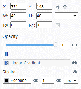
perspective-arc Element Properties
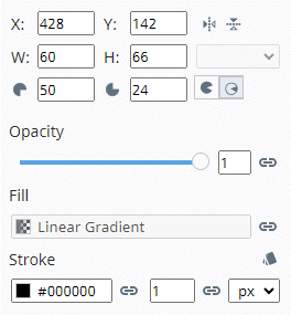
| Property | Description | Property Type |
|---|---|---|
| X | The x-coordinate of the arc's starting point. | value: numeric |
| Y | The y-coordinate of the arc's starting point. | value: numeric |
| Mirror Horizontally | Flips the arc horizontally. | value: boolean |
| Mirror Vertically | Flips the arc vertically. | value: boolean |
| W | The width of the arc. | value: numeric |
| H | The height of the arc. | value: numeric |
| Units | The units for width and height. | value: string |
Horizontal Radius | The radius along the horizontal axis. | value: numeric |
Vertical Radius | The radius along the vertical axis. | value: numeric |
Large Arc / Sweep | Toggle between large arc and sweep direction. | value: toggle |
| Opacity | Sets the arc's opacity. | value: numeric |
| Fill | The fill color of the arc. | value: color |
| Stroke | The stroke color of the arc. Click the Configure Stroke icon for access to additional properties. Refer to the Stroke Configuration Menu for a full list of properties. | value: color |
perspective-polygon Element Properties
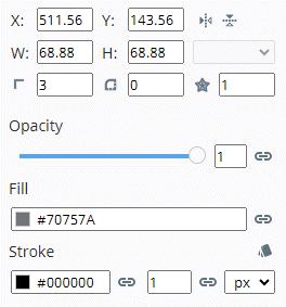
| Property | Description | Property Type |
|---|---|---|
| X | The x-coordinate of the polygon’s position. | value: numeric |
| Y | The y-coordinate of the polygon’s position. | value: numeric |
| Mirror Horizontally | Flips the polygon horizontally. | value: boolean |
| Mirror Vertically | Flips the polygon vertically. | value: boolean |
| W | The width of the polygon. | value: numeric |
| H | The height of the polygon. | value: numeric |
| Units | The units for width and height. | value: string |
Points | The number of points (vertices) in the polygon. | value: numeric |
Corner Radius | The radius applied to the polygon’s corners. | value: numeric |
Base Radius | The radius from the center to the midpoint of the sides. | value: numeric |
| Opacity | Sets the polygon's opacity. | value: numeric |
| Fill | The polygon's fill color. | value: color |
| Stroke | The polygon's stroke color. Click the Configure Stroke icon for access to additional properties. Refer to the Stroke Configuration Menu for a full list of properties. | value: color |
perspective-star Element Properties
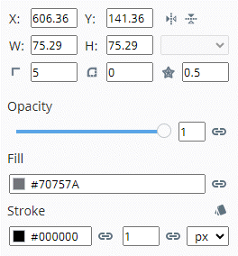
| Property | Description | Property Type |
|---|---|---|
| X | The x-coordinate of the star's position. | value: numeric |
| Y | The y-coordinate of the star's position. | value: numeric |
| Mirror Horizontally | Flips the star horizontally. | value: boolean |
| Mirror Vertically | Flips the star vertically. | value: boolean |
| W | The width of the star. | value: numeric |
| H | The height of the star. | value: numeric |
| Units | The units for width and height. | value: string |
| Points | The number of points on the star (default: 5). | value: numeric |
| Corner Radius | The radius applied to the star's corners. | value: numeric |
| Base Radius | The radius from the center to the midpoint of the sides (default: 0.5). | value: numeric |
| Opacity | Sets the star's opacity. | value: numeric |
| Fill | The star's fill color. | value: color |
| Stroke | The star's stroke color. Click the Configure Stroke icon for access to additional properties. Refer to the Stroke Configuration Menu for a full list of properties. | value: color |
pen-path Element Properties

| Property | Description | Property Type |
|---|---|---|
| X | The x-coordinate of the pen-path's starting point. | value: numeric |
| Y | The y-coordinate of the pen-path's starting point. | value: numeric |
| Mirror Horizontally | Flips the pen-path horizontally. | value: boolean |
| Mirror Vertically | Flips the pen-path vertically. | value: boolean |
| W | The width of the pen-path. | value: numeric |
| H | The height of the pen-path. | value: numeric |
| Units | The units for width and height. | value: string |
| Closed | Closes the path, connecting the last point to the first. | value: boolean |
| Opacity | Sets the pen-path's opacity. | value: numeric |
| Fill | The pen-path's fill color. | value: color |
| Stroke | The pen-path's stroke color. Click the Configure Stroke icon for access to additional properties. Refer to the Stroke Configuration Menu for a full list of properties. | value: color |
pencil-path Element Properties

| Property | Description | Property Type |
|---|---|---|
| X | The x-coordinate of the pencil-path's starting point. | value: numeric |
| Y | The y-coordinate of the pencil-path's starting point. | value: numeric |
| Mirror Horizontally | Flips the pencil-path horizontally. | value: boolean |
| Mirror Vertically | Flips the pencil-path vertically. | value: boolean |
| W | The width of the pencil-path. | value: numeric |
| H | The height of the pencil-path. | value: numeric |
| Units | The units for width and height. | value: string |
| Closed | Closes the path, connecting the last point to the first. | value: boolean |
| Opacity | Sets the pencil-path's opacity. | value: numeric |
| Fill | The pencil-path's fill color. | value: color |
| Stroke | The pencil-path's stroke color. Click the Configure Stroke icon for access to additional properties. Refer to the Stroke Configuration Menu for a full list of properties. | value: color |
text Element Properties
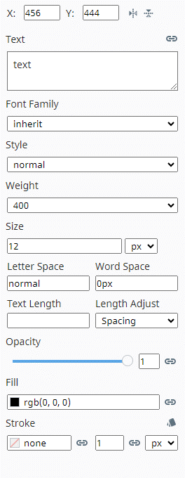
| Property | Description | Property Type |
|---|---|---|
| X | The x-coordinate of the text's position. | value: numeric |
| Y | The y-coordinate of the text's position. | value: numeric |
| Mirror Horizontally | Flips the text horizontally. | value: boolean |
| Mirror Vertically | Flips the text vertically. | value: boolean |
| Text | The content of the text element. | value: string |
| Font Family | Specifies the font family (e.g., Arial). | value: string |
| Style | Sets the font style (normal or italic). | value: string |
| Weight | Specifies the font weight (normal, bold, etc.). | value: string |
| Size | Specifies the font size and the units. | value: numeric |
| Letter Space | Controls the spacing between letters. Default is normal, which applies the default letter spacing of the current font. A value of 0 applies no additional spacing. | value: numeric |
| Word Space | Controls the spacing between words. | value: numeric |
| Text Length | Specifies the total length of the text. | value: numeric |
| Length Adjust | Adjusts the text length to fit the available space. | value: string |
| Opacity | Sets the text's opacity. | value: numeric |
| Fill | The text’s fill color. | value: color |
| Stroke | The text’s stroke color. Click the Configure Stroke icon for access to additional properties. Refer to the Stroke Configuration Menu for a full list of properties. | value: color |
gradient Element Properties

| Property | Description | Property Type |
|---|---|---|
| Opacity | Sets the gradient’s opacity. | value: numeric |
| Fill | Applies the gradient to the object's fill. | value: gradient |
| Stroke | Applies the gradient to the object's stroke. Click the Configure Stroke icon for access to additional properties. Refer to the Stroke Configuration Menu for a full list of properties. | value: gradient |
Stroke Configuration Menu
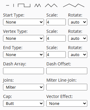
| Property | Description |
|---|---|
| Start Type | Defines the style of the stroke's starting point.
|
| Vertex Type | Determines how stroke joins are rendered at vertices.
|
| End Type | Defines the style of the stroke’s ending point.
|
| Dash Array | Defines a pattern of dashes and gaps for the stroke, where entered values are read in an alternating pattern of dash and gap lengths. Accepts a comma or spaces to separate values. For example, 6,8 would display a dash of 6 units followed by a gap of 8 units, and so on. If only a single value is provided, it is applied to both the dash and gap length. |
| Dash Offset | Specifies where to start the dash array pattern along the stroke. Accepts positive and negative values. |
| Joins | Controls how two segments of a stroke join at a vertex. |
| Miter Line-Join | Sets the maximum miter length when using miter joins. |
| Cap | Defines the shape of the stroke's end caps (e.g., butt, round, square). |
| Vector Effect | Specifies how the stroke is affected by transformations. |
Stroke Configuration Example
The following example displays applied Start Type, Dash Array, and Cap stroke properties for a perspective-arc, where the stroke fill is #000000 and 1px wide.
| Property | Value |
|---|---|
| Start Type | Square |
| Start Scale | 4 |
| Start Rotate | Auto |
| Dash Array | 1, 4 |
| Cap | Round |

Settings Panel
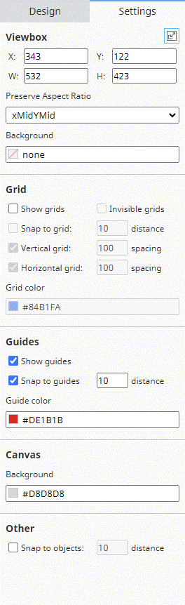
The Settings Panel in the Drawing Editor contains configuration options to control the viewBox, grids, guides, and other Drawing component properties. The panel is divided into several subsections:
Viewbox Properties

| Property | Description | Property Type |
|---|---|---|
Resize Viewbox to Content | Resizes the viewbox to fit the content inside. | value: boolean |
| X | The x-coordinate of the viewbox's origin. | value: numeric |
| Y | The y-coordinate of the viewbox's origin. | value: numeric |
| W | The width of the viewbox. | value: numeric |
| H | The height of the viewbox. | value: numeric |
| Preserve Aspect Ratio | Specifies how the viewBox's aspect ratio is maintained. | value: string |
| Background | The background color of the viewbox. | value: color |
Grid Properties

| Property | Description | Property Type |
|---|---|---|
| Show Grids | Toggles the visibility of grids on the canvas. | value: boolean |
| Invisible Grids | Enables invisible grids (snap to grids without showing them). | value: boolean |
| Snap to Grid | Enables snapping objects to grid lines. | value: boolean |
| Distance | Sets the snapping distance for grids. | value: numeric |
| Vertical Grid | Enables the vertical grid. | value: boolean |
| Vertical Grid Spacing | Sets the spacing for vertical grid lines. | value: numeric |
| Horizontal Grid | Enables the horizontal grid. | value: boolean |
| Horizontal Grid Spacing | Sets the spacing for horizontal grid lines. | value: numeric |
| Grid Color | Sets the color of the grid lines. | value: color |
Guides Properties

| Property | Description | Property Type |
|---|---|---|
| Show Guides | Toggles the visibility of guides on the canvas. | value: boolean |
| Snap to Guides | Enables snapping objects to guide lines. | value: boolean |
| Distance | Sets the snapping distance for guides. | value: numeric |
| Guide Color | Sets the color of the guide lines. | value: color |
Canvas Properties

| Property | Description | Property Type |
|---|---|---|
| Background | Sets the background color of the canvas. | value: color |
Other Properties

| Property | Description | Property Type |
|---|---|---|
| Snap to Objects | Enables snapping objects to other objects. | value: boolean |
| Distance | Sets the snapping distance for object snapping. | value: numeric |
Viewbox
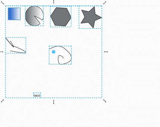
The Viewbox defines the visible area of the Canvas, establishing a coordinate system for your drawing. This controls the scaling and positioning of objects. The Viewbox can be adjusted to display a specific portion of the Canvas, and it is particularly useful when working with large or detailed drawings. You can adjust the Viewbox properties in the Settings Panel to resize, reposition, and preserve the aspect ratio of the drawing content.
Canvas
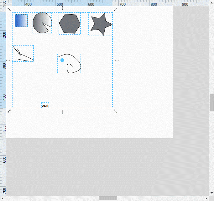
The Canvas is the primary workspace where you will create and edit vector drawings. The Canvas provides infinite space for designing and arranging elements.
Status Bar
The Status Bar displays helpful information such as the current mouse position, zoom level, and contextual tips depending on the active tool and editing state. This information is updated in real-time as you work on your drawing.
Closing the Editor

At the bottom of the Drawing Editor, you'll find the Apply and Cancel buttons. When you're finished with your edits, click Apply to save your changes to the drawing. If you do not want to save your changes, click Cancel to discard them.
You can also close the Drawing Editor by clicking the close button in the upper-right corner. If there are unsaved changes, a prompt will appear asking whether to apply the changes or discard them.