Easy Chart - Axes
Configuring Multiple Axes on an Easy Chart
The Easy Chart supports the use of multiple axes for displaying data from the Tag Historian.
To learn more, go to the Tag and Configuring Tag History pages. The examples below use OPC PC Tags from the Programmable Device Simulator driver, but Memory Tags can be used instead.
Now, let’s configure multiple axes on an Easy Chart component:
-
From the Component palette, drag an Easy Chart component to your workspace.
-
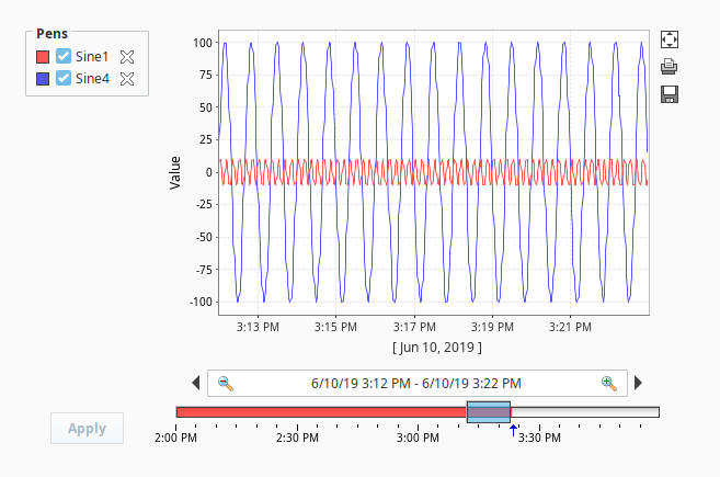
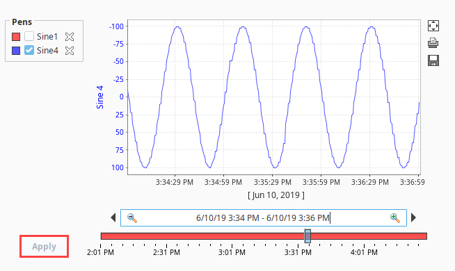
Next, drag your Tags over from the Tag Browser onto your Easy Chart. For the example, we used Sine 1 and Sine 4. Sine 1 and Sine 4 have completely different value ranges. Sine 1 values range between -10 and 10. Sine 4 values range between -100 and 100. Since both sines are on the same axis, it is hard to see the details of Sine 1 values because Sine 4 is throwing off the axis due to its wide range of values.
-
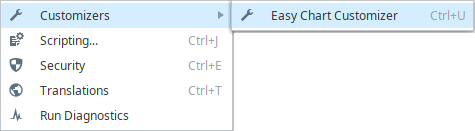
You have the option of putting Tags into different axes. You can do that in the Customizer of the Easy Chart component. Right click on the Easy Chart component and choose Customizers > Easy Chart Customizer.
-
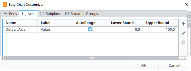
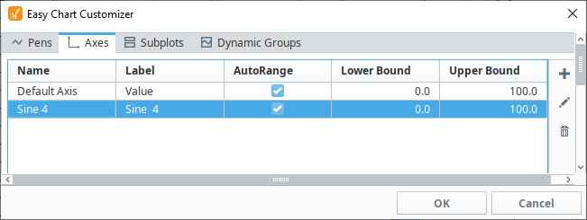
Click on the Axes tab. You'll notice that there is already one axis showing called Default Axis, which both Tags are sharing.
-
To add an axis, click on the Add
 icon.
icon. -
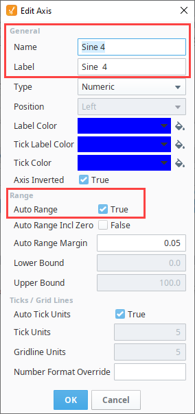
The Edit Axis window is displayed. Assign the Axis a name. In this example, it's the name of the Tag that is being used.
-
Enter a Label name, which is a name that you want users to see on your chart.
-
Select the Type of axis from the dropdown: Numeric, Logarithmic, or Symbol. This example uses the default, Numeric.
-
If desired, select the Label, Tick Label and Tick Color that you want to set for your axis.
The Position property determines which side of the chart the Axis should be drawn on. By default, this property is disabled because the Easy Chart automatically attempts to position each Axis. To manually determine the position of an Axis, locate the Auto Axis Positioning property in the Property Editor of the Easy Chart component, and set it to 'False'.
By default, the Auto Range is set to 'true' and will apply padding so the pens do not draw at the top and bottom of the axis. Instead of having the Easy Chart automatically determine the range, Auto Range could be set to 'false', in which case the Lower Bound and Upper Bound properties will determine the full range of the axis.
-
Now, you have two axes: Default Axis and Sine 4 axis.
-
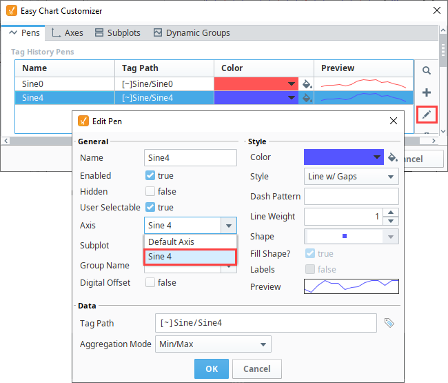
Once a new axis has been created, you need to assign a pen to the axis. Select the Pens tab, select the pen row you want to change, and click the Edit
 icon . This example uses the Sine 4 pen. In the Axis field, select the Sine 4 axis from the dropdown menu, and click OK to save the pen.
 -
Click OK again to close the Easy Chart Customizer.
-
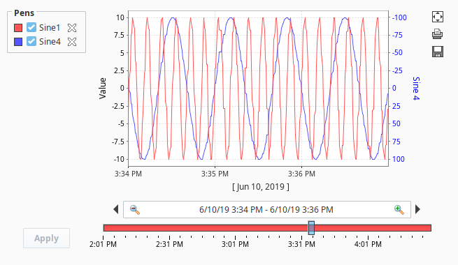
You'll notice that each pen is now in a different axis: Sine 1 is in the Default Axis, and Sine 4 is in the Sine 4 axis. On the right side, you can see Sine 4 axis and its values. On the left side, you can see the Default Axis (Sine 1) axis and its values. Now, you are using a different axis for each pen, and one pen is not going to throw off the values for the other pen.
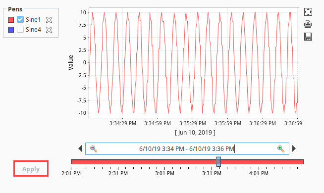
Hide Pens
You can also hide or turn off pens so they are not displayed on the Easy Chart. To only see values for the Sine 1 axis, go to Preview Mode, uncheck the Sine 4 pen, and click Apply. To see the values for only the Sine 4 axis, check the Sine 4 pen, uncheck the Sine 1 pen, and click Apply. Also important to note, auto positioning on the Easy Chart will automatically move the axis should pens assigned to an axis be removed.
| Sine 1 Pen | Sine 4 Pen |
|---|---|
 |  |
Configuring an Easy Chart using the Symbol Axis
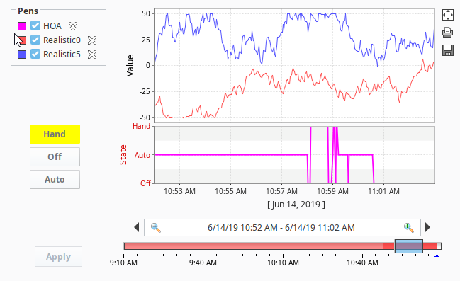
Another feature of the Easy Chart is the use of the Symbol Axis type. Instead of showing numerical values on the axis, the Symbol Axis type can show plain text on the axis.
The second subplot in this Easy Chart uses a Multi-State Button component to demonstrate the use of the Symbol Axis type. The Multi-State Button component is bound to an OPC Tag, and the value of the Tag is stored in the Tag History system. Instead of showing the numerical values '0,' '1,' and '2,' you can use plain text such as 'Hand,' 'Off,' and 'Auto.' This is helpful to an operator who immediately knows the state of the equipment instead of having to learn what the numeric values mean.
-
Click on your Easy Chart component, and select Customizers > Easy Chart Customizer.
-
Click on the Axes tab, then click the Add
icon to add an axis. -
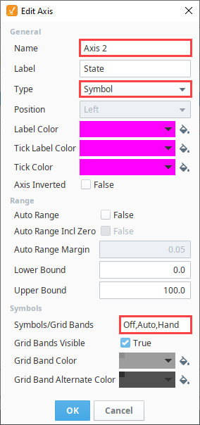
Enter a Name, we chose 'Axis 2'. Enter a Label, we called 'State'.
-
In the Type field, select 'Symbol' from the dropdown.
-
In the Symbols/Grid Bands field enter 'Auto,' 'Off,' and 'Hand' separated by commas, and no spaces. The order of the symbols when you type them in, will be ascending order on the axis.
-
Click OK once to close the Edit Axis window.
-
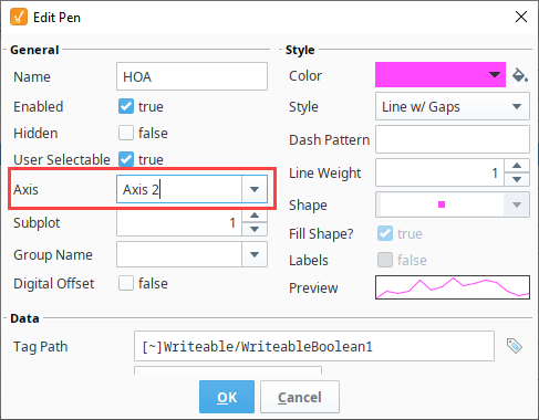
Next we need to assign the new axis to a pen. In the Easy Chart Customizer, click on the Pens tab.
-
Select the Pen that should use this new axis and click Edit
. -
Using the dropdown, set the Axis property to our newly created axis.
-
Press OK to close the Edit Pen window, and press OK again to close the Tag History Customizer.
-
Put the Designer in Preview Mode
 .
. -
Toggle the Multi-State buttons to begin logging data to your Easy Chart. Data for the Multi-State Button component is collected in the second subplot which is using the Symbol Axis type. The first subplot is data for another Tag using the Numeric Axis type.
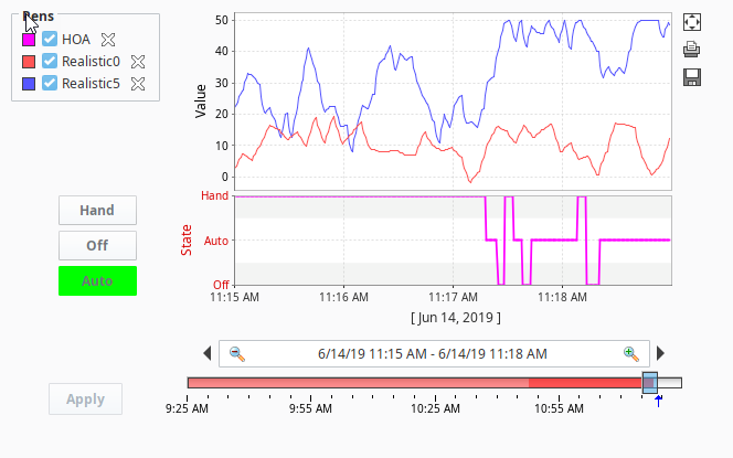
This Easy Chart example above shows the subplot feature of the Easy Chart component and how easy it is to break up the chart plot area into multiple distinct subplots sharing the same X axis. It is a good way to display lots of data from different Tags in one Easy Chart.