Other Vision Trending Charts
Aside from the Easy Chart and Classic Chart, there are several other types of charts contained in the Vision Module that can also visualize a trend and track a change in condition, output, or process through a single data point or multiple data points over time. This page describes the Sparkline and Status Charts and how they can be used.
Sparkline Chart

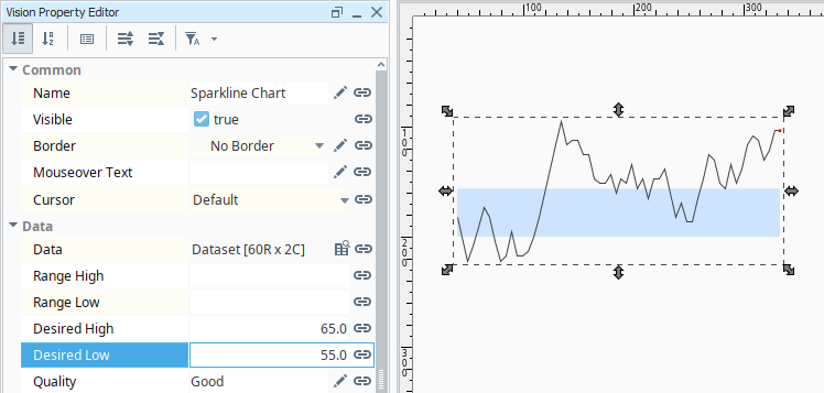
The Sparkline Chart is a minimalistic chart that displays a line-chart history for a single data point that fits well with High Performance HMI screens. It's a great way to show a lot of contextual information in a very small amount of space. It provides a fast way to display the recent history of a single data point so the viewer can quickly discern the most recent trend.
Note, the Sparkline Chart can not show multiple trends, however, multiple Sparkline Charts can be stacked. This chart is often laid over an image or level display to show a simple trend with the current value.
Usage
The trend on the Sparkline Chart is determined by the Data property located in the Property Editor. Bind the Data property to either a Tag Historian realtime query, or to a database query. The dataset should contain two columns: the first being a date, and the second a number/value.
Any additional columns in the dataset are ignored. Thus, the Sparkline Chart will only show a single pen per instance of the component. The data should be sorted by date in ascending order.
The red dot on the Sparkline Chart represents the most recent value. The Sparkline Chart can display a band of color across the back of the chart which indicates the desired operating range of the datapoint. Setpoints can be displayed on the chart by setting a value for the Desired High and Desired Low properties. This allows an easy way to view when the value fell out of bounds. Both properties must have a value for the Desired Range Color to appear.
Status Chart
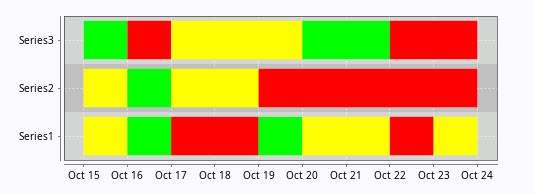
The Status Chart allows you to visualize the status of one or more discrete data points over a time range. The X-axis is always a time series axis, and the Y-axis is a category axis, with one entry per data series. The Status Chart is populated with the Series Data property in the Property Editor. This chart is good for showing machine states or HOA values over time. It is recommended to include some sort of Legend when using this chart.
Series Data
The first column of the Series Data property must be a datetime column. Each additional column should be numeric (the default columns are doubles). The order of the columns (left-to-right) determines the order of the entries on the chart (bottom-to-top). Because of this, re-ordering the entries would involve changing the order of the columns as they appear in the Series Dataset by modifying the mechanism that is populating the dataset (i.e., changing the order of columns in a query).
In Wide format, all of the columns but the first must be numeric. These "series" columns' headers will be used as the names on the y-axis. In Tall format, there should be exactly three columns. The first is the timestamp, the second is the series name, and the third is the value. For example:
Wide Format
| t_stamp | Valve1 | Valve2 |
|---|---|---|
| 2010-01-13 8:00:00 | 0 | 2 |
| 2010-01-13 8:02:00 | 0 | 2 |
| 2010-01-13 8:04:00 | 1 | 2 |
| 2010-01-13 8:06:00 | 1 | 1 |
| 2010-01-13 8:08:00 | 0 | 1 |
Tall Format
| t_stamp | Name | Value |
|---|---|---|
| 2010-01-13 8:00:00 | Valve1 | 0 |
| 2010-01-13 8:00:00 | Valve2 | 2 |
| 2010-01-13 8:02:00 | Valve1 | 0 |
| 2010-01-13 8:02:00 | Valve2 | 2 |
| 2010-01-13 8:04:00 | Valve1 | 1 |
| 2010-01-13 8:04:00 | Valve2 | 2 |
| 2010-01-13 8:06:00 | Valve1 | 1 |
| 2010-01-13 8:06:00 | Valve2 | 1 |
| 2010-01-13 8:08:00 | Valve1 | 0 |
| 2010-01-13 8:08:00 | Valve2 | 1 |
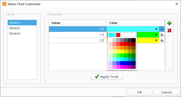
Color Mapping
Apart from getting the data into the series chart, the only other commonly configured option is the mapping of discrete values to colors. This is done in the Status Chart Customizer. Each named series can have its own mapping of colors, if desired. These mappings are stored in the expert-level dataset property Series Properties Data so they can be altered at runtime.