Using the Classic Chart
Chart
The Chart, sometimes referred to as the Classic Chart, is capable of rendering time series, XY, and Bar charts.
Configuration
The basic idea behind configuring the classic chart is simple: add datasets, and fill them in with data in a format that the chart understands. You add datasets to the chart using the chart's customizer. You then use a bindings to populate each dataset. Commonly you'll use a SQL Query Binding. Since these datasets are just normal dynamic properties, you can also access them via scripting.
The Customizer also lets you add additional X and Y axes. There are various types of axes and each works slightly differently. Lastly, you can configure additional properties for each dataset, such as which axis it maps to, its visual style, subplot, etc.
Datasets
Each dataset should define one or more "series" (a.k.a "pens"). The expected anatomy of a dataset for the Classic Chart depends on several settings: namely the Extract Order property on the chart, as well as the type of renderer specified in the Chart Customizer's Dataset Properties tab.
Binding Techniques
The classic chart can be used to make almost any kind of chart, with some effort. Historical, realtime, dynamic pen selection, etc., is all possible. Your job is just to fill the datasets with the pertinent data, and the chart will display it. The most common idea is to make the chart dynamic by varying the date range that the dataset's SQL Query bindings run. This is easy to do by adding a Date Range component and using Indirect Bindings.
Chart Type: XY vs Category
The classic chart is typically in XY Plot mode. This means that the X-axis is either date or numeric, and the Y-axes are numeric. If your X-axis is categorical (names, not numbers), you can switch the Chart Type property to Category Chart in the Property Editor. Don't be surprised when you get a few errors - you'll need to go and switch your X-axis to be a Category Axis, and fill your dataset in with valid category data, that is, String-based X-values. This is most often used with the Bar Renderer (see the Chart Customizer).
Populating a Chart with Data
Populating the Classic Chart involves using Custom Properties to collect data. New Custom Properties are added to the component via the Chart Customizer. Multiple dataset properties may be configured on the component, and each additional dataset will show as a new subplot. Populating the Chart with historical data involves populating one of these Custom Properties.
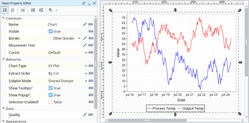
The default configuration of the component expects a dataset where the first column is a timestamp (the first column always acts as the domain for the chart), and sequential columns are pens that should be drawn on the chart. The default dataset contains a t_stamp column with values for the domain, and two columns (Process Temp and Output Temp) with values that will be drawn against the range.
Example - Tag History
The Classic Chart is initially configured in a manner that easily displays Tag History with a Tag History Binding.
-
Drag a Chart component onto a window.
-
In the Vision Property Browser, scroll down to the Data property. It should be located at the bottom of the Property Editor when sorted by section. Click the Binding
 icon.
icon. -
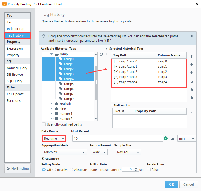
Select Tag History from the Tag section of the Binding window.
-
Browse the Available Historical Tags. For this example, we chose some ramp Tags. Drag the Tags over to the Selected Historical Tags table on the right of the window.
-
Change the Date Range to Realtime with a Most Recent set to 10 minutes.
-
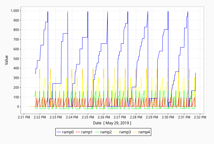
Click the OK button. The Chart will now show Tag History from the Tags you selected.
Note that the timestamp has automatically been included as the first column, so the domain has been automatically configured for you. If you wish to change the orientation of the axes, use the Chart Orientation property in the Property Editor to swap the position of the Domain and Range axes.
Customizing a Chart
Once trends are present on the chart, additional customization can be achieved through the Chart Customizer. When you open the customizer, you'll notice five tabs at the top: Dataset, X-Axes, Y-Axes, Dataset Properties, and Plot Properties. Each tab has its own set of properties and defaults.
An overview of each section in the Chart Customizer is listed below:
- Datasets: Allows additional datasets to be added to the component. Each dataset will appear as a separate custom property on the component. Data from multiple charts can be drawn on the same chart.
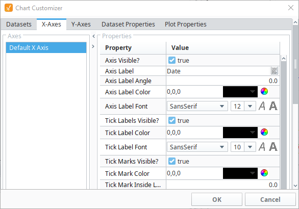
- X-Axes and Y-Axes: Allows for the creation of new X and Y Axes on the chart. There are six types of axes to choose from when configuring a chart, each having its own list of properties: Number Axis, Date Axis, Category Axis, Logarithmic Axis, Elapsed Axis, and Symbols Axis. Most of the X and Y axes properties are used in the customizer, and some properties are specific to the axis type and have their own unique properties. See the Chart Customizer page for more information on types of axis, associated properties, and examples.
- Dataset Properties: Specify which axes should a be used with each dataset. Also allows you to specify which subplot each dataset should be shown on.
- Plot Properties: Configure the look of each plot.
Chart Customizer Example
This example walks you through adding a new dataset to a chart, and modifying the existing chart properties using the Chart Customizer. When you first drag a chart to your window, you'll notice that it will display some data, that's because it's using the default dataset provided. For this example, you can add a new dataset by either copying and pasting the one below, or adding your own.
-
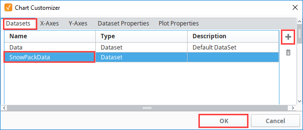
Let's add a new dataset (i.e., SnowPackData) that measures the Snow Pack Level for the month of February. Double click on the chart to open the Chart Customizer.
-
Go to the Datasets tab click the Add (
 ) icon to add a new dataset.
 -
Enter the Dataset name and then click OK.
-
In the Vision Property Editor, click on the Dataset Viewer
 icon.
icon.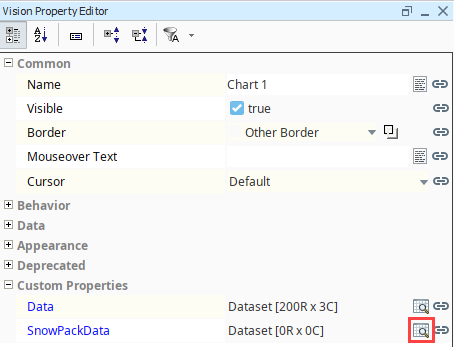
-
Highlight and copy the dataset below, then click the Paste Dataset from Clipboard
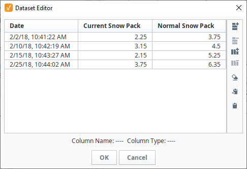
 icon.Classic Chart - SnowPack Dataset
"#NAMES"
"Date","Current Snow Pack","Normal Snow Pack"
"#TYPES"
"date","F","F"
"#ROWS","4"
"2018-02-02 10:41:22","2.25","3.75"
"2018-02-10 10:42:19","3.15","4.5"
"2018-02-15 10:43:27","2.15","5.25"
"2018-02-25 10:44:02","3.75","6.35" -
The data will appear in the Dataset Viewer. Click OK to save the dataset.
-
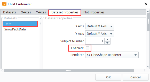
The Chart component is now displaying both the default dataset and SnowPackData dataset. Let's disable the default database. Open the Chart Customizer and go to the Dataset Properties tab.
-
Select the default dataset (i.e., Data) and uncheck the Enabled? box.
-
Click OK. You'll notice the chart is now only displaying the values for the new dataset (i.e., SnowPackData).
-
This step uses the default Number Axis type, but if you want to add a new Axis Type, go the X and Y Axes tabs and select a new Axis type.
-
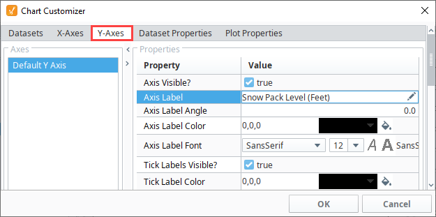
Next, let's change a few visual properties on our chart. Go to the Y-Axes tab and select Default Y Axis, and change the Axis Label (i.e, Snow Pack Level (Feet)).
-
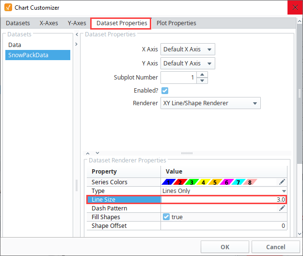
Lastly, let's make the plot lines thicker on the chart. Go to the Dataset Properties tab, and change the Line Size renderer property from 1.0 to 3. 0.
-
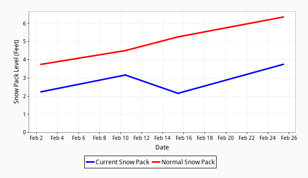
Here is the chart with the new dataset and updated properties. As you can see, you can easily configure additional properties for a dataset, as well as choose from a host of visual style properties to design your charts using the Chart Customizer.
Adding a Second Dataset to a Chart
In this example, we'll add a separate dataset to the chart.
-
Double click on the Chart component to open the Chart Customizer (or right-click and select Customizers > Chart Customizer).
-
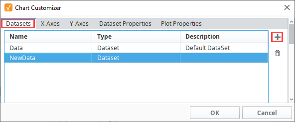
Once the Chart Customizer is open, make sure the Datasets tab is selected, and click the Add
icon to add a new dataset. -
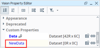
A new row will appear. Give the new dataset a name by typing into the cell under the Name column. We'll call it NewData.
-
Click the OK button.
-
Check the bottom of the Property Editor. The newly created dataset will appear and may now be populated with data.
-
Now that we have a new dataset, you can add data however you like and it will show up in a second subplot.