XY Chart Example - Line Chart Target Area
This example demonstrates how to utilize the line.open property to create a target zone. Target zones can be used to represent acceptable values for the data that is displayed to make it obvious if values are good or bad.

Although, there are many ways to enter data values and high/low limit values for a line chart, the data used in this example is shown in the code block below. Copy the JSON content below and paste it onto the Chart component's dataSources.example property.
[
  {
    "date": "2023-7-12 07:00:00",
    "actual": 128,
    "highLimit": 150,
    "lowLimit": 125
  },
  {
    "date": "2023-7-13 07:00:00",
    "actual": 130,
    "highLimit": 150,
    "lowLimit": 125
  },
  {
    "date": "2023-7-14 07:00:00",
    "actual": 115,
    "highLimit": 150,
    "lowLimit": 125
  },
  {
    "date": "2023-7-15 07:00:00",
    "actual": 133,
    "highLimit": 150,
    "lowLimit": 125
  },
  {
    "date": "2023-7-16 07:00:00",
    "actual": 142,
    "highLimit": 150,
    "lowLimit": 125
  },
  {
    "date": "2023-7-17 07:00:00",
    "actual": 136,
    "highLimit": 150,
    "lowLimit": 125
  }
]
Before creating a target zone, we must first adjust some of the default XY Chart settings to display the actual values from our example data source on the line chart:
-
Remove the legend by setting legend.enabled to false.
-
Navigate to the xAxis property to set the xAxis.0.name and xAxis.0.label.text properties. In this example, the name will be time and the label.text property will be set to Time.
-
Make sure the xAxes.0.render property is set to date and set your xAxes.0.date format if needed. This example uses date for the xAxes.0.date.inputFormat and xAxes.0.date.format properties.
-
Navigate to the yAxes property and delete the yAxes.1 array that is loaded by default.
-
Then, set the yAxes.0.name and label.text properties. In this example, the name will be count and the label.text property will be set to Count.
-
Now, set the following series.0 properties to display the actual values:
- name: actual
- data.source: example
- data.x: date
- data.y: actual
- xAxis: time
- yAxis: count
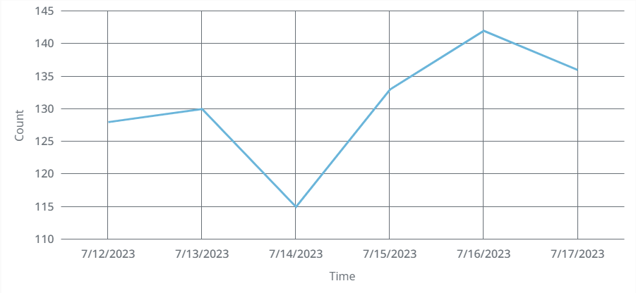
Now, you'll see a line chart that displays the actual values. However, there is still no clear way to tell if these values are good or bad. This will be achieved by creating two more series using the high and low limit data already built into our data source.
-
Create a new series and set the following series.1 properties to display the acceptable high limit area.
- name: highLimit
- data.source: example
- data.x: date
- data.y: highLimit
- xAxis: time
- yAxis: count
- render: line
- line.open.y: lowLimit
- line.appearance.fill.color: #FF8C00
- line.appearance.fill.opacity: 0.125
-
Duplicate series.1 and change the following series.2 properties to display the acceptable low limit area.
- name: lowLimit
- data.y: lowLimit
- line.open.y: highLimit

With the high and low limit areas displayed, it is now easy for any user to see that all counts were within the acceptable range, except for on 7/14/2023.