Version: 8.1

Perspective - Time Series Chart

" "

Component Palette

" "

The Time Series component provides an efficient way to visualize data from a variety of different data sources as chart data. Time series chart requires that the X axis of the chart represents time and the Y axis represents values. The Time Series Chart includes the following features:

  • Zoom or pan in and out via mouse wheel interaction.
  • X-Trace display showing data at the hovered time position.
  • Multiple chart display types (Area, Bar, Line, and Scatter).
  • Multiple Y axes with the ability to align to the left or right side of the chart.
  • Multiple plots as well as multiple trends per plot.
  • Baselines and markers.
  • Custom axes.
  • Time range showing the overall range of the data being displayed in the chart
  • Simple display customization for the axes, different trend display types, baselines, and markers.
  • Label and Title properties have their own dedicate styling properties, such as color and size.

By default, the charts contain example data, but typically a tag history binding or named query binding will be used to feed data to the charts.

The Chart Range Selector provides a complement to this chart. The Time Series Chart and Chart Range Selector components are most powerful when paired together.

New in 8.1.2
The Time Series Chart component has four pre-configured [variants](/docs/8.1/ignition-modules/perspective/working-with-perspective-components/):
  • Line chart - Default layout with appearance of a line chart.
  • Area chart - Layout set up as an area chart.
  • Bar chart - Layout set up as a bar chart.
  • Scatter chart - Layout set up as a scatter chart.

User Interaction​

InteractionDescription
ZoomThe user can zoom in and out on the Time Series chart. When zoomed to any level past its base time range, the Time Series chart will display a zoom reset " " icon in the upper right corner. Click on the icon to return the chart to its base range. Note that the range will not refresh while zoomed in.

Changed in 8.1.17
When pen data sources change, the zoom level will be reset to its base time range.
PanThe user can pan across the Time Series chart. When panned past its base time range, the Time Series chart will display a pan reset " " icon in the upper right corner. Click on the icon to return the chart to its base range. Note that the range will not refresh while panning.
Pinch ZoomOn a mobile device, the user can pinch-zoom the Time Series chart. Zooms must originate from within the boundaries of the displaying chart data.
Tracker PositionOn a mobile device, t he user can move the tracker position on the Time Series chart via touch.

Properties​

Most Properties have binding options. For more information on Bindings, see Types of Bindings in Perspective. This section only documents the Props Category of properties. The other Categories are described on the Perspective Component Properties page.

NameDescriptionProperty Type
enablePanZoomAllows the chart to be panned and zoomed. The chart cannot be zoomed out past its base range.value: boolean
autoGenerateSeriesNames
New in 8.1.31
If true, auto generates series names if no name is provided. This helps prevent the series name from resetting to the default value when the series name is provided by a binding.
value: boolean
seriesA list of series entries used as the base data source for the chart display. Each series will be a new line drawn on the chart. At a minimum, the Time Series component requires at least one complete series entry to display data. With no other configuration provided, an initial display will be created from the series data (required).
  • name: The name of the series. A name must be provided or one will be added. This will also be used as the label of the auto-generated Y axis in the chart (required). Value is string.
  • data: Data can be an object containing a time entry and value entries (all must be numbers) (required).

    Each value entry must be labeled with the column name to which it corresponds. Data can also be an array containing value entries (all must be numbers). Each value entry consists of a timestamp (which must be the first value) and one or more values that were captured at that time. Finally, data can also be in the form of a DataSet, for example, the data property can be bound to a Tag History binding to display either realtime data, or historical data (via start and end dates).

    Note: When using a dataset, the Time column should be the first column. Value can be object or array
  • array
    plotsA list of plots (subplots) for the chart. At least one entry is required. Plot entries contain properties that allow much finer control over the way that the series data can be displayed. Each plot will be represented by its own row in the component (plots always stretch to fill the width of the chart).
  • relativeWeight:
    New in 8.1.23
    Relative weight sets the amount of height space plots take up in a Time Series Chart when multiple plots are included. By default, plots are drawn using equal height with a value of 1. Customizing the value adjusts the plot height to the corresponding ratio of available space in the chart. Value is numeric.
  • trends: If specified, a trend will become the display mechanism for the plot in which it resides. It describes the way that the data should look, and provides different display types as opposed to the line display type that is provided when building from series data. Multiple trends will be built on top of each other in the same plot. An axis will be generated for each trend , unless they share a common axis (either custom created, or generated from series data). Note: When making changes to a setting under trends, an axis must also be defined under plots.axes
    • visible: If specified, this is the visible state of the trend. If not visible, the trend data will be hidden, but the time range of the trend will still be represented in the overall time range of the plot. Value is boolean.
    • type: The type of chart to create (required). Options are area, bar, line, and scatter. Value is string.
    • series: The series used to feed data to this trend (required). Value is string.
    • interpolation: The type of curve that should be used to draw the line portion of the chart. Options are: curveBasis, curveBasisOpen, curveCardinal, curveCardinalOpen, curveCatmullRom, curveCatmullRomOpen, curveLinear, curveMonotoneX, curve MonotoneY, curveNatural, curveStep, curveStepAfter, curveStepBefore.

      More information on the interpolation methods above can be found in D3's documentation. Value is string
    • breakLine: This property will be available when a trend of type line is being used. If true, the line will be broken on either side of missing data values. If false, missing data values are removed and the adjoining points are connected. Value is boolean.
    • stack: This property will be available when a trend of type area or bar is being used. If true, the multiple columns of the chart will stack on top of each other. Value is boolean.
    • axis: If specified, the name of an axis that is described in the axesproperty of the plot to which this trend belongs. This axis will be used as the Y axis for the trend. Value is string.
    • radius: This property will be available when a trend of type scatter is being used. A number specifying the radius (in pixels) of the displaying points. Value is numeric.
    • columns: If provided, only the columns in this list will be shown. Any style properties provided here will also override any existing style currently in place. Click to see columns properties.
    • baselines: If specified, a line will be drawn on the trend based upon a given type of functionality. Click to see baselines properties.
  • axes: A list of axis entries for that can be used for the plot. These can be used to override the Y Axis that is generated based on data in the series to which each trend is bound. Note: When making changes to a setting under axes, a trend must also be defined under plots.trends. Click to see axes properties.
  • markers: Settings for the markers, a list of visual indicators that can be added to the plot (optional). These are meant to draw emphasis to the data. In this first release, the line marker will be the only available option. Click to see markers properties.
  • array
    titleSettings for the title of the chart.
  • visible: Indicates whether or not the title is visible. Default is false. Value is boolean.
  • text: Text for the title of the chart. Value is string.
  • height: The vertical space taken up by the title. Value is numeric.
  • font: Title font configuration.
    • color: Color of the title text. Can be chosen from color wheel, chosen from color palette, or entered as RGB or HSL value. See Color Selector. Value is string.
    • size: The font size, in pixels, of the title text. Value is numeric.
  • style: Sets a style for the title. Full menu of style options is available for text, background, margin and padding, border, shape and miscellaneous. You can also specify a style class.
  • object
    timeAxisThis property provides settings for the X Axis. Note that multiple plots share the same axis. (required)
  • visible: The visible state of the the axis. Value is boolean
  • tickCount: The number of ticks on the axis (as a multiple of 2, 5, or 10).

    New in 8.1.22
    Setting the tickCount to 0 will automatically scale the chart's X Axis based on the zoom level, panning, and scrolling. Value is numeric
  • height: The height of the axis. Value is numeric
  • color: The color of the axis. Can be chosen from color wheel, chosen from color palette, or entered as RGB or HSL value. See Color Selector. Value is string
  • tick: The configuration of the ticks on the axis. Click to see tick properties.
  • grid:
    New in 8.1.16
    Configuration for gridlines to display on this axis.
    • visible: Visible state of the gridlines. Gridlines are shown only for axes that connect directly to the chart. Any satellite axes will display their tick configurations instead of gridlines. Value is boolean.
    • color: Color of the gridlines.
    • opacity: Opacity of the gridlines. Value is numeric.
    • dashArray: Dashed appearance of the gridlines. Value is numeric.
  • style: A style object containing properties which are applied to the horizontal line of the axis. Any property that would apply to an SVG line element can be used here. See also style options.
  • object
    timeRangeAn object describing the presentation of the time range display below the chart.
  • visible: The visible state of the time range display as a whole. Value is boolean.
  • dateFormat: The date format of the range using a MomentJS date string. Value is string.
  • timeFormat: The time format of the range using a MomentJS date string. Value is string.
  • object
    xTraceConfiguration to build the x-trace display when hovering over the chart.

    New in 8.1.13
    The X Trace display now supports numeric locale formatting. Numeric values are automatically formatted based on the session locale and the dataFormat, dateFormat, and timeFormat properties.
  • value: A read only timestamp representing the current x-trace position. If there is no active x-trace position, this value will be an empty string. Value is string.
  • visible: The visible state of the x-trace display. Value is boolean.
  • infoBox: Configuration to build the box portion of the x-trace display.
    • visible: The visible state of the box. Value is boolean.
    • showTime: Whether to display the timestamp of the current X Trace value above the info box. Value is boolean.
    • width: Width of the info box, in pixels. Value is numeric.
    • dateFormat: The date format of the xtrace date/time display using a Momentjs date string ( https://momentjscom/). Options are: [7-18-2019], [2019-7-18], [07-18-2019], [2019-07-18], [Jul 18th 19], [Jul 18th 2019], or none. Value is string.
    • timeFormat: The time format of the xtrace date/time display using a MomentJS time string (https://momentjs.com/). Options are: 12 hour [8:41:06], 12 hour w/ period [8:41:06 AM], 24 hour [08:41:06], 24 hour w/milliseconds [08:41:06:269], Unix Millisecond Timestamp [1563464737269], Unix Timestamp [1563464737], or none. Value is string.
    • dataFormat: A NumeralJS value used to format the data found at the current timestamp of the X Trace display. See numeral.js for a list of available data formats. Options are: number [1,000.12], integer [1,200], four decimal precision [1.1200], percent [10.12%], scientific [1.01E+03], accounting [$(1,000.12)], financial [(1,000.12)], currency [$1,000.12], currency (rounded) [$1,012], duration [24:01:00], abbreviation [1.2k], or ordinal [100th]. Value is string.
    • stroke: A configuration object describing the properties that will be applied to the stroke of the box display. Click to see stroke properties.
    • fill: A configuration object describing the properties that will be applied to the fill of the box display. Click to see fill properties.
    • font:
      New in 8.1.17
      A configuration object describing the properties that will be applied to the font of text in the infoBox. Click to see font properties.
    • style: Custom CSS styles to apply to the info box. Any style that applies to an SVG line element can be used. See also style options.
  • line: Configuration to build the vertical line portion of the x-trace display. Value is string.
    • visible: The visible state of the line. Value is boolean.
    • color: The color of the line. Can be chosen from color wheel, chosen from color palette, or entered as RGB or HSL value. See Color Selector. Value is string.
    • width: The width of the line, in pixels. Value is numeric.
    • opacity: The opacity of the line, ranging from 0 to 1. 0 is fully transparent, 1 is fully opaque. Value is numeric.
    • dashArray: The dashed appearance (SVG dashed array) of the line. It's a list of space separated lengths (in pixels) and percentages (percentage of the total stroke length) that specify the lengths of alternating dashes and gaps. If an odd number of values is provided, then the list of values is repeated to yield an even number of values. Thus, "5,3,2" is equivalent to "5,3,2,5,3,2". Value is numeric.
    • style: Custom CSS styles to apply to the line. Any style that applies to an SVG line element can be used. See also style options
    object
    legendConfiguration for the display and position of the legend for the Time Series Chart.
  • visible: The visible state of the legend. Default is false. Value is boolean.
  • position: The position of the legend. Options are top, right, bottom, or left. Value is a dropdown string.
  • style: A style object containing properties which are applied to the legend. See also style options. You can also specify a style class
  • object
    defaultStylesAn object providing style settings to the chart trends as a whole.
  • colorScheme: Specifies a Color Brewer color scheme to use on the series. See ColorBrewer2.org for available color schemes. Value is string.
  • colors: A list of colors to apply to the columns (in order) for each trend. If these values are provided, they will override the value provided for the colorScheme. Value is string.
  • normal: An object providing style configuration for the “normal” state (no user interaction) of a column, or data entry, in a trend. Any color values specified here will override values set in the colorScheme or colors properties.
  • highlighted: An object providing style configuration for the “highlighted” state (mouse hover) of a column, or data entry, in a trend. Any color values specified here will override values set in the colorScheme or colors properties. The highlighted property uses the same configuration properties as the 'normal' property above.
  • selected: An object providing style configuration for the “selected” state (mouse click) of a column, or data entry, in a trend. Any color values specified here will override values set in the colorScheme or colors properties.
  • muted: An object providing style configuration for the “muted” state (non selected) of a column, or data entry, in a trend. Any color values specified here will override values set in the colorScheme or colors properties.

  • Click to see the related stroke and fill properties.
    object
    styleSets a style for this chart. Full menu of style options is available for text, background, margin and padding, border, shape and miscellaneous. You can also specify a style class .object

    plots.trends.columns Properties​

    A column contains the following properties:

    NameDescriptionProperty Type
    keyThis needs to match a column name from the series to which this trend is bound (required). Once in place, this will allow the style configuration provided here to override the styles provided in the defaultStyles property.value: string
    colorIf provided, this value will override any previous color values for the column (both stroke and fill). Can be chosen from color wheel, chosen from color palette, or entered as RGB or HSL value. See Color Selector.value: string
    stylesIf provided, the styles for the state values listed here will override any previous state values.
  • normal: Takes the same configuration options as the same named state value under the defaultStyles property.
  • highlighted: Takes the same configuration options as the same named state value under the defaultStyles property.
  • selected: Takes the same configuration options as the same named state value under the defaultStyles property.
  • muted: Takes the same configuration options as the same named state value under the defaultStyles property.
  • object

    plots.trends.baselines Properties​

    NameDescriptionProperty Type
    visibleWhether the baseline is visible or not.value: boolean
    functionThe type of baseline that will be drawn (required). Options are min, max, avg, ucl (upper control limit), and lcl (lower control limit).value: string
    columnThe column against which the baseline should be calculated. If not specified, the first column in the series to which the trend is bound will be used.value: string
    axisThe axis against which the baseline should be calculated. The trend must be bound to an axis for this to work correctly.value: string
    colorThe color of the line. Can be chosen from color wheel, chosen from color palette, or entered as RGB or HSL value. See Color Selector.value: string
    widthThe width of the line, in pixels.value: numeric
    opacityThe opacity of the line, ranging from 0 to 1. 0 is fully transparent, 1 is fully opaque.value: numeric
    dashArrayThe dashed appearance (SVG dashed array) of the line. The pattern of dashes and gaps used to paint the stroke. It's a list of space separated lengths (in pixels) and percentages (percentage of the total stroke length) that specify the lengths of alternating dashes and gaps. If an odd number of values is provided, then the list of values is repeated to yield an even number of values. Thus, "5,3,2" is equivalent to "5,3,2,5,3,2".value: numeric
    labelThe configuration used for the label drawn on the baseline.
  • text: The label text. Value is string.
  • position: The position of the label relative to the baseline. Value is string.
  • font: The font style for the label.
    • color: The color of the label text. Value is string.
    • size: The font size, in pixels, of the label text. Value is numeric.
  • style: Custom CSS styles to apply to the baseline label. Any style that applies to an SVG text element can be used. See also style options.
  • object

    plots.axes Properties​

    An axis entry has the following properties:

    NameDescriptionProperty Type
    nameThe name of the axis (required). Also used as the display label of the axis.value: string
    minThe minimum value of the axis (required). If no value is specified, auto range will be used. A minimum value will be calculated from the data bound to this axis.value: numeric
    maxThe maximum value of the axis (required).

    The maximum range value of the axis. If no value is specified, auto range will be used. A maximum value will be calculated from the data bound to this axis
    value: numeric
    alignmentThe side of the trend upon which the axis should be presented (required).value: string
    widthThe width of the axis, in pixels (required).value: numeric
    labelThe configuration of the Y axis label.
  • visible: Whether or not the label is visible. Value is boolean.
  • text: The text for the label. Value is string.
  • offset: Offset the Y axis label from its default position. This allows you to fine tune the label location, which may be necessary depending on the scale and how much room the tick labels take up. This may be positive or negative. Value is numeric.
  • font: The settings for the label's font.
    • color: The color of the label text. Value is string.
    • size: The font size, in pixels, of the label text. Value is numeric.
  • style: Custom CSS styles to apply to the Y axis label. Any style that applies to an SVG text element can be used. See also style options.
  • object
    tickThe configuration for the ticks drawn on the axis.
  • color: The color of the ticks. Can be chosen from color wheel, chosen from color palette, or entered as RGB or HSL value. See Color Selector. Value is string.
  • count:
    New in 8.1.11
    Number of ticks to display on the Y axis. Default value is Auto. When the tick count is Auto, Y axis ticks will be added/removed based on the height of the chart, and the tick spacing is adjusted around whole numbers. Value is numeric or string.
  • label: The settings for the label on the tick.
    • format:
      New in 8.1.11
      Sets the numeric format for the tick label. The value must be a valid D3 Format value. Default value is Auto. When the tick label format is Auto, the D3 format ~f is used. This creates a fixed point that will trim any insignificant trailing zeroes.
      Changed in 8.1.13
      The Y axis now supports numeric locale formatting. Numeric values are automatically formatted based on the session locale and the tick.label.format property. Value is string.
    • font: The font style for the label. Click to see font properties.
    • style: Custom CSS styles to apply to the baseline label. Any style that applies to an SVG text element can be used. See also style options.
  • style: Custom CSS styles to apply to the ticks. Any style that applies to an SVG text element can be used. See also style options.
  • object
    grid
    New in 8.1.16
    Configuration for gridlines to display on this axis.
  • visible: Visible state of the gridlines. Gridlines are shown only for axes that connect directly to the chart. Any satellite axes will display their tick configurations instead of gridlines. Value is boolean.
  • color: Color of the gridlines.
  • opacity: Opacity of the gridlines. Value is numeric.
  • dashArray: Dashed appearance of the gridlines. Value is numeric.
  • style: Style for the gridlines. Full menu of style options is available. You can also specify a style class.
  • object

    plots.trends.axes.tick.label.font Properties​

    NameDescriptionProperty Type
    colorThe color of the label text.value: string
    sizeThe font size, in pixels, of the label text.value: numeric

    plots.markers Properties​

    NameDescriptionProperty Type
    visibleIndicates whether or not the marker is visible.Value is boolean
    valueThe numeric value represented by the marker.Value is numeric
    typeThe type of marker. Currently the only option is line.Value is string
    axisThe axis against which the marker should be drawn (required).Value is string
    lineThe configuration for the line portion of the marker.
  • width: The width of the marker line, in pixels. Value is numeric.
  • color: The color of the marker line. Can be chosen from color wheel, chosen from color palette, or entered as RGB or HSL value. See Color Selector. Value is string.
  • opacity: The opacity of the marker line, ranging from 0 to 1. 0 is fully transparent, 1 is fully opaque. Value is numeric.
  • dashArray: The pattern of dashes and gaps (SVG dashed array) used to paint the marker line. It's a list of space separated lengths (in pixels) and percentages (percentage of the total stroke length) that specify the lengths of alternating dashes and gaps. If an odd number of values is provided, then the list of values is repeated to yield an even number of values. Thus, "5 3 2" is equivalent to "5 3 2 5 3 2". Value is numeric.
  • label: The configuration for marker's label.
    • text: The marker label text. Value is string.
    • position: The position of the label relative to the line. Value is string.
    • font: The font settings for the label. Click to see font properties.
    • style: Custom CSS styles to apply to the marker line. Any style that applies to an SVG line element can be used. See also style options.
  • style: Custom CSS styles to apply to the marker line. Any style that applies to an SVG line element can be used. See also style options.
  • object

    plots.markers.line.label.font Properties​

    NameDescriptionProperty Type
    colorThe color of the label text. Can be chosen from color wheel, chosen from color palette, or entered as RGB or HSL value. See Color Selector.value: string
    sizeThe font size, in pixels, of the label text.value: numeric
    styleCustom CSS styles to apply to the marker label. Any style that applies to an SVG text element can be used. See also style options.object

    timeAxis.tick Properties​

    NameDescriptionProperty Type
    colorThe color of the ticks. Can be chosen from color wheel, chosen from color palette, or entered as RGB or HSL value. See Color Selector. Value is string
    labelThe configuration of the label drawn on the tick.
  • angled: If set to true, the tick labels will be angled rather than horizontal. Value is boolean
  • format: The date/time format displayed by each tick using a MomentjS date string ( https://momentjs.com/).

    Default is “Auto”, where the property attempts to figure out the best format.

    For a listing of suggested formats, refer to https://momentjs.com/docs/#/parsing/string-format/. Value is string.
  • font: The settings for the label's font.
    • color: Color of the label text. Value is string.
    • size: The font size, in pixels, of the label text. Value is numeric.
  • style: Custom CSS styles to apply to the tick labels. Any style that applies to an SVG text element can be used. See also style options.
  • object

    xTrace.infoBox.stroke Properties​

    NameDescriptionProperty Type
    colorThe color of the box stroke. Can be chosen from color wheel, chosen from color palette, or entered as RGB or HSL value. See Color Selector.value: string
    widthThe width of the box stroke, in pixels.value: numeric
    opacityThe opacity of the box stroke, ranging from 0 to 1. 0 is fully transparent, 1 is fully opaque.value: numeric
    dashArrayThe dashed appearance (SVG dashed array) of the box stroke. It's a list of space separated lengths (in pixels) and percentages (percentage of the total stroke length) that specify the lengths of alternating dashes and gaps. If an odd number of values is provided, then the list of values is repeated to yield an even number of values. Thus, "5,3,2" is equivalent to "5,3,2,5,3,2".value: numeric

    xTrace.infoBox.fill Properties​

    NameDescriptionProperty Type
    colorThe color of the box fill. Can be chosen from color wheel, chosen from color palette, or entered as RGB or HSL value. See Color Selector.value: string
    opacityThe opacity of the box fill, ranging from 0 to 1. 0 is fully transparent, 1 is fully opaque.value: numeric

    xTrace.infoBox.font Properties​

    NameDescriptionProperty Type
    colorThe text color of the info box label and datetime text.color
    sizeThe font size of the info box label and datetime text.value: numeric
    styleCustom CSS styles to apply to the info box text. Any style that applies to an SVG line element can be used. See also style options.object

    defaultStyles stroke and fill Properties​

    The defaultStyles normal, highlighted, selected, and muted properties all include the following stroke and fill properties.

    NameDescriptionProperty Type
    strokeA configuration object describing the properties that will be applied to the stroke for the “selected” state (mouse hover) of a column, or data entry, in a trend. The line and area trend types will have these styles applied to them.
  • opacity: The opacity of the trend stroke, ranging from 0 to 1. 0 is fully transparent, 1 is fully opaque. Value is numeric.
  • object
    fillA configuration object describing the properties that will be applied to the stroke for the “selected” state (mouse hover) of a column, or data entry, in a trend. The area, and box, and scatter trend types will have these styles applied to them.
  • opacity: The opacity of the trend stroke, ranging from 0 to 1. 0 is fully transparent, 1 is fully opaque. Value is numeric.
  • object

    Component Events​

    The Perspective Event Types Reference page describes all the possible component event types for Perspective components. Not all component events support each Perspective component. The Component Events and Actions page shows how to configure events and actions on a Perspective component. Component scripting is handled separately and can be accessed from the Component menubar or by right clicking on the component.

    Examples​

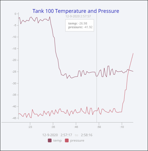
    This example shows a Time Series Chart displaying Temperature and Pressure values for Tank 100.

    1. Create a new view, and drag an Time Series Chart component on to your view.

      " "

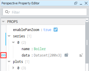
    2. With the Time Series Chart selected, click on the chain link Binding icon under the series > 0 > data property.

      " "

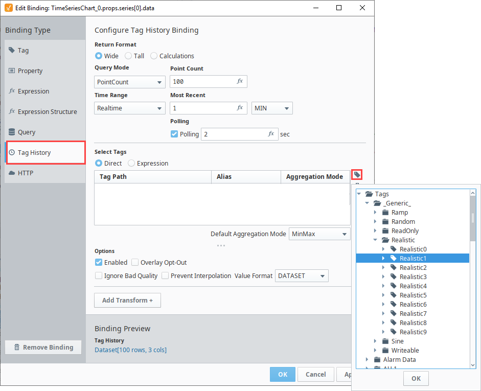
    3. This will open the Edit Binding window. Select the Tag History binding type.

    4. From the Select Tags section, click on the Tag Browse icon on the far right. Browse to select your Tag path. We selected Realistic1 and Realistic2 from the Generic > Realistic folder.

      " "

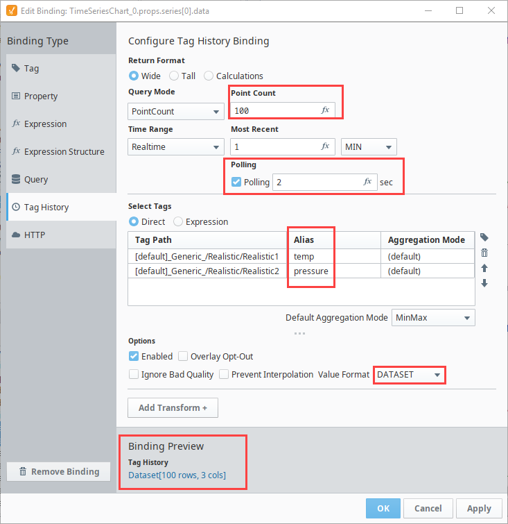
    5. Now let's configure the following Tag History binding settings:

      1. Double click in the Alias column for each Tag to add an Alias
        1. Add the Alias for Realistic1 as temp.
        2. Add the Alias for Realistic2 as pressure.
      2. Set the Point count to 100.
      3. Under Most Recent, select MIN from the dropdown.
      4. Set Polling to 2.
      5. The Tag History binding returns a Dataset. Y ou will see the format type in the Binding Preview in the lower left.
    6. Click OK.

      " "

    7. Now you have Tag History data in your Time Series Chart.

    8. To add a title, scroll to the Title object in the PROPS section and set the following values:

      1. title.visible - Set to true.
      2. title.text - Enter a title: Tank 100 Pressure and Temp Tracking.
      3. legend.visible - Set to true.

      " "

    9. Save your project.

    10. In Preview Mode, when you hover over the chart you will see a timestamp and Temp and Pressure values representing the current x-trace position.

      " "