Creating and Using Custom Perspective Themes
Themes help customize the look of components in your Perspective Sessions, acting as a foundation from which you can customize components even further using Style Classes. Perspective has default themes, which you can learn about on the Perspective Built-In Themes page.
In some cases, the default themes may not meet your requirements. For these situations, you can create a custom theme.
Creating a Custom Theme
Structure
Before creating your own theme, we recommend that you familiarize yourself with the structure of one of our provided themes, such as dark-cool. A valid theme has the following structure:
- custom-theme
|- index.css // theme entry configurable in config.json
|- config.json // theme configuration file
|- resource.json // internal resources file
Two important properties are within the config.json, entrypoint and isPrivate. By default, the entrypoint of your theme is index.css. The isPrivate property determines if the theme should be listed as an available theme. By default, this is true. Setting this to false is particularly useful if your theme is shared between multiple themes that are listed as available themes.
Features
CSS Variables
CSS variables have a central role in theme authoring. We recommend leveraging this built-in feature of CSS to aid in modular theme development and ease frustrations of long term maintenance. We use CSS variables throughout our theme stylesheets, so whenever there may be a need to change something like a color, it only needs to be changed in a single file.
--corporateColor: #FF5D00;
background-color: var(--corporateColor);
Descriptive CSS Classes
Component authors can specify unique CSS class selectors that give direct access to styling particular elements. Each class selector is unique enough to prevent clashing, and descriptive enough to minimize any guessing surrounding its dedicated purpose. We follow a standard naming convention called ABEM (Atomic Block Element Modifier).
atomicPrefix_blockName__elementName--modifierName
ia_cylindricalTankComponent__liquid--animation
Keep in mind that these unique classes give you direct access to specific elements. You can find a list of available selectors, and their defined rules, in their respective files. If you can not find the selector you need, then it is likely not defined. You may either request it or use one of the many other ways to style elements in Perspective.
CSS Imports
Imports provide the ability to develop or author themes in a modular fashion. They also make overriding easy. There are two rules that we expect you to follow when using imports.
-
Imports should be declared at the top of each CSS file.
-
Each import statement must begin with the CSS at-rule @import, specify the relative path to the file to import, and terminate with a semicolon. Imports that do not meet this criteria may be ignored. You may use single or double quotes surrounding the import path. For example:
 @import "../button.css";
 @import './variables.css';
Using the API
Custom themes can be created via the API documented in the Gateway's API Documentation interface (/openapi). These themes will be stored within a folder that contains all of the CSS files, as well as metadata files needed for resource collections.
Below is a sample API POST request at <gateway_address>/data/api/v1/resources/com.inductiveautomation.perspective/themes that will create a custom theme with an index.css file as an entrypoint.
[
    {
        "name": "test",
        "collection": "core",
        "enabled": true,
        "description": "test descriptions",
        "config": {
            "entrypoint": "index.css"
        }
    }
]
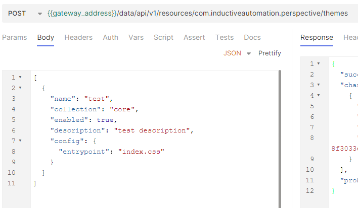
Once the entrypoint is created, you will use the Update Theme Data File endpoint <gateway_address>/data/api/v1/resources/datafile/com.inductiveautomation.perspective/themes/test/index.css to add a custom index.css file.
It's recommended to use one of the bundled themes as an example. Any derivative themes (i.e, light-cool, dark, dark-warm) will serve as ideal examples for most use cases. These themes simply extend the base theme, but override the values of the CSS variables that define fundamental colors. If any of the rules defined in the provided base theme are missing from your custom theme, the result will be reflected in your project. For example, a Button component missing a border. When creating your own custom themes, make sure that rulesets declared in the base theme exist in your custom theme at all times.
When you have ensured that the structure is correct and that an entry file has been defined in the theme resource's config.json, you can start adding your own changes to your custom theme file. For example, if you wanted to modify the .ia_button--primary background and text color, you would use the Update Theme Data File endpoint again with the button changes updated in the payload. Note that order matters for defined rules. Duplicate rules that come after existing rules will override or supplement depending on declared properties between the rules.
Base themes light and dark can be copied into the core resources folder by submitting a POST HTTP request <gateway_address>/data/api/v1/resources/com.inductiveautomation.perspective/themes/copy-base-themes. This is to make referencing the Inductive Automation base themes easier. The API token used in this request must have write permissions. Any modifications to these copied base themes are ignored.
Using the File System
In addition to the using Ignition's HTTP OpenAPI, you can create the necessary structure directly in the config file system, in the core resource collection. Follow the steps below to create a custom theme without using the API.
-
Navigate to the themes folder, located at
%IgnitionInstallationDirectory%\data\config\resources\core\com.inductiveautomation.perspective\themes. If you do not have this folder, create it and name it themes. -
Within the themes folder, create a new folder with the name of your theme. We will name our folder new-dark-cool.
-
While we can create the files necessary for our theme manually, we can also simply use the files in existing theme folders and adjust the contents to fit our needs. In our example, we'll copy the files in the dark-cool folder (config.json, index.css, resource.json, variables.css) to our new-dark-cool folder.
noteIf you are creating your theme files manually, consider the following:
- Your structure should match the files in the Structure section and an entry file should be defined in the theme resource's
config.jsonfile. - The order in which you implement your rules matter, since sequential rules will override or supplement existing rules.
- The
lighttheme is the base theme, and it is recommended to use it as a foundation for your custom themes. If any rules defined in the provided base theme are missing from your custom theme, those missing properties will be reflected in your project.
- Your structure should match the files in the Structure section and an entry file should be defined in the theme resource's
-
Modify your files to represent the theme you want and save them. We will keep the default CSS and JSON files for this example.
-
Once you are done configuring your theme, Ignition needs to rescan the file system to bring in your changes. To do this, go to your Gateway Webpage and navigate to Platform > Overview, and then click on Scan File System.
You can now use your custom theme in your Perspective project.
Overriding or Adapting Themes
Overriding or adapting themes is done by leveraging the "C" in CSS. Simply add your own CSS import pointing to your own custom style sheet containing the rulesets that you want to override or adapt after any existing imports. For example, to override something declared in the built-in light-cool theme, add your own import in the light-cool/index.css entry file like so:
@import "./light/index.css"
@import "./custom/overrides.css"
Ignition will only attempt to rewrite this file on startup if it does not exist.
Adding a Custom Font Example
This example demonstrates how to add a custom font to a default theme, with the assumption that the font has already been downloaded. Ignition comes packaged with Roboto, Merriweather, and NotoSans. Here, we will be adding Bitcount to the dark-cool theme.
Custom fonts can also be added using font API routes that will automatically build the files needed in this process.
-
Create a fonts folder in
%IgnitionInstallationDirectory%\data\config\resources\core\com.inductiveautomation.perspectiveif one doesn't already exist. -
Copy over the
.tfffiles from the downloaded font into the new fonts folder. -
Create a
resource.jsonandconfig.jsonpair that lists out all of the font files for the resource system.-
The
resource.jsonshould list each of the font variations and be formatted as shown below.{
"scope": "G",
"version": 1,
"restricted": false,
"overridable": true,
"files": [
"config.json",
"BitcountPropSingle-Light.ttf",
"BitcountPropSingle_Cursive-Bold.ttf",
"BitcountPropSingle_Cursive-Light.ttf",
"BitcountPropSingle_Cursive-ExtraLight.ttf",
"BitcountPropSingle-SemiBold.ttf",
"BitcountPropSingle_Roman-Light.ttf",
"BitcountPropSingle-Regular.ttf",
"BitcountPropSingle_Roman-ExtraBold.ttf",
"BitcountPropSingle_Roman-SemiBold.ttf",
"BitcountPropSingle_Cursive-Medium.ttf",
"BitcountPropSingle_Cursive-ExtraBold.ttf",
"BitcountPropSingle-Medium.ttf",
"BitcountPropSingle_Roman-Thin.ttf",
"BitcountPropSingle_Cursive-Black.ttf",
"BitcountPropSingle_Cursive-Thin.ttf",
"BitcountPropSingle_Roman-Regular.ttf",
"BitcountPropSingle-ExtraLight.ttf",
"BitcountPropSingle_Roman-Bold.ttf",
"BitcountPropSingle_Roman-Medium.ttf",
"BitcountPropSingle-Thin.ttf",
"BitcountPropSingle-Black.ttf",
"BitcountPropSingle_Cursive-SemiBold.ttf",
"BitcountPropSingle_Cursive-Regular.ttf",
"BitcountPropSingle_Roman-ExtraLight.ttf",
"BitcountPropSingle-Bold.ttf",
"BitcountPropSingle_Roman-Black.ttf",
"BitcountPropSingle-ExtraBold.ttf"
],
"attributes": {
"lastModification": {
"actor": "theme-manager",
"timestamp": "2025-11-12T13:41:04Z"
},
"lastModificationSignature": "724d740b276edf98109505e83b86e00d64d2f869b9a633962c7acb1fc58ca92d"
}
} -
The
config.jsonis needed for folder structure requirements, but will be empty{}for now.
-
-
On the Gateway, navigate to Platform > Overview and click Scan File System to sync the Gateway with the updated system files.
-
Verify the font file is now available by navigating to the font file path. In this instance, we can test it at
http://localhost:8088/data/perspective/fonts/BitcountPropSingle-Black.ttf.tipIf you are running into a 404 error when testing your font with the link above, try recreating
resource.jsonandconfig.jsonoutside the root directory, and then manually moving both.jsonfiles into the fonts folder. -
Create a corresponding
fonts.cssfile to define available fonts with@font-facedetails and includedsrcpaths.Available Fonts CSS Snapshot@font-face {
font-family: 'Bitcount Prop Single';
src: url('/data/perspective/fonts/BitcountPropSingle-Thin.ttf') format('truetype');
font-weight: 100;
font-style: normal;
}
@font-face {
font-family: 'Bitcount Prop Single';
src: url('/data/perspective/fonts/BitcountPropSingle-ExtraLight.ttf') format('truetype');
font-weight: 200;
font-style: normal;
}
@font-face {
font-family: 'Bitcount Prop Single';
src: url('/data/perspective/fonts/BitcountPropSingle-Light.ttf') format('truetype');
font-weight: 300;
font-style: normal;
} -
Add references to the
fonts.cssfile within the dark-cool theme'sresource.jsonandindex.cssfiles.-
resource.json: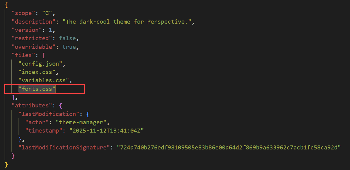
-
index.css: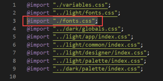
-
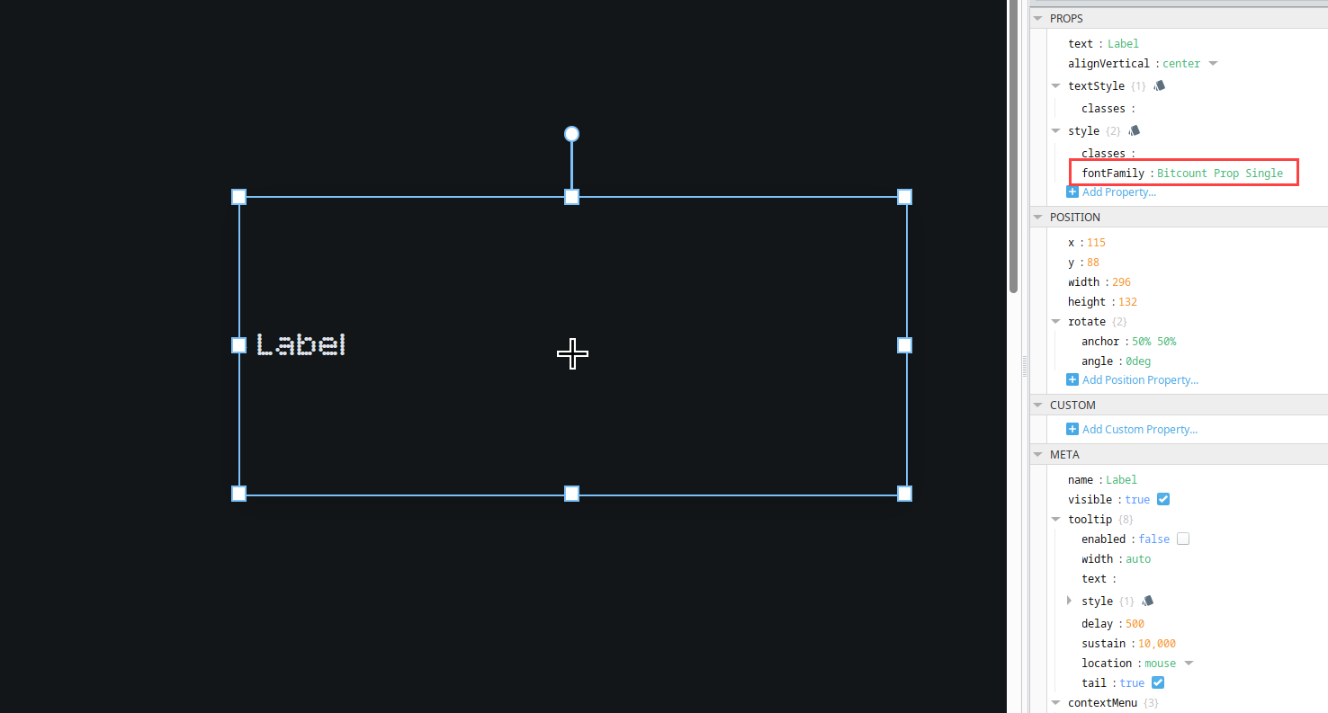
Test the Custom Font in the Designer
-
Open the Designer, and navigate to Perspective in the Project Browser.
-
Make sure the dark-cool theme is selected as the
themeproperty under Perspective Session Props. -
Place a Label component in a view.
-
In the component property panel, select the plus
 icon for style and select Properties > fontFamily.
 -
Enter Bitcount Prop Single.
Using a Custom Theme
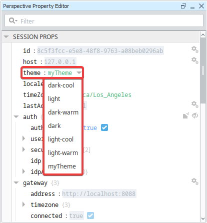
To use your custom theme, select it from the Session Properties in the Designer using the theme property. You can select your custom theme from the dropdown menu. Keep in mind that changes made to the theme property will become active only after a Gateway restart.
Once you select your custom theme and restart your Gateway, your components will change appearance according to your .css file.

There are some cases in which custom themes aren't enough to get your desired look. You can get around this by using Style Classes to fine-tune your components.