Report Design
Report Designer Interface
The Report Workspace's Design tab lets you design reports with the same intuitive feel, familiar layout, and drawing tools that you get when designing windows in Ignition. Just like designing Vision windows, you can design reports using the same familiar drag-and-drop method and choose from a library of graphs, charts, tables, and images.
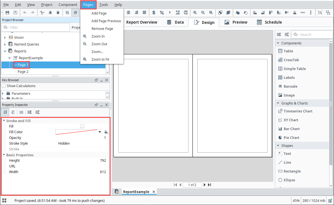
Looking at the screenshot of the Report Designer, you'll notice that an open Report Resource in the Project Browser can be expanded to provide information at a glance. This tree lets you visualize the relationship and hierarchy of Report Design elements on the page. Find an element in the tree by selecting items on the Design Panel, or find an element on the page by selecting it from the tree. As you do so, you'll notice that the bottom left of the default Report Designer will change to provide configure panels and/or property tables depending on the selected item.
Just below the Project Browser is the Key Browser which provides the Data Keys we use to reference data in our report. The Key Browser is home to all your Data Sources, Parameters, as well as a number of built-in calculation keys to speed you through the report design process. When you configure a data source and switch to the Design tab, a sample of all your queries is run on the Gateway to get information about the structure of your data. Columns in your data are represented as children in the Key Browser tree.
The right side of the panel is where the component palette lives, providing a number of powerful components, charts, and shapes which are used to build the layout and visualization of your report.

Report Design Components
Designing reports is where the fun begins. The Design Panel has a Report Design Palette with a host of components, charts, and shapes that when used together help you design and create meaningful, informative, and professional reports. Tables are used to collect and display varying amounts of data. Sophisticated charts can be created from the collected data collected. Images and Shapes can add that extra touch of class and polish making a report stand out.
Just like designing in Vision windows, Report Design components have properties which are editable in the Property Inspector which is located on the lower left side of the Design Panel. Below is a brief overview of the report design tools you can choose from for building your reports.
Note that modifying some component properties, such as the Font or Fill Color, will immediately cause a visual change in the Design Panel.
However, other properties, such as the Date Format, Number Format, and Overflow Behavior properties on a Text Shape component will not cause an immediate change. The properties described here wait until the report executes. Because of this, you will only see the results of these changes in the Preview Panel.
It is highly recommended that you review your report in the Preview Panel often. This provides an opportunity to visualize what the resulting report will look like.
Report Objects
Report Objects are the actual report and page components, and each have their own properties. They have a host of settings and properties that allow you to customize the appearance of your reports based on your requirements.
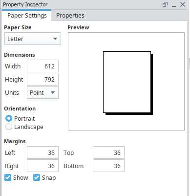
- Report Object - allows you to set the report properties for paper size, dimensions, orientation, margins, and much more.
- Page Object - allows you to add and remove pages in your report, as well as configuring additional properties that can add that creative touch to your reports. Page Objects can be accessed in the top navigation bar by selecting Pages, and in the Property Inspector when a report page is selected.
Reporting Components
The Reporting Components are the foundation for creating useful reports. There are a variety of different tables that you can choose from based on the type of data you're collecting. There are even Label and Barcode components you can use to create shipping and product labels. Here is a brief description of all the report design components.
- Table - Allows you to display tabular data in a variety of ways using the Table properties. Tables are configurable and highly flexible giving Reporting users the ability to flexibly layout and organize tabular data. They also support advanced grouping and pagination.
- CrossTab - Similar to a Table component, the CrossTab component is commonly used to summarize the relationship between two categories of data by showing summaries of cross sections of the data source. The CrossTab component creates a dynamic pivot table from your data.
- Simple Table - A basic grid table that dynamically creates new rows and columns for rows returned by the Data Keys on the component.
- Labels - Used to print out a host of different types of labels such as mailing labels, name tags, and more. You can create a set of labels using preset or custom sizes.
- Barcodes - Allows reports to contain dynamically generated barcodes. The following formats are supported: Code 128, Code 39, QR Codes, PDF 417, Aztec, Data Matrix, to name a few. Refer to Barcode in the Appendix section to see all the supported formats.
- Images - Can be embedded into reports. They can be dropped onto reports, pulled as binary data from a data source, or even a URL.
Reporting Charts
Report charts allow you to display your data in a variety of graphical ways. The four chart types you can choose from to build your reports are listed below:
- Timeseries Chart - A type of line chart whose domain, or X-Axis, represents a timestamp or datetime. The Timeseries Chart is a great way to display Tag History.
- XY Chart - Similar to the Timeseries chart with the main difference being the domain, or X-Axis which is a numeric value and not a date.
- Bar Chart - A very easy chart to use that provides a bar representation of any numeric values, and because it has many properties, it can greatly impact how the data is presented. It is useful for displaying series with relative values.
- Pie Chart - Displays items as pie wedges. It represents relative quantities as wedges of a circle.
Shapes
You may have seen some of these shapes when designing your Vision windows. The shapes you see in the Report Design Palette are shape tools. They are not dragged from the design palette on to your report, instead you select a shape tool and begin to draw your shape on to your report. You create its size, height, and shape. Some of the shape tools allow you to create various shapes as well as edit them. Just like components, once a shape is created, you can change its fill color, stroke color, stroke style, and more. Each shape has its own properties. Here is a list and brief description of the available shapes in the Report Design Palette.
- Text Shape - Creates a text area for static or data key bound content.
- Line - Creates a straight line. It can run north-south, east-west, or diagonally.
- Rectangle - Creates a square or a rectangle. Once a rectangle or square is created, you can use the handles to change its height and width.
- Ellipse - Creates circles and ellipses. Once a ellipse or circle is created, you can use the handles to change its size.
- Star - Creates a star or a polygon. Once the star is created you can use the handles to resize it.
- Polygon - Creates custom polygon shapes by drawing and connecting the lines. Once all the lines are connected to form the polygon shape, you can use the handles to change its size. Double click on any of the individual lines to change the size and shape of the selected line.
- Pencil - Draws freehand shapes with smooth paths.
To learn more about report design components, refer to the Report Design Tools section, and to the Appendix for details on each component.
Selection and Alignment
Selecting components is done with the selection tool ( ), which is the default tool in the Report Designer whenever another tool is not activated.
Reporting has a "deeper" selection model than the Ignition Designer. Simple object selection is done by single clicking an object, and is typically used to move an object around or resize it. "Selecting deep" is done by double-clicking on the object to get into the report hierarchy. For instance, if you group two rectangles together, you can select the individual rectangles by double clicking "into" the group. Visualizing selection is simplified by viewing the Project Browser to see which node in the Report Resource tree is selected.
Super Selection
Super Selection refers to an editing state that some shapes go into when double clicked. Text is the most common of these. When a text box is selected you can move and resize it. When it's super-selected, you can place the text cursor or select a range of characters and insert or delete text. The polygon and pencil are two other basic tools that support Super Selection.

Multiple Selection
Multiple Selection of components can be done by clicking and dragging the mouse over a range of the report. Every object the selection rectangle touches becomes selected. If there are shapes you want to remove from the currently selected shapes, hold the shift key while clicking and dragging inside that shape.

Resizing and Moving Objects
To resize an object, first select it with a single click, then left or right click, and drag one of the 8 resizing handles. To move an object, left or right click on the shape, and drag it anywhere on the report.

Alignment
Alignment is accomplished by selecting multiple objects, then choosing from any of the Alignment commands in the Component Menu to align objects. You can align objects in rows by their top, center or bottom border, and align columns by their sides or center. You can make objects the same size (width and height), and equally space rows and columns horizontally and vertically.
In report design, z-order defines relative order of objects when they overlap. Select the object and click Bring to front or Send to back in the Component Menu to reorder the objects.