Report Component - XY Chart
The XY Chart, while similar to the Timeseries Chart, uses a numerical value for the Domain Axis instead of a Datetime. The XY chart is ideal when trying to detail the relationship between two keys.
Report Design Component Palette Icon
![]()
Properties
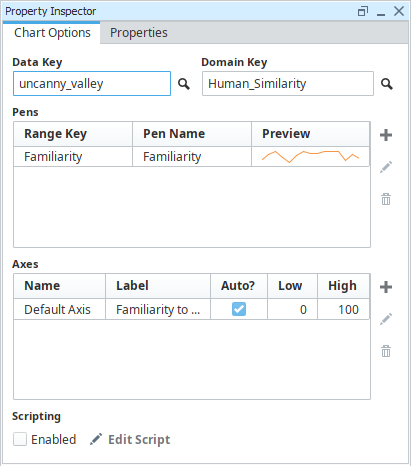
Property Inspector - Chart Options

| Property | Description |
|---|---|
| Data Key | Unique identifier or placeholder to the data source that will populate the chart. |
| Domain Key | The data key that should represent the X axis on the chart. The Timeseries Chart expects a timestamp, while the XY chart can use any numeric value as the domain key. |
| Pens | Pens represent a series of data. There are several properties for each pen exposed on the Chart Options tab:
|
| Add Pen | Adds a pen. |
| Edit Pen | Opens Pen Configuration area for editing. |
| Remove Pen | Deletes a pen. |
| Axes | There are several properties for each axis exposed on the Chart Options tab:
|
| Add Axis | Add an axis. |
| Edit Axis | Opens Axis Configuration area for editing. |
| Remove Axis | Deletes an axis. |
| Scripting Enabled | Enables the script for this component to run. |
| Edit Script | Allows the chart to be modified before the report is rendered via Python script. |
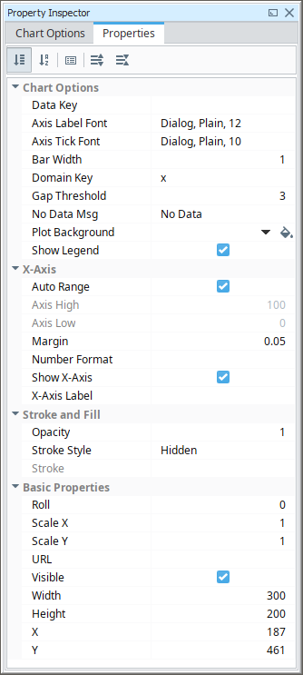
Properties Inspector - Properties Tab
| Property | Description |
|---|---|
| Data Key | Data key of the dataset that drives this chart. |
| Axis Label Font | Font to use for axis labels. |
| Axis Tick Font | Font to use for axis tick marks. |
| Bar Width | The width of any bar datapoints. |
| Domain Key | Key name of the column inside the dataset that contains the domain (x) value. |
| Gap Threshold | Multiplier for the average space between data points to be considered a data gap for the "line with gaps" render style. |
| No Data Msg | Message to show when no data is available. |
| Plot Background | Color to use for chart background. See Color Selector. |
| Show Legend | If true, show a legend for the chart. |
| Auto Range | If true, automatically determine range of X-axis. |
| Axis High | If autorange is turned off, the high value to use for the axis. |
| Axis Low | If autorange is turned off, the low value to use for the axis. |
| Margin | Margin for the x-axis edges. |
| Number Format | A optional number format string to override the automatic formatting on the x-axis. |
| Show X-Axis | If true, show the x-axis. |
| X-Axis Label | Label text for the x-axis. |
| Opacity | How opaque the fill color is, between 0 and 1. |
| Stroke Style | What style of stroke or border to use: Hidden, Shape Outline, Border, or Double. To learn more about stroke styles, refer to Stroke and Fill Properties. |
| Stroke | Details for the chosen stroke. Each Stroke has its own properties depending on the Stroke Style chosen. |
| Roll | Number of degrees this shape is rotated clockwise. |
| Scale X | Amount to scale the width of this shape. 1 is scale to 100%. |
| Scale Y | Amount to scale the height of this shape. 1 is scale to 100%. |
| URL | New in 8.1.19 A link to attach to this reporting component. Will be a clickable hyperlink if the report is exported as a PDF. You can use the values below to link to internal pages.
|
| Visible | If true, the shape will be visible. |
| Width | Width of this shape in pixels. |
| Height | Height of this shape in pixels. |
| X | Horizontal distance in pixels between the left edge of this shape and the left edge of the page. |
| Y | Vertical distance in pixels between the upper edge of this shape and the top edge of the page. |
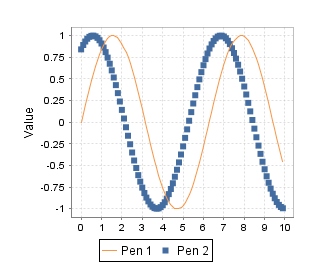
Example

XY Chart Sample CSV Data - uncanny_valley
Familiarity, Human_Similarity
0, 0
22, 24
28, 33
42, 43
65, 60
0, 72
-20, 80
50, 90
90, 95