Stroke and Fill Properties for Reports
As you probably learned working with components, each component has its own unique properties. The Report Design components are no different. The Report Designer has some of the same components like tables, bar charts, graphs, and various shape tools, but their properties are different from the other components because they are designed for reports. For example, Stroke and Fill properties control the appearance of the reporting component's stroke style or border by creating a dashed line around the shape, changing the width of the lines and the stroke color, and more. Stroke Style and Stroke properties can be particularly useful when using a Table in a report. You can make objects in a Table and then add an outline or set edges to make your report stand out.
Stroke and Fill Properties
Stroke and Fill properties are commonly used by many reporting components. All of the components, charts, graphs, and shapes in the Report Design Palette use the same Stroke and Fill properties. These properties affect how the components look in a report. There are five basic Stroke and Fill properties:
- Fill - if this property is marked true, the shape will fill its space with color.
- Fill Color - if the Fill property is selected, the color you select will fill the shape.
- Opacity - defines how opaque the color is in the shape, between 0 and 1.
- Stroke Style - defines what type of stroke or border to use.
- Stroke - An expandable list of properties for the chosen stroke style.

The Fill, Fill Color, and Opacity properties are pretty easy to understand, so we are going to focus on Stroke Styles and Stroke properties in the following sections so you can take full advantage of how to use these properties to make professional looking reports.
Stroke Styles
Stroke Style defines what style of stroke or border to use. Primarily, the Stroke Style controls the type of line drawn around the component (table, chart, shape, etc) that you are using. There are four Stroke Style templates you can choose from.
- Hidden - no stroke or border
- Shape Outline - a solid line outline
- Border - border or rectangle shape
- Double - two parallel lines
Each of these Stroke Styles come with their own set of properties. In the Design panel, select a component, and choose any one of the style templates from the Stroke Style property in the Properties tab. You can use the Stroke Style as is, or click on any of the rows or cells with values to change individual properties. For example, you might want to change the thickness of the lines or create a dashed line around the border of a component. This is easy to do: select the component, row, or cell, and change the Width under the Stroke property (thickness of the lines is specified in pixels). Then view your report with the Preview tab. You can keep repeating this step until you get the desired result.
Stroke Properties
Each Stroke shares some properties with other strokes, but have their own unique properties. The only exception is that the Hidden Stroke Style does not have any properties.
If you switch between stroke styles your values will be overwritten by defaults. This is not true when switching to the Hidden type.
The properties for each Stroke Style are shown below.
Shape Outline Stroke Properties
Shape Outline is a solid line outline around a component or shape. It has the following properties that you can use as is, or change.
| Property | Description |
|---|---|
| Color | Color to use for the stroke. |
| Dash Pattern | A "Dash Pattern" string to specify the number of pixels on and off. For example "5,10" |
| Width | Width of the shape in pixels. |
Stroke Style - Shape Outline Example
This example shows a report with a Shape Outline around the Table component at the bottom of the image. Select the whole table to set stroke and fill for it. The property values used to create the outline around the data are shown in the properties list in the table below.

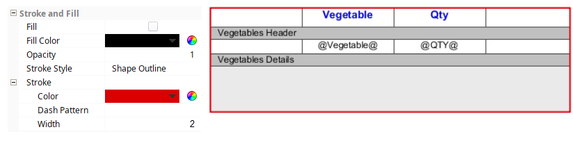
- Stroke Style - Shape Outline
- Stroke Color - Red
- Width - 2 pixels
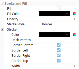
Border Style Stroke Properties
The Border Stroke Style is similar to the Shape Outline, but it gives you the option to disable the any of the lines around the border; bottom; left; right; or top.
| Property | Description |
|---|---|
| Color | Color to use for the stroke. |
| Dash Pattern | A "Dash Pattern" string to specify the number of pixels on and off. For example "5,10" |
| Border Bottom | If true, show the border on the bottom side of the shape. |
| Border Left | If true, show the border on the left side of the shape. |
| Border Right | If true, show the border on the right side of the shape. |
| Border Top | If true, show the border on the top side of the shape. |
| Width | Width of the stroke in pixels. |
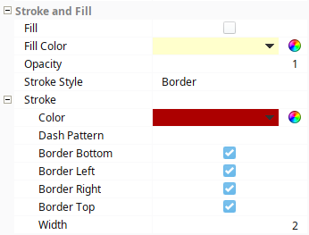
Stroke Style - Border Example
This example used the Border Stroke Style for the Equipment Summary cell at the bottom of a Table. (Total: @total.Downtime@Minutes). Three images appear inside the outline because they are in the Equipment Header (unstructured) row. The property values are shown for the Table, Row, and Cell in the property lists below.

Equipment Table in the Designer
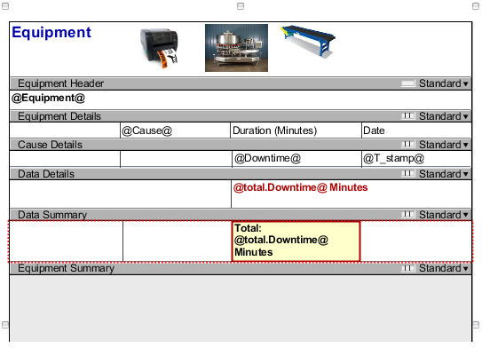
Table Property Values
- Stroke Style - Border
- Stroke
- Border Bottom - Enabled
- Border Left - Enabled
- Border Right - Enabled
- Border Top - Enabled
Data Summary Cell
Shows the Total Downtime Minutes for each downtime cause for each piece of equipment.
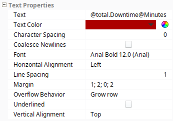
- Text Color - Red,Bold
Equipment Summary Cell
Shows the Total Downtime Minutes for all causes and for all equipment.
- Stroke Style - Border
- Fill - Enabled
- Fill Color - Yellow
- Width - 2 pixels
Double Stroke Style Properties
By default, the Double Stroke Style consists of two parallel lines around the component. You can change the width of both lines and the separation between these lines, if desired.
| Property | Description |
|---|---|
| Color | Color to use for the stroke. |
| Inner Width | Width of the inner border in pixels. |
| Outer Width | Width of the outer border in pixels. |
| Position | Position of borders relative to the bounds of the shape.
|
| Separation | Separation between inner and outer borders in pixels. |
Stroke Style - Double Example
Here is an example of a Pie Chart with a Double border used in a report. The property values for the Border Stroke Style are listed in the properties list table below.


- Stroke Style - Double
- Stroke Color - Blue
- Inner Width - 1
- Outer Width - 3
- Position - Inner on Path
- Separation - 10