Report - Crosstab Table
CrossTab Tables are commonly used to summarize the relationship between two categories of data by showing summaries of cross sections of the data source. The CrossTab Table allows you to very quickly show cross sections of data where the other table types are focused on a dynamic number of rows and columns. CrossTab data should contain the following:
- Lots of repetitious data. Sums, Averages, and other Aggregating functions are well represented by CrossTab Tables.
- A data source that provides at least two columns of data which are repetitious compared to the number of rows.
- One or more columns that represent a value that requires calculation. Examples are: summing money, displaying average response times, counting occurrences, etc. These calculations may be provided as columns or calculations of the data source, or as Keychain Expressions.
CrossTab tables can be customized using table and cell properties. It also has a number of style templates. Select any one of the style templates, use as is, or double click on any of the cells to change the individual cell's properties. Configure the style in the Design panel, and view the table with your data in the Preview panel. To learn more about the CrossTab Table, refer to the CrossTab and Simple Tables page.

Report Design Component Palette Icon:
Properties
Table Properties
| Property | Description |
|---|---|
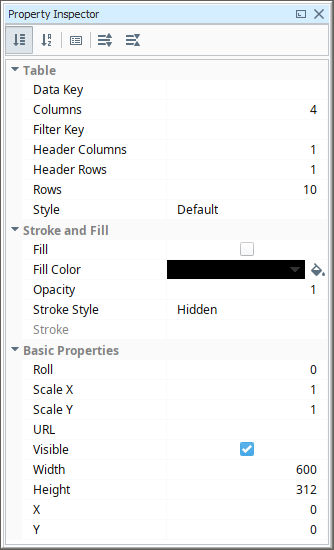
| Data Key | The data key associated with this Tabular component. Should be the data key of a data source that contains rows, such as a query. |
| Columns | Number of columns. |
| Filter Key | A key or expression used to prune the underlying data source's rows down. If not blank, only rows for which this key expression evaluates to true will be included. |
| Header Columns | Number of Header Columns. |
| Header Rows | Number of Header Rows. |
| Reprint Header Rows | Enable header row printing when pagination occurs. |
| Rows | Number of Rows. |
| Style | Give the CrossTab or Simple Table a pre-configured style.
|
| Fill | If true, the shape will fill its space with color. |
| Fill Color | If Fill is selected, the color that will fill the shape. |
| Opacity | How opaque the fill color is, between 0 and 1. |
| Stroke Style | What style of stroke or border to use: Hidden, Shape Outline, Border, or Double. To learn more about stroke styles, refer to Stroke and Fill Properties. |
| Stroke | Details for the chosen stroke. Each Stroke has its own properties depending on the Stroke Style chosen. |
| Roll | Number of degrees this shape is rotated clockwise. |
| Scale X | Amount to scale the width of this shape. 1 is scale to 100%. |
| Scale Y | Amount to scale the height of this shape. 1 is scale to 100%. |
| URL | New in 8.1.19 A link to attach to this reporting component. Will be a clickable hyperlink if the report is exported as a PDF. You can use the values below to link to internal pages.
|
| Visible | If true, the shape will be visible. |
| Width | Width of this shape in pixels. |
| Height | Height of this shape in pixels. |
| X | Horizontal distance in pixels between the left edge of this shape to the left edge of the page. |
| Y | Vertical distance in pixels between the upper edge of this shape to the top edge of the page. |
Cell Properties
| Property | Description | Category |
|---|---|---|
| Text | Text to display in the shape. | Text Properties |
| Text Color | Color of the text. | Text Properties |
| Character Spacing | Amount of extra spacing to add between characters. Negative spacing makes characters closer together. | Text Properties |
| Coalesce Newlines | If true, consecutive line breaks will be merged into one. | Text Properties |
| Font | Font to use for the text. | Text Properties |
| Horizontal Alignment | Horizontal Alignment for text: Left; Right; Center; Full. | Text Properties |
| Line Spacing | Spacing between lines of text. 1 is single spacing, 2 is double spacing, etc. | Text Properties |
| Margin | Margin between texts and bounds of shape in pixels. Format is top: left: bottom; right. | Text Properties |
| Overflow Behavior | How text that overflows the bounds of the shape should be handled. Select Shrink text to fit to reduce the font size when previewed or printed so that the text fits into the shape. Changed in 8.1.19 The Grow row option has been removed, and the default value is now None. | Text Properties |
| Underlined | If true, use underlined text. | Text Properties |
| Vertical Alignment | Vertical alignment for text: Top; Middle; Bottom. | Text Properties |
| Date Format | Formats to use for dates in this shape. | Data Key and Format Properties |
| Null Format | Formats to use for null values in this shape. | Data Key and Format Properties |
| Number Format | Formats to use for numbers in this shape. | Data Key and Format Properties |
| Negative in Red | If true, show negative numbers in red. | Data Key and Format Properties |
| Fill | If true, the shape will fill its space with color. | Stroke and Fill |
| Fill Color | If Fill is selected, the color that will fill the shape. | Stroke and Fill |
| Opacity | How opaque the fill color is, between 0 and 1. | Stroke and Fill |
| Stroke Style | What style of stroke or border to use: Hidden, Shape Outline, Border, or Double. To learn more about stroke styles, refer to Stroke and Fill Properties. | Stroke and Fill |
| Stroke | Details for the chosen stroke. Each Stroke has its own properties depending on the Stroke Style chosen. | Stroke and Fill |
| Grouping | Grouping Key will add a row or column for each Grouping the key generates. | Grouping |
| Radius | Amount to radius the corners of this shape. | Rectangle Shape |
| Roll | Number of degrees this shape is rotated clockwise. | Basic Properties |
| Scale X | Amount to scale the width of this shape. 1 is scale to 100%. | Basic Properties |
| Scale Y | Amount to scale the height of this shape. 1 is scale to 100%. | Basic Properties |
| Visible | If true, the shape will be visible. | Basic Properties |
| Width | Width of this shape in pixels. | Basic Properties |
| Height | Height of this shape in pixels. | Basic Properties |
| X | Horizontal distance in pixels between the left edge of this shape and the left edge of the page. | Basic Properties |
| Y | Vertical distance in pixels between the upper edge of this shape and the top edge of the page. | Basic Properties |
Cells have a functions feature. Double click on a cell and then right click to see the functions. All the functions are the same for any cell that is selected.
| Function | Description |
|---|---|
| Clear Contents | Deletes all contents from the selected cell. |
| Add Row Above | Adds a row above the selected cell. |
| Add Row Below | Adds a row below the selected cell. |
| Add Column Before | Adds a column before the selected cell. |
| Add Column After | Adds a column after the selected cell. |
| Remove Row | Removes the selected row. |
| Remove Column | Removes the selected column. |
| Merge Cells | Combines the selected cells. |
| Split Cell | Splits the selected cell into individual cells. |
Reserved Column Names
Besides the built-in keys for the Reporting Module's Table component, there are several reserved names that should not be used as keys for column headers. These keys are broken down into categories in the following table:
| Key Type | Key |
|---|---|
| Heritage/Top Level | Running |
| Heritage/Top Level | Remaining |
| Heritage/Top Level | Up |
| Aggregate | total |
| Aggregate | average |
| Aggregate | count |
| Aggregate | countDeep |
| Aggregate | max |
| Aggregate | min |
Example
The Elegant Style template was used for this CrossTab table in a report. This CrossTab Table shows the downtime in minutes for each piece of equipment at each site.

The Downtime Dataset used for this CrossTab Table example is below:
Equipment,Time,Site
Motor, 15, Site A
Motor, 23, Site A
Conveyor Line, 148, Site B
Pallet Wrapper, 58, Site A
Motor, 96, Site C
Conveyor Line, 23, Site B
Palletizer, 40, Site B
Palletizer, 30, Site C
Conveyor Line, 56, Site A
Conveyor Line, 50, Site C
Pallet Wrapper, 45, Site C
Motor, 43, Site C
Palletizer, 20, Site A
Pallet Wrapper, 55, Site B
Motor, 100, Site B
The data keys Equipment, Time, and Site were used to populate the CrossTab Table with data:

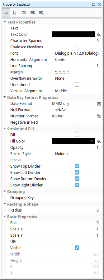
The property values used to configure the CrossTab Table are shown in the property list:
| Property | Value |
|---|---|
| Style | Elegant |
| Text Color (for Equipment and Site Headers) | FF0000 |
| Font | 14 |
| Horizontal Alignment | Center |
| Horizontal Alignment (for Site) | Right |