Perspective - Split Container
New in 8.1.18

Component Palette Icon:
Description
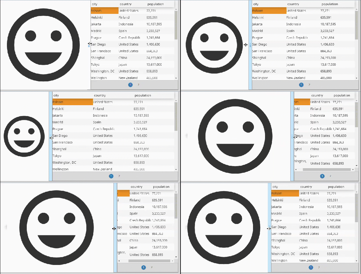
The Split container holds two children separated by a draggable "split" that allows the user to resize the two children during the runtime. The Split container supports both horizontal and vertical layouts.
Properties
Most Properties have binding options. For more information on Bindings, see Types of Bindings in Perspective. This section only documents the Props Category of properties. The other Categories are described on the Perspective Component Properties page.
| Property | Description | Property Type |
|---|---|---|
| orientation | The orientation in which the container's split is fixed. Horizontal will allow the user to adjust the container from left to right, while Vertical will allow the user to adjust it from top to bottom. | value: numeric |
| split | Configuration for the split bar.
| object |
| style | Use Style to customize the visual style of the component. The Style menu contains all the tools for modifying text, background, margins, and borders. You can also specify a style class. | object |
Child Component Position Properties
When a component is placed inside of a Split container, it will inherit the position property listed below.
| Property | Description | Data Type |
|---|---|---|
| position | Indicates which side of the split bar the child component is located on. Expected values include "left", "right", "top", and "bottom" | value: string |
Scripting
See the Perspective - Split Container Scripting page for the full list of scripting functions available for this component.