Perspective - Tab Container
Component Palette Icon:
Description
The Tab container uses tabs as navigation buttons arranged together with the selected tab highlighted. Only one component can be displayed in each tab.
The Tab Container component has two pre-configured variants:
- Classic - Layout is a traditional menu with boxed tabs.
- Modern - Layout has no borders around each tab and shows selection with an underline.
Properties
Most Properties have binding options. For more information on Bindings, see Types of Bindings in Perspective. This section only documents the Props Category of properties. The other Categories are described on the Perspective Component Properties page.
| Property | Description | Property Type |
|---|---|---|
| tabs | Responsible for the number of tabs in the container. Adding additional elements to this array will result in an additional tab being rendered on the component. In addition, each element is responsible for determining the content of the tab: either text or an embedded view. By default, the component starts with a single element is this array, set to a value type. Providing a string to the element will set the text on the tab.  If the element is changed to an object data type, then the text on the tab can be set by adding a text value member to the object and providing a string, as seen on element 0 below. Alternatively, viewPath (value data type) and viewParams (object data type) can be added to the element, which allows you to render a view inside the tab as well as pass parameters to it. Element 1 below demonstrates the idea. Keep in mind that the viewPath property will be ignored in favor of the text property if both exist in the object. If the element is changed to an object data type, then the text on the tab can be set by adding a text value member to the object and providing a string, as seen on element 0 below. Alternatively, viewPath (value data type) and viewParams (object data type) can be added to the element, which allows you to render a view inside the tab as well as pass parameters to it. Element 1 below demonstrates the idea. Keep in mind that the viewPath property will be ignored in favor of the text property if both exist in the object. 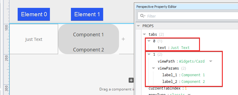 New in 8.1.5 A boolean runWhileHidden property can be added to an element that's set to an object data type. This setting determines if contents of this tab loads once the tab is first activated, and if it should persist while in the background when the currentTabIndex changes.  New in 8.1.20 A boolean disabled property can be added to an element that's set to an object data type. This setting determines if a tab can be selected. If the tab is already active when it becomes disabled, users will not be prevented from leaving the tab, but they will not be able to get back to it. The content of the tab is not affected by the enabled/disabled state of the tab. | array |
| currentTabIndex | Which index in tabs array is currently active. | value: numeric |
| menuType | If the type is 'classic', a traditional menu with boxed tabs is shown. If the type is 'modern', it has no borders around each tab and shows selection with an underline. | value: string dropdown |
| tabSize | Default size allotted to a single tab. If a container width does not allow, tab width will shrink from this size accordingly.
| object |
| menuStyle | Opens the Style menu to change Tab properties: Text, Background, Margin and Padding, Border, and Misc. | value: string dropdown |
| contentStyle | Sets a style for the content frame component. A full menu of style options are available. You can also specify a style class. | object |
| tabStyle | Additional styling to apply to all tabs depending active (selected) or inactive state.
| object |
| style | Use Style to customize the visual style of the component. A full menu of style options are available. You can also specify a style class. | object |
User Interaction
Adding Components to Tabs
To add a component to a tab, deep select the Tab container, then drag a component onto it.
Adding and Deleting Tabs
To delete a tab, click on the "X" to the right of the tab itself.

To add a tab, click on the Add icon to the right of the tabs:

You can also use the right-click menu in the Property Editor. Just right click on the tab you want to work with. You'll see options for copying, pasting,

Scripting
See the Perspective - Tab Container Scripting page for the full list of scripting functions available for this component.
Examples
Example 1

In this example, the default (Classic variant) Tab Container is used. Three tabs are set up in the Tab Container component. Tab 3 is active and contains a Map component.
| Property | Value |
|---|---|
| props.tabs.0 | Tab 1 |
| props.tabs.1 | Tab 2 |
| props.tabs.2 | Tab 3 |
| props.menuStyle.backgroundColor | #D5D5D5 |
| tabStyle.active.backgroundColor | #00FFFF |
| tabStyle.active.fontWeight | bold |
| tabStyle.inactive.backgroundColor | #CCFFFF |
| tabStyle.inactive.fontWeight | lighter |
Example 2
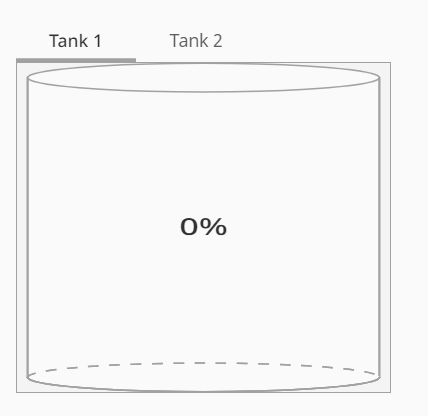
In this example, the default (Modern variant) Tab Container is used. Two tabs are set up in the Tab Container component, each with a Cylindrical Tank component.
| Property | Value |
|---|---|
| props.tabs.0 | Tank 1 |
| props.tabs.1 | Tank 2 |
| props.menuType | modern |