Perspective - Column Container

Component Palette Icon:
Description
The Column Container is a 12 column grid layout, where components can be organized into columns which alter their layout depending on screen viewport size. The container features three different breakpoints that it can switch between as the viewport changes. Each component inside the container stores positioning and sizing values per breakpoint, allowing you to determine the location and size of each component for each breakpoint.
A column container provides a way to create a single set of components that can be arranged up to three ways depending on the width of the container. Components are able change how many columns they span when switching between breakpoints, as well as change row and column index altogether. In the GIF below, the components are resizing and repositioning as the viewport on the container changes.

User Interface
While deep selected, the Perspective Property Editor will show a Column Breakpoints interface. Clicking on Small, Medium, or Large will change the container workspace, showing you the current configurations for all child components in the container. When a container workspace is selected, you can freely move and resize components for the selected breakpoint, allowing you to determine their placement when the selected breakpoint is active in a session.
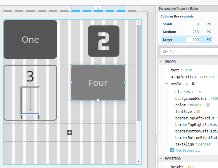
Note that switching between breakpoints in the designer does not resize the container. The pixel dimensions represent a minimum width for the viewport, meaning that the container will switch to the breakpoint when the minimum width is satisfied during runtime. For example, if Medium is set to 280px and Large is 500px, then the container will show the medium breakpoint when the viewport is between 280 and 499 pixels in width.
Properties
Most Properties have binding options. For more information on Bindings, see Types of Bindings in Perspective. This section only documents the Props Category of properties. The other Categories are described on the Perspective Component Properties page.
| Property | Description | Property Type |
|---|---|---|
| breakpoints | Width breakpoint declarations for child layouts. When the container is sized below minWidth, child position rules will fall back to the next set breakpoint rules. - name: Name of the breakpoint with a string property type. - minWidth: Minimum width for this breakpoint with a numeric property type. | array |
| gutters | Settings for the gutters, which are the amount of space, in pixels, to place between child components. - vertical: Vertical gutter setting between child components with a numeric property type. - horizontal: Horizontal gutter setting between child components with a numeric property type. | object |
| style | Use Style to customize the visual style of the component. The Style menu contains all the tools for modifying text, background, margins, and borders. You can also specify a style class. | object |
Child Component Position Properties
When a component is placed inside of a Column container, it will inherit the position property listed below.
| Property | Description | Property Type |
|---|---|---|
| height | Specifies the horizontal positioning of the component in pixels. | value: numeric |
| breakpoints | An array of objects, where each object represents a different breakpoint. In the image below, a component in a column container is selected. Each element under breakpoints contains positioning information that will be used when the container switches to the named breakpoint. 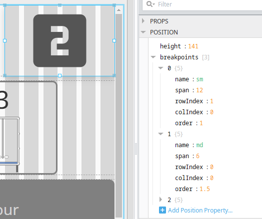 | array |
Breakpoints Child Properties
| Property | Description | Property Type |
|---|---|---|
| name | Name of a breakpoint defined in container. If this matches the currently applied breakpoint, these rules determine child layout. Options are sm (small), md (medium), or lg (large). | value: string |
| span | Number of columns the child's width will span. | value: numeric |
| rowIndex | Row index (starting from 0) in which to place child. Children may wrap lines within a row. Children in separate rows don't affect each other's layout. | value: numeric |
| colIndex | Column number upon which the child's span should begin unless forced to wrap. | value: numeric |
| order | Where component is places among its siblings within its row. Ordering is independent per row. | value: numeric |
Scripting
See the Perspective - Column Container Scripting page for the full list of scripting functions available for this component.