Perspective - Breakpoint Container
Component Palette Icon:
Description
The Breakpoint container consists of a single breakpoint, with two child views. In other words, using a Breakpoint container offers you a layout with the opportunity to create two different views that are shown at two distinct ranges of layout widths.
This allows for a very simple responsive design that removes one container and replaces it with another when the viewport width is changed. With the Breakpoint container, you can define completely different content to render for each child. This is in contrast to a container such as the column container, where the content for each breakpoint is identical but the layout of it changes according to screen size.
Breakpoint containers are ideal to use in cases where you want completely different components available between a mobile user or a desktop user, since the components in each breakpoint are completely separate instances. Thus, if you're attempting to make a responsive view, and a Flex container isn't quite giving the desired result, a Breakpoint container can be used to switch to a completely different container or view.
Properties
Most Properties have binding options. For more information on Bindings, see Types of Bindings in Perspective. This section only documents the Props Category of properties. The other Categories are described on the Perspective Component Properties page.
| Name | Description | Property Type |
|---|---|---|
| breakpoint | Width (in pixels) breakpoint declarations for child layouts. When the container is sized below minWidth, child position rules will fall back to the next set breakpoint rules. | value: numeric |
| determinant | New in 8.1.32 Choose between the height or width dimension that the Breakpoint container will use to break. Default is width. | value: string |
| style | Use Style to customize the visual style of the component. The Style menu contains all the tools for modifying text, background, margins, and borders. You can also specify a style class. | object |
Child Component Position Properties
When a component is placed inside of a Breakpoint container, it will inherit the position property listed below.
| Name | Description | Property Type |
|---|---|---|
| size | Indicates which child the component located in. Expected values are "small" and "large". | value: string |
Scripting
See the Perspective - Breakpoint Container Scripting page for the full list of scripting functions available for this component.
Nested Breakpoint Containers Example

In this example, we have a Breakpoint container nested inside a root Breakpoint container. The setup is as follows:
Containers
- The nested Breakpoint container is used when the root Breakpoint container's size is less than 800 pixels.
- The nested Breakpoint container will change when its size is less than 700 pixels.
Components
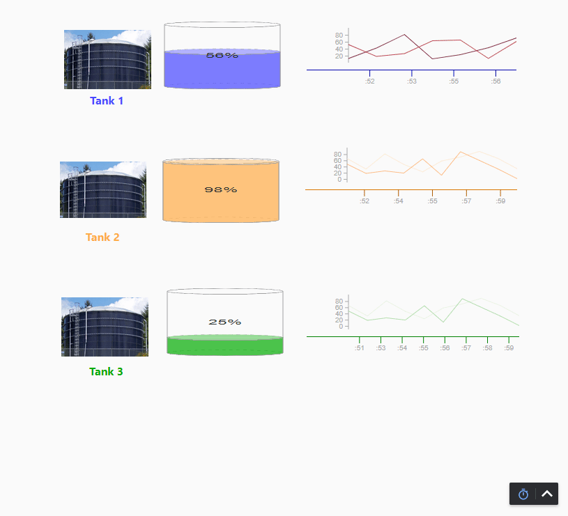
- When the page is greater than 800 pixels, an XY Chart is displayed.
- When the page is between 700 and 800 pixels, an empty Power Chart is shown.
- When the page is less than 700 pixels, an Icon is displayed.
The relevant properties for this example are displayed below:
Root Breakpoint Container Properties
| Property | Value |
|---|---|
| Breakpoint | 800px |
Nested Breakpoint Container Properties
| Property | Value |
|---|---|
| Breakpoint | 700px |