Perspective - Coordinate Container
Component Palette Icon:
Description
The Coordinate Container makes a component's size and location relative to its parent's size and location. Components can be fixed size, or optionally grow/shrink proportionally when the view is stretched.
Coordinate Containers are ideal to use in cases where you need components to overlap each other, such as adding a component on top of another (z-axis) to act as an overlay. They're also useful in cases where you do not want components within to resize - for example, building a diagram where each element is a separate component.
Components placed in coordinate containers can be rotated. The Rotate property has been moved to the Position Properties section of the Perspective Property Editor. For more information, see Working with Perspective Components.
The Coordinate Container component has two pre-configured variants:
- Fixed - Child layouts will be in fixed coordinate space.
- Percent - Child layout will be stretched to different size containers.
Properties
Most Properties have binding options. For more information on Bindings, see Types of Bindings in Perspective. This section only documents the Props Category of properties. The other Categories are described on the Perspective Component Properties page.
| Name | Description | Property Type |
|---|---|---|
| mode | Whether child layouts should always be in fixed coordinate space, or stretched relative to different container sizes: fixed or percent. Fixed mode uses absolute units, which reduces the amount of resizing of components within the container when launched across different display sizes. Percent mode uses relative units, which means child components will be able to resize appropriately when launched on different sized displays. | value: string |
| aspectRatio | Only applied in percent mode. Optional dimensions, in x:y format to apply to maintain container aspect ratio for different sizes. Empty string (or non x:y input) will disable this mode. | value: string |
| style | Use Style to customize the visual style of the component. The Style menu contains all the tools for modifying text, background, margins, and borders. You can also specify a style class. | object |
Child Component Position Properties
When a component is placed inside of a coordinate container, it will inherit the position properties listed below. The values for x, y, width, and height will differ based on the mode of the coordinate container.
- fixed: Values represent absolute lengths. Example, an x value of 100px means the left edge of the component starts 100 pixels from the left edge of the container.
- percent: Values are in relative lengths. Example, say a component has an x value of 0.25. In this scenario, the left edge of the container would be 0, the right edge would be 1. So 0.25 would be 25% distance from the left edge of the container.
| Name | Description | Property Type |
|---|---|---|
| x | Specifies the horizontal positioning of the component in pixels. | value: numeric |
| y | Specifies the vertical positioning of the component in pixels. | value: numeric |
| width | Specifies the width of the component in pixels. | value: numeric |
| height | Specifies the height of the component in pixels. | value: numeric |
| rotate | Setting that sets the anchor and angle of rotation for the component.
| object |
Scripting
See the Perspective - Coordinate Container Scripting page for the full list of scripting functions available for this component.
Example

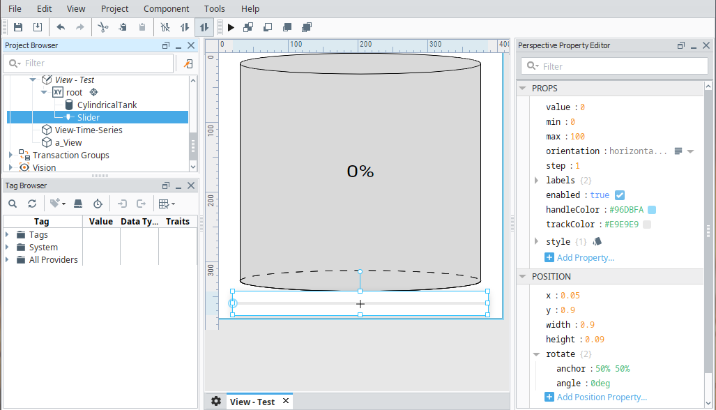
In this example, we have a Coordinate container with a Cylindrical Tank component and a Slider component. We've set the container property to percent so that the components will grow and shrink with the container size.
Container properties
| Property | Value |
|---|---|
| props.mode | percent |
Cylindrical Tank properties
| Property | Value |
|---|---|
| position.x | 0.05 |
| position.y | 0 |
| position.width | 0.9 |
| position.height | 0.9 |
Slider properties
| Property | Value |
|---|---|
| position.x | 0.05 |
| position.y | 0.9 |
| position.width | 0.9 |
| position.height | 0.09 |