Perspective - Embedded View

Component Palette Icon:
Description
The Embedded View component allows you to include an entire view inside another. Using this component allows you to select a view to display, and to pass parameters into the view. Because of this, views can easily act as templates for information.
For example, you could create a tank view and embed several into another, larger view that shows an overview of the facility.
Using an Embedded View is different than a container because you cannot alter the contents of the view. A new container would allow you to create a new grouped set of components.
Embedded views are convenient, but oversaturating your view may come with performance issues. Too many embedded views in a single view or too many nested embedded views, along with potential race conditions from passing parameters between embedded views may cause slow performance.
Properties
Most Properties have binding options. For more information on Bindings, see Types of Bindings in Perspective. This section only documents the Props Category of properties. The other Categories are described on the Perspective Component Properties page.
| Name | Description | Property Type |
|---|---|---|
| path | Path of the view to load in wrapper. New in 8.1.29 If a path is present in the path property field, an Open View  icon will appear that will navigate directly to the view when clicked. icon will appear that will navigate directly to the view when clicked. | value: string |
| params | Parameters for the view. If passing parameters into the embedded view, the names here must match the parameters on that view. New in 8.1.4 As of 8.1.4 a dropdown list of parameters is available when the user clicks the Add Object Member  icon. This makes it easy to add parameters from the embedded view. See also Embedded Views. icon. This makes it easy to add parameters from the embedded view. See also Embedded Views.  | object |
| useDefaultViewWidth | Use of view's default width instead of adjusting based on the content's width. | value: boolean |
| useDefaultViewHeight | Use of view's default height instead of adjusting based on the content's width. | value: boolean |
| loading | New in 8.1.5 View loading settings.
| object |
| style | Sets a style for this component. Full menu of style options is available for text, background, margin and padding, border, shape and miscellaneous. You can also specify a style class. | object |
Component Events
The Perspective Event Types Reference page describes all the possible component event types for Perspective components. Not all component events support each Perspective component. The Component Events and Actions page shows how to configure events and actions on a Perspective component. Component scripting is handled separately and can be accessed from the Component menubar or by right clicking on the component.
Example
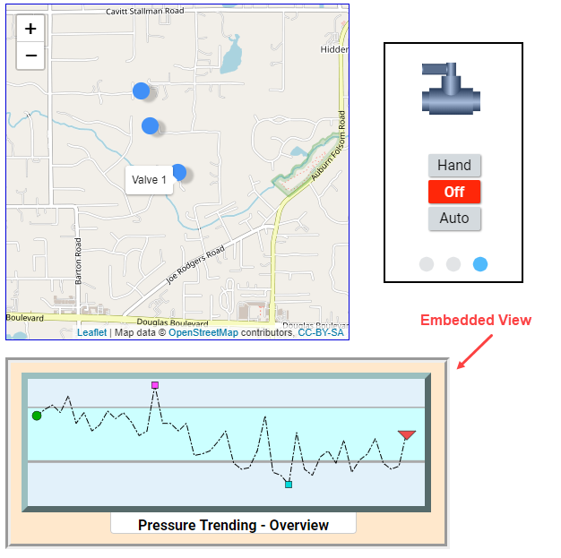
In this example, there is a Map component and a Carousel component on the top of the page. Underneath them, we've placed an Embedded View component. The idea was to embed this overview to give users a quick visual reference to bigger picture trends for the site. This example assumes you have a view already created named "Pressure Trend Overview". The table below shows the properties for just the Embedded View.
| Property | Value | Style Category |
|---|---|---|
| props.path | Pressure Trend Overview | N/A |
| props.style.backgroundColor | #FFE8CC | background |
| props.style.borderStyle | groove | border |
| props.style.borderWidth | 6px | border |