Carousel Component Examples
Example 1
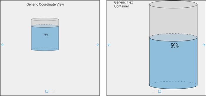
In this example we made two view containers. One is a coordinate container and the other is flex container, named generic_coordinate and generic_flex, respectively. Each has a Label component and a Cylindrical Tank component. The Label's text property shows the name of the view it is in. The Cylindrical Tank's value property shows a level above 20. The generic_flex view is set to display as a row. We did not adjust any other settings on these two generic screens.
Once the two view containers are set up, we can create the Carousel with the following properties and values:
| Property | Value | Style Category |
|---|---|---|
| props.views.0.viewPath | generic_coordinate | N/A |
| props.view.1.viewPath | generic_flex | N/A |
| props.autoplay.enabled | true | N/A |
| props.autoplay.pauseOnHover | true | N/A |
| props.appearance.useDefaultViewWidth | false | N/A |
| props.appearance.useDefaultViewHeight | false | N/A |
| props.appearance.dots.iconPath | /system/images/material/crop_square | N/A |
| props.appearance.arrows.enabled | true | N/A |
| props.style.borderStyle | solid | border |
| props.style.borderWidth | 1px | border |
| props.style.backgroundColor | #EFEFEF | background |
Example 2
In this example, we have set up a Carousel component that enables users to quickly move between four views showing valves and multistate buttons. The views must be created before the carousel, but it doesn't matter what the contents of the views are. You could use any combination of views including duplicates. Example 3 below describes setting up the views to scroll through in more detail.

They are named as follows in a Views - Test folder:
- CarouselView
- FirstView
- SecondView
- ThirdView
- FourthView

The properties used for the Carousel component are as follows:
| Property | Value | Style Category |
|---|---|---|
| props.views.0.viewPath | Views - Test/FirstView | N/A |
| props.views.1.viewPath | Views - Test/SecondView | N/A |
| props.views.2.viewPath | Views - Test/ThirdView | N/A |
| props.views.3.viewPath | Views - Test/FourthView | N/A |
| props.autoplay.enabled | false | N/A |
| props.appearance.useDefaultViewWidth | true | N/A |
| props.appearance.useDefaultViewHeight | true | N/A |
| props.appearance.dots.enabled | true | N/A |
| props.appearance.dots.iconPath | material/adjust | N/A |
| props.appearance.dots.styles.active.fillColor | #0000D9 | N/A |
| props.appearance.arrows.enabled | true | N/A |
| props.appearance.arrows.next.iconPath | material/arrow_right | N/A |
| props.appearance.arrows.next.fillColor | #0000D9 | N/A |
| props.appearance.arrows.previous.iconPath | material/arrow_left | N/A |
| props.appearance.arrows.previous.fillColor | #0000D9 | N/A |
| props.style.borderStyle | ridge | border |
| props.style.borderWidth | 5px | border |
| props.style.borderRadius | 20 | border |
| props.style.borderColor | #808080 | border |
Example 3
This example demonstrates a more complex case of how to configure side scrolling using the Carousel component starting with the initial project setup.
Initial Project Setup
First we'll create three views for the carousel to scroll through.
-
In the Project Browser, right-click on Views and select the NewFolder
 option. We named our folder Carousel Example.
 -
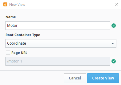
Right-click on the Carousel Example folder and select the NewView
 option.
- Name: Motor
- Layout: Coordinate
- Page URL: unchecked
-
Click Create View.
-
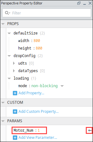
Next, create a view parameter that we can use for the motor number. In the Property Editor under PARAMS, click on the Add View Parameter
 icon.
icon.-
Select value.
-
Change key to Motor_Num.
-
Change value to 1.
-
Make sure the arrow icon is facing to the left, indicting this is an input parameter.
-
-
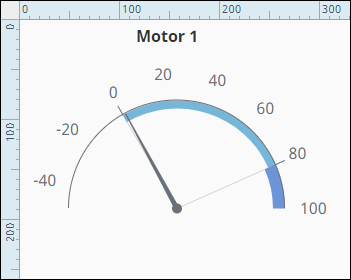
Next, make a title that will change depending on the Motor that's being displayed. Drag a Label component onto the view.
-
Bind the Label's text property to the view parameter as follows:
-
Click the binding
 icon next to the text property.
 -
Select Expression as the binding type.
-
Enter "**Motor **" +.
-
Click the Property
 icon then scroll down and select the Motor_Num view parameter.
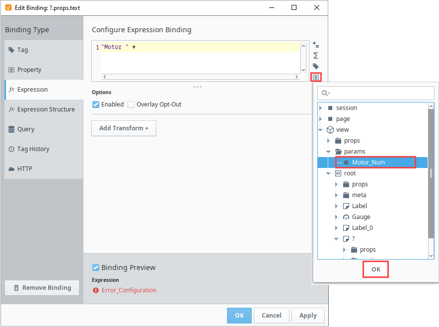
-
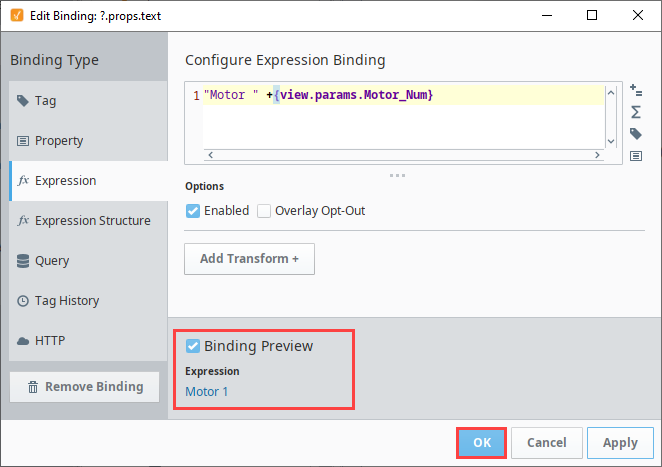
Click OK. You'll now see the binding preview shows "Motor 1."
-
Click OK to save the binding.
-
-
Next, drag a Gauge component onto the view to display motor Amps.
-
Align the Motor label centered above the Gauge component.
-
In the Property Editor, expand the outerAxis properties. Change the properties as follows:
-
minValue: -50
-
maxValue: 100
-
-
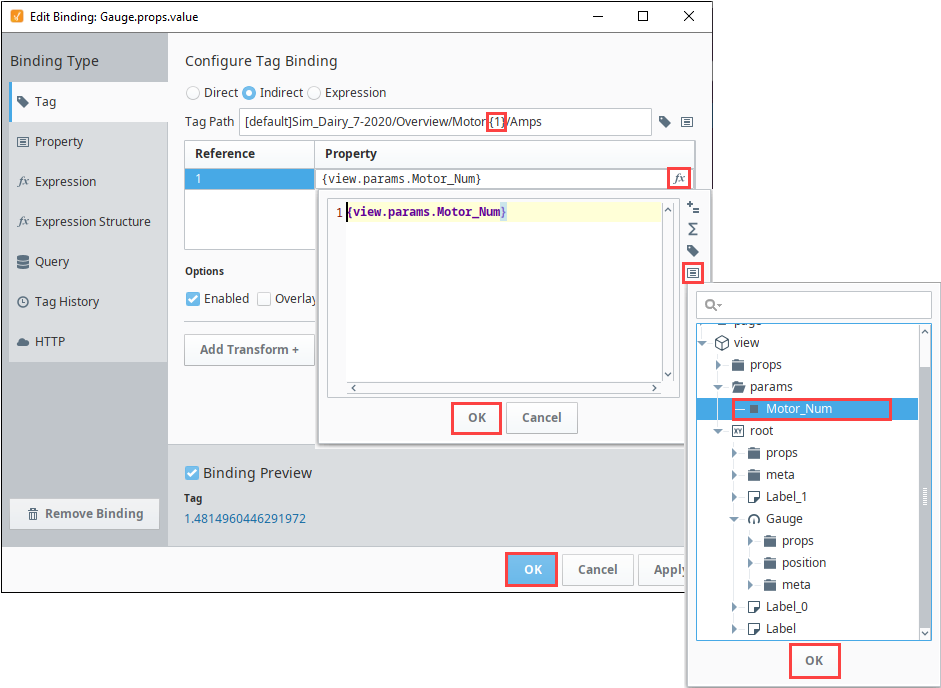
Now we'll set up an indirect tag binding using one of the motor tags in the Dairy simulator. (For more information on the Dairy simulator, see Programmable Device Simulator.) Select the Gauge component.
-
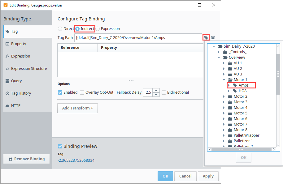
In the Property Editor, click the binding
icon next to the value property. On the Configure Tag Binding page set the following:-
Choose Tag as the binding type.
-
Select the Indirect option.
-
Next to the Tag Path field, click on the Tag
 icon and navigate to the the Motor 1/Amps tag in the Dairy simulator program.
 -
Click OK.
-
In the Tag Path field, replace the 1 with 1.
-
In the References list, under Property, click on the Functions
 icon.
icon. -
Click the Properties
 icon.
icon. -
Scroll to the view params folder and select Motor_Num. Click OK.
-
Click OK again. You'll see the binding in the preview area.
-
Click OK to save the binding.
-
-
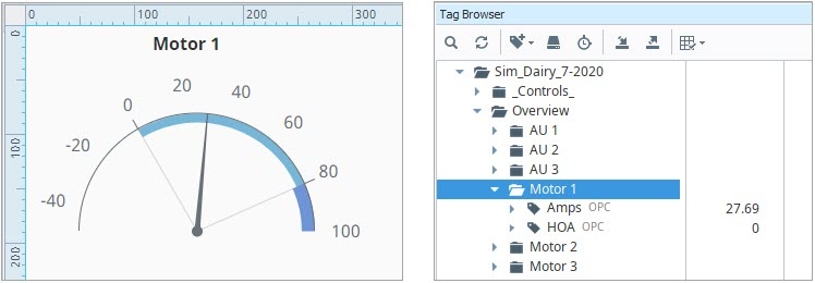
Confirm the Gauge now displays the value of the Amps tag.
-
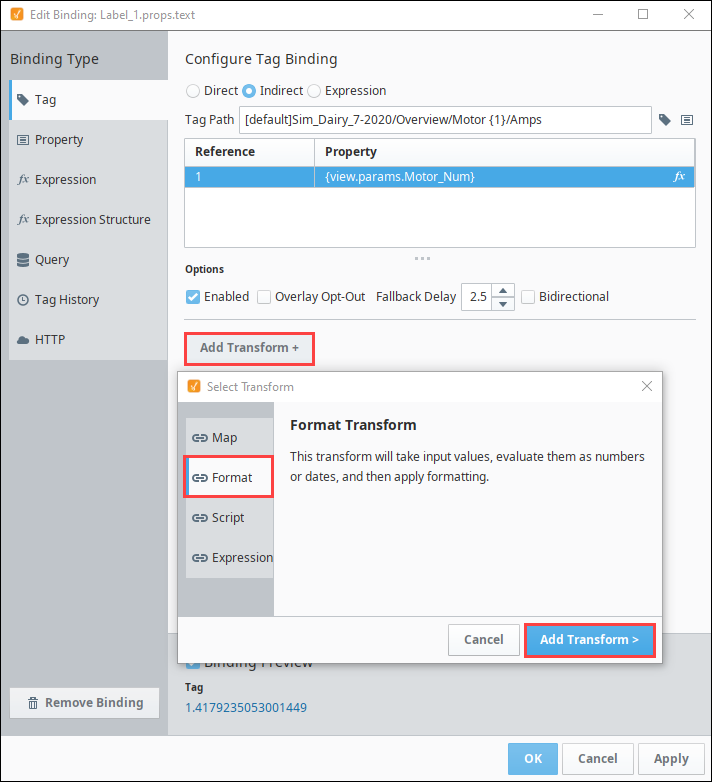
Drag a Label component onto your view. Place it under the Gauge component and change the text property to AMPS.
-
Drag another Label component onto your view and place it next to the AMPS label. We'll set up a similar indirect tag binding on this label.
-
Select the second Label click the binding
icon next to the value property.-
Select Tag as the binding type and click the Indirect radio button.
-
Next to the Tag Path field, click on the Tag
icon and navigate to the the Motor 1/Amps Tag in the Dairy simulator program. -
Click OK.
-
In the Tag Path field, replace the 1 with 1.
-
In the References list, under Property, click on the Functions
icon. -
Click the Properties
icon. -
Scroll to the view params folder and select Motor_Num. Click OK.
-
Click Apply. You'll see the binding in the preview area.
-
For this Label component we don't want the full tag value displayed. So we'll add a Transform to limit it to two decimal points. Click on Add Transform.
-
Select Format, then click Add Transform.
-
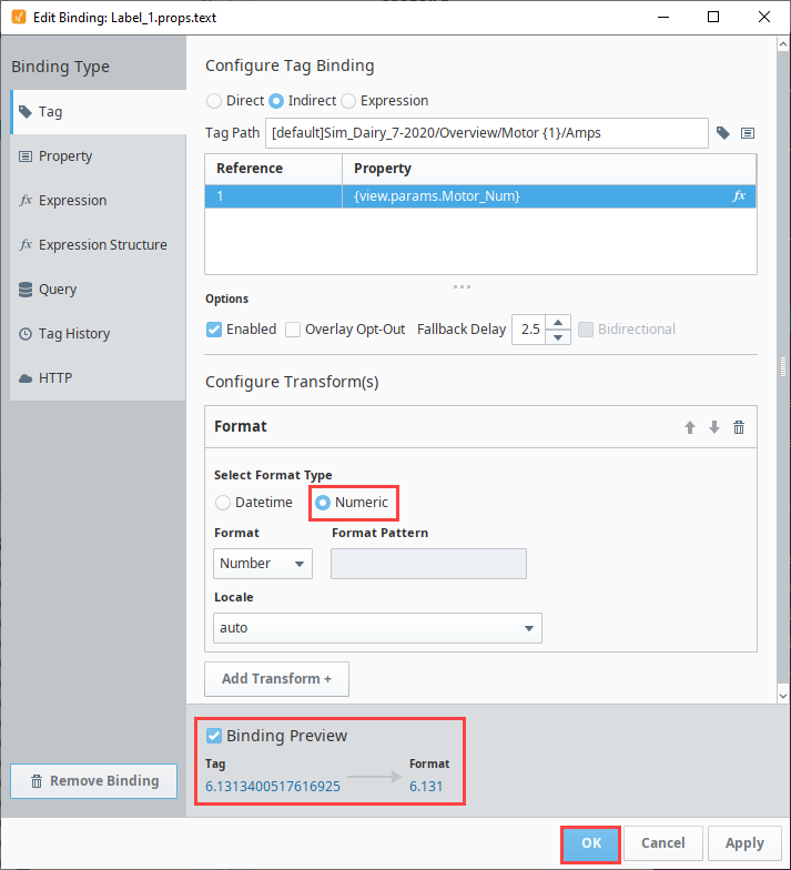
Select Numeric as the Format type. The displayed value will now be shortened to just two decimal points. You can see the format in the Binding Preview.
-
Click OK to save the binding.
-
Set Up the Carousel View
Now we'll set up a view that holds the Carousel component.
-
Right-click on the Carousel Example folder and select the NewView
option. -
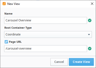
Name the view Carousel Overview. Check the Page URL option.
-
Click Create View.
-
Drag a Carousel component onto the view.
-
In the Property Editor, click the Expand
 icon in expand the props.views.0.viewPath property and select the Motor view.
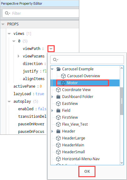
-
Under viewParams, click the Add
icon then choose value. -
Replace key with Motor_Num and replace value with 1.
-
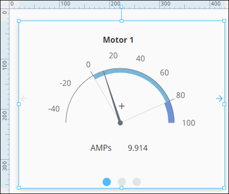
Click OK. The Motor view now appears in the Carousel component. You may need to expand your Carousel component slightly to fit the Motor view in without scrollbars.
-
Next, we'll add two more views. Click on the Add
icon two times for the Property Editor's views property.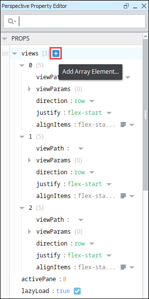
-
Under the props.views.1.viewPath property, choose the Motor view.
- Under viewParams, click the Add icon then choose value.
- Replace key with Motor_Num and replace value with 2. This will point this instance to the Motor 2/AMPS Tag.
- Click OK.
- Under viewParams, click the Add
-
Under the props.views.2.viewPath property, choose the Motor view.
- Under viewParams, click the Add icon then choose value.
- Replace key with Motor_Num and replace value with 3. This will point this instance to the Motor 3/AMPS Tag.
- Click OK.
- Under viewParams, click the Add
-
Save your project.
-
Put the Designer into Preview mode. Click the left and right arrows or the dots to scroll between the three Motor views.

-
Lastly, we decided to change a few properties on the Carousel to update the appearance. Here are the settings we used:
| Property | Value |
|---|---|
| props.appearance.dots.enabled | false |
| props.appearance.arrows.next.iconPath | material/navigate_next |
| props.appearance.arrows.next.fillColor | #AC00AC |
| props.appearance.arrows.previous.iconPath | material/navigate_before |
| props.appearance.arrows.previous.fillColor | #AC00AC |
| props.style.borderStyle | outset |
| props.style.borderColor | #AC00AC |
| props.style.borderWidth | 7 |
| props.style.borderTopLeftRadius | 15 |
| props.style.borderTopRightRadius | 15 |
| props.style.borderBottomLeftRadius | 15 |
| props.style.borderBottomRightRadius | 15 |