Grouping Data Inside of Tables
Another important feature of tables is the ability to separate a single dataset into different categories or groups. When using a table in a report, you can group data in the table by a specific column. With Dataset Grouping, you can break tables down by data keys that share a common value (i.e., if you have a table that shows addresses, you can group the rows by the city, state, zip code, or any combination of the columns). This is done by dragging and dropping any of your data keys from the Key Browser to the Grouping list under the Configure Table tab.
When you add a data key to the Grouping list, a corresponding Details row will be added to your table component. Using dataset grouping allows you use data keys to organize and arrange your data into different categories, organizing the results based on the values of a key. Each group can have its own Header, Details, and Summary rows. Additionally, the keys from Show Calculations and other keychain functions are supported for any level of grouping.
Table Groups and Grouping Data in Tables are two completely different things despite having similar names. Table Grouping involves using multiple datasets in the same Table component while Grouping Data Inside of Tables (this page) sorts the rows inside a single dataset.
Demonstration
Assuming an initial table that looks like the following:
| Type | Count |
|---|---|
| Type 1 | 100 |
| Type 2 | 45 |
| Type 2 | 450 |
| Type 4 | 123 |
| Type 3 | 50 |
| Type 1 | 250 |
| Type 3 | 871 |
| Type 2 | 984 |
We could utilize Dataset Grouping to group the results in the table by unique "Type" values. By adding a grouping on the Type column, and some additional formatting, we can produce a table that looks like the following:
| Type 1 | Count |
|---|---|
| 100 250 | |
| Type 2 | Count |
| 45 450 984 | |
| Type 3 | Count |
| 50 871 | |
| Type 4 | Count |
| 123 |
Notice that we're no longer listing each type individually. Instead, the type acts as a sub-header for each group of data. See the example below for a how-to.
Grouping Data Inside of a Table Example
This example begins with a table similar to the one created in the Report Workflow Tutorial. This example will demonstrate how to group the existing downtime report by equipment, collect downtime totals, and introduce some formatting techniques.
-
In the Data panel, create a Data Source that has a Timestamp, Equipment, Downtime, and Cause. Shown below is the text needed for a Static CSV datasource used for this example.
Data Source for Equipment Downtime ReportT_stamp, Equipment, Downtime, Cause
"Jan 20, 2017 17:55", "Labeler", 50, "Out of labels"
"Feb 20, 2017 18:40", "Filler", 120, "Overflow"
"Feb 28, 2017 12:45", "Palletizer", 21, "Misalignment"
"Feb 12, 2017 20:13", "Labeler", 98, "Stuck labels"
"Jan 21, 2017 18:15", "Conveyor Line", 27, "Backup"
"Feb 25, 2017 16:22", "Filler", 2, "Scheduled Maintenance"
"Feb 13, 2017 19:19", "Conveyor Line", 21, "Scheduled Maintenance"
"Jan 20, 2017 15:30", "Palletizer", 241, "Misalignment" -
In the Design panel, drag a Table component to your report.
-
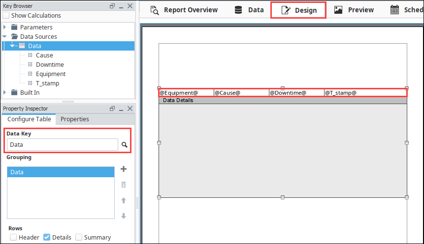
With the Table selected, drag the Data data source to the Data Key under the Configure Table tab of the Property Inspector.
-
Drag each of the data keys (i.e., Equipment, Cause, Downtime, and T-Stamp) to any of the columns in the table row.
-
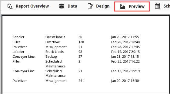
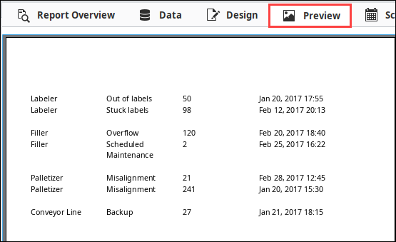
Click on the Preview panel to see what the report looks like. You'll notice that all your data is there, but it's a little hard to read because it's not organized.
-
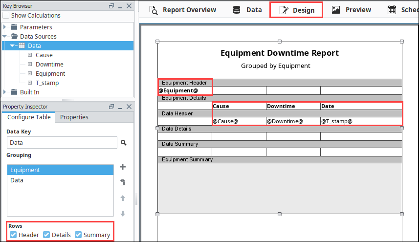
Let's sort each row in the table by equipment and group all the equipment together. Go to the Property Editor, and in the Configure Table, click the Add
 icon next to Grouping, and a window will open with a list of data keys. Select the 'Equipment' row, and click OK. You'll notice 'Equipment' was added to the Grouping list, and an Equipment Details row was immediately added to the table.
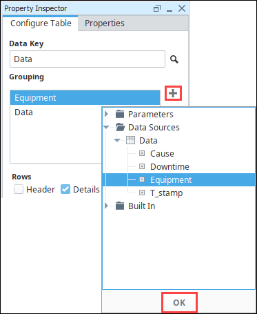
-
Go to the Preview panel to see that the report is now sorting by equipment name.
-
Let's remove the Equipment Name from each row in the table and add a Header. Go to the Design panel and cut '@Equipment@' from the Data Details row and paste it in the Equipment Details row. You can bold it to make it stand out.
-
While the table component is selected, go to the Configure Table tab in the Property Inspector and select the Equipment item in the grouping list and check both the Header and Summary boxes. Then select the Data group and select the Header and Summary checkboxes for it.
-
Next, make the Equipment header an unstructured row and add text as a title for your report using the Text Shape in the component palette. Unstructuring the row allows you to easily center the title of your report.
-
Now add header text for each of the Data Details columns (Cause, Downtime, and Date) by typing into the Data Header row.
-
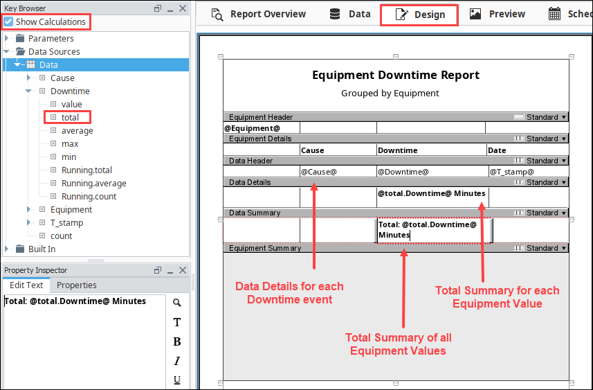
Set the Show Calculations checkbox at the top of the Key Browser. Drill down into the Downtime column and drag the '@total.downtime@' to both the Data Summary and Equipment Summary rows. You can also add any text outside of the @ symbols. In this example, we added 'minutes' after the total downtime in our cell to '@total.downtime@ minutes'.
-
Lastly, do the same in the Equipment Summary row. We also added the word "Total" to the beginning of the cell: 'Total: @total.downtime@ minutes'.
noteIn any Summary row, '@total.Downtime@' is a sum of all downtime at that level of grouping; (i.e, in the Data Summary row it is the total downtime grouped by equipment. In the Equipment Summary row, '@total.Downtime@' is the sum of all downtime for all equipment groupings).
-
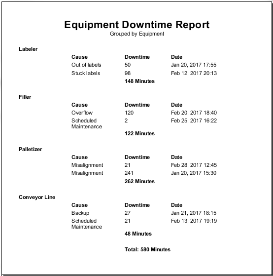
Click over to the Preview panel to check out your report. If you want to make any changes, go back to the Design panel to update your report. Notice that the 'total' data key respects both groupings.
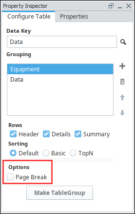
Separating Groupings using Page Breaks
In the Configure Table tab of the Property Inspector, there is a Page Break option that can be set to create breaks between each Grouping. Each new instance of that level of grouping creates a new page in the report. In the example above, we could add a page break in-between each grouping of equipment type, which would further delineate each grouping of data. This is especially useful if you are adding charts or other images at the beginning of each group.