Getting Started with the Report Table
The Report Table is another Reporting component, like report charts, that has a lot of features and functions that help you create meaningful reports. Tables are a major part of Reporting and simple to create. This page will give you a great head start for creating your own standard report tables using the built-in design tools.
Creating a Report Table
Creating a table is a simple process, but the order of how you create a table is important. The first thing you need before creating your report table is to create a data source. Your data source can be a query, script, or CSV file. Next, add a table and configure the data in the table that you want to display. Lastly, you can use the built-in tools to enhance your table. You can add images to your reports, change row types, show mathematical calculations, and much more.
The following example creates a standard table that tracks the downtime minutes for each production line. We'll configure the data in the table, perform a calculation, and make a few property changes so you get a sampling of the power of report tables.
Adding a Datasource
This example uses a CSV file as its datasource. You can use the one shown in the code block below, or create your own.
- In the Data panel, click the Add
 icon to add a datasource, and select StaticCSV from the resulting list of options. From the code block below, copy the text and paste it into the Data field. This is the data that we will use in this example.
| Downtime Data |
|---|
| Production Line, Downtime Line A, 75 Line B, 92 Line C, 43 Line D, 54 Line E, 66 Line F, 80 Line G, 40 Line H, 88 |
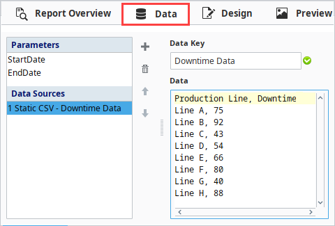
Table Configuration
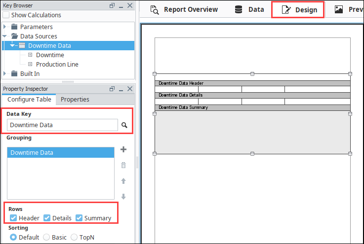
The most important step when configuring a Table is choosing the data source at the beginning. A single report can have many different data sources so the Table's Data Key needs to be assigned an individual data source. The next configuration options include adding header or summary rows and customizing the design.
-
Go to the Design panel and drag a Table component into the page.
-
From the Key Browser, expand the Datasources folder, and drag your data source (i.e., Downtime Data) into the Data Key field of the Configure Table tab of the Property Inspector.
-
Add Header and Summary rows by marking the checkboxes.
-
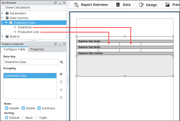
Now, let's configure the data in the Table. With the Table still selected, drag each of the data keys to a cell on the table above the Data Details row: (i.e., Production Line, and Downtime).
-
Next, let's add column headers by selecting a cell above one of our details cells, and enter the appropriate column header name (i.e., Production Line, and Downtime [Minutes]). You can change the font style, size, and color using the functions on the right side of the Edit Text Tab. Bold the headers using the Bold
 icon.
icon.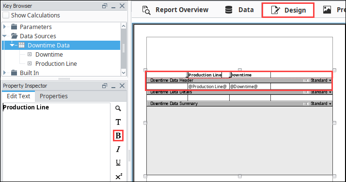
-
Go to the Preview panel to view how your report looks with the data. If it doesn't look how you want, continue making formatting changes as desired.

Finishing Touches
- Back in the Design panel, let's make a few changes. Select the "@Production Line@" in the Details row and click on the Properties Tab to see all the cell properties. Let's change the Horizontal Alignment property from left to Center so the data falls nicely under the header. Repeat this for "@Downtime@."
At any point during the table configuration process you can go to the Preview panel and see how your table looks with all the data. Configuring the data and designing the table layout is an iterative process. You can go back and forth between the Design and Preview panels as many times as you want making and viewing changes until you get the results you want.
-
In the Key Browser, check the Show Calculations field to display a list of available calculations.
-
Expand the Downtime data key and you'll see the 'total' calculation. Drag the 'total' key to a cell in the Summary row.
-
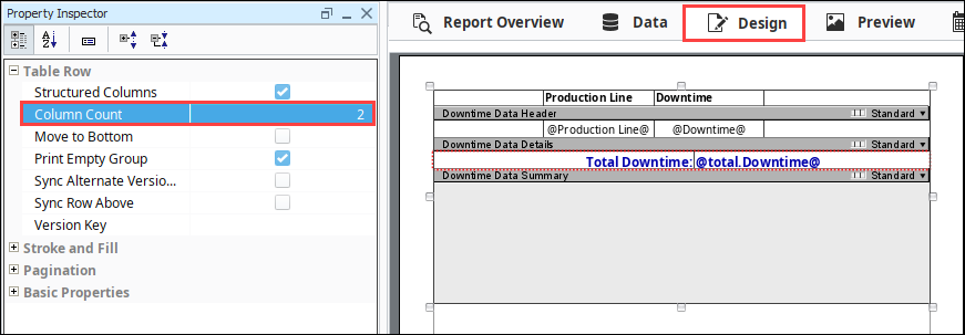
Now let's configure the Summary row title (i.e., Total Downtime). First, let's make the text blue and bold. If the cell is too small to show the title, you can make the cell larger by dragging the cell border either to the left or right. You can also make the Summary row taller, which will allow you to fit multiple summary values for each column.
-
With the Summary row still selected, we can go to the Properties tab and change the Column Count (i.e., 2), as shown in the screenshot below. This is an optional design choice for how to display the row title and corresponding data.
-
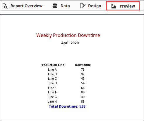
Click the Preview tab to check your work.
Preview a Report
The Preview panel lets you validate that all your data is organize and formatted, and you're completely satisfied with how your data is presented in the report. Once your satisfied, you can schedule the report to be run and delivered automatically.