Vision - Multi-State Indicator
Component Palette Icon
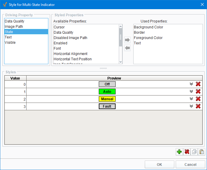
This component is a specialized label used to display a discrete state. The state must be represented by an integer, but the values and number of different states is customizable. Use the component's styles customizer to configure the different states.
Properties
| Property | Description | Property Type | Scripting | Category |
|---|---|---|---|---|
| Background Color | The background color of the component. Can be chosen from color wheel, chosen from color palette, or entered as RGB or HSL value. See Color Selector. | Color | .background | Appearance |
| Border | The border surrounding this component. Options are No border, Etched (Lowered), Etched (Raised), Bevel (Lowered), Bevel (Raised), Bevel (Double), and Field Border. Note: The border is unaffected by rotation. Changed in 8.1.21 As of 8.1.21, the "Button Border" and "Other Border" options are removed. | Border | .border | Common |
| Cursor | The mouse cursor to use when hovering over this component. Options are: Default, Crosshair, Text, Wait, Hand, Move, SW Resize, or SE Resize. | int | .cursorCode | Common |
| Disabled Image Path | The relative path of the image to be displayed when this component is not enabled. | String | .disabledPath | Appearance |
| Enabled | If disabled, a component cannot be used. | boolean | .componentEnabled | Common |
| Font | Font of text on this component. | Font | .font | Appearance |
| Foreground Color | The foreground color of the component. Can be chosen from color wheel, chosen from color palette, or entered as RGB or HSL value. See Color Selector. | Color | .foreground | Appearance |
| Horizontal Alignment | Determines the alignment of the label's contents along the X axis. | int | .horizontalAlignment | Layout |
| Horizontal Text Position | Determines the horizontal position of the label's text, relative to its image. | int | .horizontalTextPosition | Layout |
| Icon-Text Spacing | The space (in pixels) between the icon (if any) and the text (if any). | int | .iconTextGap | Appearance |
| Image Path | The relative path of the image. | String | .path | Appearance |
| Mouseover Text | The text that is displayed in the tooltip which pops up on mouseover of this component. | String | .toolTipText | Common |
| Name | The name of this component. | String | .name | Common |
| Quality | The data quality code for any Tag bindings on this component. | QualityCode | .quality | Data |
| State | The current state of the component. | int | .state | Data |
| Styles | Contains the component's styles. | Dataset | .styles | Appearance |
| Text | Text of this Label. | String | .text | Data |
| Vertical Alignment | Determines the alignment of the label's contents along the Y axis. | int | .verticalAlignment | Layout |
| Vertical Text Position | Determines the vertical position of the label's text, relative to its image. | int | .verticalTextPosition | Layout |
| Visible | If disabled, the component will be hidden. | boolean | .visible | Common |
Deprecated Properties
| Property | Description | Property Type | Scripting | Category |
|---|---|---|---|---|
| Data Quality | The data quality code for any Tag bindings on this component. | int | .dataQuality | Deprecated |
Scripting
Component Functions
This component does not have component functions associated with it.
Extension Functions
This component does not have extension functions associated with it.
Event Handlers
Event handlers allow you to run a script based off specific triggers. See the full list of available event handlers on the Component Events page
Customizers
The Style Customizer for the Multi-State Indicator includes one additional Driving Property: State. The State is represented by an integer, but the values and number of different states are customizable.
Additional Customizers
Examples
| Property Name | Value |
|---|---|
| Styles | As defined by the style customizer. |