Vision - Linear Scale

Component Palette Icon
The Linear Scale component displays a series of tick marks and labels representing a linear range, as well as indicators that represent a value or range of values positioned on the linear scale.
There is no tall/wide property for this component. This is based on the width/height of the component. A tall Linear Scale has tick marks on the left or right, and a wide component has tick marks on the top or bottom.
Properties
| Property | Description | Property Type | Scripting | Category |
|---|---|---|---|---|
| Border | The border surrounding this component. Options are No border, Etched (Lowered), Etched (Raised), Bevel (Lowered), Bevel (Raised), Bevel (Double), and Field Border. Note: The border is unaffected by rotation. Changed in 8.1.21 As of 8.1.21, the "Button Border" and "Other Border" options are removed. | Border | .border | Common |
| Cursor | The mouse cursor to use when hovering over this component. The mouse cursor to use when hovering over this component. Options are: Default, Crosshair, Text, Wait, Hand, Move, SW Resize, or SE Resize. | int | .cursorCode | Common |
| Fine Tick Color | The line color for fine ticks. Can be chosen from color wheel, chosen from color palette, or entered as RGB or HSL value. See Color Selector . | Color | .fineTickColor | Appearance |
| Fine Tick Length | The line length for fine ticks, in pixels. | double | .fineTickLength | Appearance |
| Fine Tick Span | The span length for fine ticks. Should be a factor of the major and minor tick spans. Use zero to disable fine ticks. | double | .fineTickSpan | Data |
| Fine Tick Thickness | The line thickness for fine ticks, in pixels. | float | .fineTickStroke | Appearance |
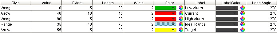
| Indicators | This dataset stores the indicators (if any) for the scale. | Dataset | .indicators | Data |
| Label Angle | Changes the angle that the labels are drawn. | int | .labelAngle | Appearance |
| Label Color | The color used for drawing tick labels. See Color Selector . | Color | .majorTickLabelColor | Appearance |
| Label Font | The font used for drawing tick labels. See Color Selector. | Font | .majorTickFont | Appearance |
| Label Format | The label format string. Examples: "%.1f" will render numbers like "15.0", "%.0f" will render numbers like "15". Using the empty string "" will disable the labels. | String | .majorTickLabelFormat | Appearance |
| Major Tick Color | The line color for major ticks. See Color Selector. | Color | .majorTickColor | Appearance |
| Major Tick Length | The line length for major ticks, in pixels. | double | .majorTickLength | Appearance |
| Major Tick Span | The span length for major ticks. Should be a multiple of the minor and fine tick spans. | double | .majorTickSpan | Data |
| Major Tick Thickness | The line thickness for major ticks, in pixels. | float | .majorTickStroke | Appearance |
| Margin | The margin to leave blank as a percentage of the total height or width of the scale. | double | .margin | Appearance |
| Max Value | The upper bound of the scale. | double | .maxValue | Data |
| Min Value | The lower bound of the scale. | double | .minValue | Data |
| Minor Tick Color | The line color for minor ticks. See Color Selector. | Color | .minorTickColor | Appearance |
| Minor Tick Length | The line length for minor ticks, in pixels. | double | .minorTickLength | Appearance |
| Minor Tick Span | The span length for minor ticks. Should be a factor of the major tick span and a multiple of the fine tick spans. Use zero to disable minor ticks. | double | .minorTickSpan | Data |
| Minor Tick Thickness | The line thickness for minor ticks, in pixels. | float | .minorTickStroke | Appearance |
| Mirror | Mirror the scale so it paints against the opposite edge. | boolean | .mirror | Appearance |
| Mouseover Text | The text that is displayed in the tooltip which pops up on mouseover of this component. | String | .toolTipText | Common |
| Name | The name of this component. | String | .name | Common |
| Quality | The data quality code for any Tag bindings on this component. | QualityCode | .quality | Data |
| Reverse Range | Reverse the scale so that values go from high to low instead of low to high. | boolean | .reverseRange | Appearance |
| Visible | If disabled, the component will be hidden. | boolean | .visible | Common |
Deprecated Properties
| Property | Description | Property Type | Scripting | Category |
|---|---|---|---|---|
| Data Quality | The data quality code for any Tag bindings on this component. | int | .dataQuality | Deprecated |
Scripting
Component Functions
This component does not have component functions associated with it.
Extension Functions
This component does not have extension functions associated with it.
Event Handlers
Event handlers allow you to run a script based off specific triggers. See the full list of available event handlers on the Component Events page
Customizers
The Linear Scale Customizer allows you to configure the indicators that visually represent how your data is displayed on the scale. You can choose from several indicator styles: Arrow, Line, Range, and Wedge. Not all Linear Scale Customizer properties are available with all indicator styles. The property will be grayed out if it is not available for the selected indicator. Use the preview window to validate the style you want to use for your data.
To make your indicator values dynamic, you can use a Cell Update binding on the Indicators property of this component.
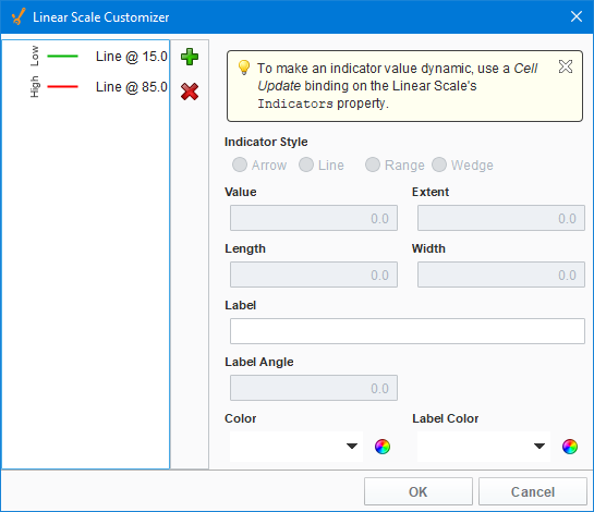
Linear Scale Customizer - Property Descriptions
| Property | Description |
|---|---|
| Indicator Style | There are four indicator styles to choose from: Arrow, Line, Range, and Wedge.
|
| Value | The position of the indicator. |
| Extent | Overall thickness of the indicator. Not valid for a Line style. |
| Length | The number of pixels to draw the indicator starting at the component edge. |
| Width | Thickness of the line in the indicator. Only valid for Arrow and Line styles. |
| Label | Name displayed next to the indicator. |
| Label Angle | The angle of the label specified in degrees. |
| Color | Color of the indicator. |
| Label Color | Color of the indicator Label. |
Examples
Horizontal Scale with Blue Indicators

Properties