Vision - Compass
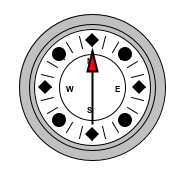
Component Palette Icon
The compass is a component that displays up to three needles at once on a cardinal direction compass. This can be useful for plotting anything that has a cardinal direction, such as the wind direction. Each needle can use one of nine different styles. Use the "Disabled" style to turn off any needle.
Properties
| Property | Description | Property Type | Scripting | Category |
|---|---|---|---|---|
| Border | The border surrounding this component. Options are No border, Etched (Lowered), Etched (Raised), Bevel (Lowered), Bevel (Raised), Bevel (Double), and Field Border. Note: The border is unaffected by rotation. Changed in 8.1.21 As of 8.1.21, the "Button Border" and "Other Border" options are removed. | Border | .border | Common |
| Center Color | The center color of the compass. Can be chosen from color wheel, chosen from color palette, or entered as RGB or HSL value. See Color Selector . | Color | .centerColor | Appearance |
| Cursor | The mouse cursor to use when hovering over this component. Options are: Default, Crosshair, Text, Wait, Hand, Move, SW Resize, or SE Resize. | int | .cursorCode | Common |
| Label Font | The font to use for the compass's labels. | Font | .labelFont | Appearance |
| Mouseover Text | The text that is displayed in the tooltip which pops up on mouseover of this component. | String | .toolTipText | Common |
| Name | The name of this component. | String | .name | Common |
| Quality | The data quality code for any Tag bindings on this component. | QualityCode | .quality | Data |
| Rose Color | The background color of the rose. See Color Selector . | Color | .roseColor | Appearance |
| Rose Highlight | The highlight color of the rose. See Color Selector. | Color | .roseHighlightColor | Appearance |
| Styles | Contains the component's styles. | Dataset | .styles | Appearance |
| Value 1 | Value 1 for the compass. | double | .value1 | Data |
| Value 1 Color | The main color for Value 1's needle. See Color Selector. | Color | .value1Color | Appearance |
| Value 1 Needle | The needle type for this value. | int | .value1Needle | Data |
| Value 1 Outline | The outline color for value 1's needle. See Color Selector. | Color | .value1OutlineColor | Appearance |
| Value 2 | Value 2 for the compass. | double | .value2 | Data |
| Value 2 Color | The main color for Value 2's needle. See Color Selector. | Color | .value2Color | Appearance |
| Value 2 Needle | The needle type for this value. | int | .value2Needle | Data |
| Value 2 Outline | The outline color for Value 2's needle. See Color Selector. | Color | .value2OutlineColor | Appearance |
| Value 3 | Value 3 for the compass. | double | .value3 | Data |
| Value 3 Color | The main color for Value 3's needle. See Color Selector. | Color | .value3Color | Appearance |
| Value 3 Needle | The needle type for this value. | int | .value3Needle | Data |
| Value 3 Outline | The outline color for Value 3's needle. See Color Selector. | Color | .value3OutlineColor | Appearance |
| Visible | If disabled, the component will be hidden. | boolean | .visible | Common |
Scripting
See the Vision - Compass Scripting Functions page for the full list of scripting functions available for this component.
Event Handlers
Event handlers allow you to run a script based off specific triggers. See the full list of available event handlers on the Component Events page
Customizers
Examples
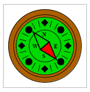
| Property Name | Value |
|---|---|
| Center Color | 0,217,0 |
| Rose Color | 172,95,0 |
| Label Font | Times New Roman, Bold, 14 |
| Value 1 | 140 |
| Value 1 Color | 255,0,0 |
| Value 1 Needle | Pointer |