Vision - Label
Component Palette Icon
The Label component can display text, images, or both. Its text can be HTML formatted (like most components) and can be bound to dynamic properties.
Properties
| Property | Description | Property Type | Scripting | Category |
|---|---|---|---|---|
| Background Color | The background color of the label, if opaque is set to "true". Can be chosen from color wheel, chosen from color palette, or entered as RGB or HSL value. See Color Selector. | Color | .background | Appearance |
| Border | The border surrounding this component. Options are No border, Etched (Lowered), Etched (Raised), Bevel (Lowered), Bevel (Raised), Bevel (Double), and Field Border. Note: The border is unaffected by rotation. Changed in 8.1.21 As of 8.1.21, the "Button Border" and "Other Border" options are removed. | Border | .border | Common |
| Cursor | The mouse cursor to use when hovering over this component. Options are: Default, Crosshair, Text, Wait, Hand, Move, SW Resize, or SE Resize. | int | .cursorCode | Common |
| Disabled Image Path | The relative path of the image to be displayed when this component is not enabled. | String | .disabledPath | Appearance |
| Enabled | If disabled, a component cannot be used. | boolean | .componentEnabled | Common |
| Fill Background | If true, the label's background color will be drawn. If false, it will have a transparent background. | boolean | .fillBackground | Appearance |
| Font | Font of text on this component. | Font | .font | Appearance |
| Foreground Color | The color of the Label's text. | Color | .foreground | Appearance |
| Horizontal Alignment | Determines the alignment of the label's contents along the X axis. | int | .horizontalAlignment | Layout |
| Horizontal Text Position | Determines the horizontal position of the label's text, relative to its image. | int | .horizontalTextPosition | Layout |
| Icon-Text Spacing | The space (in pixels) between the icon (if any) and the text (if any). | int | .iconTextGap | Appearance |
| Image Path | The relative path of the image. | String | .path | Appearance |
| Mouseover Text | The text that is displayed in the tooltip which pops up on mouseover of this component. | String | .toolTipText | Common |
| Name | The name of this component. | String | .name | Common |
| Quality | The data quality code for any Tag bindings on this component. | QualityCode | .quality | Deprecated |
| Rotation | The angle of rotation in degrees. | int | .rotation | Appearance |
| Styles | Contains the component's styles. | Dataset | .styles | Appearance |
| Text | Text of this Label. | String | .text | Data |
| Vertical Alignment | Determines the alignment of the label's contents along the Y axis. | int | .verticalAlignment | Layout |
| Vertical Text Position | Determines the vertical position of the label's text, relative to its image. | int | .verticalTextPosition | Layout |
| Visible | If disabled, the component will be hidden. | boolean | .visible | Common |
Deprecated Properties
| Property | Description | Property Type | Scripting | Category |
|---|---|---|---|---|
| Data Quality | The data quality code for any Tag bindings on this component. | int | .dataQuality | Data |
Scripting
Scripting Functions
This component does not have scripting functions associated with it.
Extension Functions
This component does not have extension functions associated with it.
Event Handlers
Event handlers allow you to run a script based off specific triggers. See the full list of available event handlers on the Component Events page
Customizers
Example
Stylized Label Inside a Popup Window
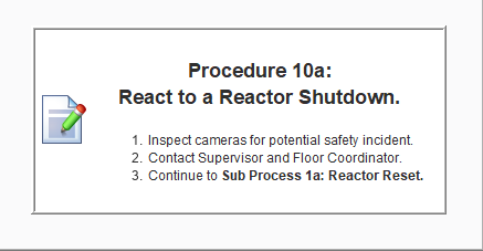
Properties
| Property | Value |
|---|---|
| Image Path | Builtin/icons/48/edit.png |
| Text | <html><p><strong><center><h2>Procedure 10a: <br>React to a Reactor Shutdown.</h2></center></strong></p><ol><li>Inspect cameras for potential safety incident.</li><li>Contact Supervisor and Floor Coordinator.</li><li>Continue to <strong>Sub Process 1a: Reactor Reset.</strong></li></ol></html> |