Perspective - Gauge

Component Palette Icon:
The Gauge component in Perspective provides a way to show realtime values in a range as they change. The gauge can have one or two axis. It is fully customizable in its appearance, from colors, line widths, needle length, radius, and more.
The Gauge component has three pre-configured variants:
- Half Circle - Default layout with a half-circle gauge.
- 3/4 Circle - Layout with a 3/4 circle gauge.
- Full Axis - Layout with a full axis gauge. For an example of each variant, see the examples section below.
Properties
Most Properties have binding options. For more information on Bindings, see Types of Bindings in Perspective. This section only documents the Props Category of properties. The other Categories are described on the Perspective Component Properties page.
| Name | Description | Property Type |
|---|---|---|
| value | Numeric value for the gauge to display. Default is 0. | value: numeric |
| secondaryValue | Optional secondary value for the gauge to display on a second axis. Default is 0. | value: numeric |
| startAngle | Radial position for the start of the gauge's axis. Default is 180. | value: numeric |
| endAngle | Radial position for the end of the gauge's axis. Default is 360. | value: numeric |
| outerAxis | Sets the values for an outer axis on the gauge. Click to see the outerAxis properties. | object |
| innerAxis | Sets the values for an inner axis on the gauge. Click to see the innerAxis properties. | object |
| backgroundColor | Color applied as a background within the gauge. Can be chosen from color wheel, chosen from color palette, or entered as RGB or HSL value. See Color Selector. | color |
| animate | Whether needle should be animated in a sweeping motion when value changes. Default is false. | value: boolean |
| reverseScale | If true, the gauge will reverse the direction from minValue to maxValue on its dial. | value: boolean |
| style | Sets a style for this gauge. Full menu of style options is available for text, background, margin and padding, border, shape and miscellaneous. You can also specify a style class. | object |
outerAxis Properties
| Name | Description | Property Type |
|---|---|---|
| data | What value this axis and its needle should display. Can be set to the value or secondary value of the gauge. | value: string dropdown |
| show | Whether the outer axis is displayed. Default is true (show). | value: boolean |
| minValue | Minimum gauge value for this axis. Default is zero (0). | value: numeric |
| maxValue | Maximum gauge value for this axis. Default is 120. | value: numeric |
| width | Width of the line (in pixels) that represents the outer axis. | value: numeric |
| color | Color of the arc line that represents the outer axis. Can be chosen from color wheel, chosen from color palette, or entered as RGB or HSL value. See Color Selector. | color |
| percentRadius | Radius of the outer axis, as a percentage of the total chart radius. | value: numeric |
| ranges | Zones defined on the gauge arc line with a unique color. Array values always start at 0 and increment.
| array |
| needle | Settings for the needle on the gauge.
| object |
| tickMarks | Settings for the display of the tick marks on the outer access.
| object |
innerAxis Properties
| Name | Description | Property Type |
|---|---|---|
| data | What value this axis and its needle should display. Can be set to the value or secondary value of the gauge. | value: numeric |
| show | Whether the inner axis is displayed on the gauge. Default is false (don't show). | value: boolean |
| minValue | Minimum gauge value for this axis. Default is zero (0). | value: numeric |
| maxValue | Maximum gauge value for this axis. Default is 80. | value: numeric |
| width | Width of the line (in pixels) that represents the inner axis. | value: numeric |
| color | Color of the arc line that represents the inner axis. Can be chosen from color wheel, chosen from color palette, or entered as RGB or HSL value. See Color Selector. | color |
| percentRadius | Radius of the inner axis, as a percentage of the total chart radius. | value: numeric |
| ranges | Number of zones defined on the gauge arc line with a unique color.
| array |
| needle | Settings for the display of the needle on the inner access.
| object |
| tickMarks | Settings for the display of the tick marks on the inner access.
| object |
Component Events
The Perspective Event Types Reference page describes all the possible component event types for Perspective components. Not all component events support each Perspective component. The Component Events and Actions page shows how to configure events and actions on a Perspective component. Component scripting is handled separately and can be accessed from the Component menubar or by right clicking on the component.
Examples
Example 1 - Fourth Axis

In this example we added a fourth axis (outerAxis.ranges.3) and configured it.
| Property | Value |
|---|---|
| Value | 75 |
| props.outerAxis.maxValue | 150 |
| props.outerAxis.ranges.3.start | 120 |
| props.outerAxis.ranges.3.end | 150 |
| props.outerAxis.ranges.3.width | 20 |
| props.outerAxis.ranges.3.color | #C077D8 |
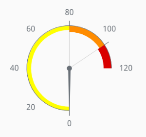
Example 2 - 3/4 Circle Variant

Start with the Gauge 3/4 Circle variant. Set the properties as follows:
| Property | Value |
|---|---|
| props.startAngle | 90 |
| props.endAngle | 360 |
| props.outerAxis.ranges.0.color | #FFFF00 |
| props.outerAxis.ranges.1.color | #FF8C00 |
| props.outerAxis.ranges.2.color | #D90000 |
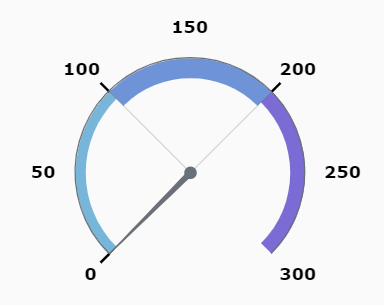
Example 3 - Full Axis Variant

Start with the Gauge Full Axis variant. Set the properties as follows:
| Property | Value |
|---|---|
| props.startAngle | 135 |
| props.endAngle | 405 |
| props.outerAxis.maxValue | 300 |
| props.outerAxis.ranges.0.end | 100 |
| props.outerAxis.ranges.1.start | 100 |
| props.outerAxis.ranges.1.end | 200 |
| props.outerAxis.ranges.2.start | 200 |
| props.outerAxis.ranges.2.end | 300 |
| props.outerAxis.tickMarks.color | #000000 |
| props.outerAxis.tickMarks.thickness | 2 |
| props.style.color | #000000 |
| props.style.fontFamily | Verdana |
| props.style.fontSize | 12 |
| props.style.fontWeight | bold |