Images and SVGs in Vision
Using SVGs
Ignition can import SVGs (Scalable Vector Graphic) into a Vision window. Once imported, SVGs can be modified and styled. To use an SVG in your project, simply drag the SVG file directly onto the window you want the SVG to appear on. The SVG becomes a new polygon component on the window.
Sometimes the way the SVG imports may result in the SVG appearing very small, in which case you can manually expand the SVG to your desired size.
Some elements, attributes, and properties in an SVG are not supported. The Vision module uses the Apache Batik library to handle SVGs, so a list of supported elements, attributes, and properties can be found on Apache Batik's website.
SVGs as Grouped Components
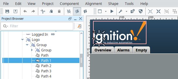
All SVG images are made up of a group or groups of several (and often many!) paths. These paths are Ignition's Drawing Tools, and are the basic building blocks of all SVGs in Ignition. You can select each path individually from the Project Browser, or by double-clicking on an SVG then single clicking on an object inside it.
Coloring an SVG
With SVGs, one useful HMI technique is to color the SVG (Scalable Vector Graphic) to show the state of whatever the SVG represents. Whether you are bringing in a vector graphic from the Symbol Factory or importing an SVG from your computer, you can easily color the SVG to suit your needs. There are two ways of coloring an SVG: coloring an individual piece of the SVG, or placing a tint over the whole SVG.
Coloring SVG Parts
Individual pieces of the SVG can be pulled out and colored, by finding the path that corresponds with the part of the SVG that you want colored and applying a color to it. This can be done for a single piece of the SVG, or multiple different pieces. These colors can even be made dynamic by setting up a binding on the Fill Color. Since the property is expecting a value with a data type of Color, you can either set up an expression binding which uses the color() function to create a color object, or use Ignition's built in Number to Color Translator, which will automatically be made available to you when selecting a binding that will typically return a value, such as a Tag or Property binding.
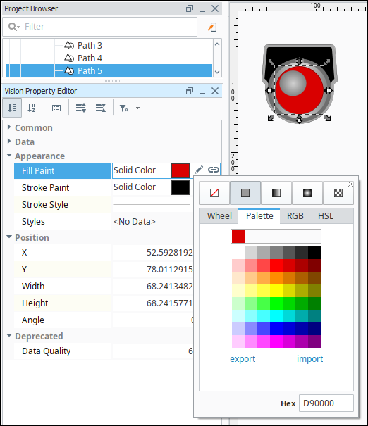
Coloring SVG Example
In this example, we selected an individual piece in a push button symbol and added a color to that area.
-
Place a push button image or any image from Symbol Factory onto the window.
-
Right-click on the image and select Ungroup.

-
Right-click in the center of the image and select Ungroup again.
-
Click on the larger inner circle in the image, then select the Fill Paint color you want. We chose red #D90000.
-
To get color in the "highlight" section of the graphic, click on the highlight. The Fill Paint for this section is a Radial Gradient.
-
Click on the Edit
 icon to change the colors in the gradient.
 -
Click on the left side stop and select white. Click on the right side stop and select red.

-
To regroup all the parts of the SVG, drag a box around them with your mouse. Then right-click and select Group.

Alternately, you can create a style using the Style Customizer to change the color of an SVG path based on a driving property on that path. This is typically done by setting up a custom property to use as the driving property, and then binding the custom property to the property or Tag that will drive the color change.
SVG Tinting
Because an SVG is typically composed of many smaller shapes, it is difficult to color the entire object, as it would require changing the color on every shape within the SVG. So instead of changing the color of the entire SVG, we can make a new shape that is the same shape and size as the SVG, and make it opaque, so that its color acts like a tint on top of the SVG. A clever way to do this is to duplicate the SVG, union together the new SVG, so that all shapes combine into one shape, and then change the color.
Tinting Example
Let's say you chose one of the many grayscale symbols, such as the 3-D Valve symbol from the Valves category, and you want to tint the valve green when the valve is open, red when the valve has a fault, and keep it gray when the valve is closed. For this example, you'll also need to have a Tag called ValveStatus, that is 0 for closed, 1 for open, and 2 for faulted.
-
Drag the symbol onto the screen.
-
Duplicate the symbol by selecting it and choosing Duplicate from the Edit menu, or pressing CTRL-D.
-
Now, select the duplicate symbol, which will be above the original.
-
Click the Union
 icon in the toolbar or find the Union item under the Shape menu. This will combine the duplicate SVG into a single shape.
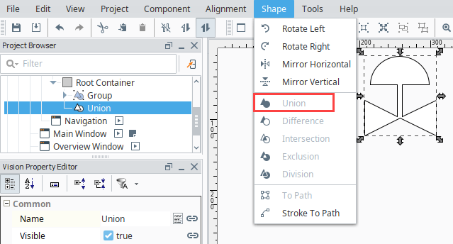
-
Remove the outline by setting the Stroke Paint property to No Paint
 .
. -
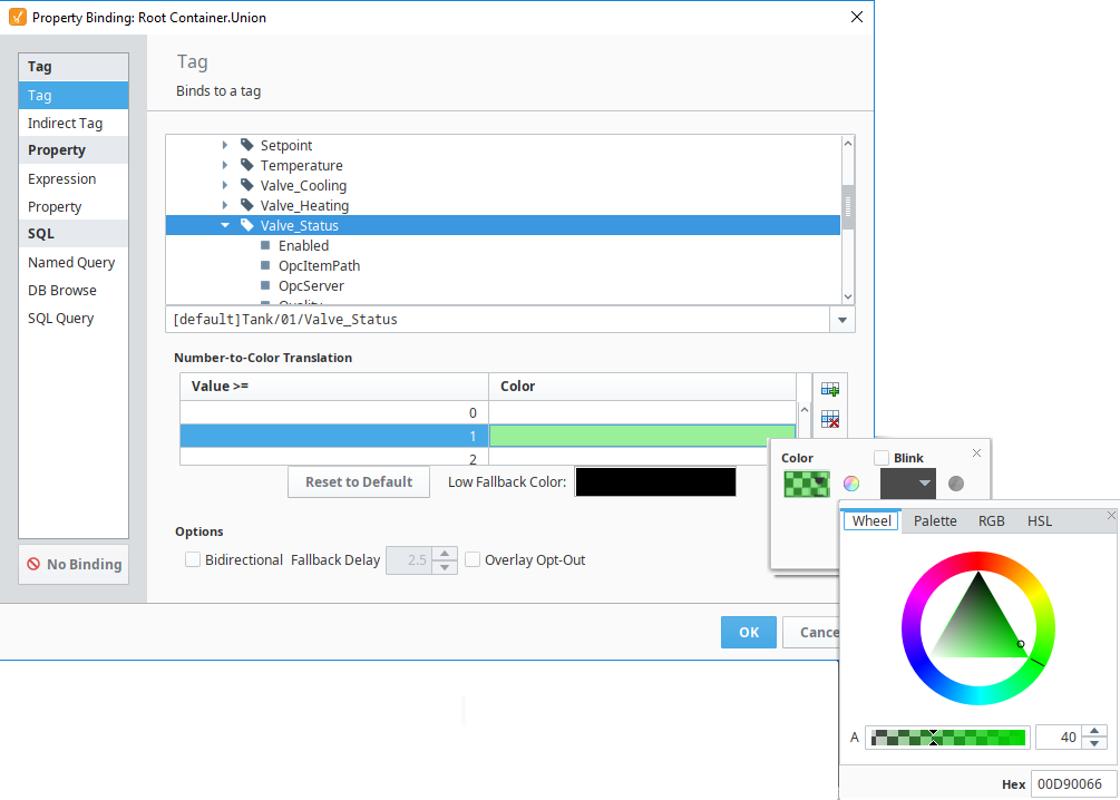
Click on the Binding
 icon next to the Fill Paint property.
 -
Select the Tag binding type.
-
Navigate to the Tag you want to use. For this example, we used a Valve_Status Tag.
-
In the Number-to-Color Translation, double click the color next to the Value 0 and select white.
-
Click the Add New Translation icon. Set the Value 1 at 40% opaque green.
-
Click the Add New Translation icon. Set the Value 2 at 40% opaque red.
-
Click OK to save the binding.
-
On the window, place another copy of the original symbol.
-
Select the colored symbol and select Alignment > Move to Front.
-
Next place the colored symbol on top of the original.
-
Select them both, then select Component > Group.

In summary, we made a flat shape that had the exact same outline as the symbol, and used semi-transparent fills to achieve a tint effect for the underlying symbol.
Using Images
Images can be very useful for displaying important information, such as giving visual representations of real world objects. There are a few ways that images can be brought into a Vision project. The first is by pulling images from The Image Management Tool, where the images are stored in the Gateway. The other way is to grab images using a filepath.
Using the Image Management Tool
Bringing in images using the Image Management Tool is easy.
-
Place an Image component on the Window.
-
In the Vision Property Editor, scroll down to Data and click on the Folder Search
 icon next to the Image Path property. This will bring up the Image Management Tool.
 -
In the Image Management Tool, find the image you want, and double click to select it.
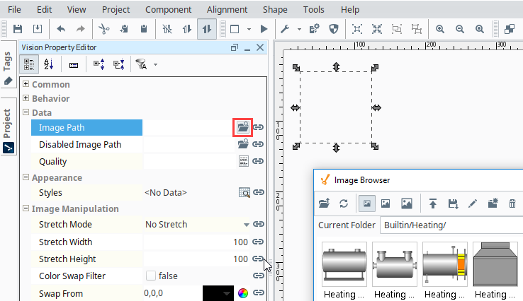
The path to the image is now displayed in the component's Image Path property. Images can be displayed in the image component, but they can also be used in components like labels and buttons.

You can add any images you want to the Image Management Tool, which are stored on the Gateway.
Instead of using images in the Image Management Tool in Image Path properties of components, you can use the file path to a local image. This is done by prefixing the file path with file:///. An example Image Path would look like this:
file:///C:/Users/Public/Pictures/Sample Pictures/Chrysanthemum.jpg
It is important to understand that this will only work if the image is accessible from where the client is running. So if you access an image from the Designer on the local machine, clients that launch elsewhere may not have the image stored in the same location. For this reason, we recommend storing the images in a location that everyone can reach, such as a shared drive.
When working with images found online, make sure to follow all applicable copyright laws.