Creating Vision Components
Adding Components to a Window
There are four primary methods for adding Vision components to a window:
- Select the component in the palette, and then clicking and dragging on the window.
- Drag a component's icon from a palette onto a container.
- Drag one or more Tags onto a window.
- Adding shapes using the drawing tools or SVGs.
The Component Palette
There are two styles of component palette in Ignition Vision: the tabbed palette and the collapsible palette. These palettes work in the same way, but the tabbed palette docks to the north or south edge of the workspace, and the collapsible palette docks to the east or west edge. By default, the collapsible palette is visible in the window workspace. To switch palettes, navigate to the View > Panels menu, and select either Component Palette - Tabbed Palette or Component Palette - Collapsible Palette.
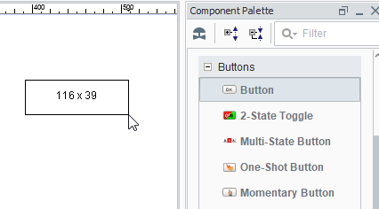
Creating Components Using Click and Drag
Components can be created on the window by first selecting them in the component palette, and then clicking and dragging on the window space. Draw a rectangle in the container to specify where the component should be placed and what size it should be.
Creating Components by Dragging from the Palette
Components can be created by dragging them from the component palette to the window. The component will be placed where they were dropped at its default size. Once on the window, the component can be resized using its resize handles.

Creating Components Using Tags
Components can also be created by simply dragging a Tag onto a container. Depending on the data type of the Tag, you will get a popup menu prompting you to select an appropriate type of component for that Tag. This technique is great for rapid application design as it does two things for you:
- The component is created at the position you dropped it.
- A variety of property bindings are created automatically.
Tags are used in windows to power property bindings on components. The easiest way to make some components that are bound to Tags is to drag and drop some Tags onto your window.
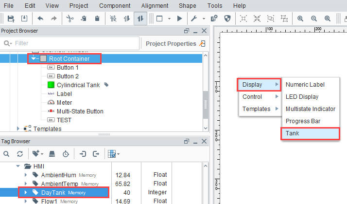
In the example above, we dragged the DayTank Memory Tag onto the window and were given the option of Display, Control, or Templates. Within the display components, we were given the option of displaying the tag in a Numeric Label, LED Display, Multistate Indicator, Progress Bar, or Tank component.
The bindings depend on what kind of Tag was dropped and what kind of component was created. For example, lets suppose you have a Float8 point that represents a setpoint, and you want to set it. Drop the Tag onto a container and choose to control it with a Numeric Text Field. The following bindings will be set up automatically:
- The text field's doubleValue property gets a bidirectional Tag binding to the Tag's Value property.
- The text field's minimum and maximum properties get Tag bindings to the Tag's EngLow and EngHigh properties, respectively.
- The text field's decimalFormat property gets a Tag binding to the Tag's FormatString property.
- The text field's toolTipText property gets a Tag binding to the Tag's Tooltip property.
It is important to realize that multiple property bindings are created when creating components this way. These bindings not only using the Tag's value, but much of the Tag's metadata as well. Using the Tags metadata in this way can greatly improve a project's maintainability. For example, if you decide that the setpoint needs 3 decimal places of precision, you can simply alter the Tag's FormatString to be #,##0.000, and anywhere you used that Tag will start displaying the correct precision because of the metadata bindings.
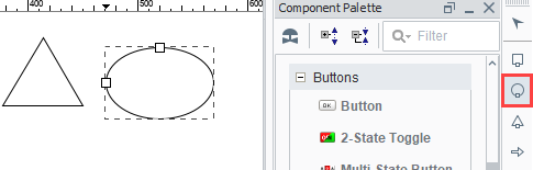
Creating Components Using Shapes
All of the shapes that you can draw using the shape tools are themselves components. As such, they have properties, event handlers, names, layout constraints, and all of the other things that you'll find on other components.
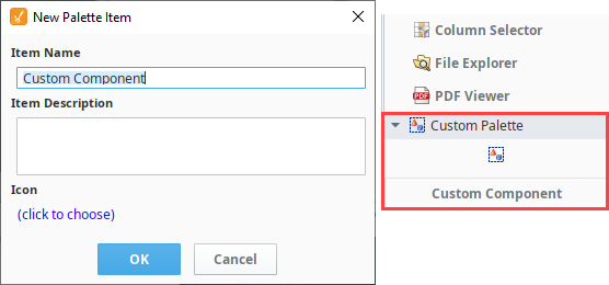
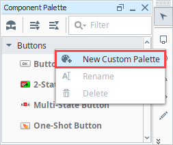
Custom Palette
Custom palettes are like expanded copy/paste clipboards. You can put customized components or groups of components into a palette for quick access.
To create a custom palette, right-click on a tab in the tabbed palette or a header in the collapsible palette, and choose New Custom Palette. Your custom palette will appear as the last palette. You can rename it by right clicking on the palette. Your custom palette has one special icon in it, the Capture  icon. To add components to your palette, select them and press the capture button. This effectively does a copy, and stores the captured components as a new item in the clipboard. You can then use that item much like a normal component, and add multiple copies of it to your windows.
You can assign your custom component a name and it will appear under the Custom Palette. Note that these are simple copies, and are not linked back to the custom palette. Re-capturing that palette item will not update all uses of that item across your windows.