How to Create a Flashing Component
In some cases you may want to have a label or other display component flash, standing out from other components on the screen. This can easily be accomplished by creating an animated style class, as they have a built-in mechanism to change styling over a duration, allowing us to create a flash. However, you may might only want to have the component flash at certain times, such as in cases where an alarm is active on a tag, which can be handled with a binding. In cases where we don't want the component to flash, we can simply remove the style class from a component.
Part 1 of this guide will show how to create the animated style class, while Part 2 will demonstrate using a binding and transform to switch between different style classes on a component.
Part 1 - Creating an Animated Style Class
-
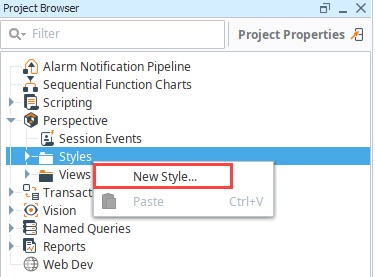
In the Project Browser, right-click Styles and select New Style.
-
Enter a Style Class name, for this example we used "InAlarm", and click Create Style Class.
-
On the Edit Style screen, check the Animated option in the upper right corner. For this example, we'll leave the default settings in the fields.
-
Next click on 0% to set the style for the beginning of the animation.
-
Click on the Expand
 icon next to Background to see the Background settings.
 -
In the Background color field, enter a color code or click on the color wheel to select a background color for the first animation stop. We chose #FF8A8A, a light red.

-
Next click on 100% to set the style for the end of the animation.
-
Click on the Expand
icon next to Background to see the Background settings. -
In the Background color field, enter a color code or click on the color wheel to select a background color for the first animation stop. We chose #FFFF47, a bright yellow.

-
Click OK to save the Style Class.
-
Next drag a Label component onto a view. Select the component.
-
In the Perspective Property Editor, click the Expand
icon under Style Classes. Select the InAlarm class.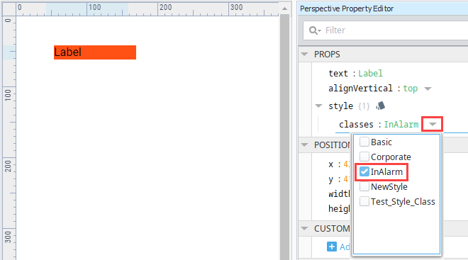
-
The Label component will immediately display the animated Style Class, transitioning between the light red and yellow colors we selected.
-
The color change will be linear initially, which creates a pulsing sort of effect. You can edit the style class again, and change the Timing to "exaggerated", which provides a more drastic switch between the two styles. Further more, selecting "exaggerated" will show the exact CSS cubic-bezier function the animation is using, allowing you to type on values manually.
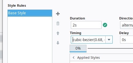
In addition, we can also reduce the overall duration of the animation, making the transition between the two colors occur more frequently. Regardless, we now have an animated style class.
Part 2 - Dynamically Using the Style Class
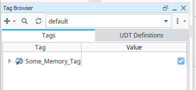
In this part, we can use a binding to conditionally add or remove our animated style class. First, we need to identify what should cause the label to flash. In this example, we'll use a simple tag value on a Memory Tag set to a Boolean value. However, you could use some other criteria, such as a tag binding to the HasActive alarm property on a tag.
-
Identity the criteria that will cause our component to flash. In our case, we have a Memory Tag with a Boolean data type. When the value is True on the tag, we will cause the label to flash.
-
With our component selected, place a binding on the style.classes property.

-
Since we want a tag value to determine the flash, we'll select a Tag Binding, and set the path to our desired tag.

-
Next, click Add Transform. We'll configure a transform that will return a string to the property, and use this as a way to add or remove our animated style class.
-
Select a Map type transform, and click Add Transform > in the popup.
-
Add one new row to the Map table by clicking the Add + button.
-
Under the Input Type column. Double click into the blank cell and type "true", without the quotation marks, then press Enter on your keyboard to commit the new text.

-
Change the Output Type column to Style Class by clicking on the header over the Output Type column, and selecting Style Class.
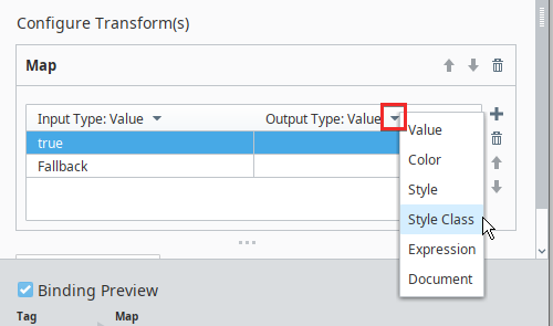 note
noteFor this example, we could use a Value type of output since the classes property simply needs a string value that matches the name of our Style Class, but the Style Class output type is less error prone since you don't need to type the name of the Style Class.
-
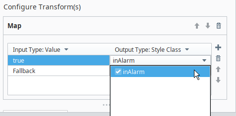
Click the top cell under the Output Type column, and select the "inAlarm" Style Class from the popup. Output Type column, set the cell to the first row to "inAlarm".
-
Press OK to close the binding window.
-
Toggle the value on your tag. You'll notice that when the tag's value is "true", the animation will start playing. While the tag has a false value, the style class will be removed, and no animation can be shown.
This example can be extended by adding an additional style class when the value of our binding is false. Furthermore, instead of setting just a single style class, we can use the map transform to set multiple style classes on the component, allowing us to switch between multiple styles on demand.