How to Change Style on Hover
Element states provide an opportunity to change the styling on a component when a user simply hovers the mouse cursor over a component. In this guide, we will create a Style Class with a hover Element State that changes the background color of a component using this Style Class.
-
Create a new style class, or edit an existing one. In this example, we will create a new style class called HoverLabel.
-
Under Style Rules, click on the Add
 icon and select Element State.
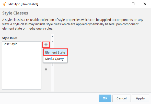
-
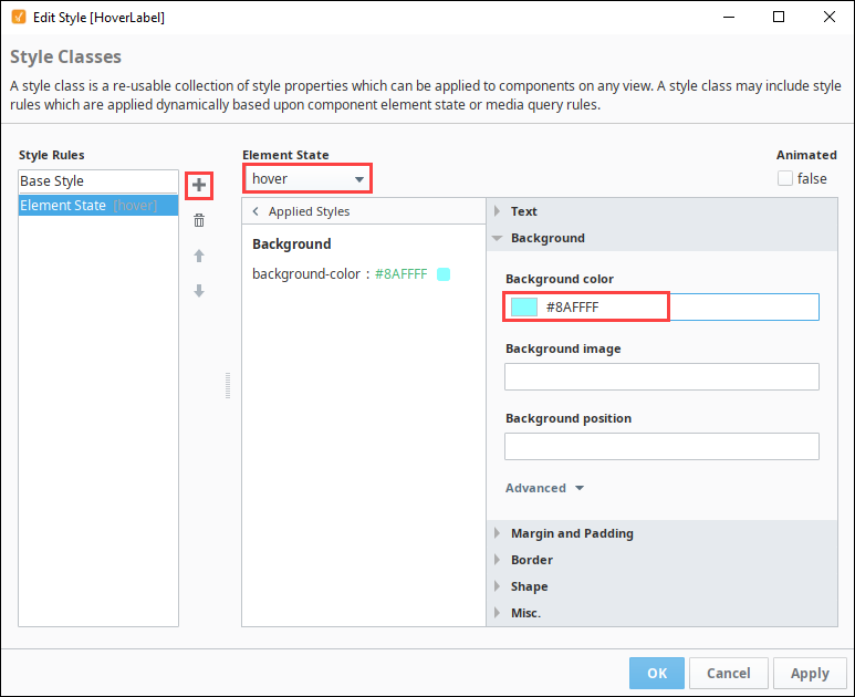
On the Element State dropdown, scroll down and select hover.
-
Click on the Expand
 icon next to Background to see the Background settings.
 -
In the background color field, enter a color code or click on the color wheel to select a background color. We chose #8AFFFF, a light blue.
-
Click OK to finish configuring the Style Class.
-
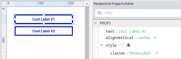
Next, apply the the Style Class to a perspective component. In this example, we will use a Label component.
-
Put the designer in preview mode, or launch a session. While hovering over the label, you will see that the background color of the component will change while the mouse cursor is hovering over the component.
