How to Change Text Size Based on Width
Since media queries react to viewport changes, we can use them to change the text size of a style class. Imagine a scenario where text needed to be larger on a smaller display, such as phone, to improve readability. That same text could likely be smaller on a desktop.
In this example, we will configure a media query that will change the text size for the Style Class when the screen is smaller.
-
Create a new Style Class. We called ours MediaQuery.
-
Under Style Rules, click on the Add
 icon and select Media Query.
-
With the Media Query selected, change Media Query to max-width and the pixel value to 500px. We also set the Text Font size to 24px.
-
Click OK to save the Style Class.

-
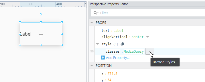
Create a new component that contains text, or select an existing component within a container. In this example, we created a new Label component and placed it on a view.
-
Assign the MediaQuery Style Class we just created to the Label component using the props.style.classes dropdown to browse Styles.
-
Save the project.
-
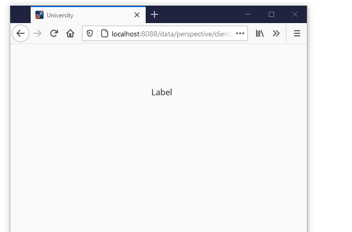
Launch a Perspective Session, and navigate to view containing the label (you may have create a page for the view). You will see the font size on the label change as you adjust the size of your session window.